With the creative industry in sight beyond graduation, many final-year students already have a working identity for themselves; a brand name, business cards, social media accounts... things that could prove helpful in making a professional impression.
This has long been a personal blank space for a number of reasons. I've always found it hard to solidify a clear creative identity; when asked "who are you?" or "what's your work about?", I'm more likely to respond with panicked silence than an answer. I'm not the most confident in my work either, which inhibits me sharing it. And, having only recently being diagnosed with ADHD, I really struggle being as 'on-the-ball' as you have to be to run this sort of ship. In realising how little I had to take forward, I had to address and change that. This project was essentially the route from A to B.
This has long been a personal blank space for a number of reasons. I've always found it hard to solidify a clear creative identity; when asked "who are you?" or "what's your work about?", I'm more likely to respond with panicked silence than an answer. I'm not the most confident in my work either, which inhibits me sharing it. And, having only recently being diagnosed with ADHD, I really struggle being as 'on-the-ball' as you have to be to run this sort of ship. In realising how little I had to take forward, I had to address and change that. This project was essentially the route from A to B.
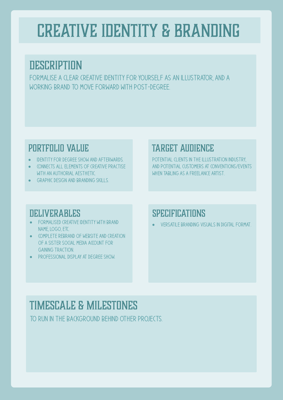
Above is the rough brief I landed on after considering what that route might involve. Based on what I felt was going to be most important and most valuable to my next steps, my main focuses were to be:
- formalising a creative identity, with a name and visual logo.
- visually rebranding my student website.
- creating a sister account on social media.
WHO AM I?
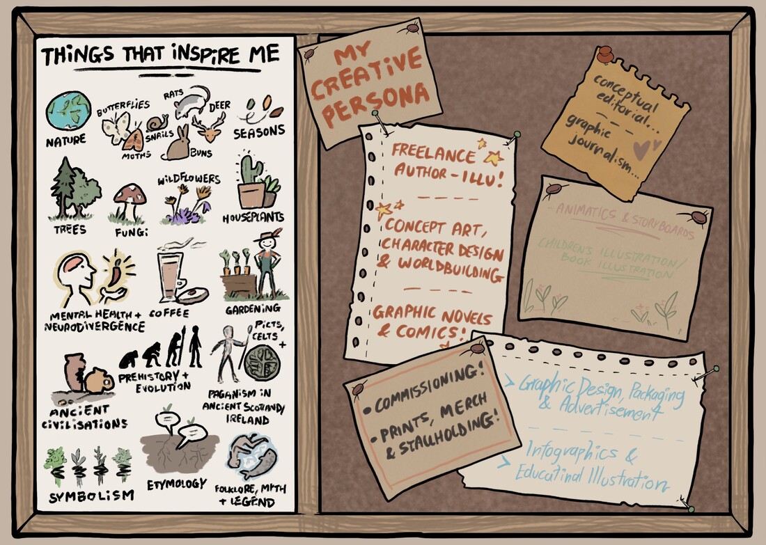
Answering this question was the first port of call, since it would effectively serve as the foundations for everything else. Below is a virtual pinboard I doodled to help me visualise my identity and personality as a creative. I thought about what inspires and influences me, what kind of work I produce, and what my aspirations are within the industry. That was about as easy as untangling Christmas tree lights - in the mind of an ADHD creative (at least in mine) there are always far too many colours, all flashing to asynchronous rhythms, and you have no idea where the string starts and ends.
My passion and respect for nature is definitely something that reflects in most of my work. Ultimately I felt what would visually encapsulate my creative personality on this website was a slightly playful woodland theme.
I wanted to use a pseudonym for this identity because of its advantages in versatility and security. 'Bayleaf' is a reference to the bay tree laurus nobilis, which in subtext links both to me as an individual and the themes of my work. I went on to integrate this into the visuals of the corresponding logo, which I've gone through below.
I wanted to use a pseudonym for this identity because of its advantages in versatility and security. 'Bayleaf' is a reference to the bay tree laurus nobilis, which in subtext links both to me as an individual and the themes of my work. I went on to integrate this into the visuals of the corresponding logo, which I've gone through below.
CREATING A Logo
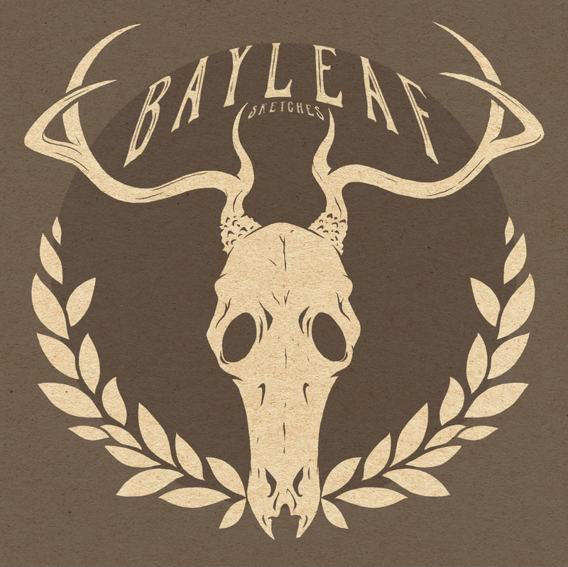
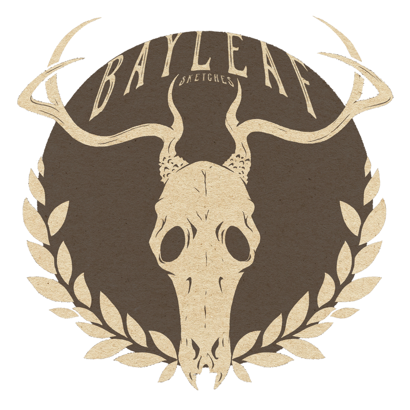
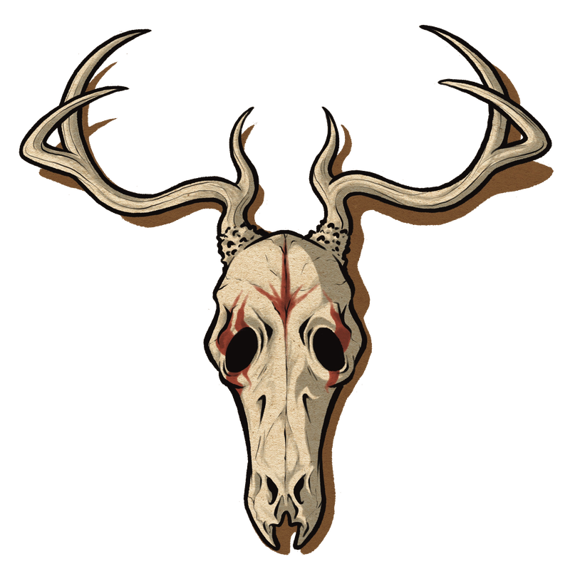
The Bayleaf logo would reflect both myself and my work, and so the design had to reflect accurately. I missed the mark on my first shot, but I've included the development progress below. The red deer skull has significance to me as a symbol of natural beauty and rebirth, but I forgot to consider that from outside something "dead" may come across differently, especially in a logo with no other context.
I used this point in the process to also make a watermark out of this logo for online artwork; an action I repeated later with the revised logo.
REBRANDING THE WEBSITE
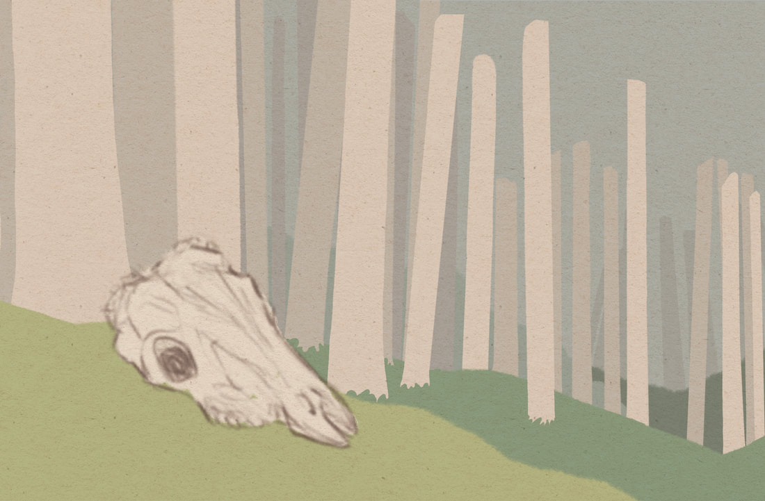
For the larger background elements of the site such as banners and headers, I tried to keep to the same neutral/natural colour tone and theme to convey the same personality. I wanted to create an old woodland feel with a slightly playful/fantasy element.
S I T E B A N N E R S & H E A D E R S . . .
|
|
|
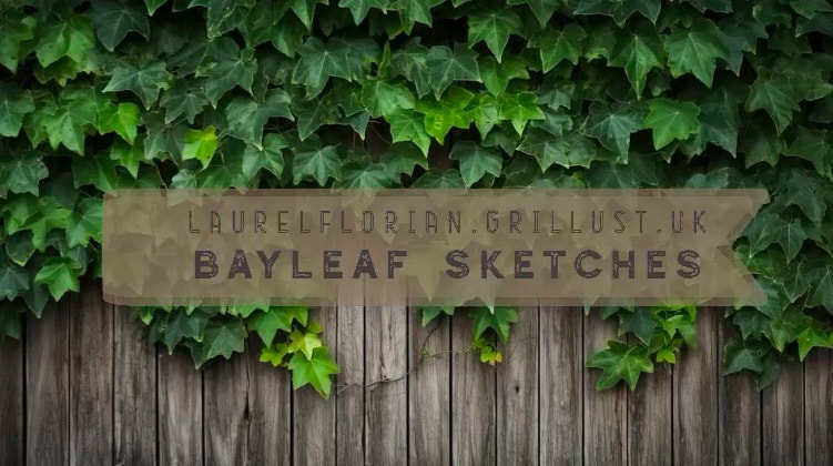
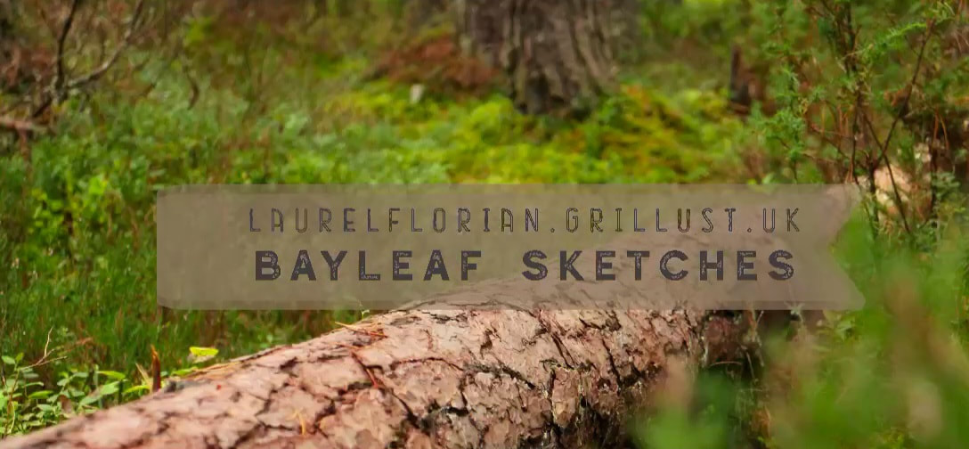
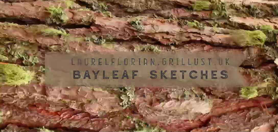
To emphasise the personal connection in this theme, I used my own photography (all except for the ivy are my photos - the ivy was a website-provided experiment.
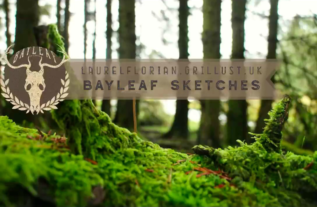
Though I really liked the above photo as a background, it was too busy for anything in front to properly stand out. In the end what worked best for the website main page header was a blurred forest canvas with no key subject. It was chosen for how it complimented the logo as well.
R E V I S I O N S . . .
Following advice from a tutorial pointing out the way the deer skull came across, and how it was distant from the other visual elements in visual personality, I trialled some adjustments that built on that feedback whilst trying to keep essential elements. Below are some conceptual sketches I made as I was doing this.
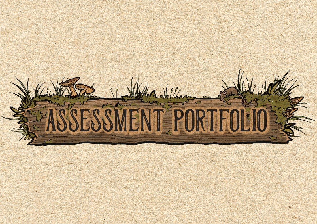
Below is the final revised logo and respective banner.
C o u r s e w o r k p o s t - i t b u t t o n s . . .
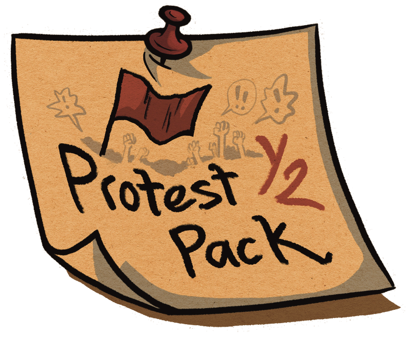
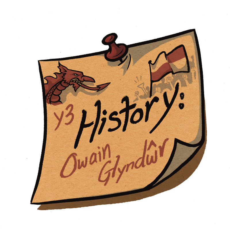
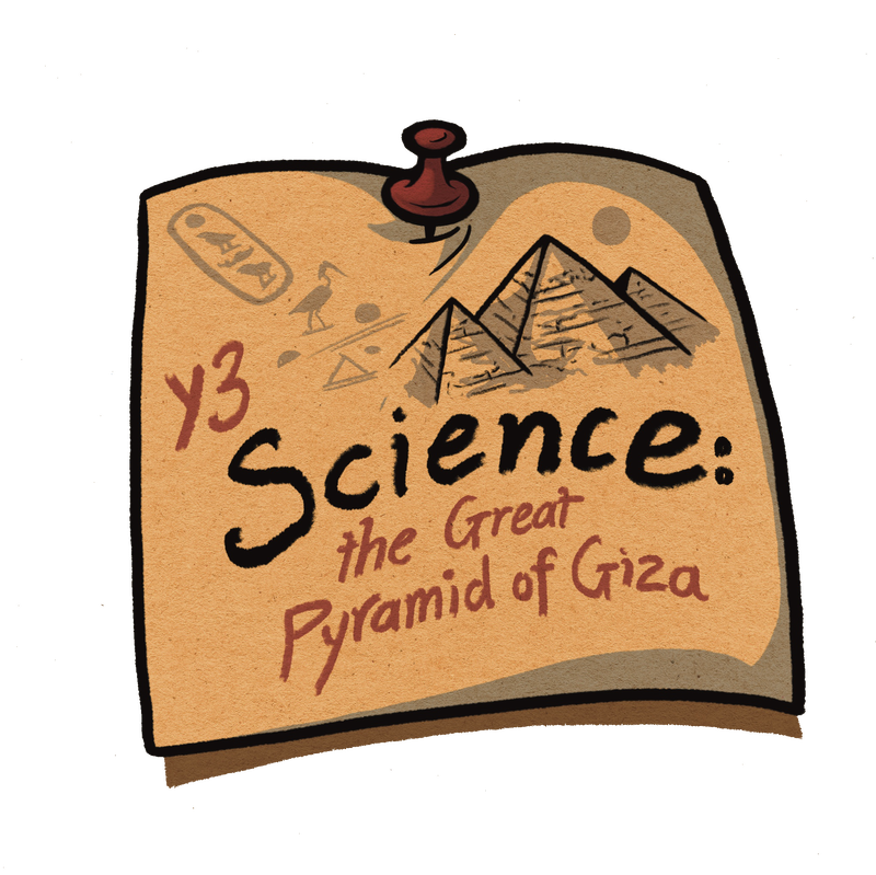
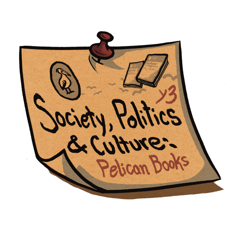
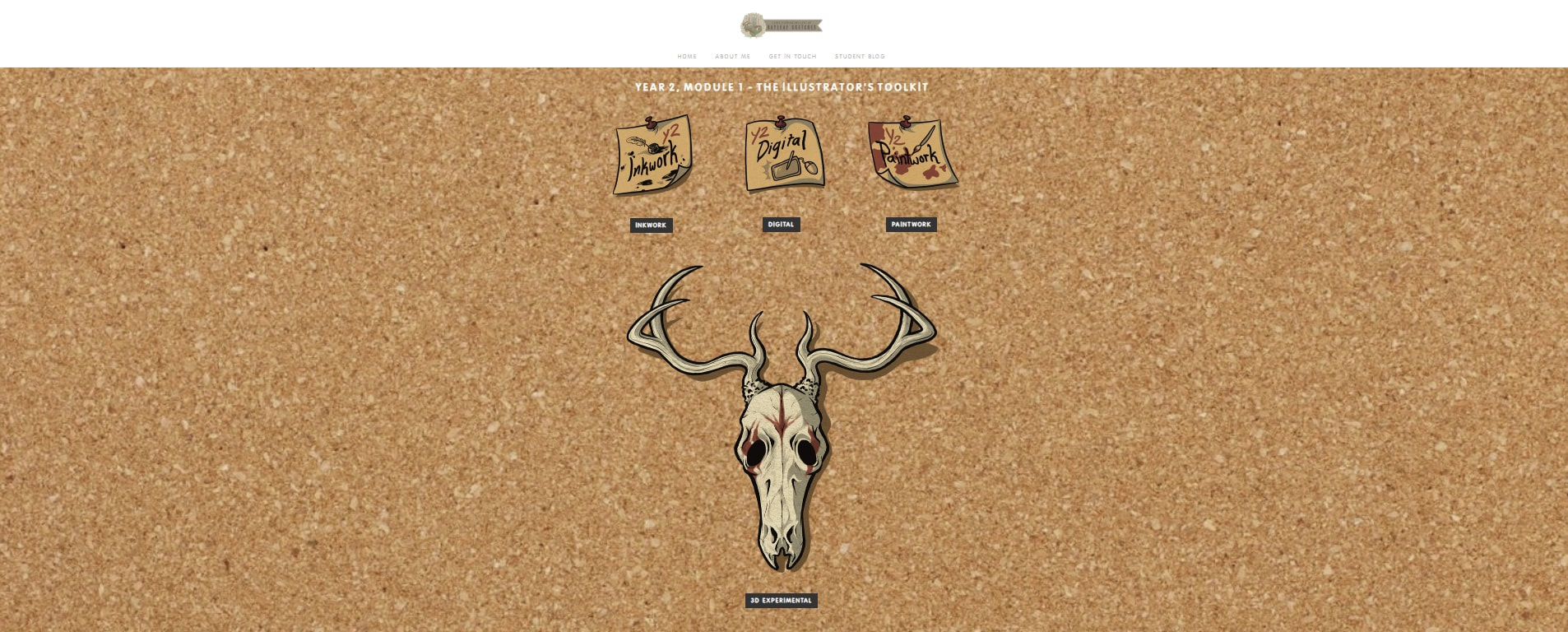
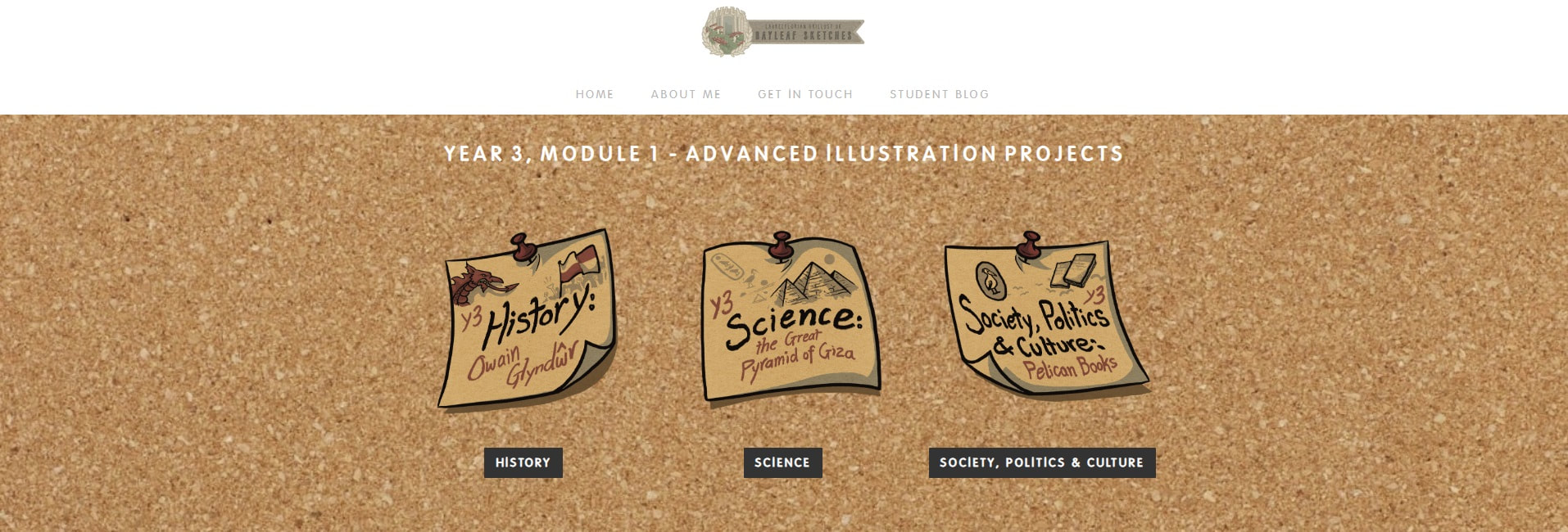
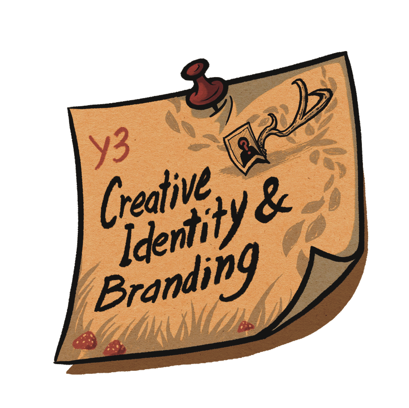
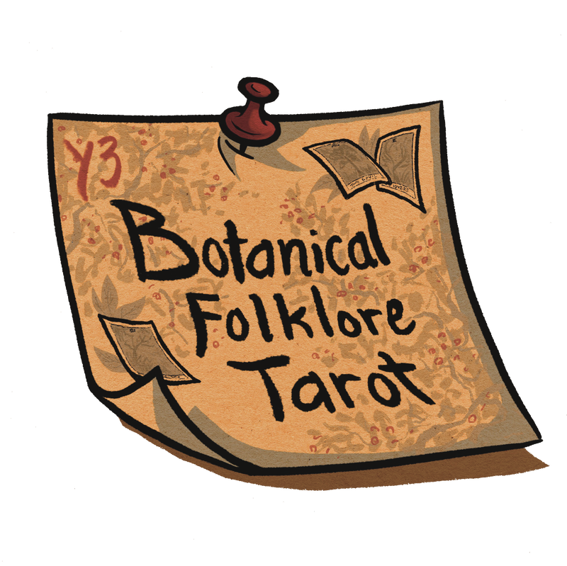
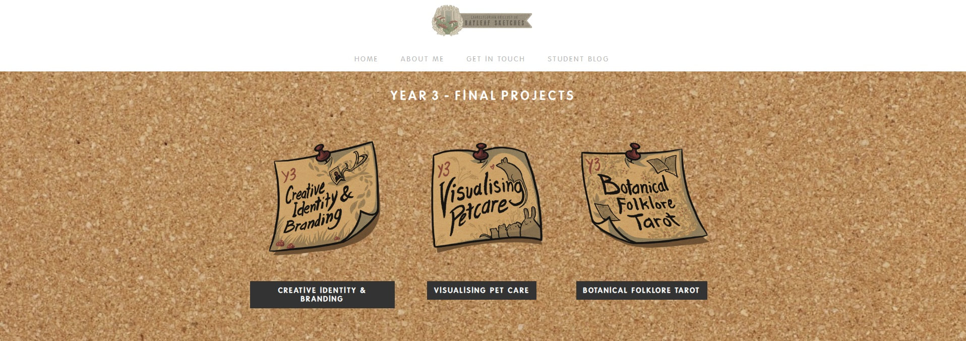
These assets were created to integrate every section of the site, including previous coursework pages, into the new aesthetic whilst still separating them categorically. The corkboard and post-it idea worked well for coursework with it being a "classroom-esque" visual, inferring students and learning.
[these are the Y2 Illustration Projects post-its]
[these are the Y3 Advanced Illustration Projects post-its]
S I T E N A V I G A T I O N & O T H E R V I S U A L S . . .
Below are some additional visual assets I made for the website in-keeping with the developing woodland theme. These include mushroom navigation buttons, rustic signpost buttons, contact buttons and special buttons for the 'Development' and 'Outcome' pages for each final project.
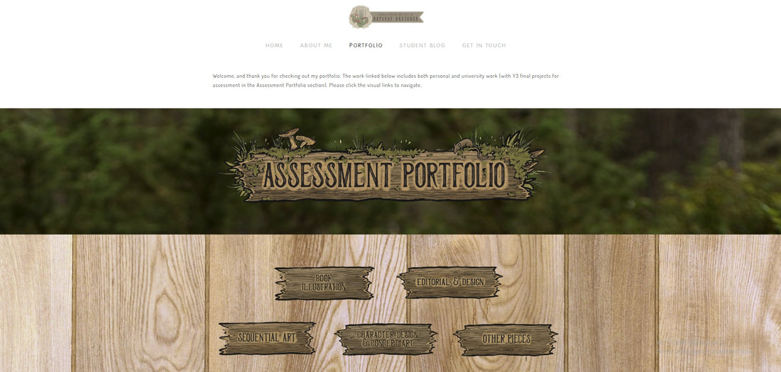
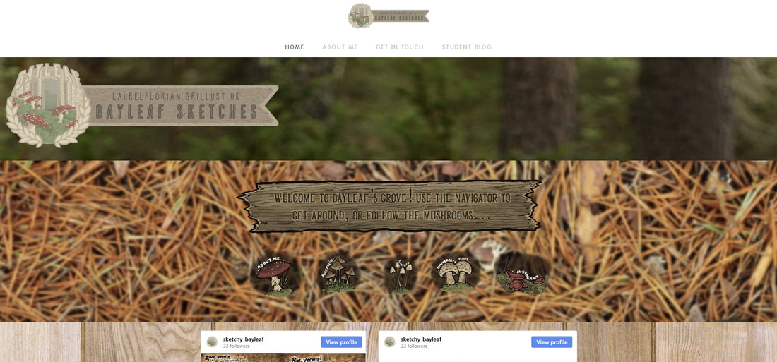 screenshot of home page with integrated logo, banner/header and site visuals
GETTING ON SOCIAL MEDIA
Site powered by Weebly. Managed by 34SP.com

