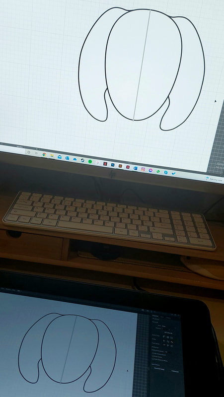
Before starting the course, I had next to no experience in digital illustration. I had used Photoshop before many years ago, but hadn't retained any skills. Picking it up again in first year was a good opportunity to re-familiarise myself with the software; I've been trying to improve since then, and have recently been lucky enough to acquire an iPad with Procreate. This was a good chance to test my skills and see if the practise had served any purpose.
PHOTOSHOP
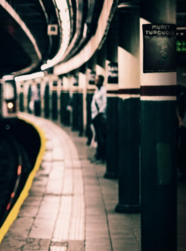
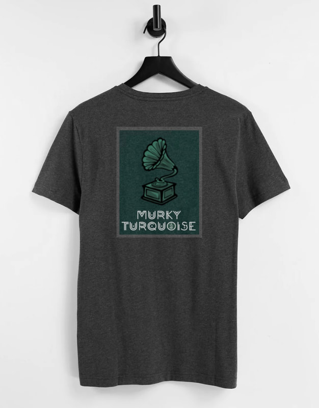
For this exercise, we were each given a band name and asked to create a gig poster for it. The poster had to be created digitally, but look like a beat-up, analogue product. The name I was given was 'Murky Turquoise'.
WHO ARE 'MURKY TURQUOISE'?
|
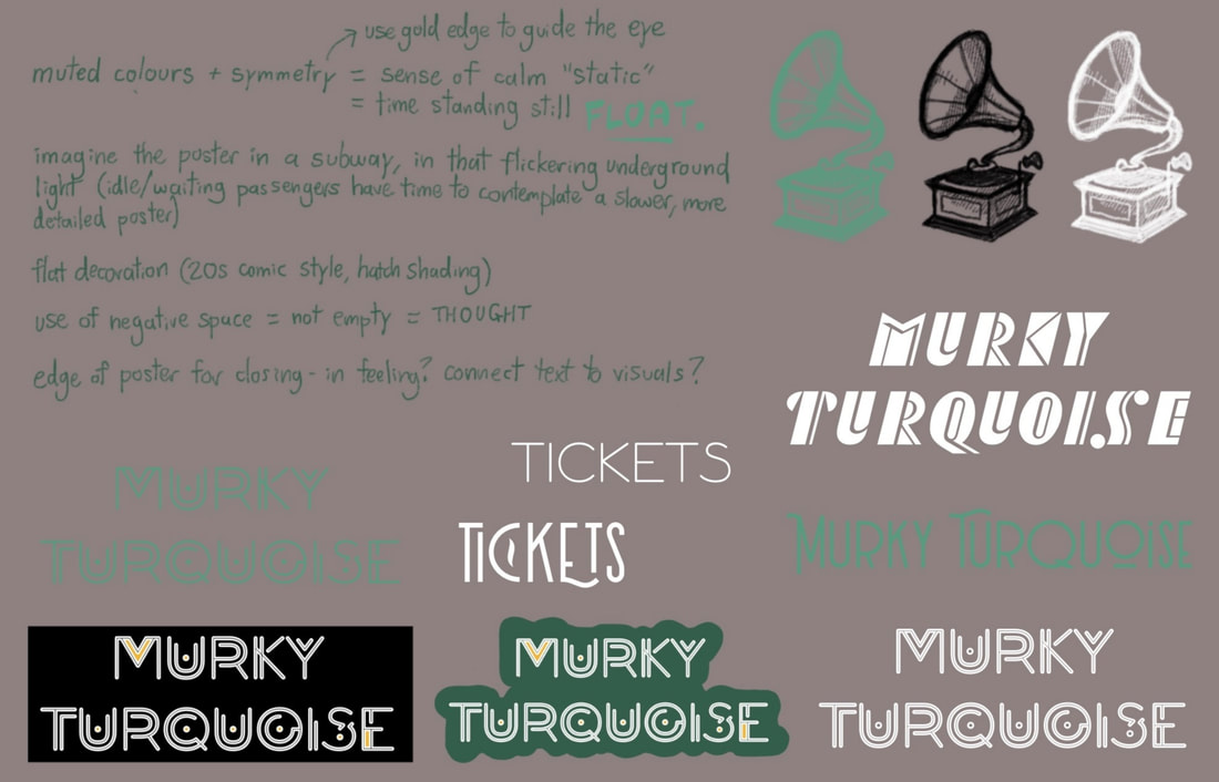
For tasks like this, a good, fleshed-out background concept really helps me along. I scrawled a quick page of notes on my fictional band, which you can see on the left; I thought about who they were, what genre of music they played, etc. The title 'Murky Turquoise' almost immediately dictated the colour scheme, and struck me with an image of muted blue-greens. It also had an old-timey, vintage feel to it. I began to visualise a colour scheme of teals, greys and gold, and I was soon certain that Murky Turquoise was an electro swing band. I listen to a lot of electro swing; a new-age take on 1920s swing dance music, it's both lively and the perfect mix of vintage and modern. Adding all the details you see on the left helped me build the image and visualise ideas for the poster. |
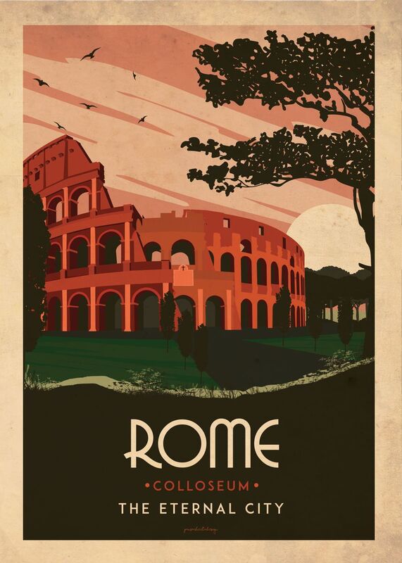
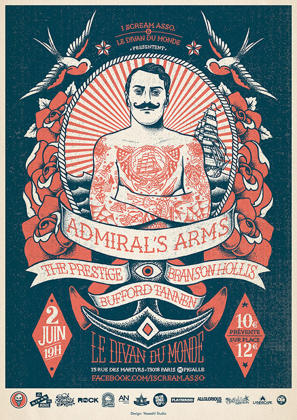
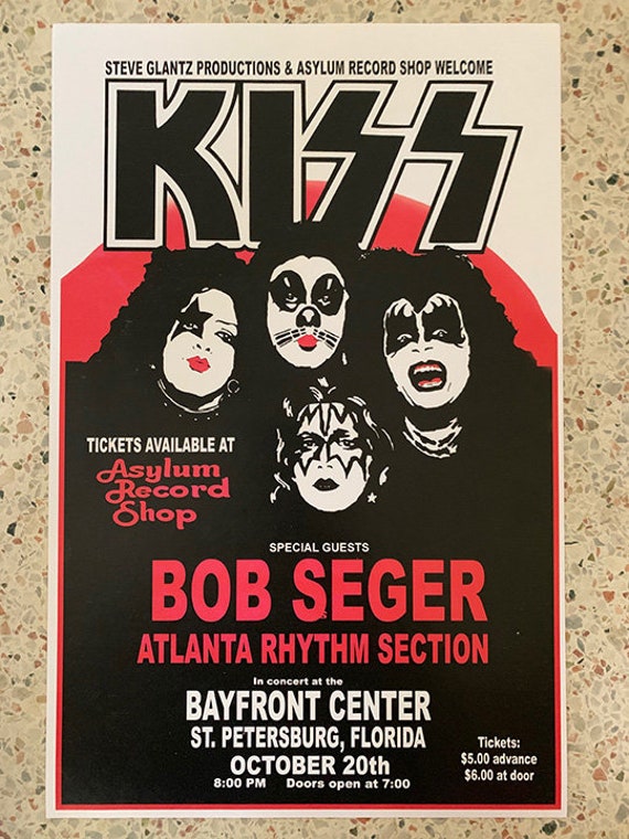
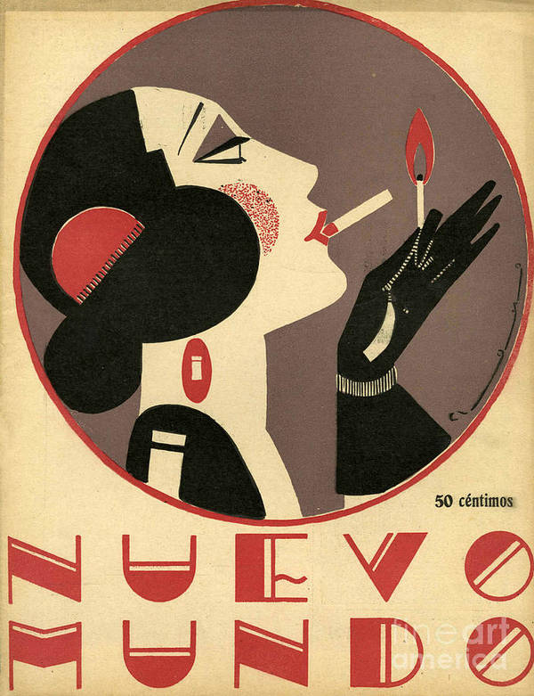
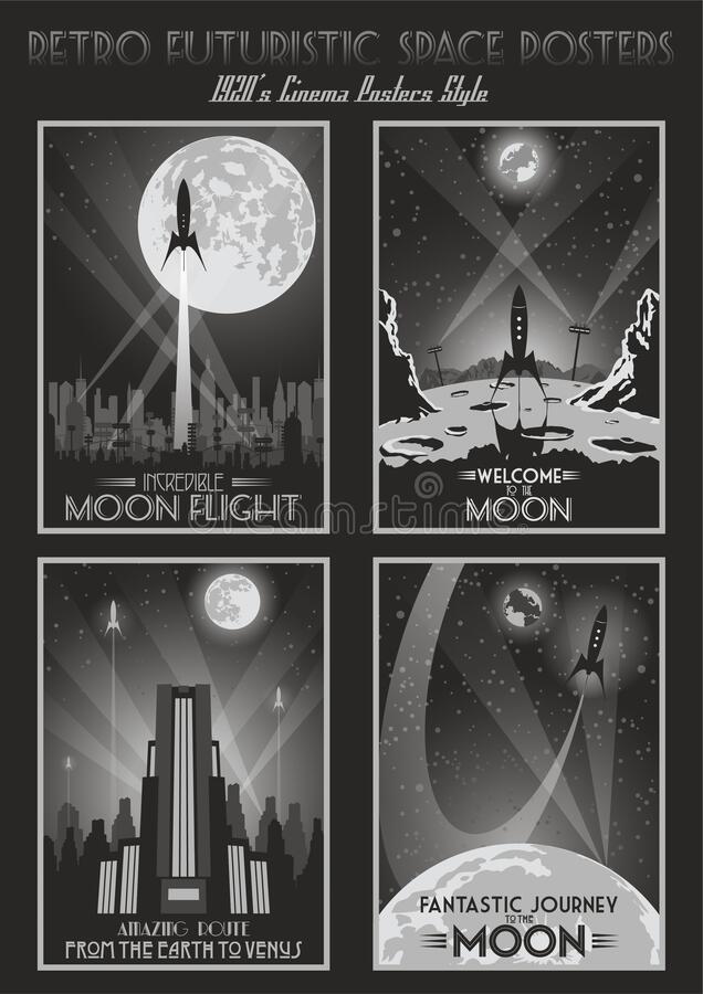
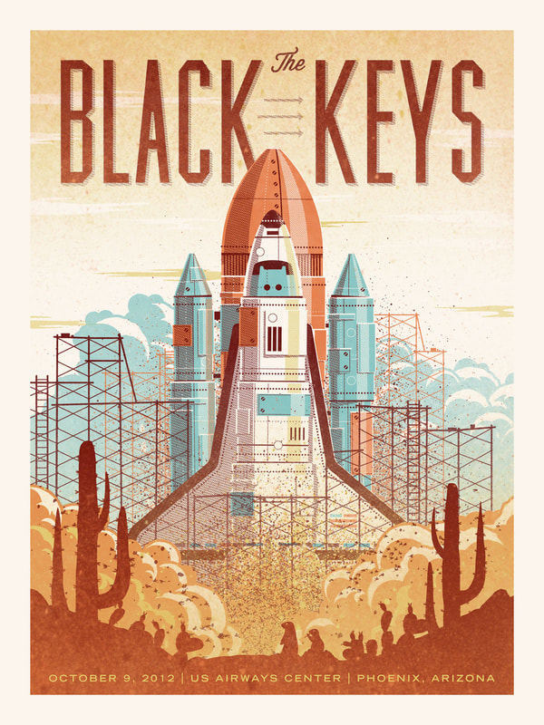
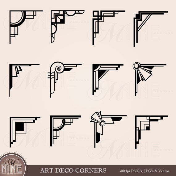
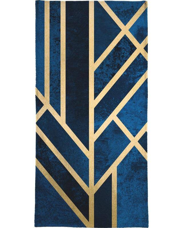
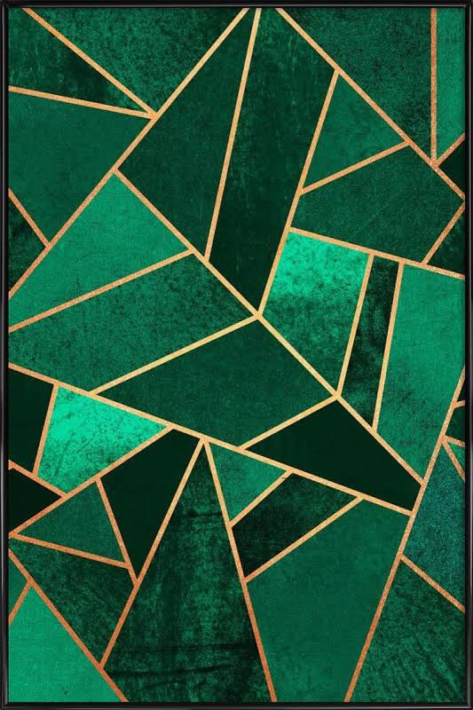
With the genre decided, I moved on to research. I looked at examples of vintage and modernised 1920s posters, which you can see below. The look of the 20s was defined by the elegant geometrics of Art Deco - I liked the idea, but I had to be careful to keep the poster suitable modern for a 90s-00s band. I wanted the style to have a vintage feel to it whilst still reflecting the modern revamp of electro swing; it had to be crisp, slick and clean, but with the vibe of the 20s.
THUMBNAILING
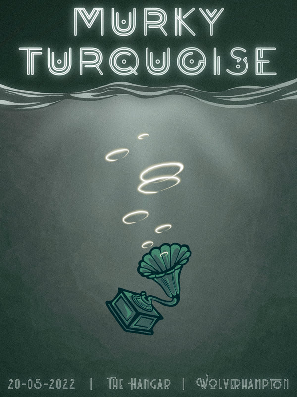
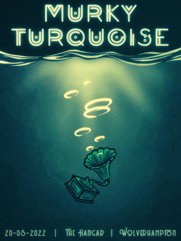
I developed the gramophone idea quite early on in the project - the symbol of vintage music sinking into deep, murky water, but still bubbling a tune to the surface. The idea behind this was to symbolise the rebirth of 20s swing; although the gramophone was sinking (buried by time), it was still very much alive and influencing modern music (bubbles reaching the surface). This idea stuck so stubbornly that I neglected any others, but I've learned I need to produce more thumbnails in future projects.
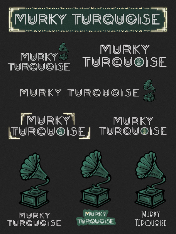
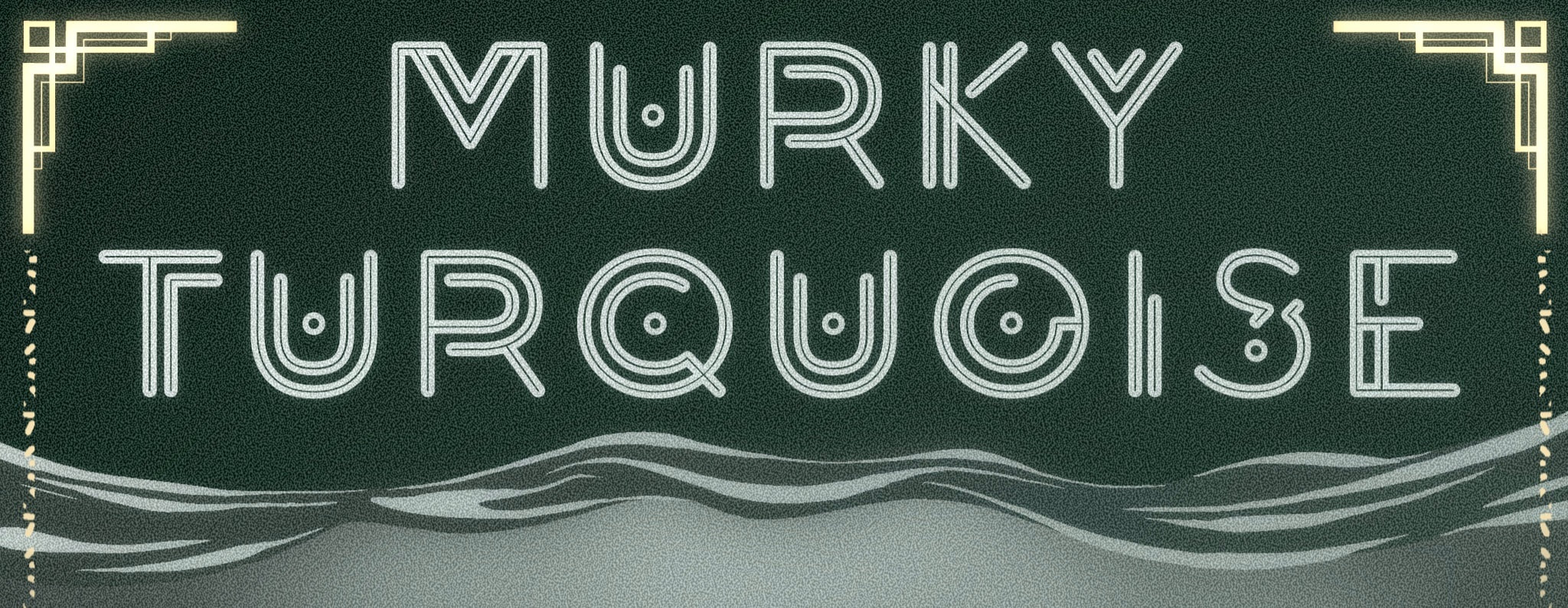
For the typeface, I researched fonts published in the 1920s, collecting a few modernised variants to try as well. Eventually I decided on Decora for the main title; it was the right mix of vintage elegance with slick, neon-sign-style modernism, which I felt represented electro swing well.
REFINING THE VISUALS
|
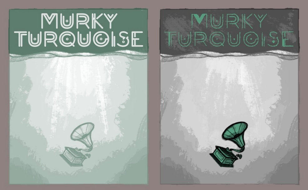
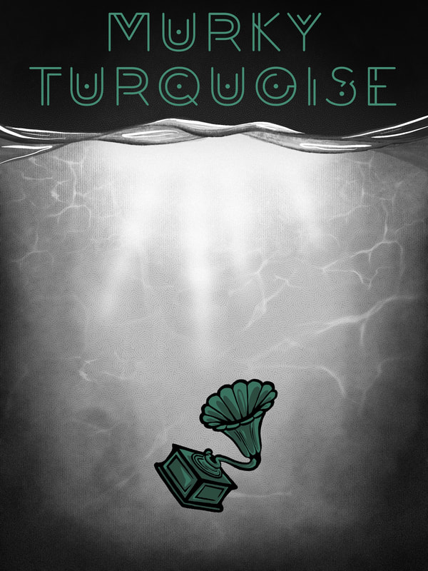
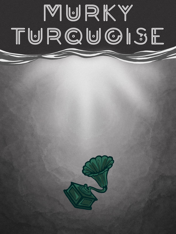
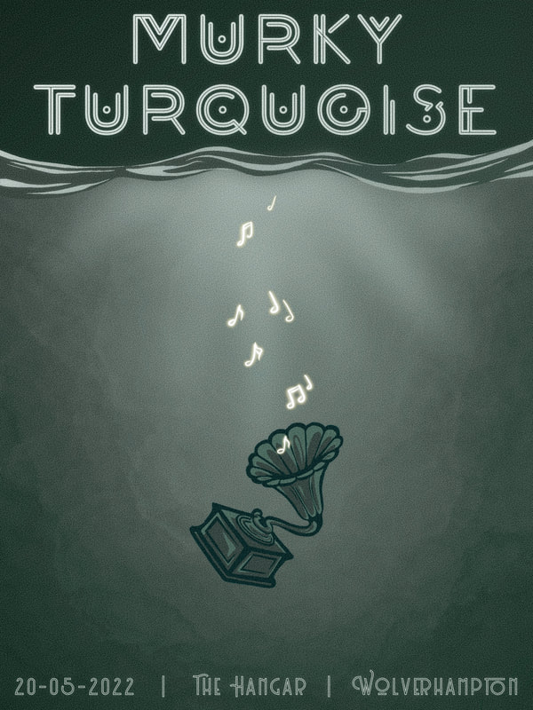
It was time to make some mock posters. These two are my initial attempts, using grayscale for everything except the focal points. I also made use of negative space around the gramophone to create a slow, thoughtful, sinking feeling. I liked both of these, but it didn't seem turquoise enough for a band called Murky Turquoise. |
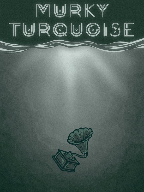
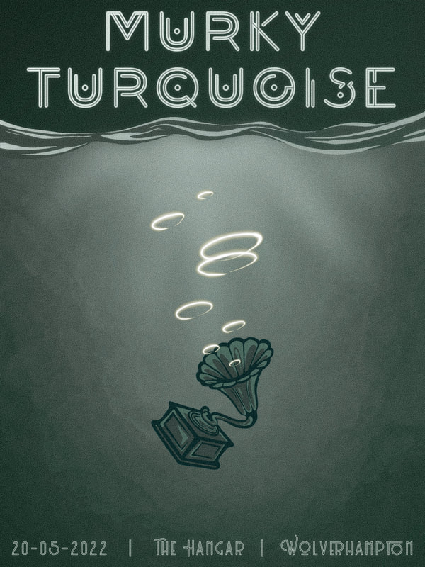
Eventually I moved to an all-turquoise theme, and found it much more appropriate. I kept the colours muted and fairly dark to go with the rest of the theme.
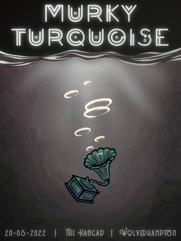
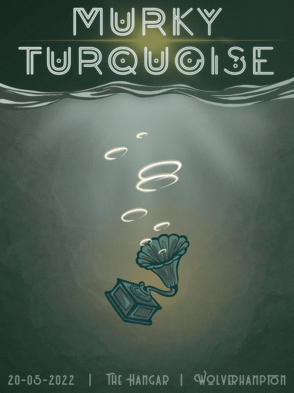
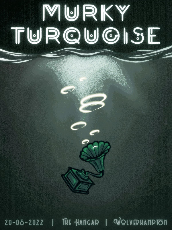
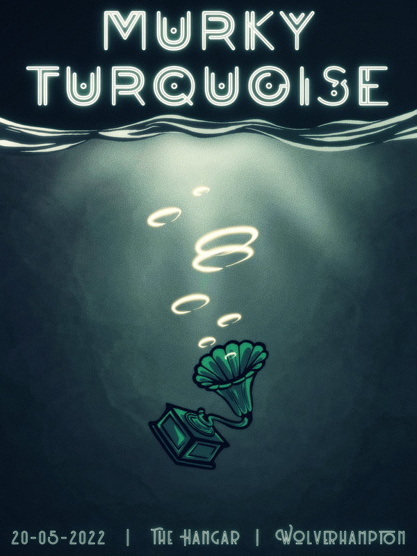
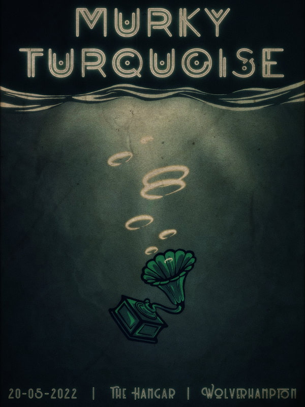
Once I had a base visual, it was simply a matter of refining and adding detail. I used the different digital brushes available to make the background look as analogue as possible; I also trialled various digital effects to amplify this, as you can see below. I played around with the brightness, exposure and contrast, and added different levels of noise and grain. After narrowing it down to three, I began to play around with final details and effects.
For a while I was stuck between actual music notes or bubble rings for the gramophone's music - I chose the rings because, the more I looked at it, the more the music notes were too childish for a band poster.
For a while I was stuck between actual music notes or bubble rings for the gramophone's music - I chose the rings because, the more I looked at it, the more the music notes were too childish for a band poster.
FINAL PIECE
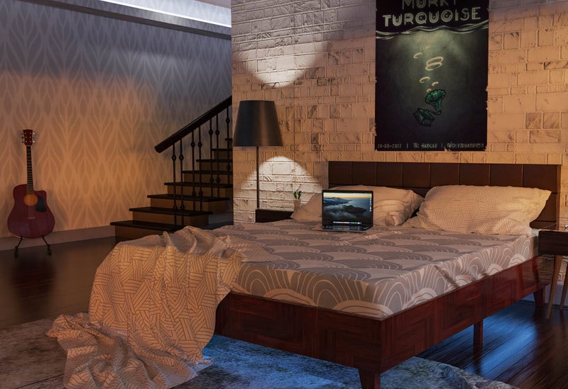
After deciding on the final visual, I saved the file as a JPEG and moved to photo editing apps to apply specialised analogue effects. I added two paper overlays; stained paper, and creased paper.
ILLUSTRATOR
For our Illustrator task, we were asked to create three mock designs for enamel pin badges, complete with backing cards. The badges were to reflect an existing pop culture property of our choice - we were limited to four colours plus line to create these, so the first challenge was choosing a property that worked within the brief.
'UNDERTALE' BY TOBY FOX
By definition, pop culture refers to cultural products and properties widely recognised by society. Personally, I find it difficult to wrap my head around what this would actually entail, since society and its mainstream interests are forever evolving. Thinking about what would've probably been the "pop culture" of my school years, I decided on 'Undertale'.
'Undertale' is an indie RP video game. Released in 2015 by creator Toby Fox, it quickly gained popularity with a largely-youthful audience of fantasy lovers and gaming connoisseurs (most people refer to us as "geeks" or "nerds"). What a lot of folk, including myself, found interesting about Undertale was its throwback design and art style - with its pixelated graphics and glitchy soundtrack, it pays homage to old 8-bit games. I felt it would be a fun challenge to tweak the original pixelated designs into badges with my own twist.
'Undertale' is an indie RP video game. Released in 2015 by creator Toby Fox, it quickly gained popularity with a largely-youthful audience of fantasy lovers and gaming connoisseurs (most people refer to us as "geeks" or "nerds"). What a lot of folk, including myself, found interesting about Undertale was its throwback design and art style - with its pixelated graphics and glitchy soundtrack, it pays homage to old 8-bit games. I felt it would be a fun challenge to tweak the original pixelated designs into badges with my own twist.
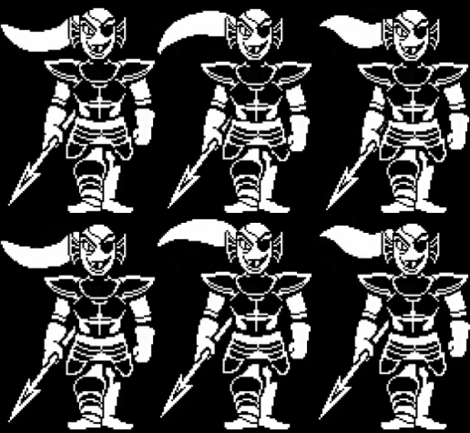
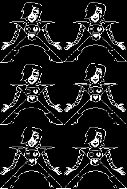
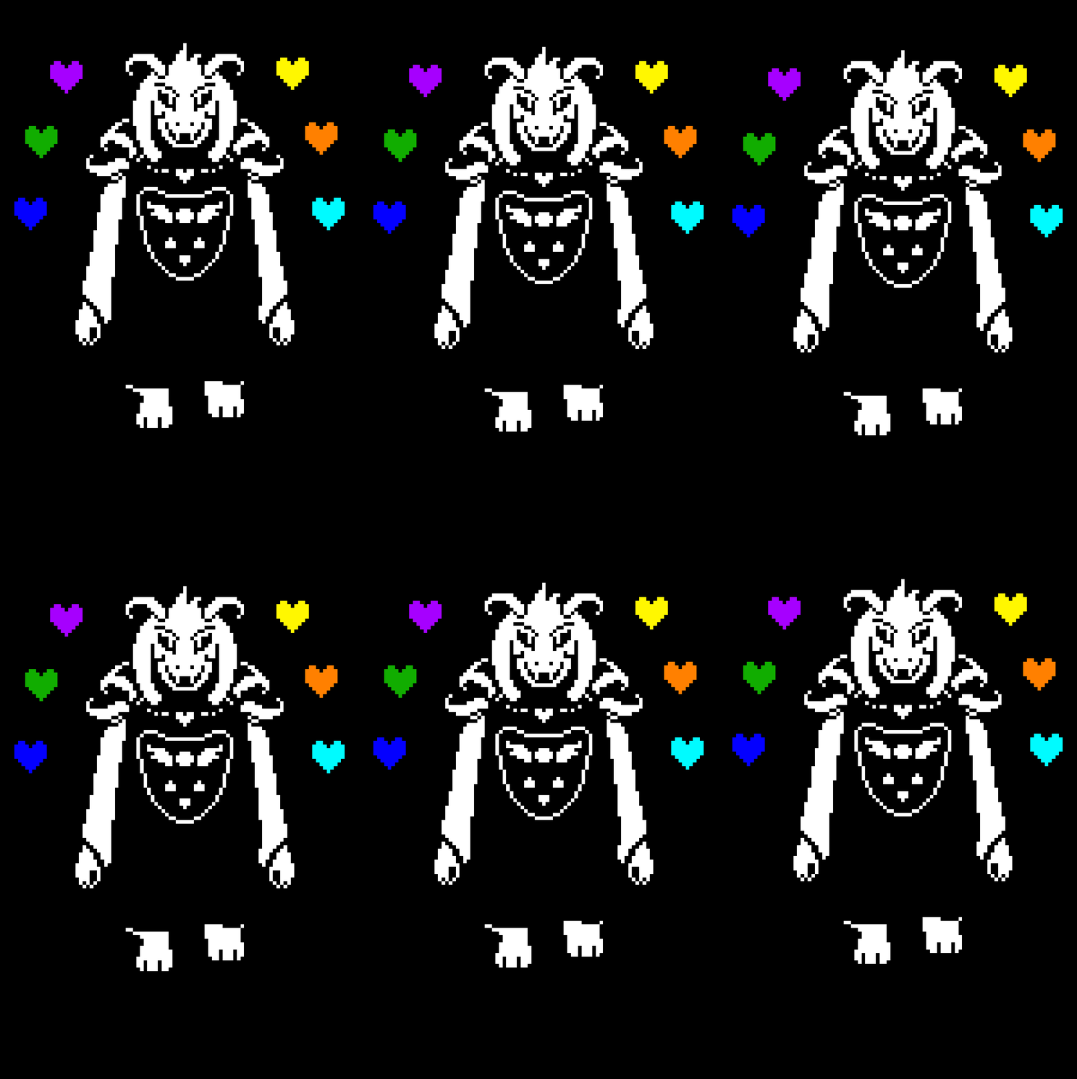
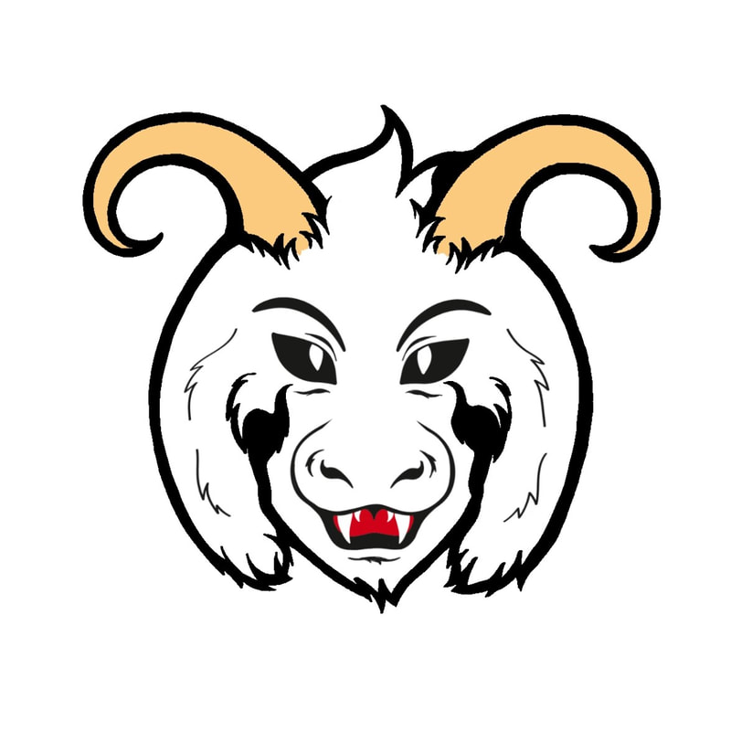
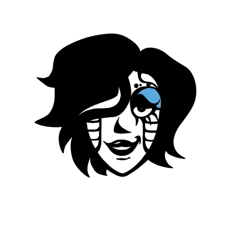
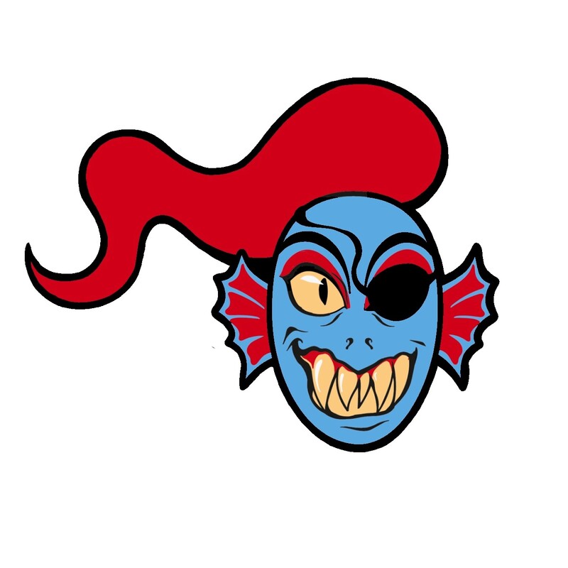
The characters above are the ones I chose to base my badges on - Undyne, Mettaton EX and Asriel. Each character has their own in-game colour scheme shown in cutscenes; by doing headshot badges, I figured I'd be able to work with a limited palette of blue, red, yellow and white (plus line).
GETTING TO GRIPS WITH ILLUSTRATOR
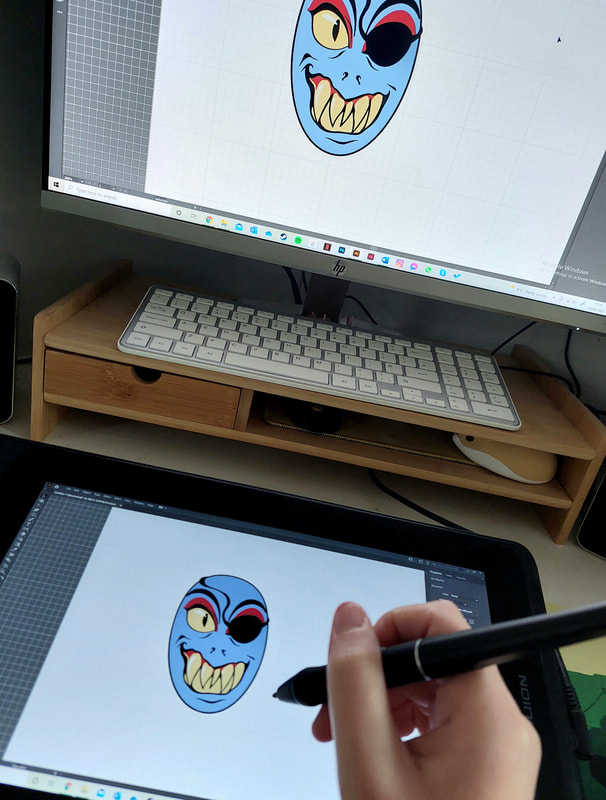
I'd never properly used Illustrator before - I didn't really understand the software at all at first, so a good many hours were spent just experimenting with different tools and getting a general feel for it. I can't say I'm completely confident with it now, but I definitely know more than I did before.
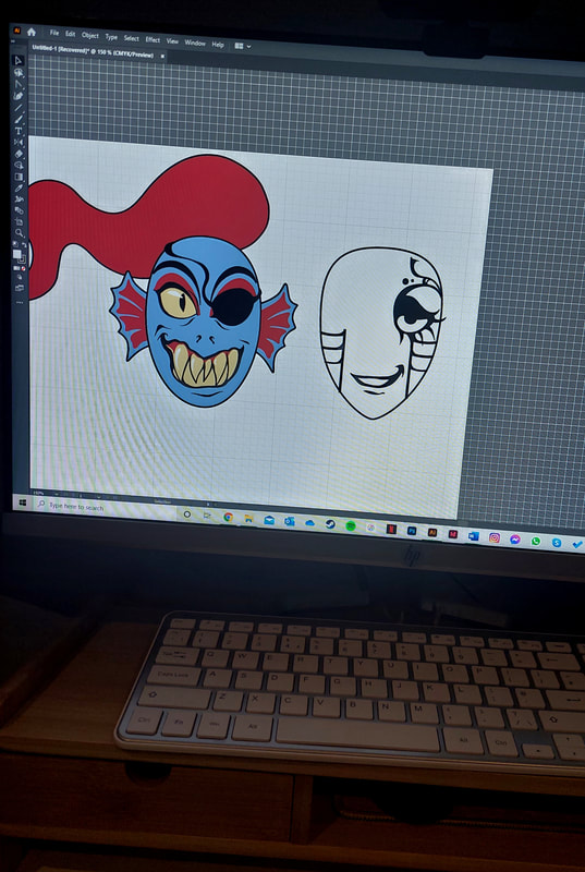
One thing I like about the character design in Undertale is the simplicity. If you analyse them, each figure is made of simple shapes which differ between characters. Undyne uses squared and pointed ovals; Mettaton is a mix of rounded and pointed polygons, and Asriel's overall design is very rounded and elongated. I worked in the basal shapes with the line, ellipse and polygon tools before building in the colour and detail.
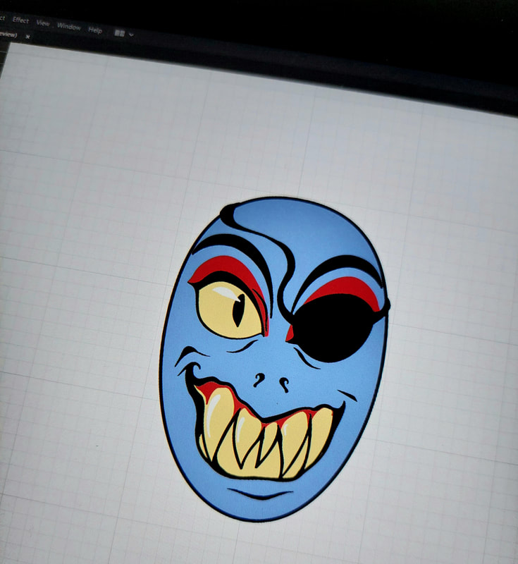
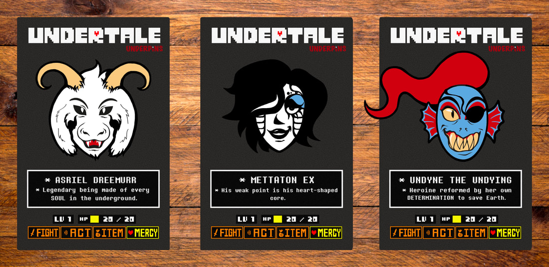
After a lot of tweaking and fine-tuning, I ended up with the final designs above. I am currently trying to distance myself from heavy outlines, but I felt they were appropriate here - necessary even - to catch the eye and make the badges pop. I took inspiration from Comic Cons and other artist alley conventions I frequented before the pandemic - what really drew me in at those badge stalls, and how could I replicate that in my work?
BACKING CARDS
Again, like I mentioned a moment ago, I thought back to convention time when creating the backing card design. Packaging and branding was always my favourite part of craft fairs when I held a stall - their design is just as important as the product to draw in the target audience.
In this case, my target audience would be my beforementioned "nerd" clan - largely gamers and fans of fantasy fiction. The battle screen in Undertale is well-known amongst fans, with the action buttons and humorous narrative becoming beloved symbols of the game. I thought it would be effective to incorporate these into the backing card design; to almost recreate the battle scene for each of my chosen characters. I had a little fun with the branding, too.
In this case, my target audience would be my beforementioned "nerd" clan - largely gamers and fans of fantasy fiction. The battle screen in Undertale is well-known amongst fans, with the action buttons and humorous narrative becoming beloved symbols of the game. I thought it would be effective to incorporate these into the backing card design; to almost recreate the battle scene for each of my chosen characters. I had a little fun with the branding, too.
THE FINAL PRODUCT
These are the products I finished with. I really enjoyed this project, overall - as well as having fun with designs and badge concepts, I found it a good opportunity to practise and experiment with Illustrator as a software. I didn't think I would be a fan of it, to be honest (and it took me hours of working to challenge this thought) but I find myself curious about what other things I could create.
Site powered by Weebly. Managed by 34SP.com


