In this project, we had a choice of focus - editorial, narrative fiction, picture books for early readers, or song lyrics. I was initially going to attempt another editorial piece but, after thinking on it, ended up choosing children's literature. For this I was required to illustrate a double page spread, a single page, and a cover.
I have never enjoyed or been interested in children's illustration - I actually get a little worked up when folk assume it's my aim, just because I write and illustrate fantasy and cartoons. I prefer stories with dark sides, cerebral plotlines, symbolism... and children's picture books don't exactly come to mind when I think of those things. However, after a particular lecture on children's illustration, I realised that it doesn't have to be the brightly-coloured, meaningless stuff that puts me off. It can have deeper meaning to it, and it doesn't have to be too cutesy - I've started reminding myself of nursery rhyme origins to prove this to myself. And anyone who knows the legend behind 'The Pied Piper of Hamelin' gets my point already.
If anything, it is experience gained from trying.
DER LEGENDäRE RATTENFäNGER VON HAMELN
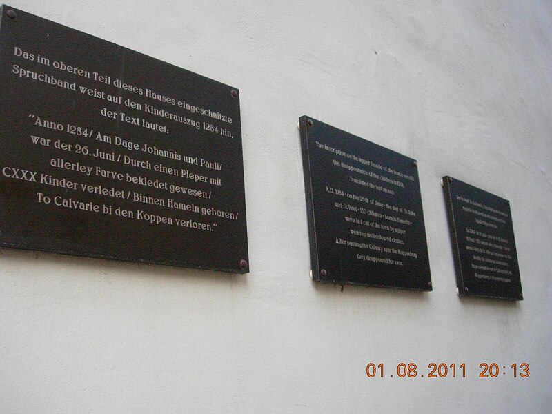
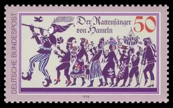
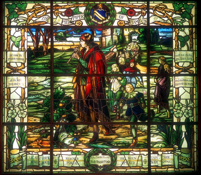
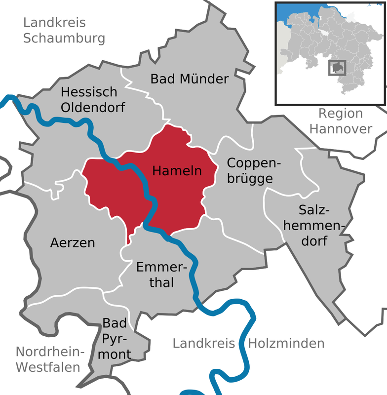
The original legend dates back to the Middle Ages; approximately 1284 in the town of Hameln, Lower Saxony, Medieval Germany. Hameln's town records hold the earliest mention of the story in an entry from 1384, which solemnly states "it is 100 years since our children left". No earlier evidence or explanation has been found bar the stained glass window in Hameln's church; built c. 1300, destroyed in 1660, reconstructed in modern times. Though everyone knows the children's tale of the Pied Piper, nobody really knows what tragedy befell the children of Hameln in the reality of 1284.
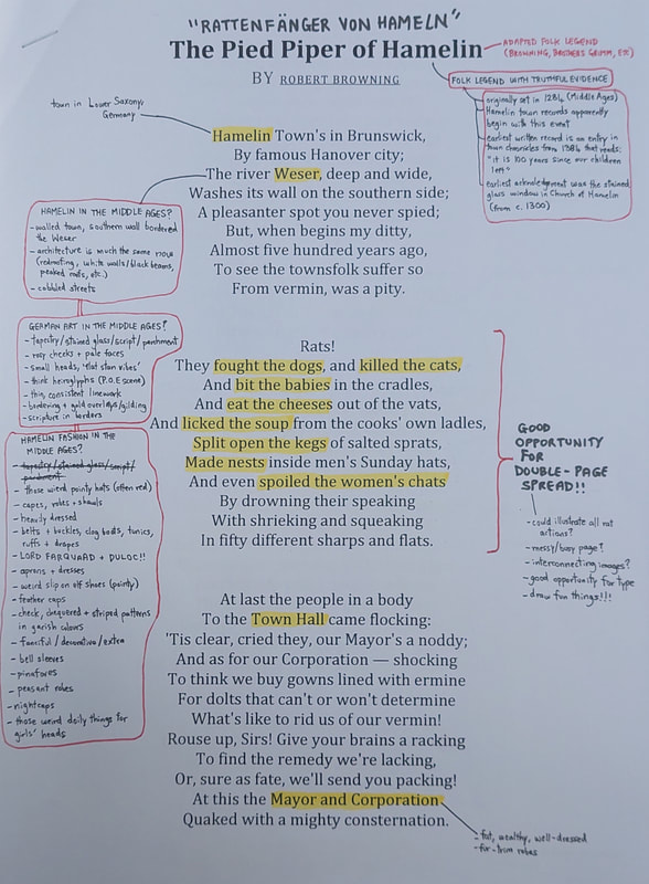
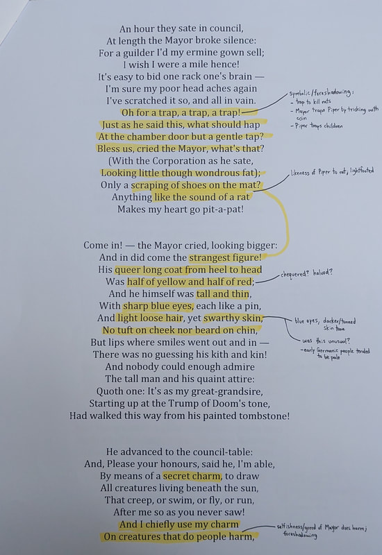
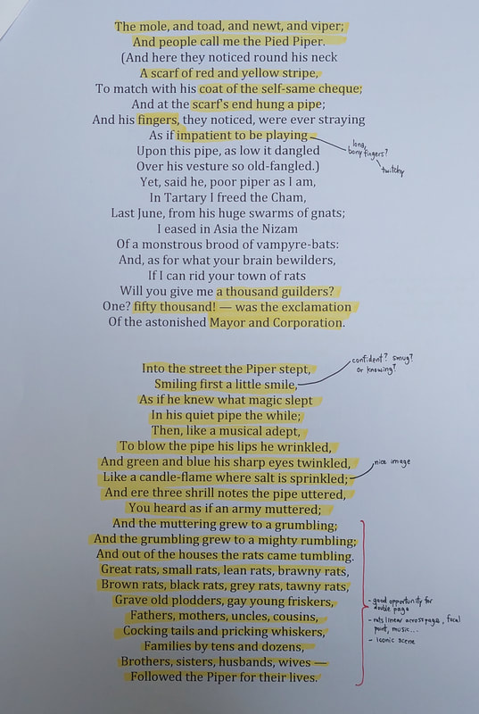
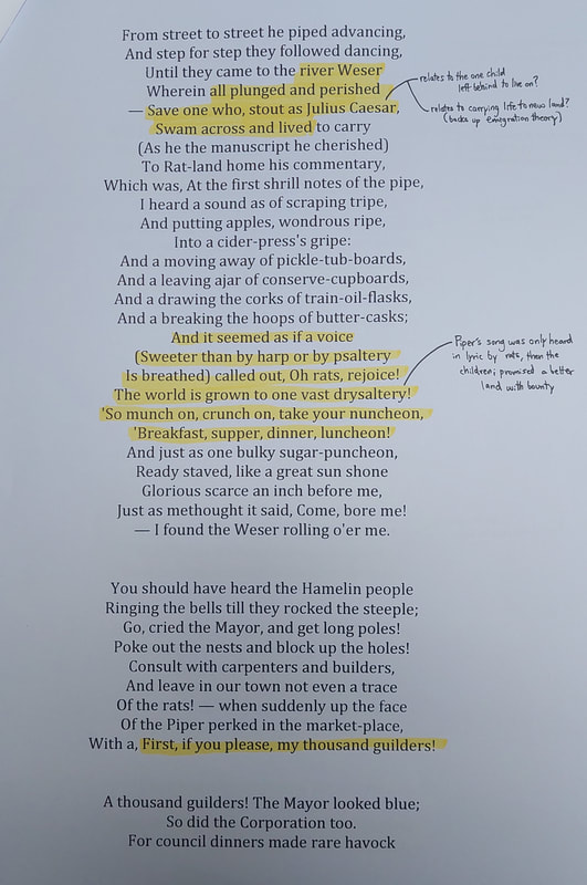
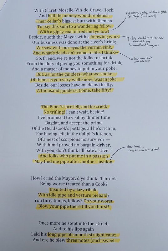
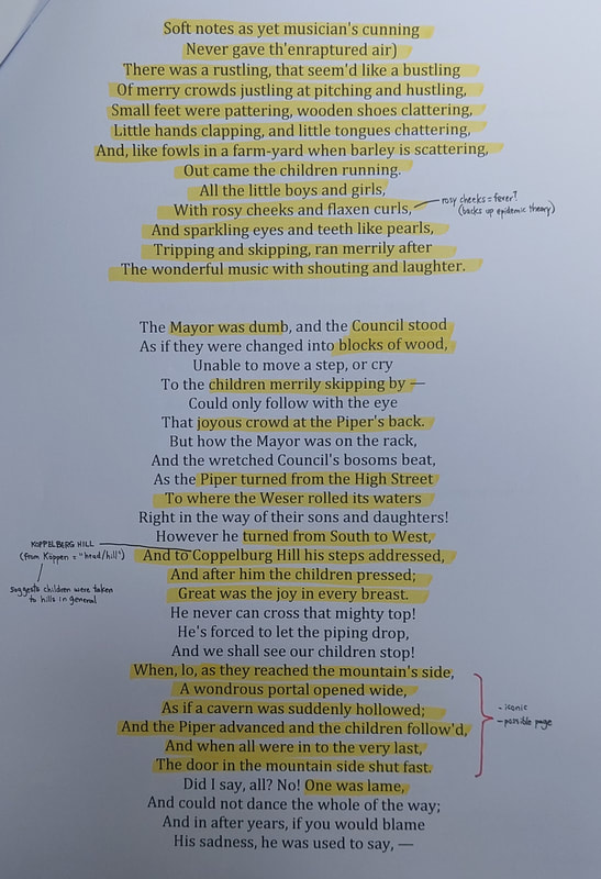
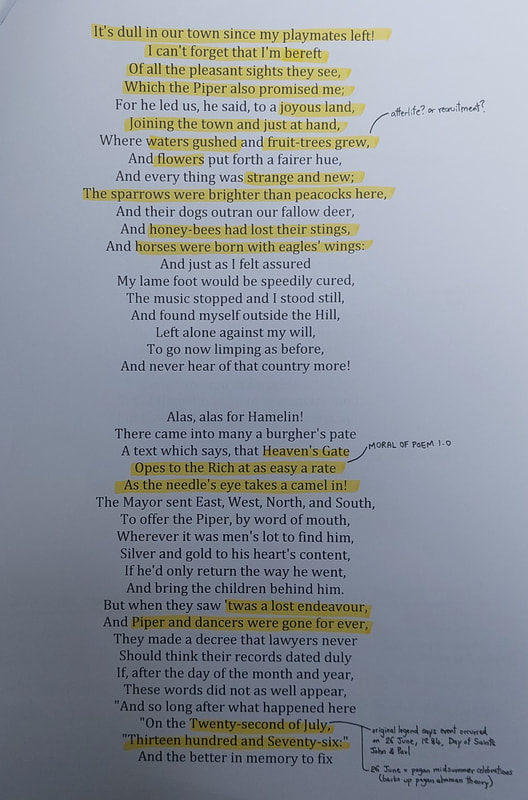
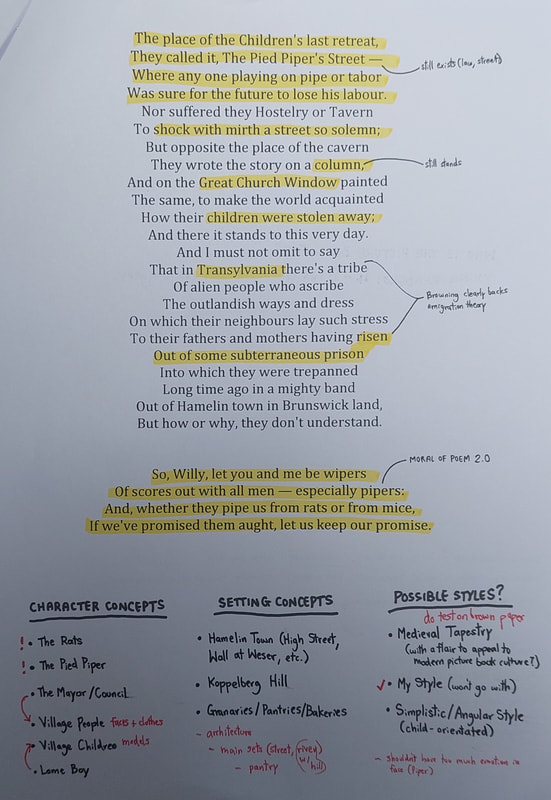
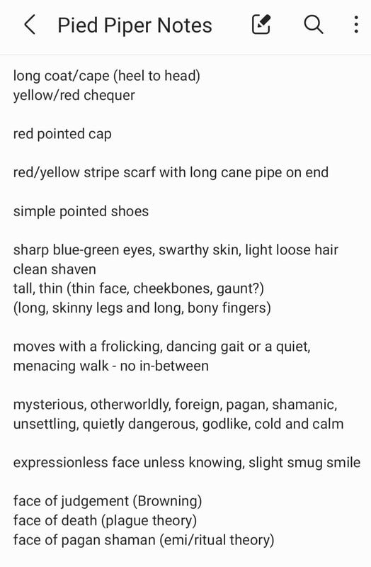
Adaptations have taken liberties over the years. The original legend does not actually feature rats at all - they were added in sometime during the 1500s. Since then, storytellers and artists have spun the legend into their own works - Robert Browning's poem is perhaps one of the most famous, and it is this version I was tasked to illustrate for this project. Below are my initial notes and annotations.
Adaptations have taken liberties over the years. The original legend does not actually feature rats at all - they were added in sometime during the 1500s. Since then, storytellers and artists have spun the legend into their own works - Robert Browning's poem is perhaps one of the most famous, and it is this version I was tasked to illustrate for this project. Below are my initial notes and annotations.
RESEARCH & REFERENCE
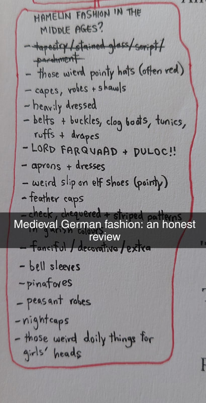
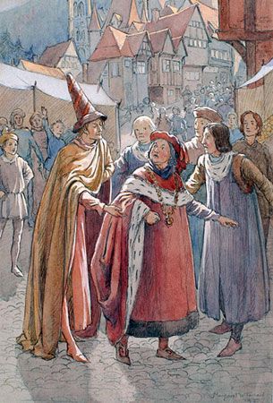
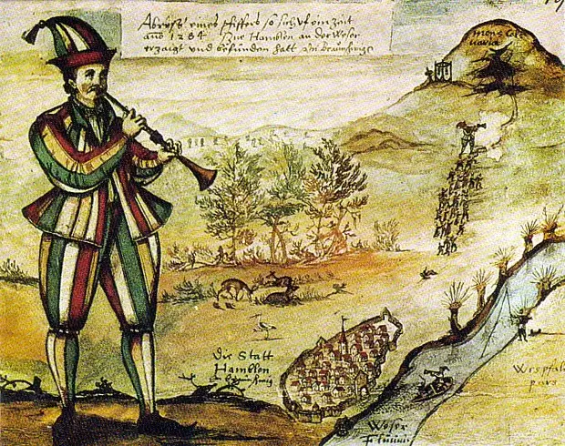
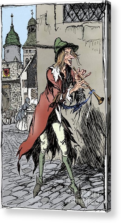
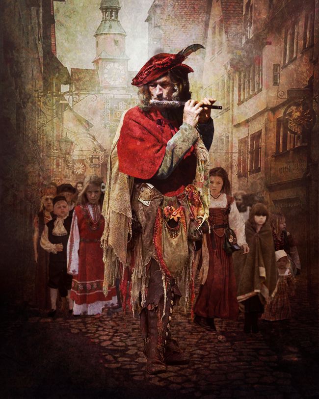
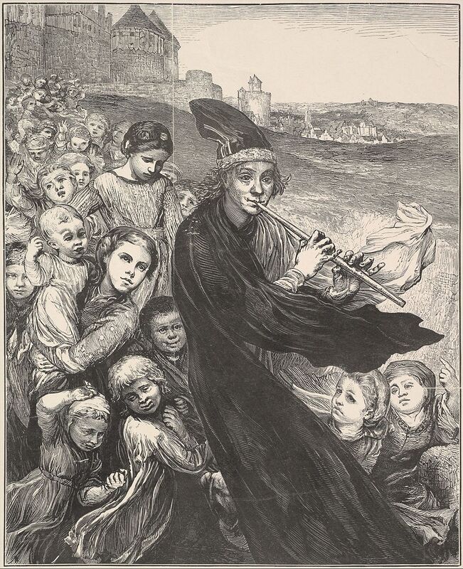
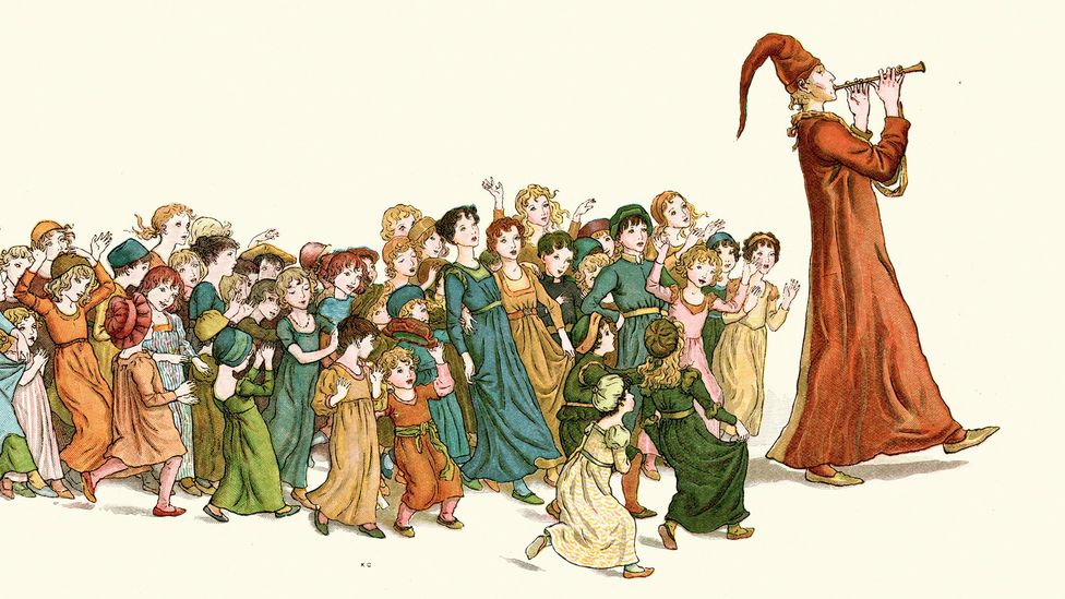
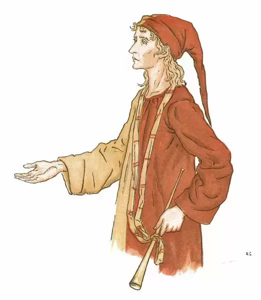
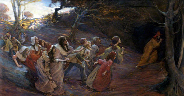
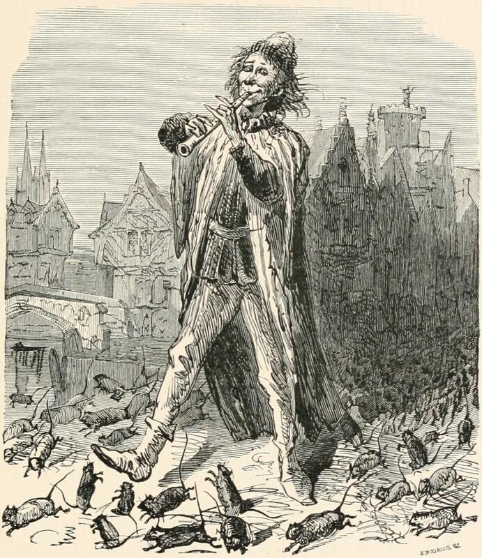
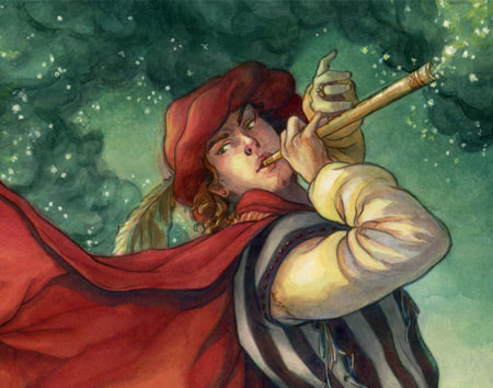
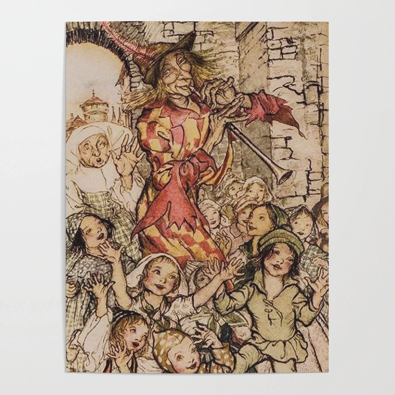
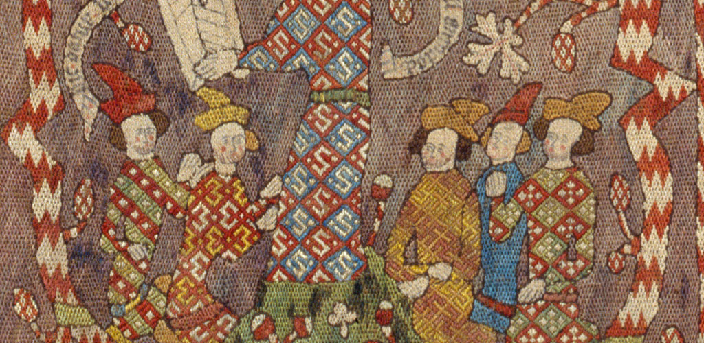
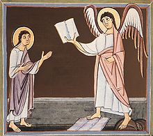
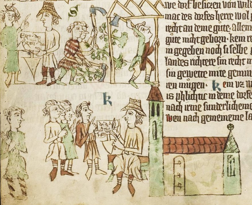
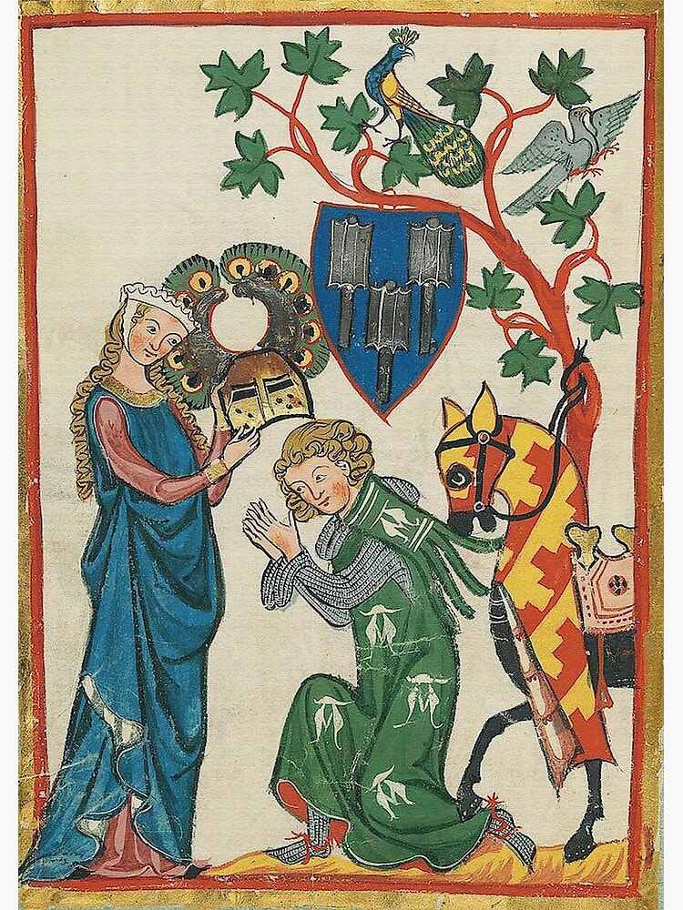
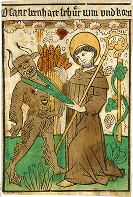
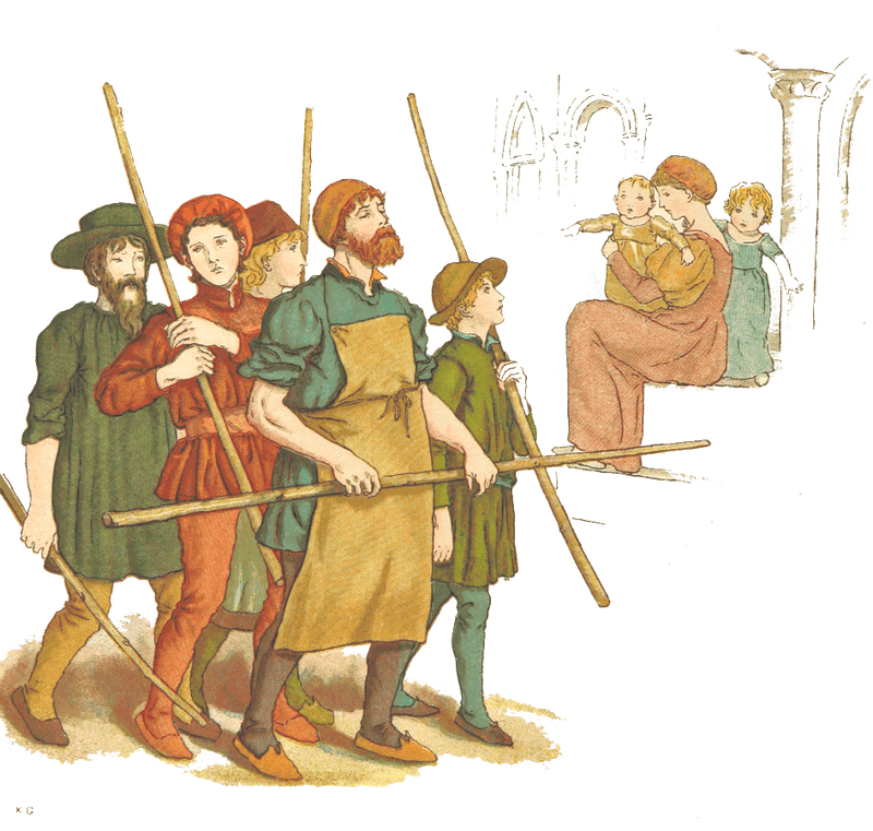
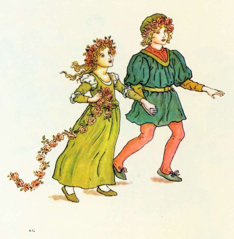
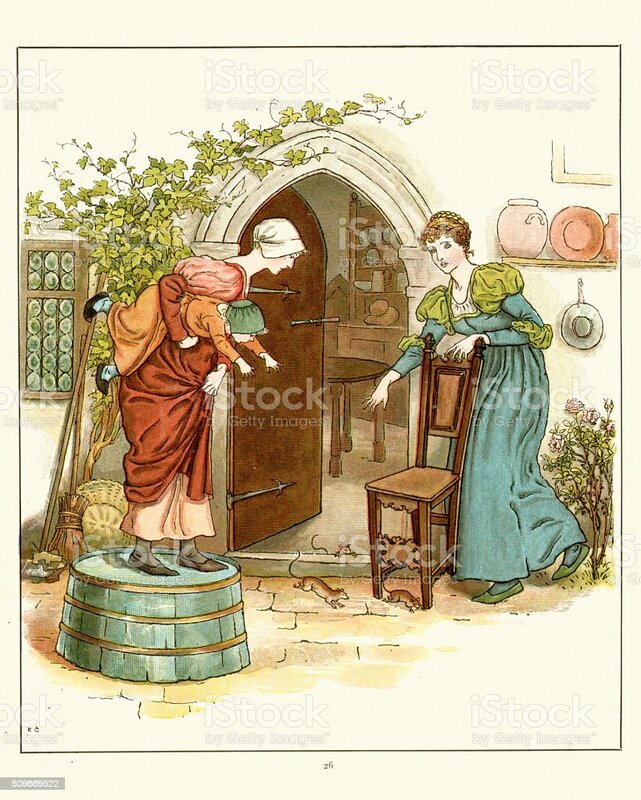
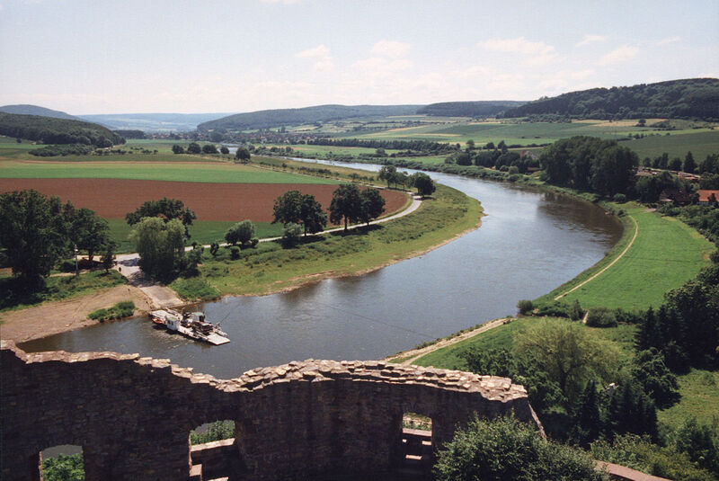
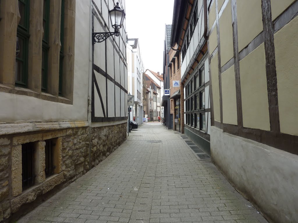
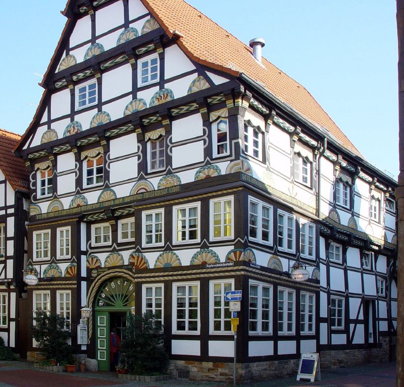
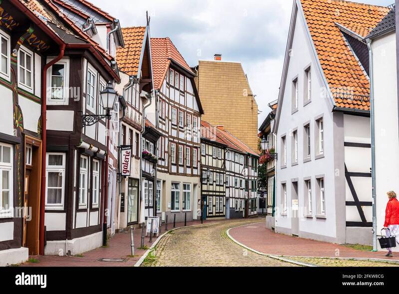
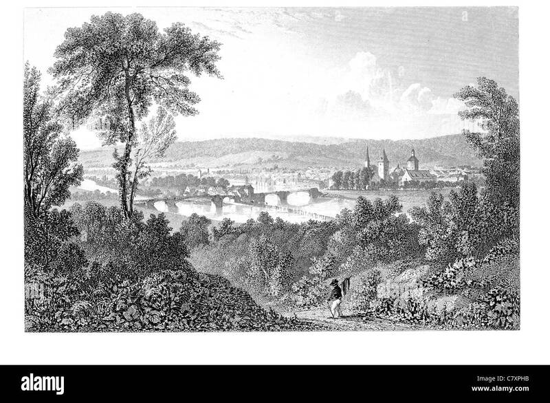
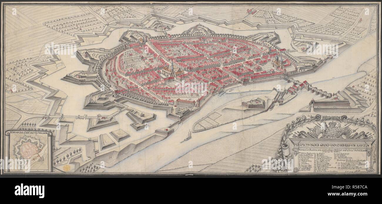
Like with the M.R. James project, I had to research the contextual time period. I got quite engrossed in Medieval German culture, and accidentally spent four hours in Starbucks reading about 1200s Saxon fashion. I gathered reference images for Medieval German clothing and art, alongside images of Hameln itself and representations of the Piper.
TESTING OUT STYLES
I quickly became fascinated with the Pied Piper and the mysterious legend behind it. I knew I didn't want to mutilate this old and beautiful folk tale too much with childish picture book visuals - the illustrations had to meet the brief and appeal to children, but I wanted to strike a balance and also pay homage to the story's roots. Below you can see my trials and errors as I tried to work this out.
I tested out quite a few styles and ideas - all abstracted, but in different ways. Browning's description of the Piper has always struck a very vivid image in my mind, so at least I had an immediate character design to work with. There were a number of different ways I could go with it, and it was hard to decide. Should the Piper be aloof and lofty? Mischievous? Mysterious with an air of danger? In all honesty, had I had been in a better frame of mind, there's so much more I'd want to do with this concept.
I tested out quite a few styles and ideas - all abstracted, but in different ways. Browning's description of the Piper has always struck a very vivid image in my mind, so at least I had an immediate character design to work with. There were a number of different ways I could go with it, and it was hard to decide. Should the Piper be aloof and lofty? Mischievous? Mysterious with an air of danger? In all honesty, had I had been in a better frame of mind, there's so much more I'd want to do with this concept.
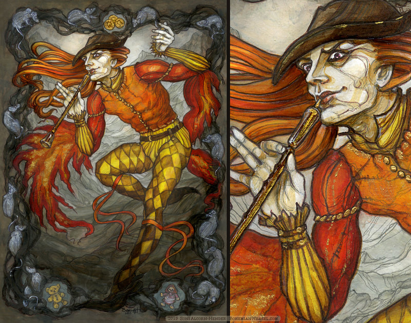
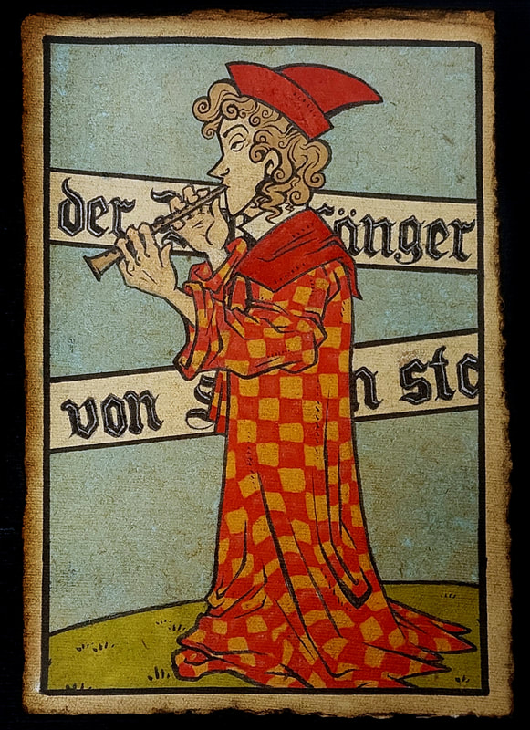
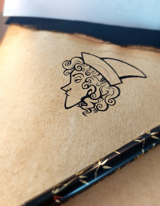
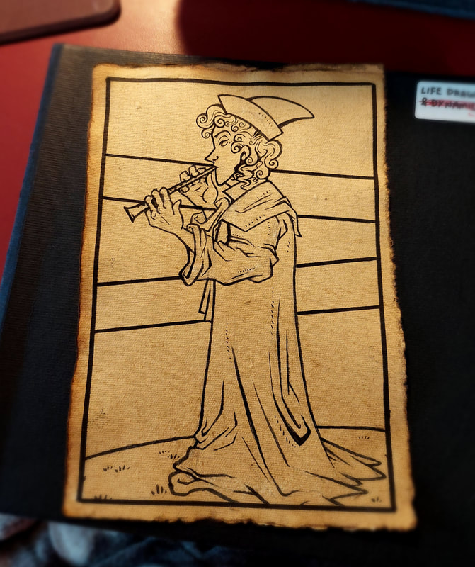
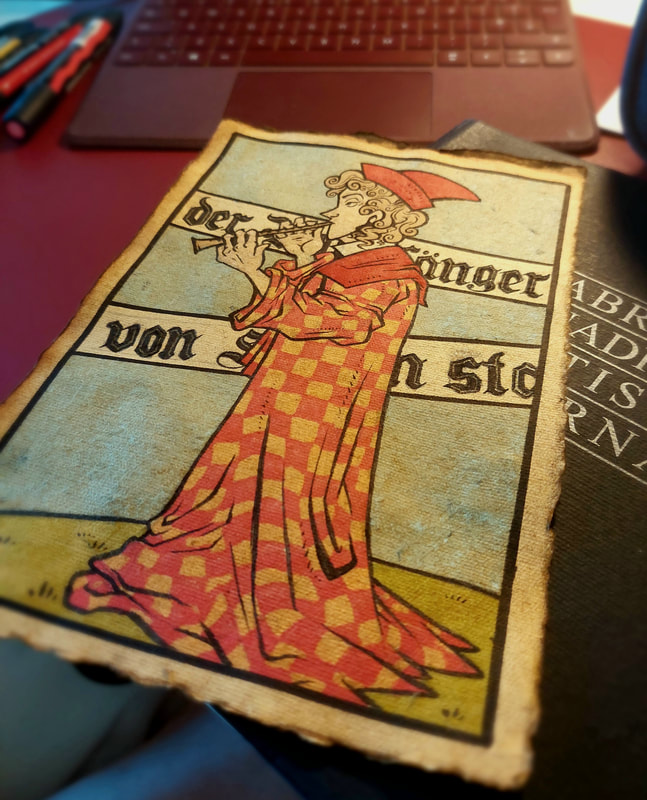
Above is my Medieval take on the Piper inspired by German parchments from the Middle Ages. I really enjoyed doing this, and perhaps should have tried a few mock-up pages in this style, but on the whole I decided it wasn't the vibe I was going for.
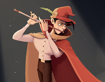
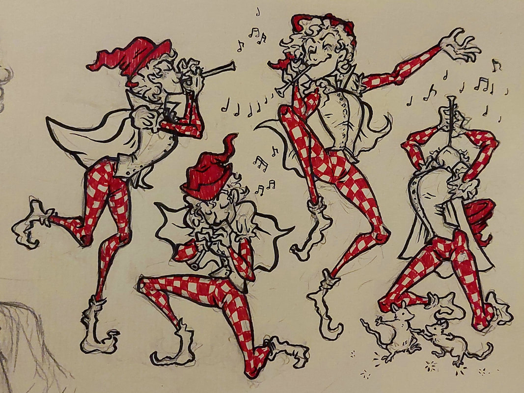
Below are a few different cartoony pipers. Style and proportion were the main things that varied. I decided that, given the task was a picture book for "early readers", I should keep the style simplistic and appealing (so, unfortunately... a certain level of cutesy).
Below are a few different cartoony pipers. Style and proportion were the main things that varied. I decided that, given the task was a picture book for "early readers", I should keep the style simplistic and appealing (so, unfortunately... a certain level of cutesy).
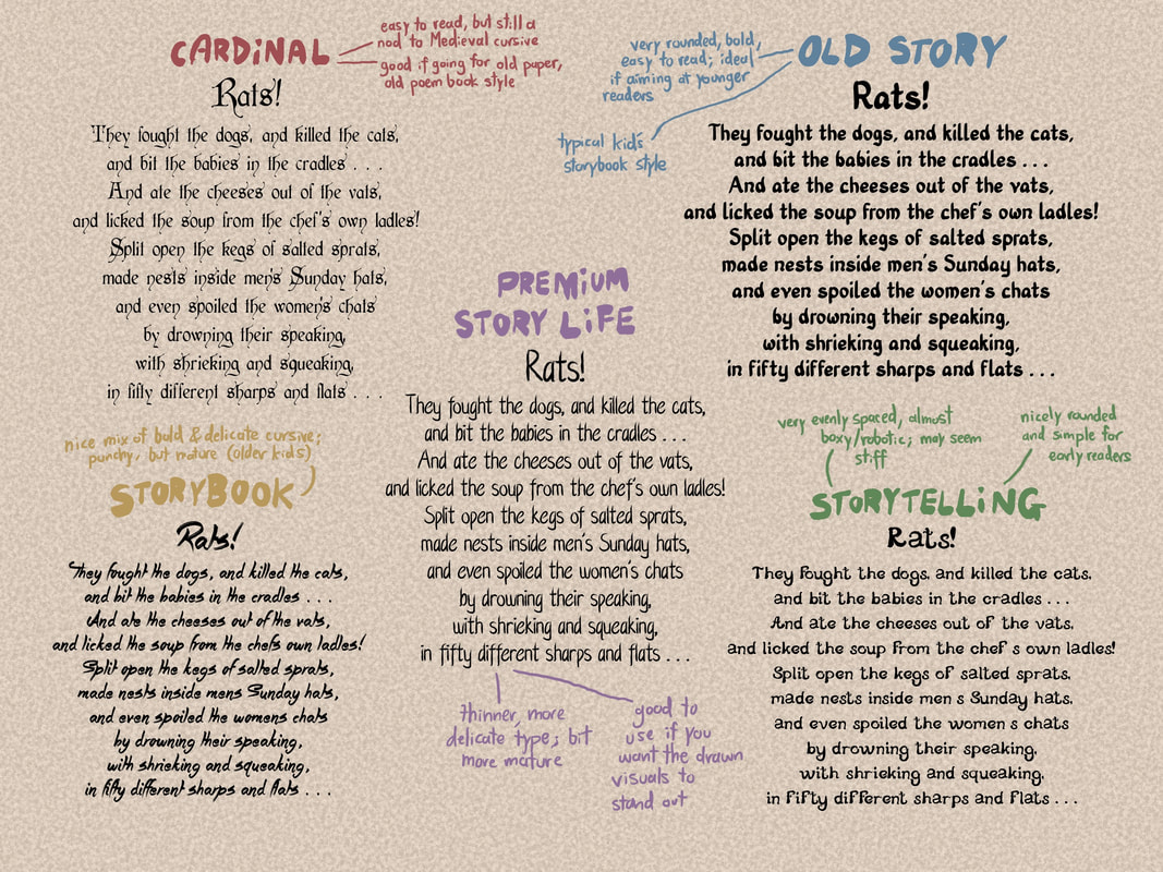
It was also important at this point to brainstorm typefaces, as you can see below.
THUMBNAILING
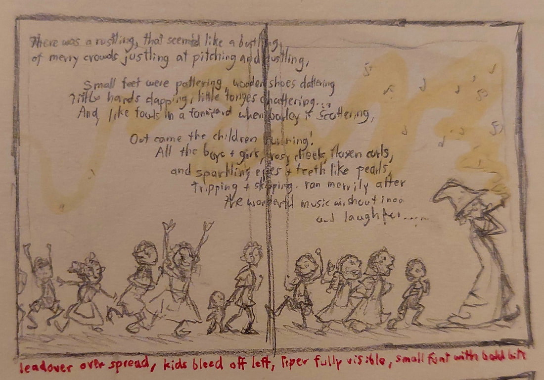
There were a few scenes that stood out to me with good potential for page illustrations. The thumbnail stage was where I tested these ideas out, played with the flow and focal points, and narrowed it down until I had a solid plan. I took particular inspiration from an old green English poem book my mum used to read me when I was wee - I can't remember the name of it for the life of me, but it had the most interesting artwork and layouts.
I chose the rat introduction verse for the single page and the Piper leading the children for the double page spread, but you can see some other thumbnails below too.
I chose the rat introduction verse for the single page and the Piper leading the children for the double page spread, but you can see some other thumbnails below too.
THE WORK IN PROGRESS
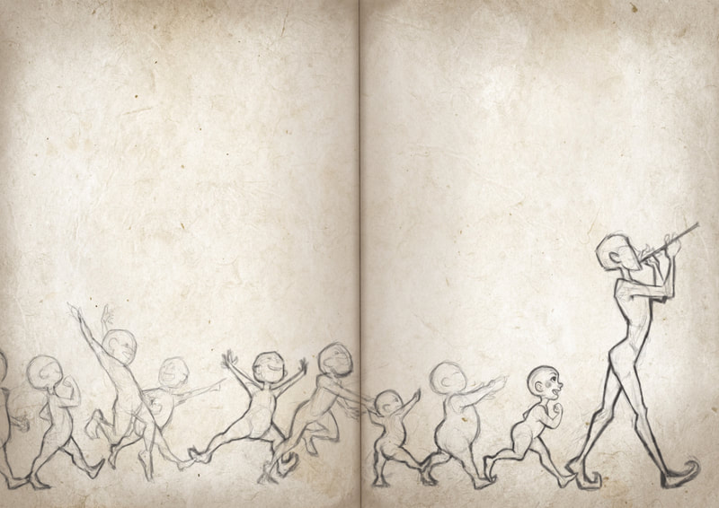
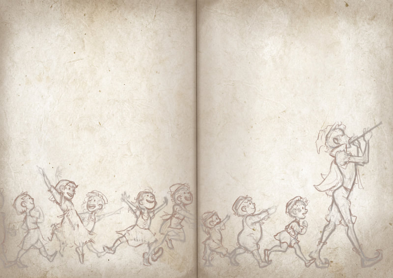
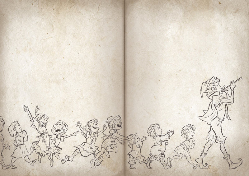
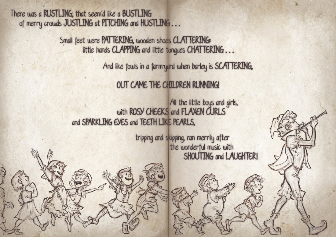
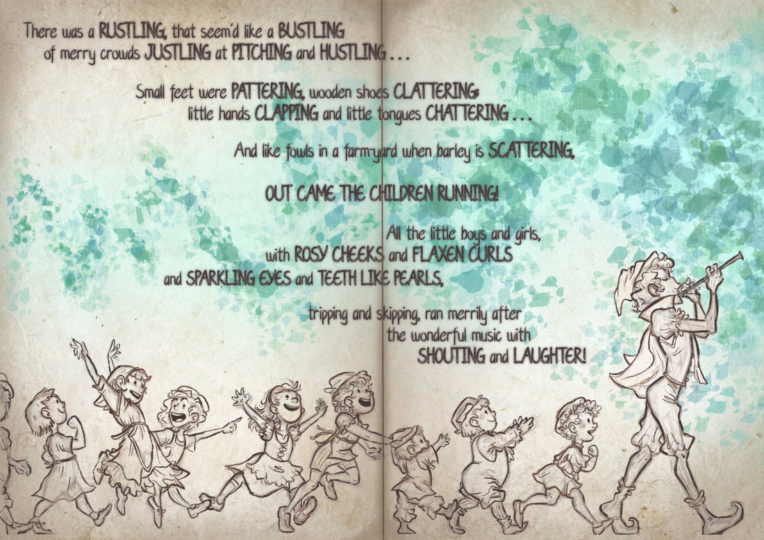
For the actual illustrations, I began by mocking up my pages and texturing them on Procreate (parchment-like, as a nod to the Medieval legend). I then added the text, edited it with a few overlays, and laid it out. I'm not sure why I ever thought text crossing the page turn was a good idea, to be honest - after some feedback from tutors I fixed this for the final.
I struggled to know which brushes to use for the linework and colours that would fit with the overall feel of the piece. I am still very inexperienced in digital illustration - I'm still not entirely sure of my choices here, but I was happy enough with it to move ahead. I do feel like I am learning and improving with digital art, even if it's little by little.
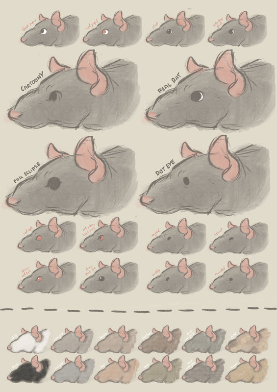
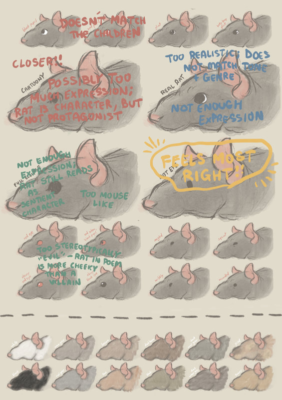
There was a slight mid-process crisis about the rats looking too realistic to match the Piper and children, so I had to re-evaluate their design.
There was a slight mid-process crisis about the rats looking too realistic to match the Piper and children, so I had to re-evaluate their design.
THE FINAL PIECES
Site powered by Weebly. Managed by 34SP.com

