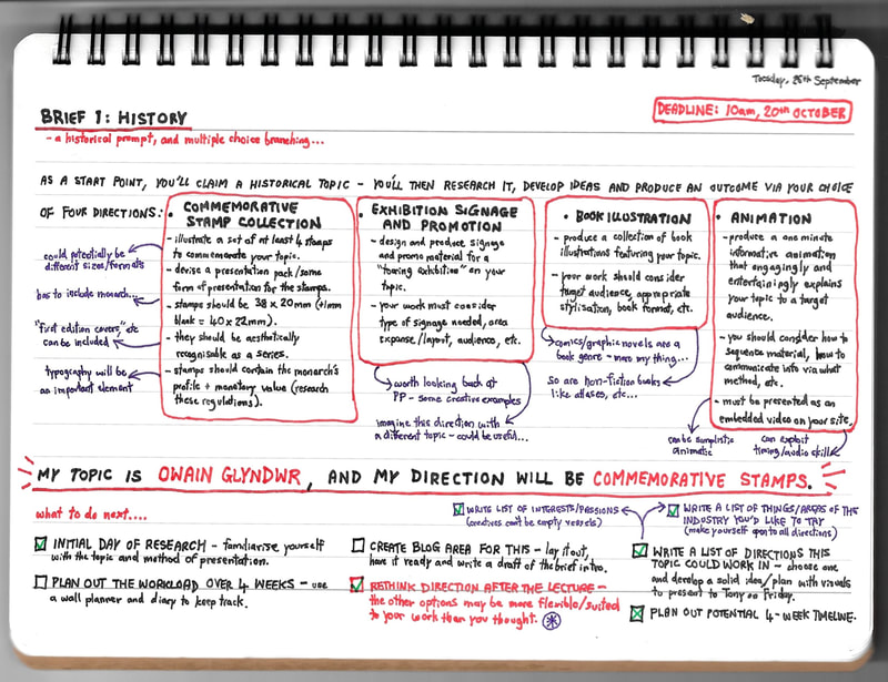
For this project we were each given a historical topic, to take forward in our choice of four directions - commemorative stamps, exhibition signage, book illustration or animation.
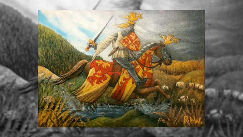
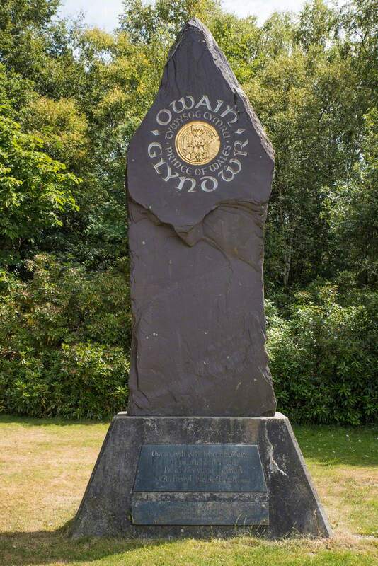
The topic given to me was Owain Glyndŵr - Welsh national hero, leader of the legendary Welsh revolt, and the last native Prince of Wales. Given my aspirations, I thought it fitting to take this a book illustration project. This involved producing a collection of book illustrations, and showing a consideration for target audience, appropriate formatting, stylisation, etc.
The topic given to me was Owain Glyndŵr - Welsh national hero, leader of the legendary Welsh revolt, and the last native Prince of Wales. Given my aspirations, I thought it fitting to take this a book illustration project. This involved producing a collection of book illustrations, and showing a consideration for target audience, appropriate formatting, stylisation, etc.
Owain Glyndwr: The Last Prince of Wales...
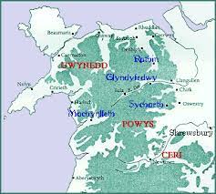
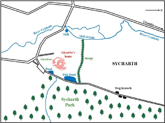
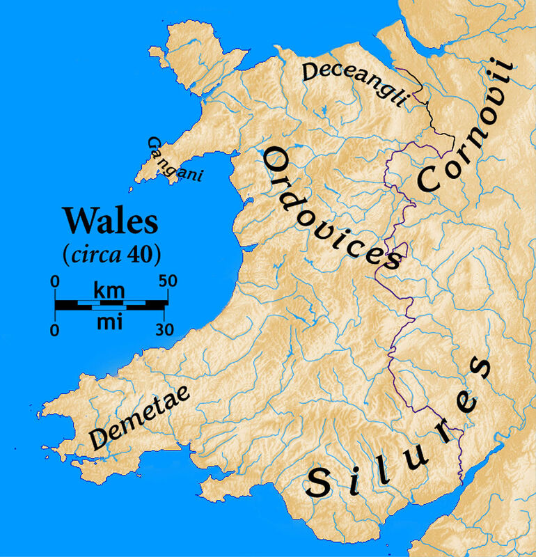
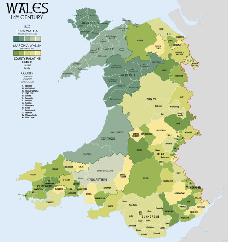
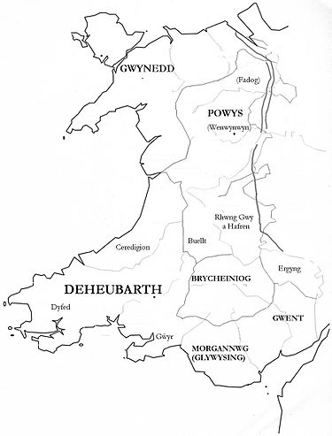
Glyndwr was born in 1354, in the NE Welsh Marches of Medieval Wales. He was descended from several dynasties of Welsh nobility; a bloodline that birthed the Tywysogaeth of Powys, the great princes of the Welsh Kingdoms. This was a time of relative peace between Wales and England. As Anglo-Welsh nobles living on the national border, Glyndwr's family was able to work both with and for the English Marcher Lords, retaining their proud Welsh status. However, this peace was short-lived.
In 1399 - following a dispute with English rival Reginald Grey, which was unfairly mediated by King Henry IV of England - Glyndwr lost his land and lordship. He responded with an uprising against the King and English rule. He very quickly amassed a large and loyal following, with many Welshmen seeing him as their long-awaited leader, and was proclaimed Prince of Wales by his people in 1400. Led by their new prince and saviour, the revolution laid siege to English strongholds throughout Wales in a fifteen-year bloodshed to reclaim Wales as an independent nation.
After spending his final years in hiding, Owain Glyndwr was reported dead by his followers in 1415. The English had prevailed.
The aftermath of the revolt saw Wales left in ruins, and brought its fragile coexistence with England to a bloody end. It was said of Glyndwr that he'd "brought all things to waste". In a way, he had; the destruction of land, loss of life and economic/political scars left in his wake took Wales well over a century to recover from. But every endeavour comes with risk, whether it fails or triumphs, and we have to acknowledge intention as well as outcome.
Wales reclaimed its native voice in the 19th Century, clearing Glyndwr's name and hailing him a national hero. His legacy lives on in the celebrations of Owain Glyndwr Day, and in Welsh legend itself - it is said that if Wales is ever threatened again, he will return to fight for its freedom.
Wales reclaimed its native voice in the 19th Century, clearing Glyndwr's name and hailing him a national hero. His legacy lives on in the celebrations of Owain Glyndwr Day, and in Welsh legend itself - it is said that if Wales is ever threatened again, he will return to fight for its freedom.
Research
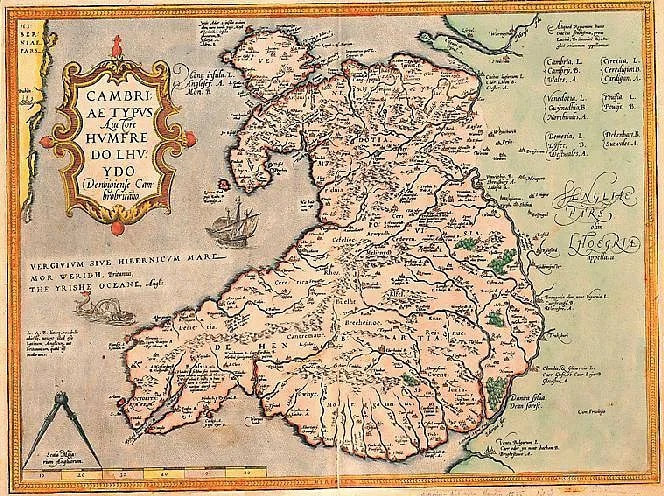
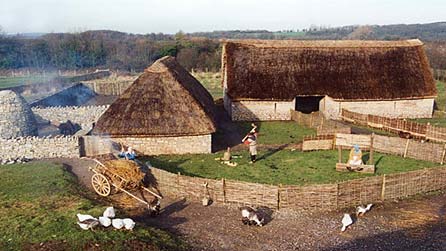
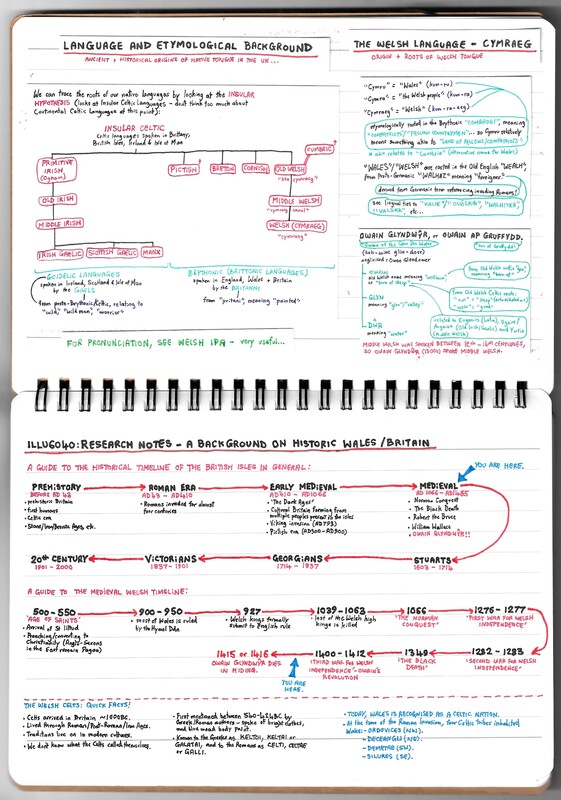
Much of my initial research involved setting the scene, so to speak. I wanted to get a good feel for the time period - for Welsh culture, its history, and what paved the way to the revolt. I felt context would sharpen my understanding of the topic, and therefore deepen my depiction of it; as someone proud of my own heritage, I very much wanted to avoid a shallow, superficial re-telling of such a proud, national legend.
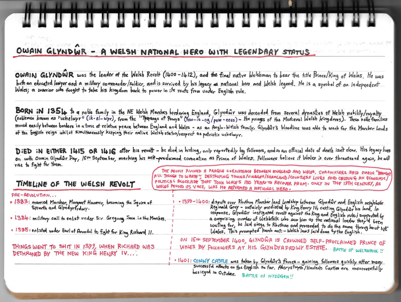
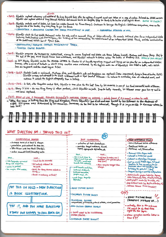
Above is a slideshow of my notes at research stage. As well as learning about Glyndwr and the revolt, I was also getting to grips with the time period and what the world would have been like then. I grew up in a community that respected its Scottish Gaelic roots; this sparked my fascination with old languages, and a lot of my personal work is backed by a passion for Celtic/Gaelic culture. I didn't know much about Welsh culture, but I knew I wanted to tackle this in a way that respected it. So doing this groundwork was a vital part of the process.
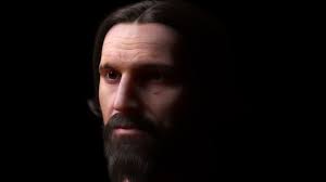
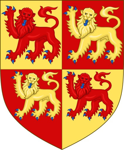
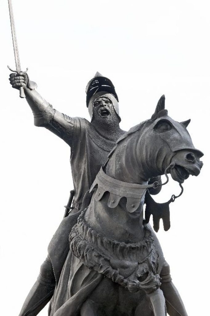
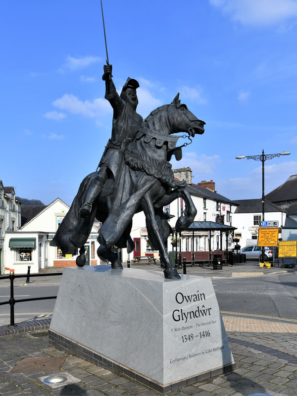
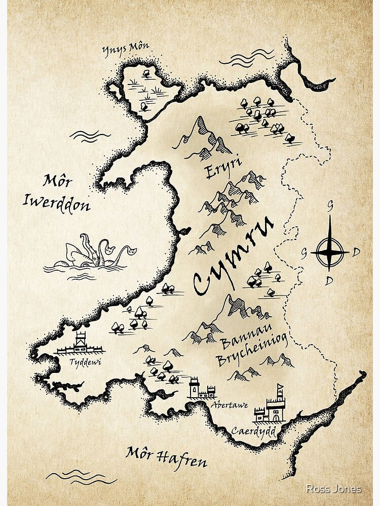
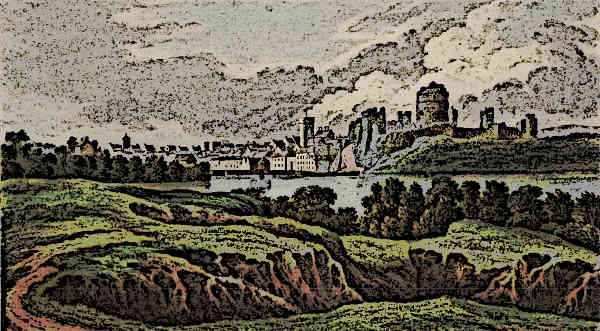
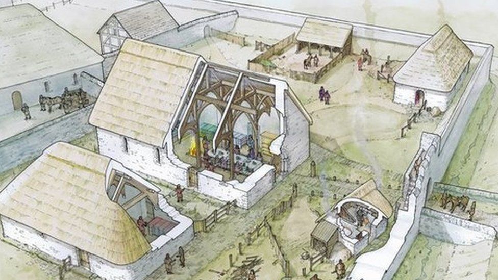
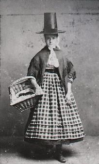
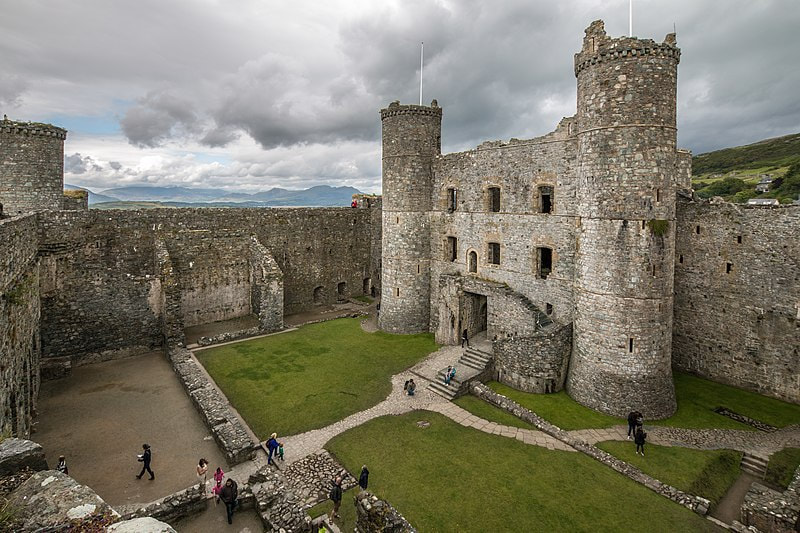
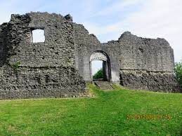
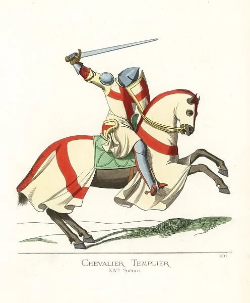
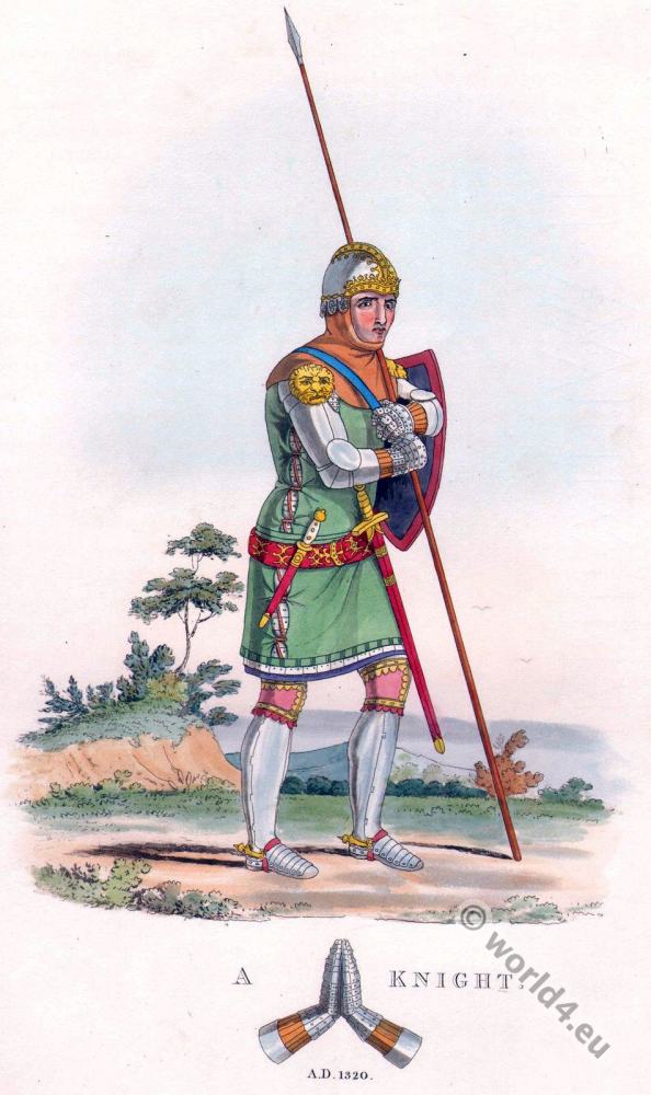
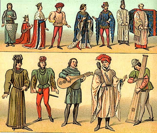
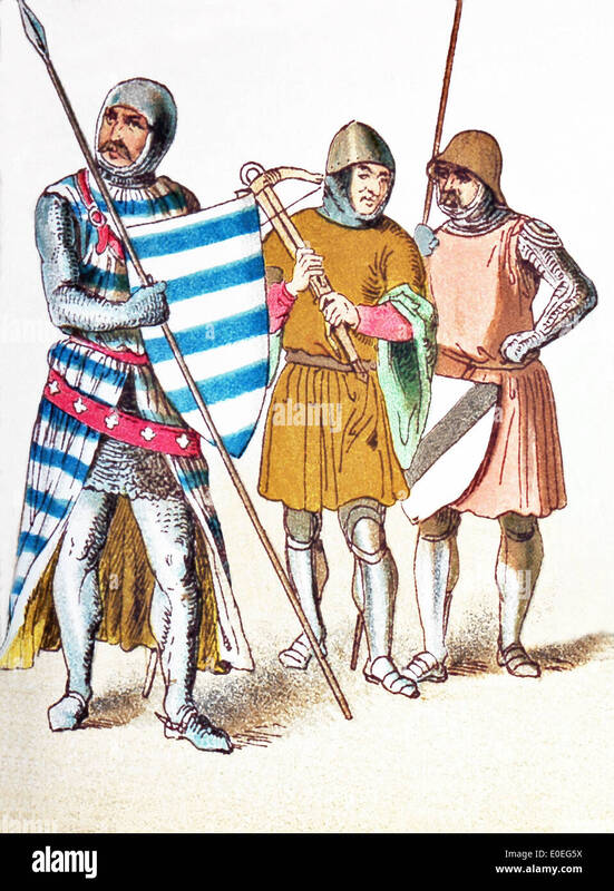
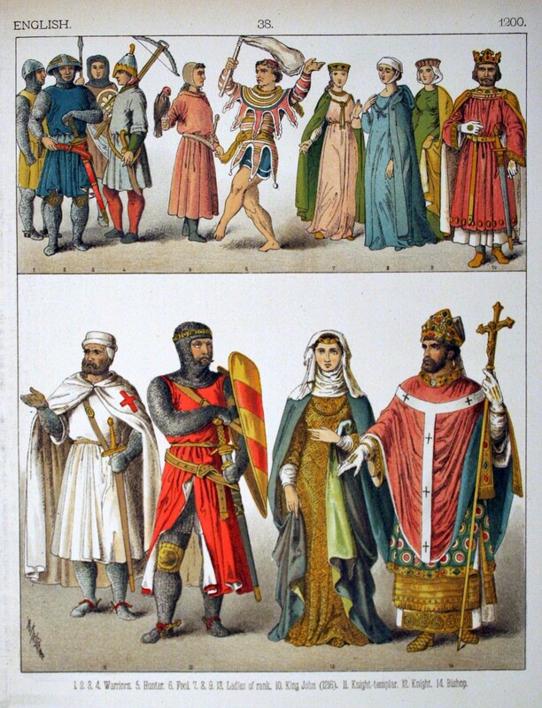
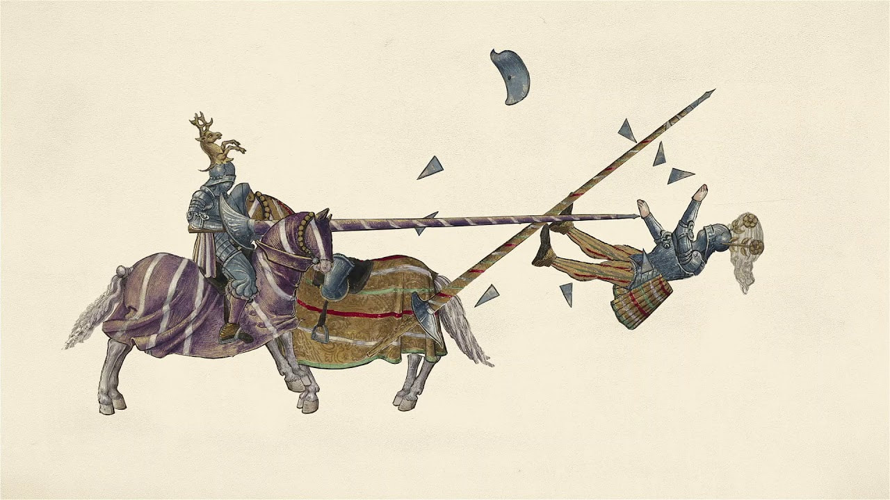
I collected banks of reference images as I researched, for clarity and for inspiration, using broad categories and more specific subcategories. You can see these galleries below.
I collected banks of reference images as I researched, for clarity and for inspiration, using broad categories and more specific subcategories. You can see these galleries below.
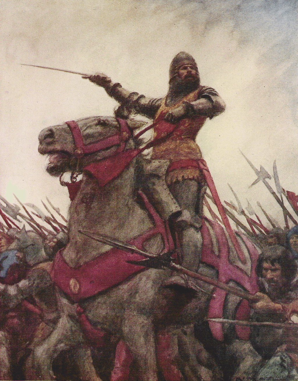
OWAIN GLYNDWR
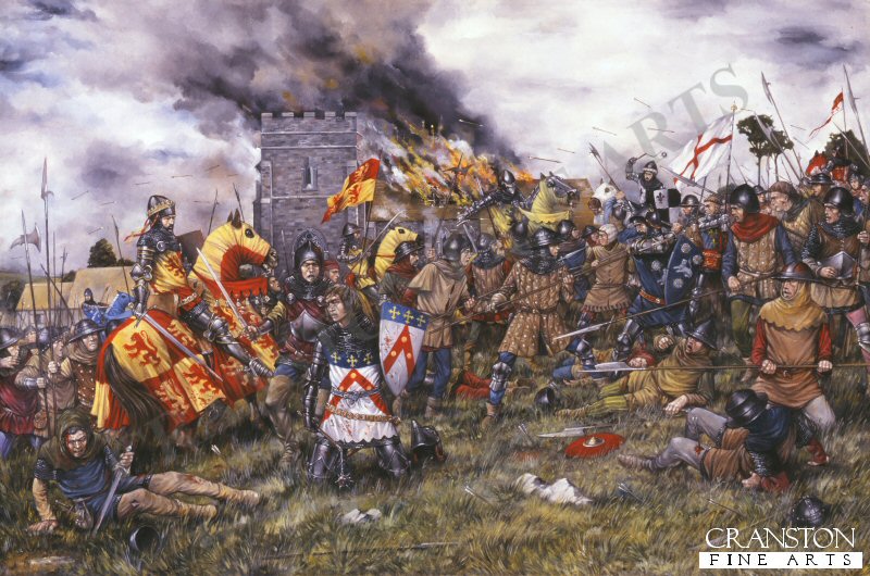
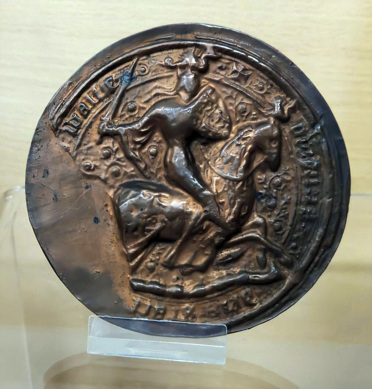
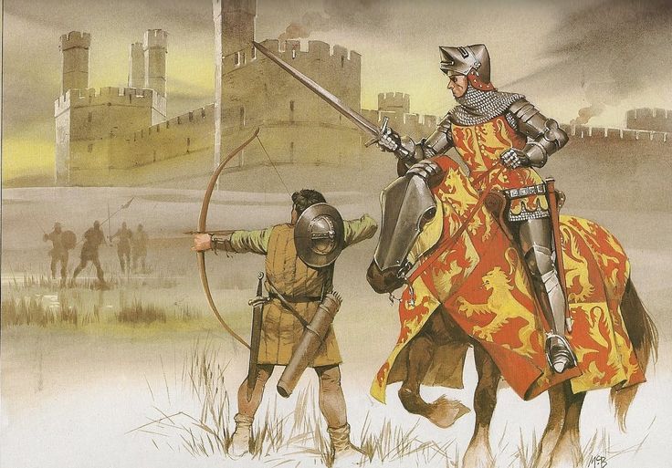
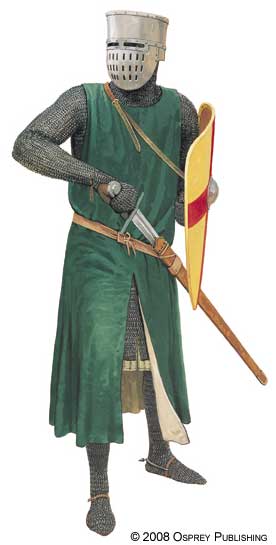
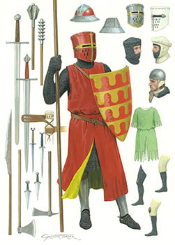
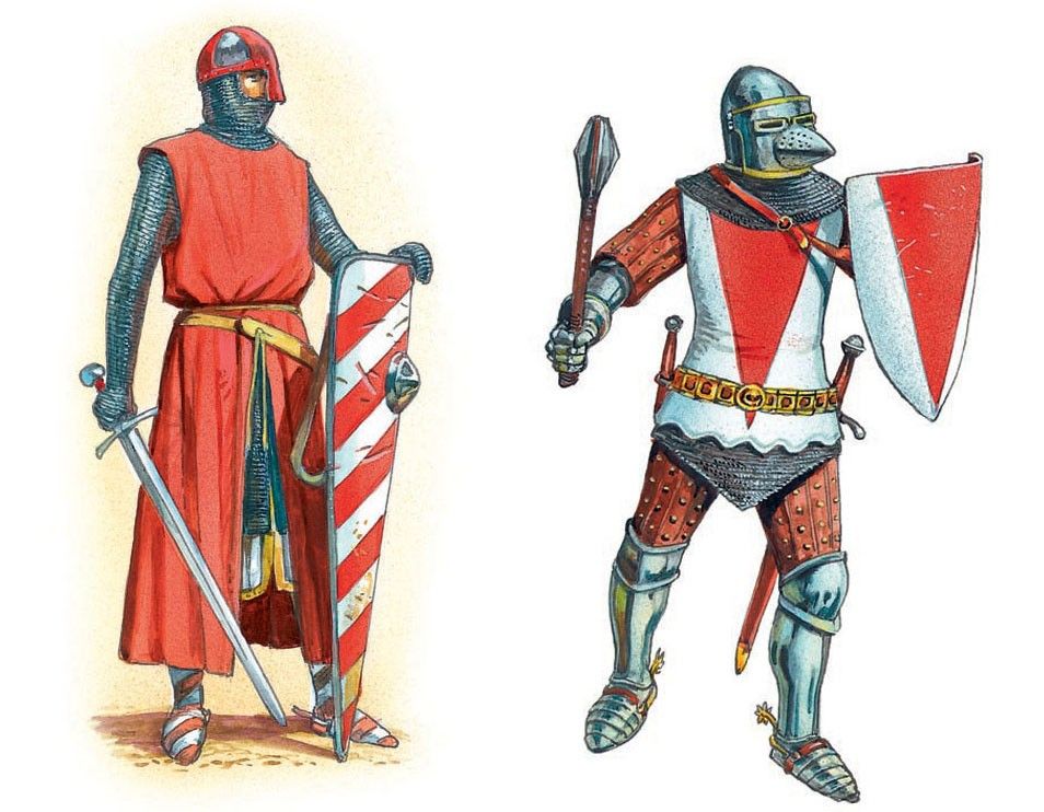
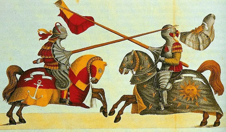
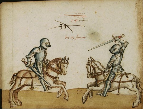
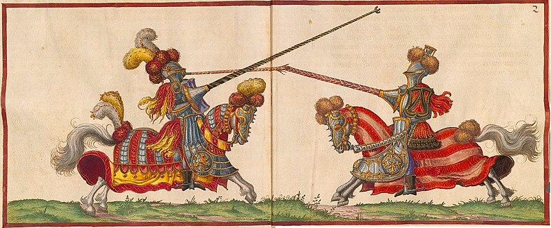
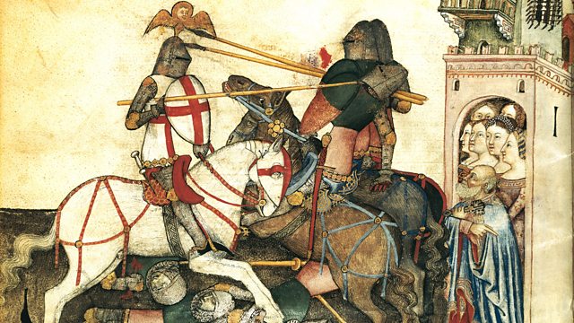
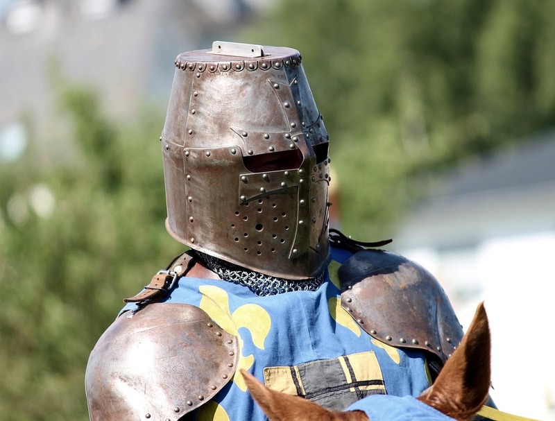
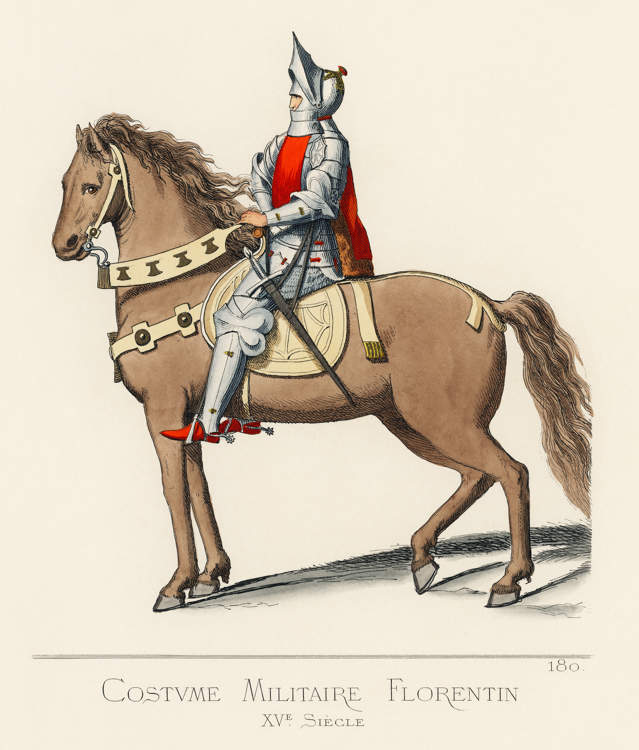
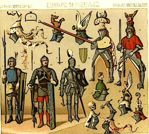
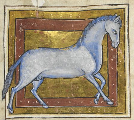
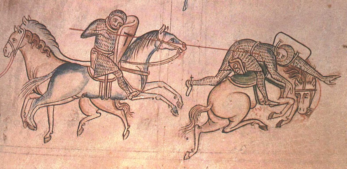
MEDIEVAL WELSH KNIGHTS & HORSES
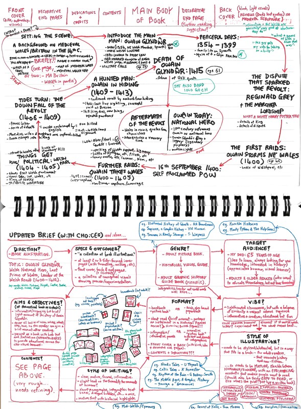
Plenty of research and reference helped me understand the topic. But, to move onto development, I had to think about where I wanted to take this and how. I'd initially thought commemorative stamps was the most fitting direction; this was until I was reminded in a lecture that "book illustration" didn't have to mean a standard one-per-page-every-now-and-then prose; it's a much broader playing field than that. So I had a think about what options I had, and how to best present this.
I did a lot of reading and book gathering at this stage to help me visualise what genres were out there. In particular, I thought about the likes of non-fiction graphic novels, poetry books, and illustrated history books, and I looked at reference books such as 'Celtic Tales - K Forrester', 'Russian Folk Tales - Alexander Afanasyev', and 'Medicine: A Magnificently Illustrated History - Hudson & Taylor', all of which I had at hand on my bookshelf and felt might be of inspiration in terms of layout/genre/style/etc.
The idea I settled on ended up being inspired by my dad, more than anything. I've always known my dad to like learning; he'd always ask me what I'd learned when I got home from school as a kid, just like he asked me who "The Welsh Dude" was in this uni project. He likes to learn and actively seeks out new knowledge, which inspires me to do the same. He also loves a good bit of fun and is fond of art and cartoons, and some statements he's made stick about in my head such as "I wish I'd had Horrible Histories when I was wee, I'd have learned so much more!", and how his history classes at school were not the most inspiring. That made me want create something I felt he'd enjoy - a sort of 'graphic history' book for adults who wanted to learn for leisure, something that was just as visually appealing as books made for younger readers.
I don't believe there should be a set way to learn, or set things we enjoy at set ages. It personally irks me when people just assume anything "cartoony" is for children.
Visual Development
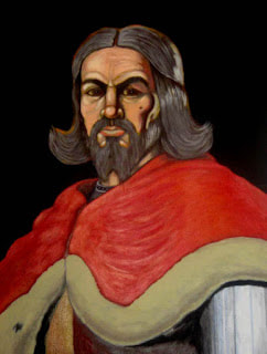
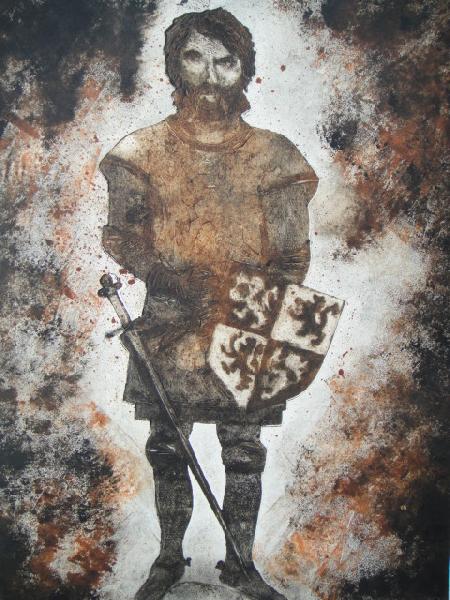
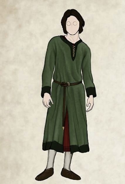
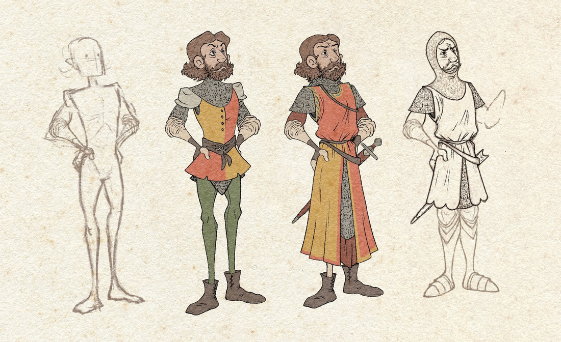
With Glyndwr as the protagonist, visualising a design for him was essential. A lot of artists' depictions of him are extremely variable in appearance, so it was difficult to pinpoint a specific look for him. I did know that whilst I wasn't going for realism, the illustration style also had to veer away from childish and light-hearted. This was a time of uprising and bloodshed in Wales' medieval history, and I had to find a look with a suitable amount of grit - one that fit the target audience, and respected the historical figures it was borrowing.
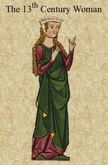
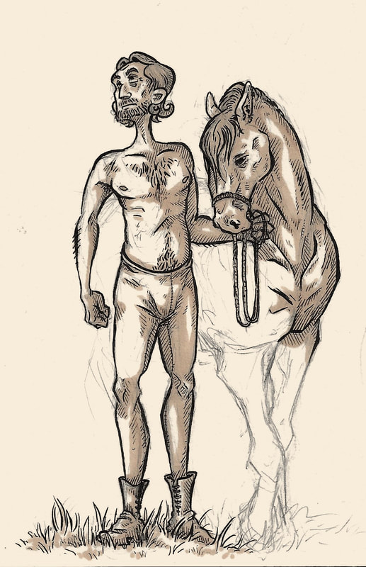
I found a lot of my troubles in initial sketches fell in the face and eyes. I tend to be unconfident with my linework on facial features, and also have a habit of making eyes quite expressive. At this point, going off a vague idea of what I wanted my version of Glyndwr to look like, I looked towards art from medieval illuminated scriptures. In particular I noted how pronounced both curves and angles seemed to be wherever present, how flat but vivid colours were, and how much the artist just didn't sugarcoat anything or anyone's appearance whatsoever.
From a more modern perspective I also looked at the illustration work of Tomm Moore, an Irish cartoonist/animator whose work for Cartoon Saloon's Irish Trilogy I am personally in love with. His character designs always have a good balance of cartoon visuals and a darker plot/backstory, which is exactly what I felt I wanted to go for here - I had a closer look at the Irish Trilogy art books to see if I could track how he was achieving that. This is where I figured out I'd have to be a lot bolder with my angles and line weight on faces to get the look I was aiming for, and I'd have to make the pupils a lot smaller and more central for slightly "wilder" looking eyes.
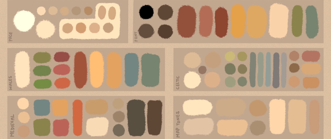
You can see some of my development sketches above and below, including a colour palette test.
Book Layout Development
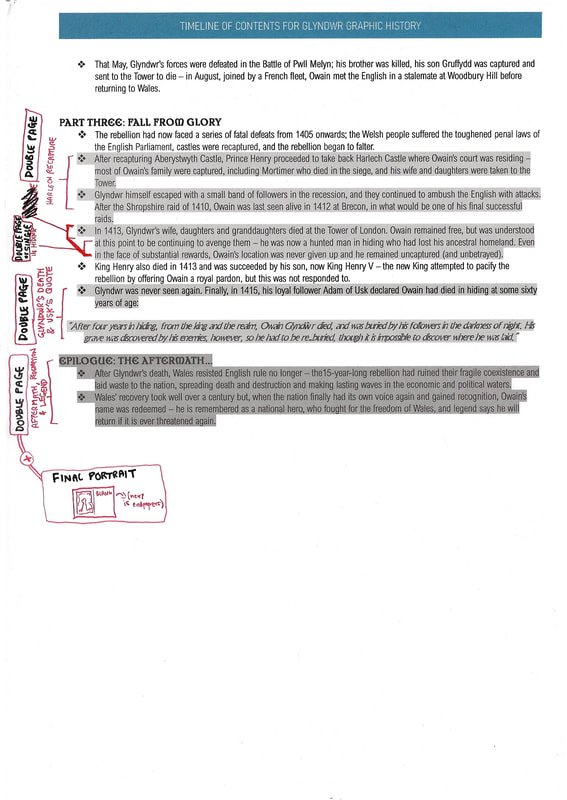
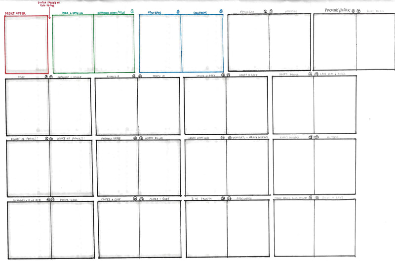
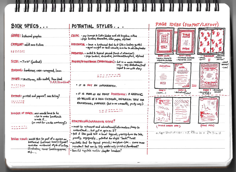
By now I had a very particular vision for this in my mind's eye, and I felt it wouldn't come out quite right if I didn't explore that in full. I therefore spent a fair bit of time working on layout plans for this book concept; figuring out what the contents would be, what order they'd be in, what narrative feel they'd have and so on. I developed a pretty solid idea of how I'd want all this to be by mocking up contents, page maps and book specifications, as if I were producing the whole thing - the idea of this was to make the pages I took forward as finals seem like part of a fully-realised thing, not just stray concepts looking like they didn't fit into anything bigger.
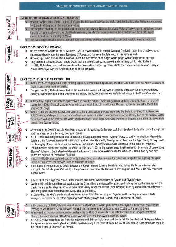
I began by laying out Glyndwr's tale in hypothetical chapters, using key moments to create a narrative flow. I wanted this retelling to be creative as well as respectful - something that educated people about the legend in an engaging, visually-appealing way. I then assigned the narrative points on a mock page map; arranged in terms of what scenes would work best as double-page spreads, what moments would need a suspenseful build-up, etc.
The last image in the slide below are the rough conceptual specifications I settled on for this imaginary book. A portrait 7" x 10" size seemed to suit the content, layout and estimated page amount. I had also used this as an opportunity to look briefly into printing options (again, hypothetically) - it might not have mattered to picture a silk page finish or a case-wrapped linen cover, but I think considering that actually gave me a better visual on how I wanted the innards of the book to look.
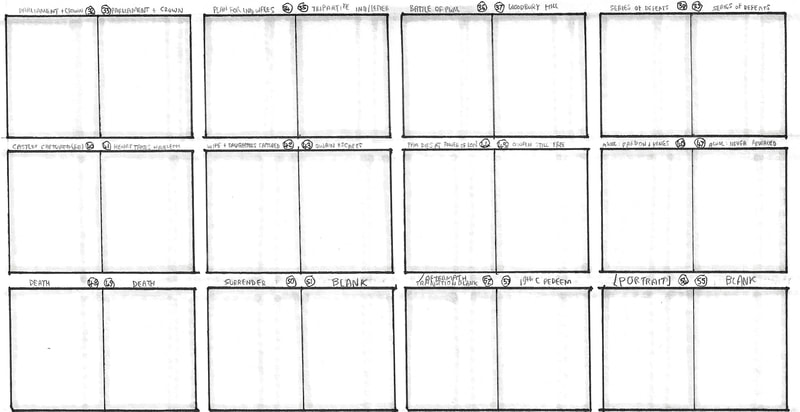
Below are my revised plans after the initial ideas above. I've tweaked and modified to make the layout more coherent, efficient and visually effective; you can see my annotated notes on scenes I was considering for finals, and potential page layouts I felt may suit them.
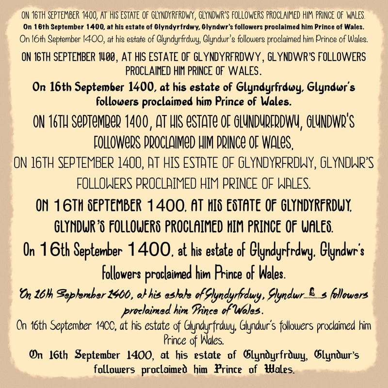
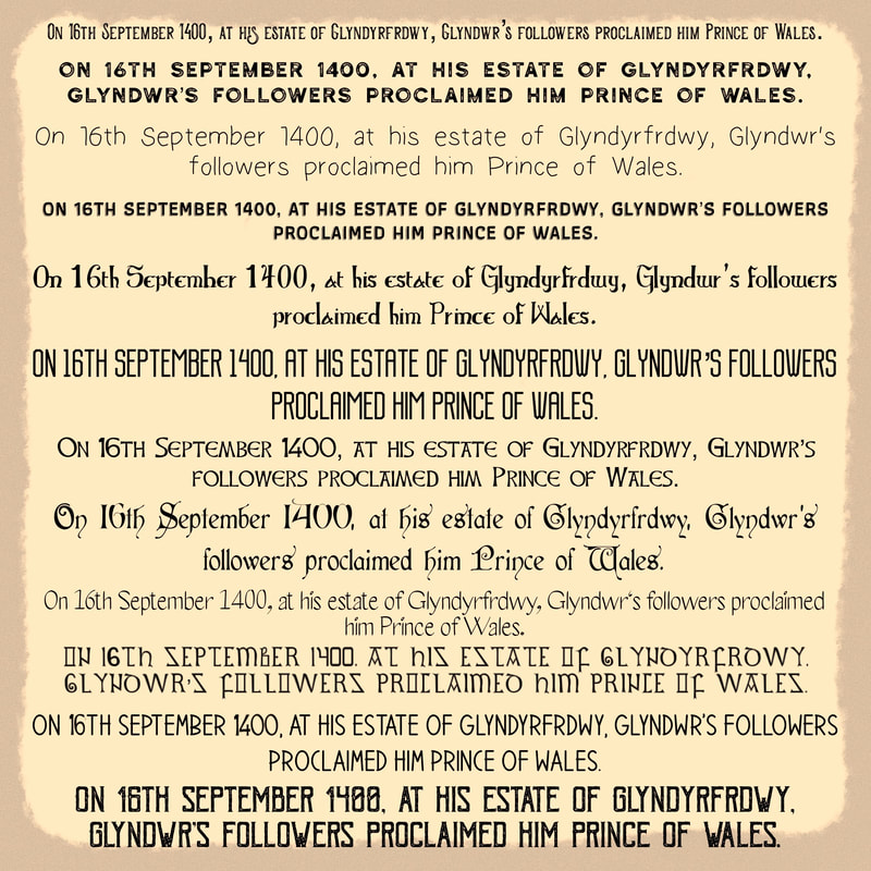
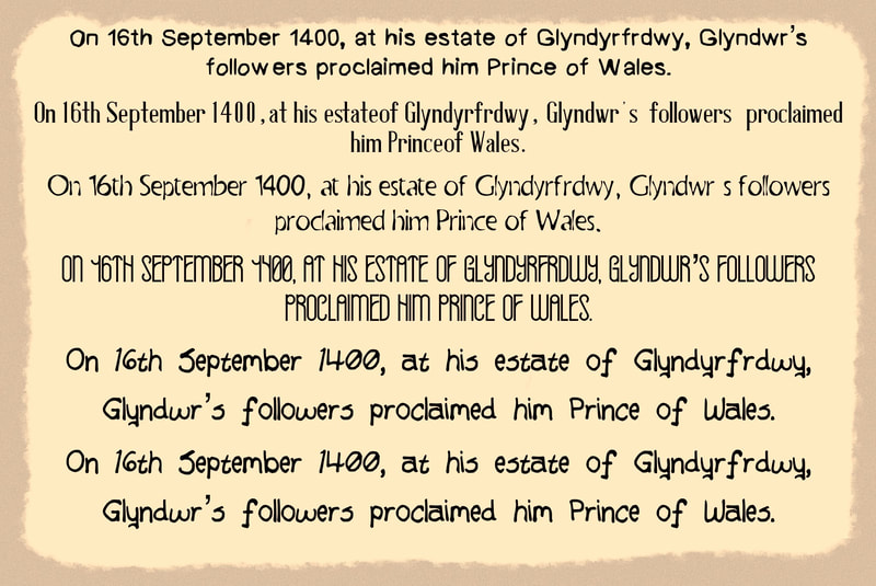
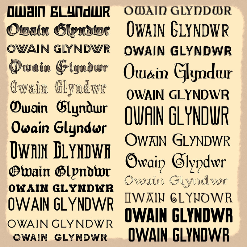
I did some digging for historical typefaces relative to the project, and tested these out on the pages below. I was looking for typefaces with the right feel for titular, sub-titular and narrative text - typefaces that preferably didn't make the page look like a school PowerPoint presentation, but also weren't too decorative to be legible. I settled on the following typefaces:
- Old Excalibur: for titles - broad and eye-catching, good balance of modern book title and medieval scripture looks.
- Historycal Inline: for subtitles - subtler and smaller, but still broad and of importance; highlights mid-tier text.
- Old Englished Boots: for narrative - decorative but legible, suitable medieval lower-case for story body.
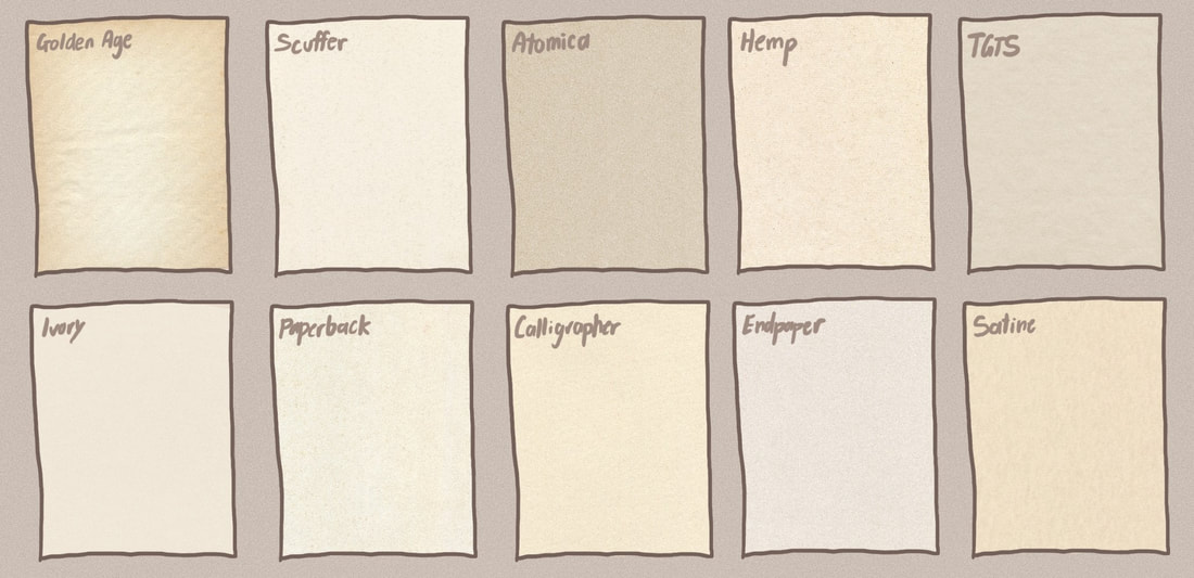
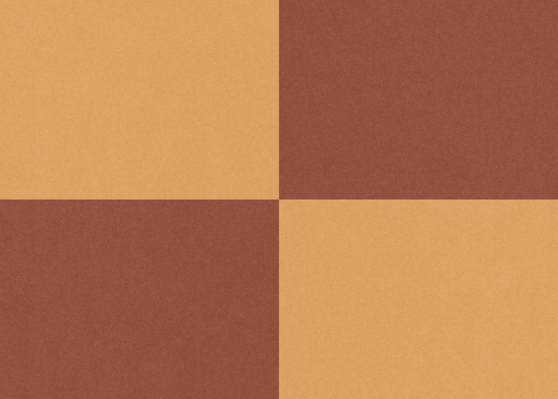
In terms of paper texture, I was initially using a more aged, antique look for the book pages. But as I developed my visuals, I realised that I could achieve a medieval feel without the paper looking like it was from the 1400s - it actually worked better to have a slightly off-white, mid-textured page to give the feel of an old tale bound in a modern book. The texture I used in the end can be seen trialled below under "ivory".
I've also included an image of some books I kept handy for visual reference/inspiration - two of them I've mentioned earlier, the other being 'Godfather Death - Nicholls & Sarda'. At this point, I was keeping them on hand as examples of old tales bound in modern books which I felt worked well. I was particularly fond of the borderwork and nods to medieval scripture in these books, which I tried to take inspiration from.
I've also included an image of some books I kept handy for visual reference/inspiration - two of them I've mentioned earlier, the other being 'Godfather Death - Nicholls & Sarda'. At this point, I was keeping them on hand as examples of old tales bound in modern books which I felt worked well. I was particularly fond of the borderwork and nods to medieval scripture in these books, which I tried to take inspiration from.
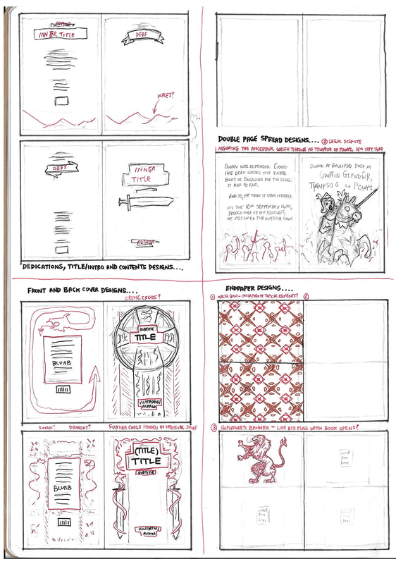
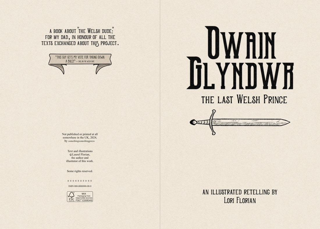
With everything above covered, and having chosen key pages/scenes I wanted to illustrate, I began to thumbnail layouts for them as shown below. I wanted to challenge myself to make a fitting back and front cover, and I wanted to illustrate at least one single page and one double page spread of narrative. In addition, I wanted to try designing decorated endpapers since I personally enjoy that extra little detail in a book, and I wanted to try designing an inner title page for the challenge of making this seem more "real".
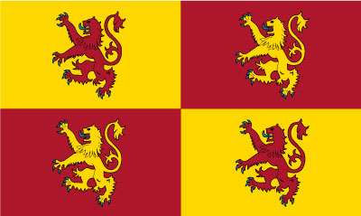
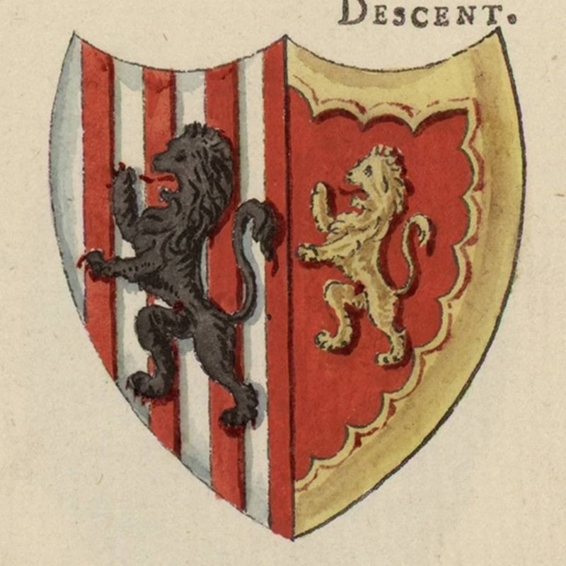
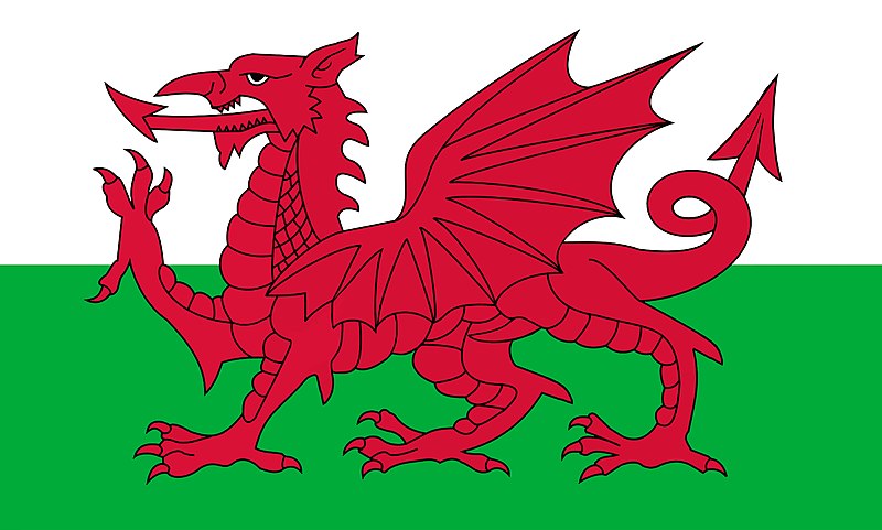
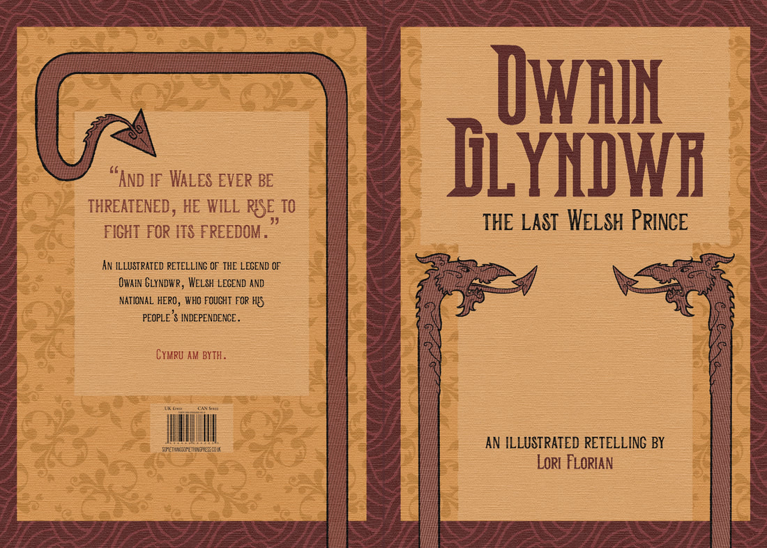
For the cover page, I tried to bear in mind what I'd researched on the printing websites and what detail was/wasn't possible on textured covers - I wanted it to have that modern yet historical feel, like linen-bound special editions of classics. For the endpaper designs I considered visuals such as Welsh quilt patterns, Glyndwr's banner, and a mashup of both. Swords and the Welsh dragon were also a recurring theme in conceptual visuals.
For the cover page, I tried to bear in mind what I'd researched on the printing websites and what detail was/wasn't possible on textured covers - I wanted it to have that modern yet historical feel, like linen-bound special editions of classics. For the endpaper designs I considered visuals such as Welsh quilt patterns, Glyndwr's banner, and a mashup of both. Swords and the Welsh dragon were also a recurring theme in conceptual visuals.
Working on the Finals
After laying out the page templates in accordance with the formatting decisions I'd made earlier, I applied texture (the paper I'd chosen for the inner pages, and a canvas weave texture for the cover) and set up gridlines and bleed layers to keep me right. I also kept a bank of "runner up" typefaces in case the ones I'd chosen turned out not to work as well as hoped.
Illustrating the two narrative spreads was the heart of the work. You can see some work-in-progress slideshows of both of these spreads below.
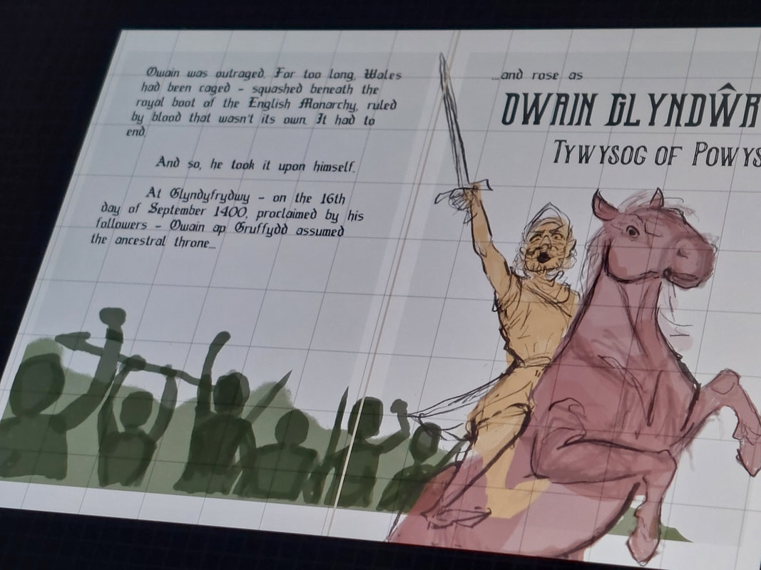
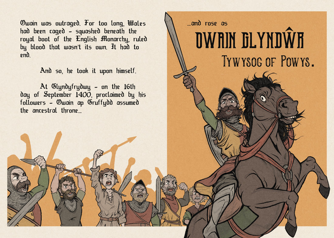
The first is a double-page spread detailing the initial uprising of Glyndwr after losing his ancestral land in the legal dispute with Lord Grey de Ruthyn. This happened on the 16th September 1400, a day now celebrated nationally in Wales as Owain Glyndwr Day - given this, and the fact it was the initiation of the rebellion itself, I thought it would only be fitting to illustrate it as a final for this project.
As seen in a previous thumbnail, I had a visual idea I was following; this meant it was best for me to implement the text first and then illustrate, and tweak layout/placement as I went. The slideshow shows the progress from blank page with margin markers all the way through adding text, blocking in key visuals, sketching, lining, adding colour, and adding backdrop. I was attempting to employ a line of sight method to subtly lead the reader's eye on a route through both text and illustration. After working through the text on the left-hand page, the slope of the crowd of followers should lead the reader to Glyndwr - the eye should then track up via his face and sword to his ancestral title, and down via the horse's hoof to where the reader would then turn the page. The yellow backing was an afterthought that seemed to aid this concept by having the slope lead into a general highlight of the right page, with the focal points encased within.
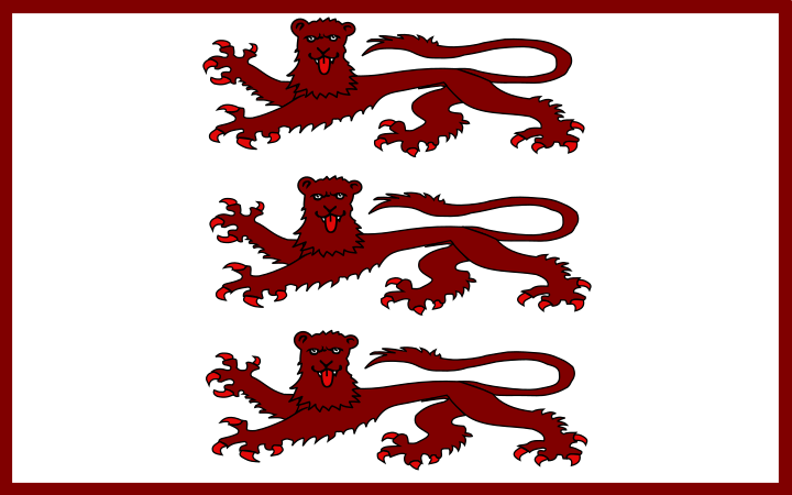
The red border was trialled as a nod to Glyndwr's banner, but it was ultimately too busy.
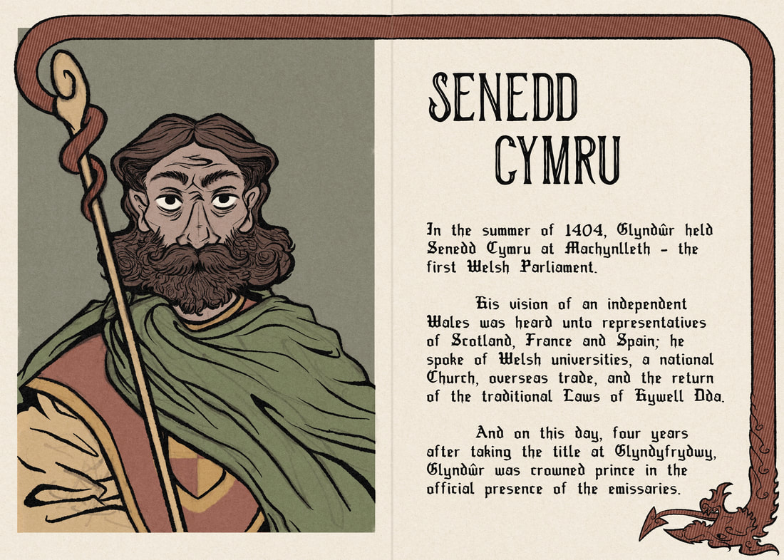
The second spread I'd imagined as a single page of text, potentially a chapter opening, with an adjacent full-page illustrated portrait. This would depict Owain at Machynlleth in 1404, when he formed and held the first Welsh Parliament and proposed the Tripartite Indenture. Glyndwr had trained in law before his uprising against the English in 1400, and he was fighting for Welsh freedom from the rule of English throne and law; since the other spread covers his role as rebellion leader, I wanted to focus here on his other role as political leader.
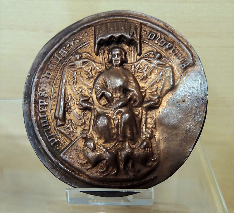
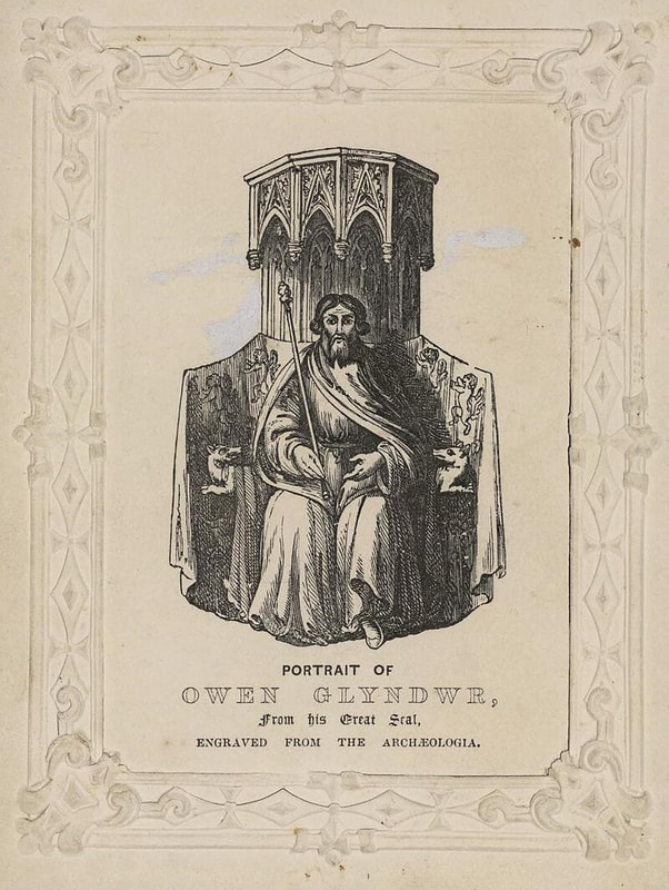
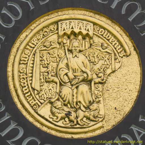
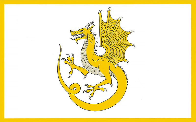
The portrait of Glyndwr was inspired by his likeness in his Great Seal, used to seal his Pennal Letter to the King of France. I kept very much to the idea of a stylised portrait of an existing historical image here, but with added colour and visual symbolism via the Welsh Dragon. The Dragon is a proud symbol of power and authority in Wales and amongst its historical royalty; I wanted to use this respectively to highlight Glyndwr's role as national hero and protector, since he was essentially the Dragon of the rebellion. I illustrated the staff as it appeared in the Great Seal portrait, but from its spire I curled the Dragon's tail into a border encircling the majority of the spread, leading ultimately to the page turn where its head comes to rest. With this visual, I was intending to bond Owain and the Dragon as one symbol - proud, fearsome protectors of Wales leading their nation into the future.
The portrait of Glyndwr was inspired by his likeness in his Great Seal, used to seal his Pennal Letter to the King of France. I kept very much to the idea of a stylised portrait of an existing historical image here, but with added colour and visual symbolism via the Welsh Dragon. The Dragon is a proud symbol of power and authority in Wales and amongst its historical royalty; I wanted to use this respectively to highlight Glyndwr's role as national hero and protector, since he was essentially the Dragon of the rebellion. I illustrated the staff as it appeared in the Great Seal portrait, but from its spire I curled the Dragon's tail into a border encircling the majority of the spread, leading ultimately to the page turn where its head comes to rest. With this visual, I was intending to bond Owain and the Dragon as one symbol - proud, fearsome protectors of Wales leading their nation into the future.
Final Outcomes
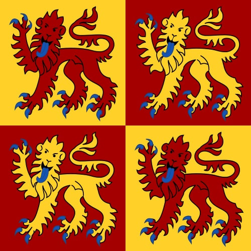
The final outcome can be seen in the above flipbook, and below in individual images. It includes a front and back cover, decorated end pages, an inner title page, and the two narrative spreads. I continued the dragon border idea on the cover, as I felt it worked well with the heads and tail providing a visual "start and end". For the end pages, I settled on the red and gold of Glyndwr's freedom banner laid out so that the reader would have the full flag upon opening the spread - I did think about adding the lions, but trialling this looked far too busy. I also trialled some lighting in the main illustrations, but ultimately decided to stick to flat colour to resemble a more medieval art style.
I did my best to steer them as clearly as I could towards how I'd envisioned them. I'm a lot happier with the Parliament spread than I am with the Uprising spread, as I felt I began to lose track of where I was with the style - I would have liked to spend more time making that one feel right, but that unfortunately wasn't an option this time. For what it turned out to be, I think I'm fairly pleased on a personal level at what I learned through this project.
I did my best to steer them as clearly as I could towards how I'd envisioned them. I'm a lot happier with the Parliament spread than I am with the Uprising spread, as I felt I began to lose track of where I was with the style - I would have liked to spend more time making that one feel right, but that unfortunately wasn't an option this time. For what it turned out to be, I think I'm fairly pleased on a personal level at what I learned through this project.
Site powered by Weebly. Managed by 34SP.com


