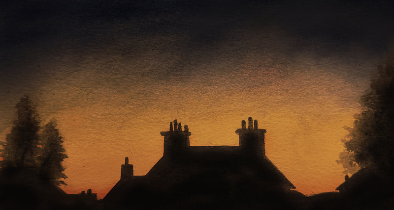
Working with paint has never been my strong suit; I struggle with controlling the medium, and definitely have a lot of confidence-building to do. I was nervous about this task, but hopeful it would give me grounds to improve.
WATERCOLOUR
|
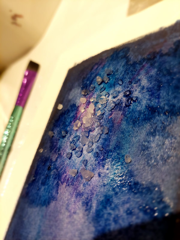
Although I use watercolour far more often than acrylic, I didn't have a good understanding of proper technique. This was a good challenge to learn more about the medium's potential, and improve my confidence when using it. For these pieces, I used a mix of traditional watercolour, Derwent Inktense, and Viviva sheets. After researching techniques and looking at examples, I began to practise what I'd learned. I don't feel these turned out particularly well, but I did get a lot out of trying. I learned about washes, wet-on-dry and wet-on-wet, and how to use the brush to my advantage. I enjoyed creating this galaxy mountain scene; for this, I started with a light colour wash before layering in the darker tones. I then sponged some of the colour away whilst it was still wet, using both rock and table salt to enhance the white in the centre of the nebula. I added the stars by spattering white acrylic before inking the mountain. |
ACRYLIC
I didn't expect to enjoy working in acrylic at all. It always makes me nervous; even though you have the advantage of painting over errors easily, I still find it terribly difficult to control. I especially struggle with fine detail and colour consistency when mixing.
Again, I started off with some research. I read about tools and techniques, and collected examples of artwork that used them. After reading up on brush types, I also invested in a new set of brushes and some tools such as sponges and palette knives. Once I began to paint and got into it, I found it surprisingly relaxing - I think actually taking time to research acrylic techniques gave me a better understanding of the medium when using it myself.
ARTIST STUDIES
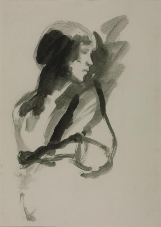
AMBROSE McEVOY
works by Ambrose McEvoy
|
Ambrose McEvoy piqued my interest because of the looseness of his work. Despite the lack of intense detail, his paintings still capture an intense atmosphere and dynamic. Some of his portraits are mere suggestions of figures; subtle shadows that hint at facial features, strange brushstrokes that almost tease the idea of a body. I was particularly interested to try this. I produced a self portrait in an attempt to replicate McEvoy's painting style. It felt foreign not to outline something; to simply paint the shadows and let them highlight the figure. It was a useful exercise for pushing myself out of my comfort zone, and for learning how to be loose and suggestive using washes and different weights of brushstroke. |
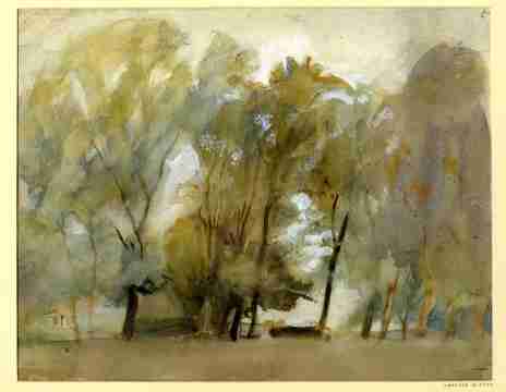
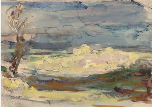
JOHN SELL COTMAN
works by John Sell Cotman
|
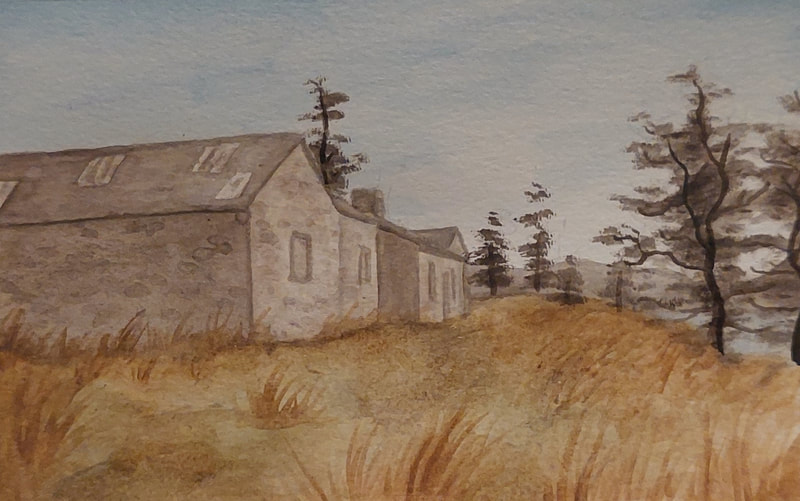
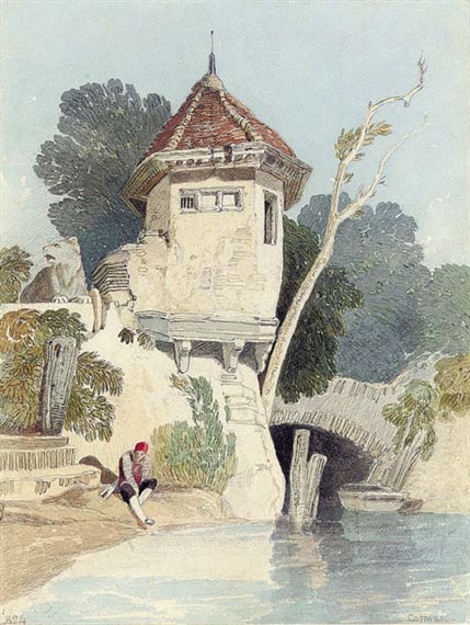
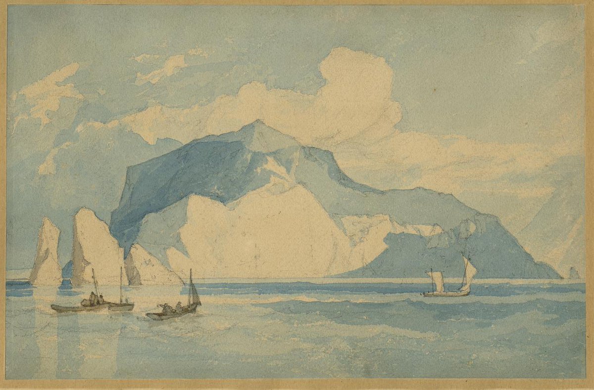
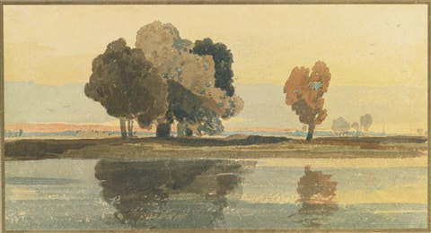
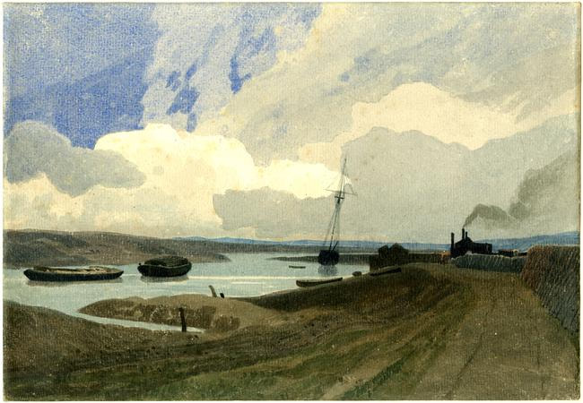
The first thing I noticed about Cotman's work was his sharp lighting; shadows are cleanly separated, not blended. However, despite the sharp edges in his painting, his muted colour palettes make his paintings soft and subtle. To the left is my attempt at the old farmhouse at Loch Thom, Greenock. I tried to replicate Cotman's use of tone and subtle colours. |
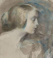
JOSEPH C. LEYENDECKER
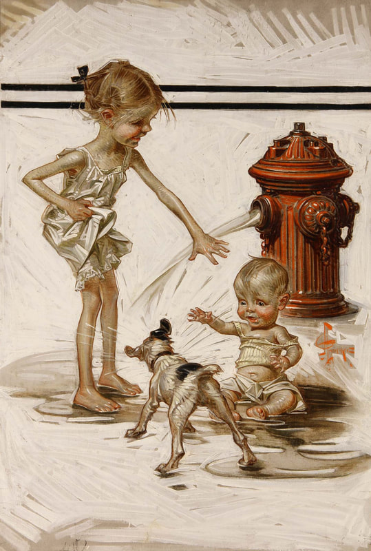
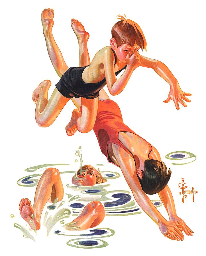
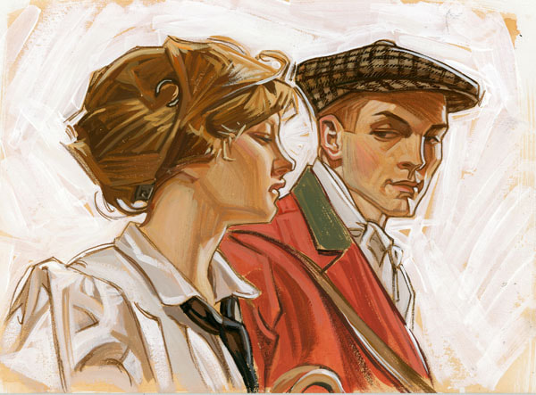
works by Joseph C. Leyendecker
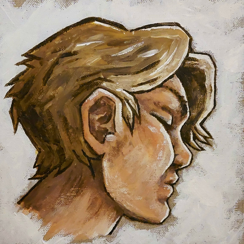
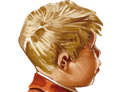
As mentioned, I have never been confident with acrylic paints. However, when I discovered Leyendecker, I fell in love with his work immediately. The warm tone of his paintings, the vivid expressions and emotions, the sense of movement... I feel like there's so much life in his work, and I wanted a closer look at his technique and method. To do this I attempted a self portrait, referencing his paintings for inspiration.
This gave the paint a half-blended, half-sharp kind of look; I was pleased to see that it somewhat followed Leyendecker's crisp, angular style whilst still resembling soft skin. A big component of Leyendecker's work is dramatic lighting; strokes of white edging the subject within a thin, darker outline. I added this last, and tried to replicate his "derelict shop window" background as well.
Site powered by Weebly. Managed by 34SP.com


