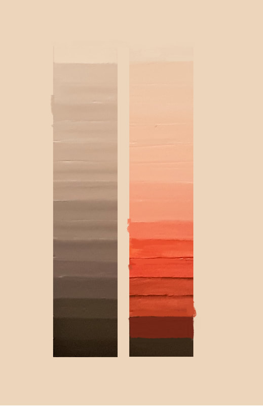
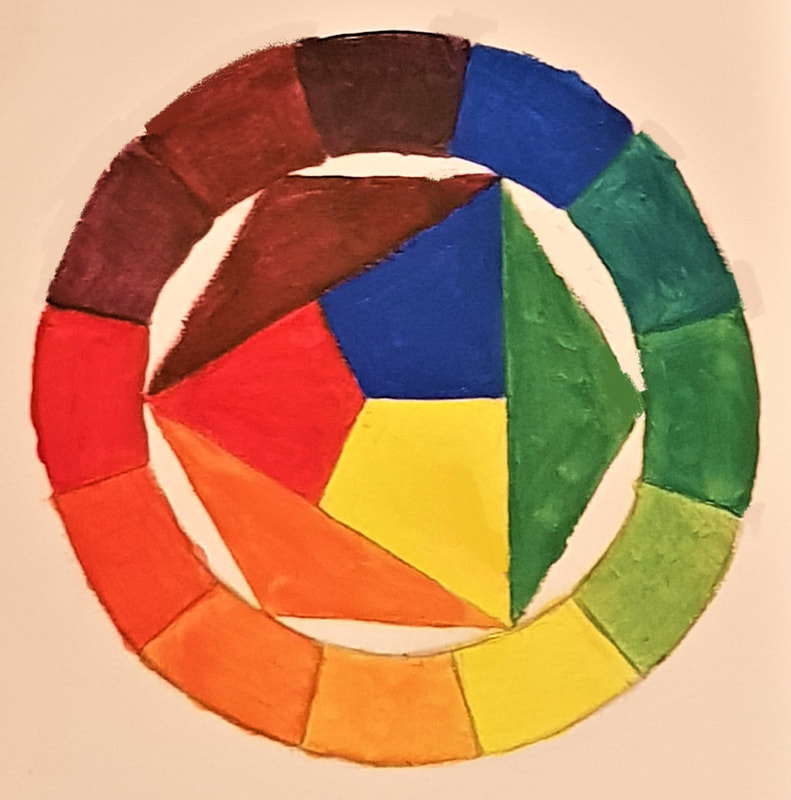
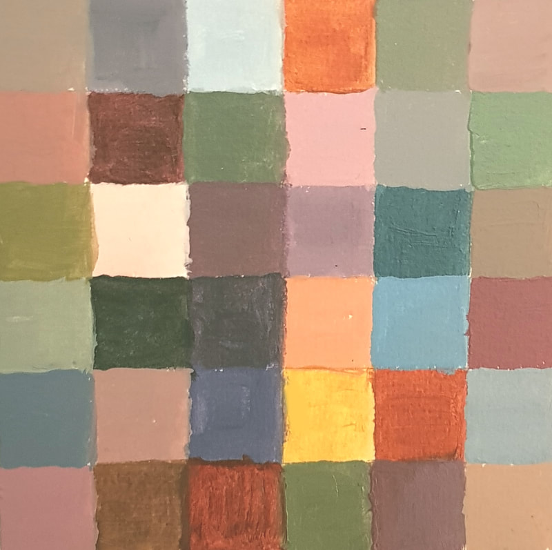
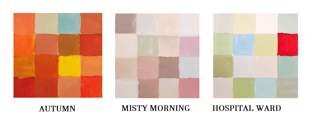
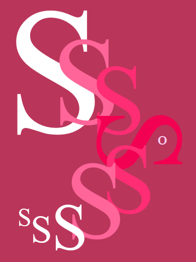
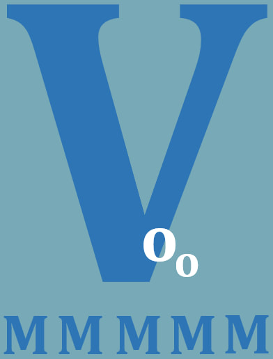
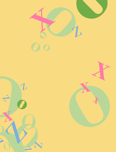
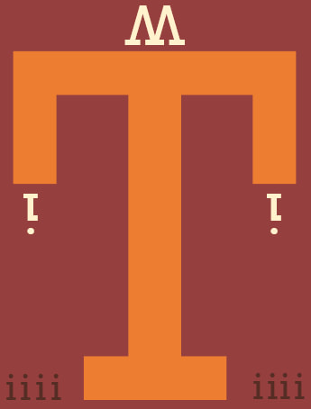
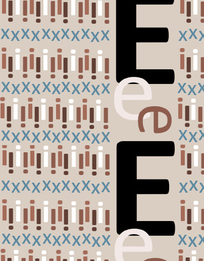
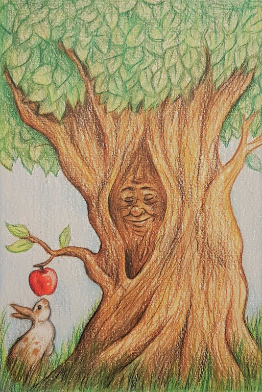
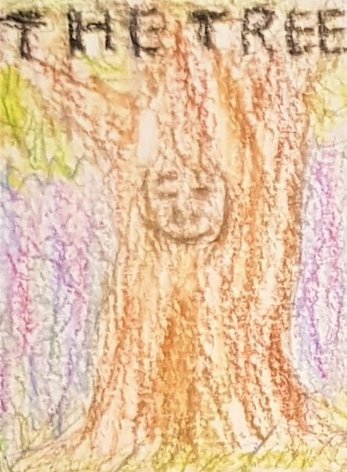
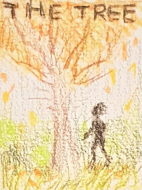
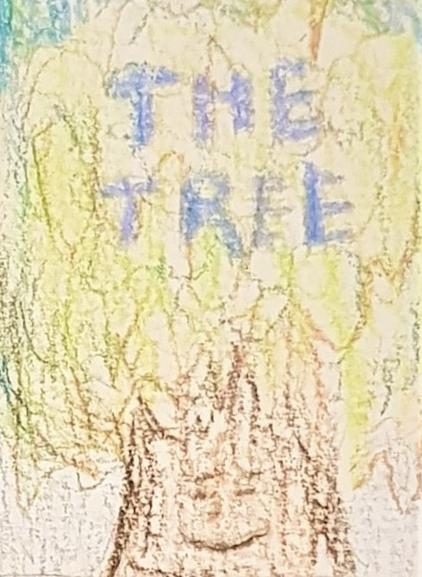
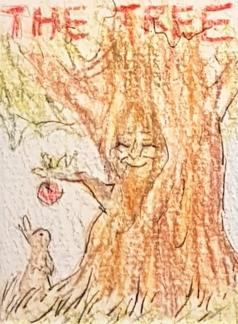
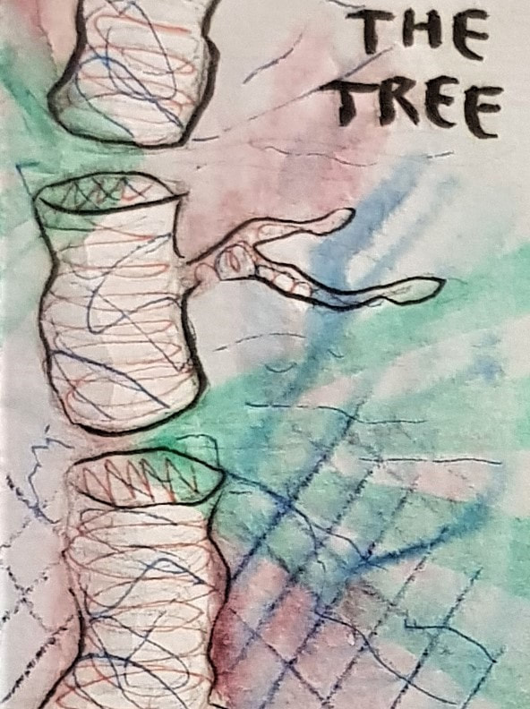
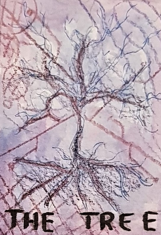
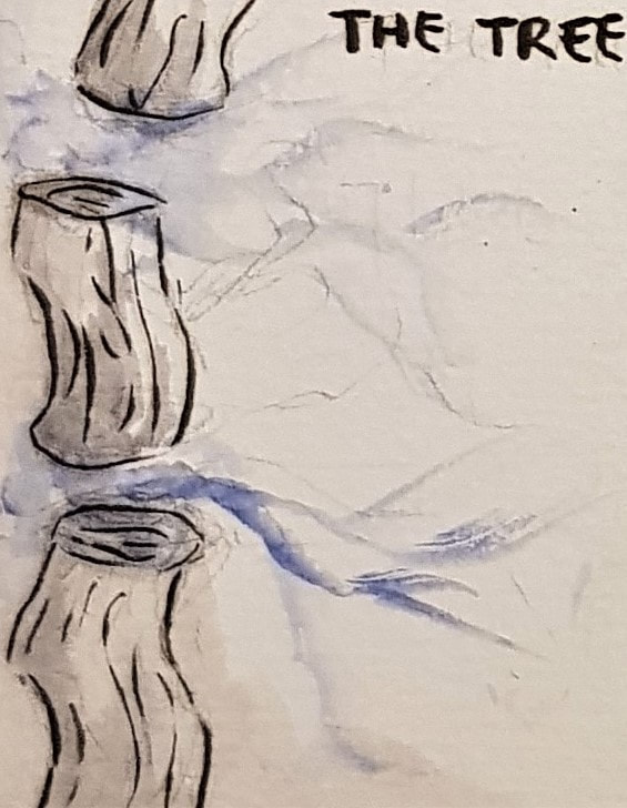
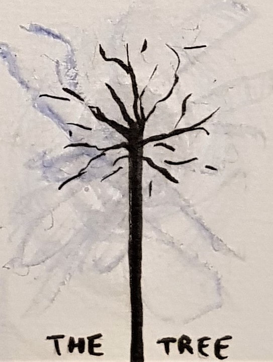
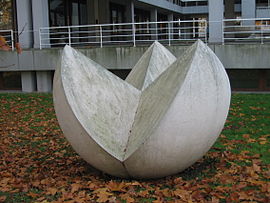
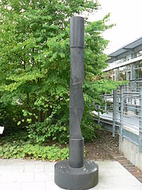
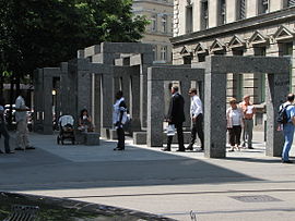
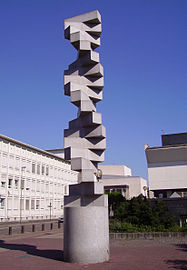
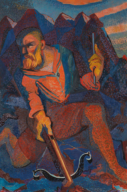
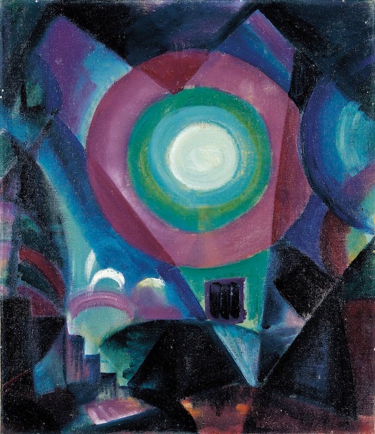
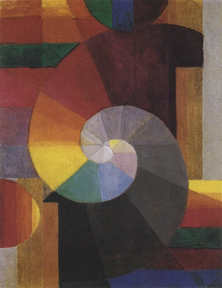
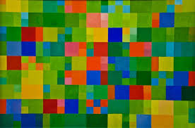
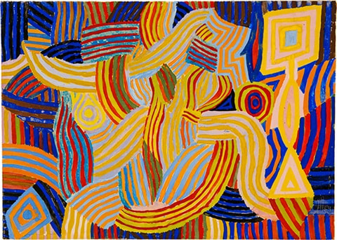
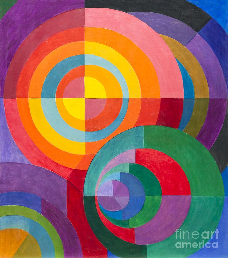
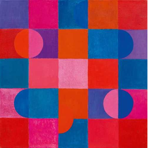
Colour Theorycolour exercises in acrylic These exercises using paint were interesting, and useful for developing my understanding of colour and tone. Of all mediums, paint is definitely one of my least used and most feared. I often work with ink and markers, so having to mix my own shades was quite challenging. I particularly found the 16 step scale difficult, as I struggled to match "equal" tones between different colours. My attempt is not the best, but at least it lets me know what I need to work on. For the Bauhaus personality exercise, we were to mix colours we found appealing. In doing so, I ended up with a rather eclectic collection. This fits me quite well, in a sense - I am a terribly indecisive, open-minded "shades of grey" person, so a lot of different colours appeal to me for different reasons. Saying that, however, one similarity between the majority of my chosen colours is that they can be found in the natural world. This is very much my comfort zone; I am instinctively drawn to natural colours (florals, etc), and repelled by more synthetic-looking ones (I have a burning hatred for hot pink, lime green, and anything neon). Bauhaus theme exercises in acrylic The next part of the exercise was fun. We had to do smaller versions of the Bauhaus square exercise, but using colours we associated with prompt titles this time. I particularly enjoyed the natural settings and the hospital ward - since I have spent a lot of time in these settings, I found it interesting to think of the most prominent colours my brain associates with them. Designing with TypeFor the typography exercise we were given a list of fonts, and a list of concepts to convey. We had to match each concept to the font we thought represented it best, and construct visuals consisting only of letterforms. For "feminine", I chose Helvetica - the supple curve of this font seemed to fit well with the typical idea of the feminine shape. I chose curvy letters to emphasise this, and based the shape of the design on the female reproductive system. For "masculine", I chose Clarendon - this is a slightly thicker, stiffer font than Helvetica, so I thought it fitted well with the idea of the male body biologically consisting of more muscle than fat. I chose the letter V as the focal point of the design as a reference to the typical idea of the male shape. For "playful", I chose Bodoni - I tried to make the design as eclectic and random as possible to convey the speed and humour of someone's dialogue when they're feeling playful. I also incorporated the idea of childhood by using pastel colours and "tumbling" letters to look like building blocks. For "power", I chose Rockwell - this is a very bold and imposing font which I thought fitted the concept well. Personally "power" made me think of society, so I used one giant letter as the 'figure of authority' (with a 'crown' and 'high-profile individuals' at their fingertips) with the 'commoners' down below. For "pattern", I chose Calibri - this is a very 'general' font, which made it the most suitable for the binary-style visual I wanted to create. Other influences for the design were tartan and argyle patterns. For "scale", I chose Myriad Pro - this seemed like the most clinical font, which suited the idea of scale and technical measurement. I incorporated three scale ideas into one visual tone, general size (technical scale) and height - and chose a letter that stacked well to show this effectively. CompositionFor this activity, we were tasked with creating three book covers - a children's book, a science fiction novel, and a psychological horror - all titled 'The Tree'. Each cover had to be in the style of one of the illustrators mentioned in the brief, and we had to choose which fitted which book genre. I chose to match Anne Yvonne Gilbert's style with the children's cover. Gilbert's work features coloured pencils and a vast array of tone, particularly soft florals and naturals. I found the pleasant, fantastical feel of her illustrations almost fairytale-like, and thus well-suited a children's novel. I tried to use similar colour schemes and a fantasy approach, whilst keeping the image bright and positive to appeal to a youthful audience. I added a rabbit and an apple, to give a secondary sentient focal point and a bright contrast, which would hopefully hint at a storyline and pique a child's attention. For the science fiction cover, I tried to replicate the style of Charles Keeping. Keeping used pen and ink, often utilising abstraction and vibrant clashing colours to give a surreal feel to his work. I thought the illusionary, ethereal vibes of his style were suited to the concept of science fiction. I aimed to use clean black brushstrokes and a white base colour for the main focus (the tree), and contrast that with a coloured background and some more vibrant, abstract highlights. I had the idea to split the tree into sections and have electronic pathways emerging from the gaps - this was an attempt to give the 'tree' a dual identity as a wire, with reference to a motherboard,
0 Comments
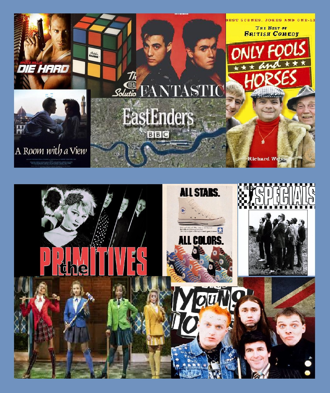
The cultural texts of 1980s Britain can be separated into official culture and unofficial culture. The former consists of popular media - films, TV, art and design - that was mainstream, commercially produced and reflected cultural norms. The latter consists largely of small scale media that appealed to the working class and cult followings - inspired by the political events of the times, unofficial culture was contrarian and rebelled against the Thatcherite zeitgeist.
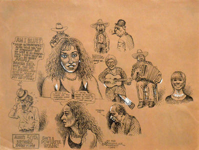
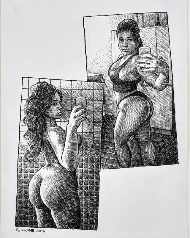
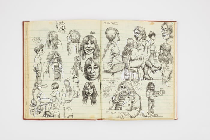
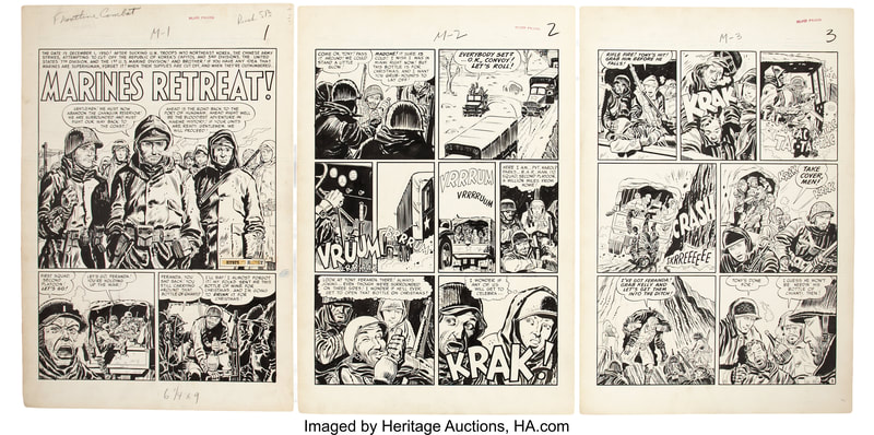
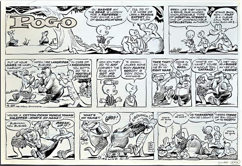
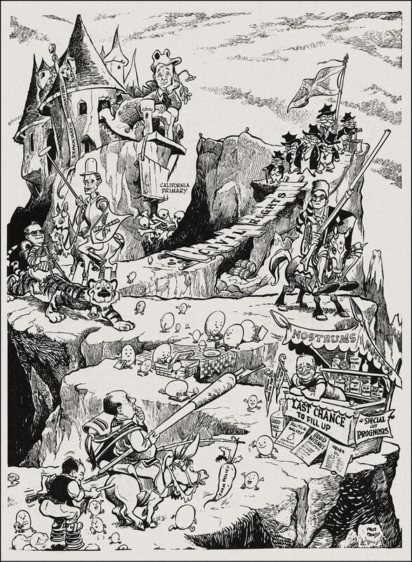
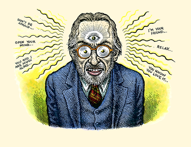
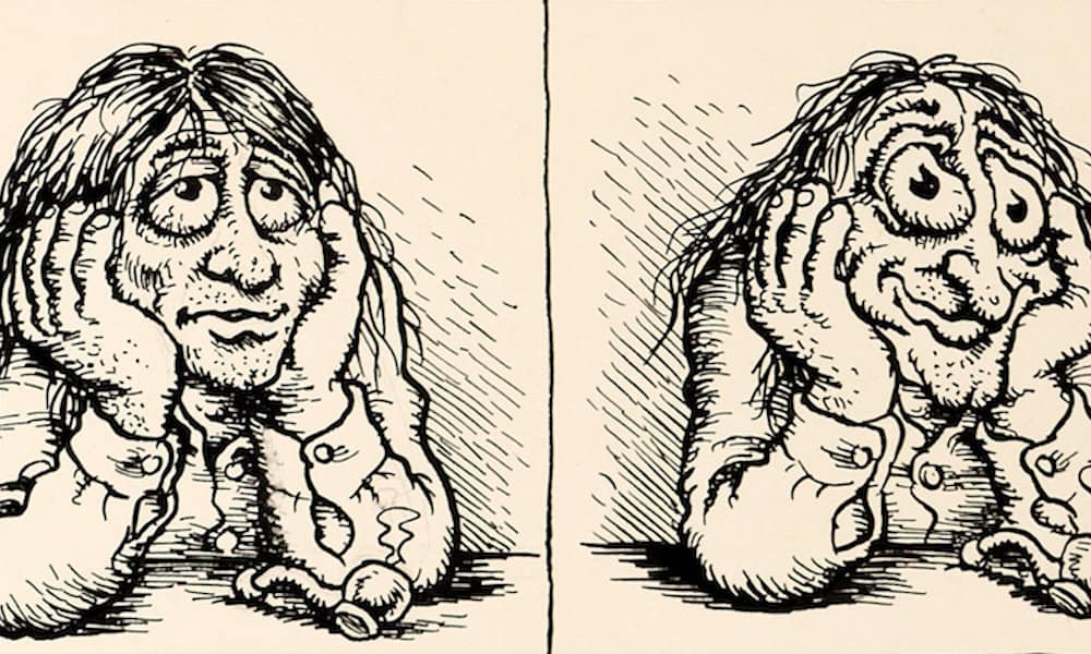
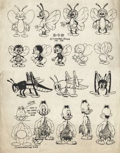
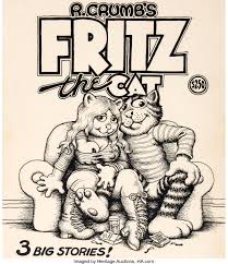
The task for this session was to create a visual moodboard halved into examples of official and unofficial culture. On the top half of my moodboard are official examples, such as the TV show 'Only Fools and Horses' which gained a mass commercial following in 80s Britain. On the bottom half of the moodboard are unofficial examples, such as the indie band 'The Primitives' which earned a more cult following. Robert Dennis Crumbillustrations by Robert Crumb Robert Dennis Crumb (commonly signing his works as 'R. Crumb') is an American counterculture cartoonist. Born into an age where traditional cultural norms were being actively challenged, Crumb became a huge name in the world of counterculture art. Crumb's sketchbook (above) compared to the work of Kurtzman (below left) and Kelly (below right) - note the similarities in fine, black and white linework and crosshatch shading In terms of technical form, Crumb's style is very reminiscent of late 19th-/early 20th-century cartoons, which he drew from heavily. Inspired by the likes of animator Max Fleischer and cartoonist Carl Banks, his illustrations feature heavily crosshatched pen and ink, mostly done in black and white. However, following a particularly intense LSD trip, his style developed into a slightly more surreal, psychedelic one. This can be seen clearly in the work he produced during his time working with Underground Comix, inspired by his own trips and psychedelic poster art. psychedelic inspired cartoons by Robert Crumb In terms of subject and outlook, Crumb's work conveys a certain contempt for contemporary American life. He employs scathing satire, an erotic fixation and a bold irreverence which ultimately made his name famous. He was particularly inspired by the use of satire in cartoonist Harvey Kurtzman's work, who was his mentor for a number of years. Interestingly, contrary to the inappropriate nature of his own work, Crumb also drew influence from Walt Disney animator Walt Kelly. Crumb's cartoon 'Fritz the Cat' (right) compared to the work of Max Fleischer, creator of 'Felix the Cat' (left) - note the similarities in exaggerated cartoon features such as the eyes, anthropomorphism, and blatant character-lifting Though perhaps not an "artistic" influence, I feel it is well worth mentioning the effects Crumb's personal life had on his work. Born into a heavily Catholic family, Crumb has stated he was "born weird". Intrigued, I researched further and found a number of striking facts about his early life which, from a psychological perspective, I believe correlate directly to his erotic fetishes.
His father was a military illustrator, suggesting a strict (and religious) upbringing, and his mother reportedly abused diet pills and other medications. He had four siblings - two sisters, and two brothers (both of whom suffered from mental illnesses also related to sexual fixation and urges). He attended a Catholic school, taught by nuns and teachers who discouraged his interest in cartoons. All this combines into what I personally interpret as a horrendously stressful and oppressive environment for a growing child - one which could fuel hatred and mental stability as an adult. Crumb has confirmed some of this in interviews. He has spoken of his painful struggle to fit in during his adolescence, stating that it allowed him to develop his own aesthetic ideals contrary to Hollywood's concept of attractiveness. With much of his work featuring graphic, sexual imagery of women, he admits that the fixation is partly fuelled by a hatred for the female sex. He states that the nuns terrified him, he was rejected by girls throughout his youth... That alongside the knowledge of the image he probably had of his addict mother as a child, you can kind of see a root to his anger towards women in general.
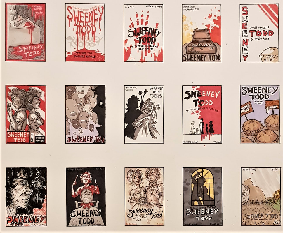
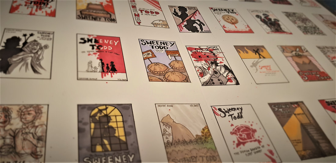
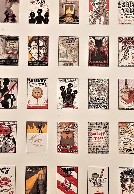
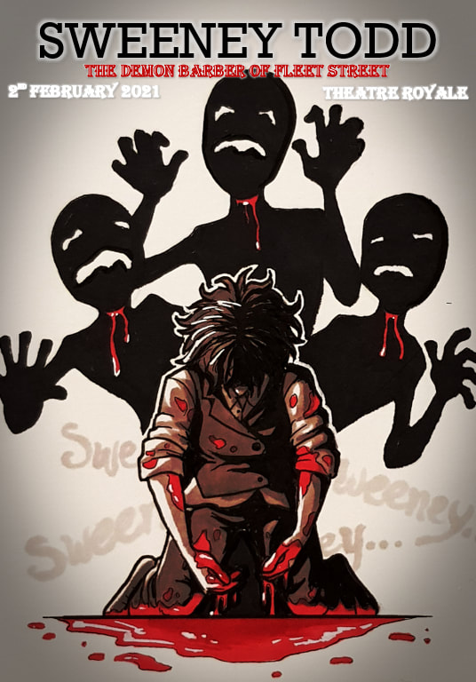
perspective from multiple angles. I am glad I chose to do this, since coming up with 40 different ideas for thumbnails proved to be quite difficult. Having knowledge of the play, its script, its music and the film adaptation definitely helped with generating ideas. Some of the thumbnails use symbolism and subtle details from the script, whilst others are much more literal - either way, I tried to create images that didn't give too much of the plot away, 40 thumbnail visuals I also made sure to keep in mind that our task was to produce a theatre poster, not a film poster. I find the two often differ greatly; film posters tend to be more cinematic, utilising modern photography and digital effects. Theatre was around long before we had these tools at our disposal - traditionally, other than word of mouth, the only real way to advertise an upcoming play was via illustration. Many modern theatre posters still champion this method, favouring illustration and graphic design over photography and often appearing more stylised than realistic. The aim of any advertisement poster is to draw the viewer's attention to the product. Ideally, it should visually pique their interest, encouraging them to consider said product. To do this, an effective combination of colour, composition and subject must be used. Right away, with Sweeney Todd as my "product", I knew I would be making good use of a bleak and minimalistic colour scheme. 3 final client visuals I chose to use only red, black and white in my finals. Red and white are of course the trademark colours of a barber - historically, this was to symbolise their practice of bloodletting, and the white bandages used to stem the bleeding. This (rather beautifully) correlates directly to the plot of Sweeney Todd. Adding black provided depth and contrast, resulting in stark images that both draw the eye and convey the morbid themes of the play.
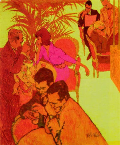
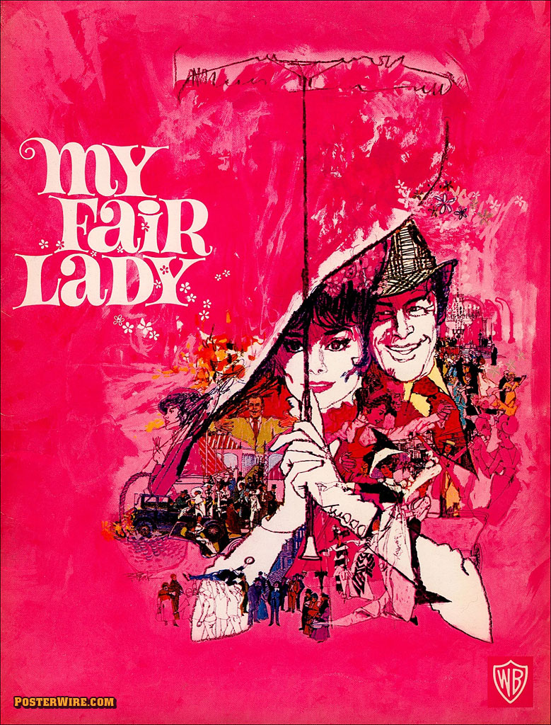
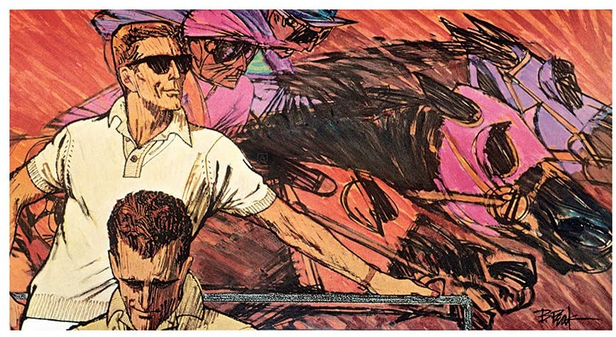
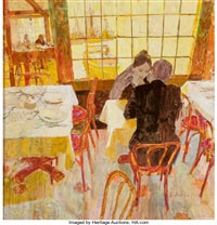
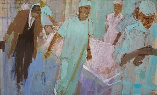
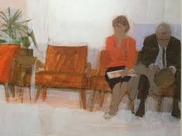
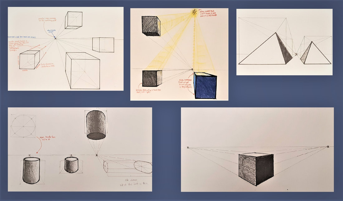
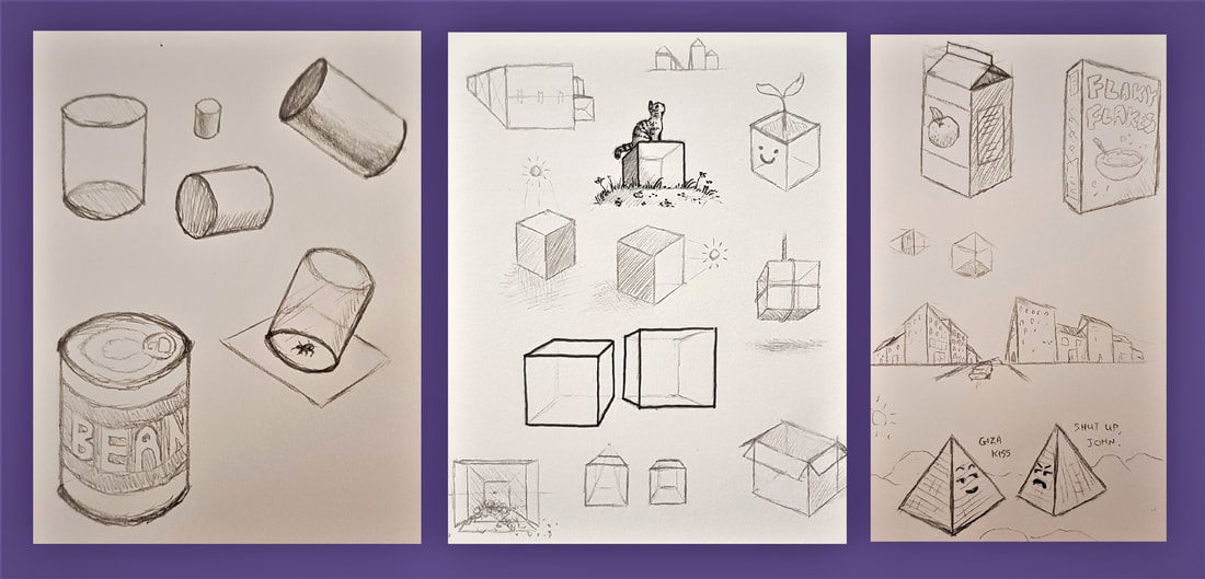
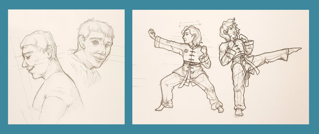
The three ideas I chose to finalise experimented with differing perspectives and interpretations. For example, I explored the use of the worm's view in one; placing Todd behind his unknowing victim to create dramatic effect, and convey a predatory sense of power. For the others, I chose to portray Todd himself as the victim. He states in the play that his former self is "dead" - this made me visualise his tragic past as a fatal wound, slowly bleeding out as he tortures himself with his pursuit of revenge. It seemed effective to make this fatal wound the same one he inflicts on his victims. Bob Peakillustrations by Bob Peak An American commercial illustrator, Bob Peak eventually came to be known as 'the father of the modern movie poster'. He earned this title through his famous poster work in the mid 90s - gaining a reputation after being hired to illustrate a poster for 'West Side Story', he went on to be hired as the illustrator for many other famous posters. He also illustrated for advertisements, alongside producing his own original illustrations. Though some of his illustrations lapse into more cartoon-like territory, Peak's work is mainly defined by a realistic style featuring unnaturally bright, often neon colours. Take his poster for the film 'My Lady Fair' - the entire background is a very "out there" shade of hot pink. Such an unmissable colour would catch the viewer's eye even from a distance. In contrast, the central illustration is done mostly in stark blacks and whites; only the figures of the main characters are lined and shaded boldly, highlighting their importance as protagonists. The eye then moves progressively to smaller detailed scenes around the focal point; these are coloured in an orange so similar to the pink that they appear undefined from afar. This is a clever trick to draw the viewer closer, making them pay more attention to the poster to quench their curiosity. Overall, the eye-catching combination of bright colours and stark contrasts is extremely effective for advertisement - whether it be a new clothing range or an upcoming film, his work was sure to draw the attention of the public to the product at hand. This ultimately lead to his famed reputation and his rise to success in commercial illustration. Bernie Fuchsillustrations by Bernie Fuchs Another notable mid-90s American illustrator was Bernie Fuchs. As a trumpet player, Fuchs' initial ambition was to be a musician. However, after losing three fingers in an industrial accident, he turned his attention to art despite having no experience. After graduating from university, he began his career illustrating car advertisements - word of his talent spread fast and soon he was a much sought-after illustrator, going on to work in magazines and portraiture. Fuchs had somewhat of a fascination with mundane scenes - the everyday man and his everyday activities. In theory, these should be boring concepts for an illustration. But Fuchs had a gift for making the mundane extraordinarily eye-catching. His paintings lacked bold lining, instead using stark colour contrasts to define people and objects. He had a tendency to use warm tones, but would tailor his colour schemes to the subject of the painting (note the pale clinical colours of the hospital illustration against the warmth of the café scene). However, the defining quality of Fuchs' style is the bizarre angles he chooses to illustrate from. His odd use of perspective hints at abstraction. By showing everyday life from rarely-used angles, he creates art from the ordinary - turning familiar scenes into new ones, if you will. This draws the viewer's attention despite the lack of action in his scenes. Practical TaskPerspective has always been something I have struggled with in my artwork; technical measures and spatial positioning have always confused me. I was apprehensive to have a go at these activities, but on the other hand I was eager to learn how perspective really works in order to better my work. Even learning the basic concepts (eg. oblique projection vs. realistic convergence) and getting to grips with the three dimensions was a useful starting point. We started off with 1 point perspective, which only distorts depth by using one vanishing point. We had a go at drawing some cubes, cylinders and pyramids using this technique. Out of these, I found the cylinders and ellipses the most challenging. After many failed attempts, I eventually felt a little more comfortable constructing a cylinder by using what I like to refer to as "the phantom box". 2 point perspective was relatively straightforward - using two vanishing points to construct shapes angled towards the viewer, distorting depth and width this time. You can see some of my notes and attempts above and below. In another 1PP exercise, we constructed "railroads" and "chessboards". I found this extremely useful when drawing an object that extends into the distance - the "zigzag" technique, points of distance, and the use of aerial perspective really helped me develop my proportional accuracy. You can see some of my attempts below. Something I was very keen to learn was how to better the anatomy of my sketches using perspective. Again, proportion is something I struggle with - especially when it comes to facial structure, limb length, placement of a figure on the page, and so on. I found the techniques we learned in these activities very useful, and have since noticed a visible improvement in my figure sketching.
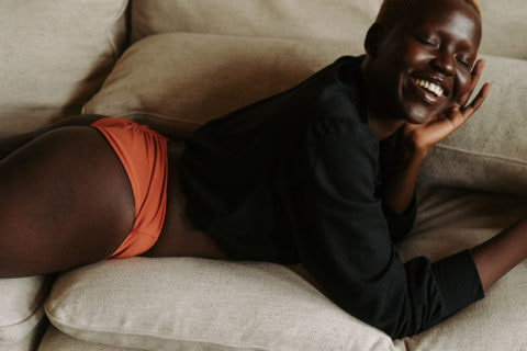
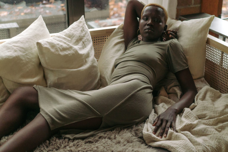
Below you can see some practice and development sketches of figures and busts. I took pictures of my fiancé (who grudgingly agreed) and used them as references to develop my understanding of facial proportions. To practice full body figures and movement, I used screenshots from a video of myself during martial training. I particularly learned a lot about drawing figures that aren't all at the same distance from the viewer - the bent knees in the first stance and the torso bending backwards in the second were useful challenges. This session looked at the storytelling qualities of editorial fashion, and how it both reflects and influences visual culture. We considered fashion photography as an art form. Personally, I believe it is well worthy of that title; even as someone who is not a follower of fashion (and definitely not the side of it that champions a more materialistic society), I cannot deny the artistry in fashion and fashion photography. They both require skill, an eye for composition, and a knack for visual storytelling - in my opinion, this more than qualifies it as art. For our blog task, we were asked to discuss and critique two fashion articles of our choice. 'Londre Bodywear Founders on Values and Intuition' |
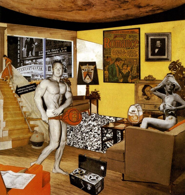
| In 1956, an exhibition called 'This is Tomorrow' took place in London, featuring a host of post-wartime British artwork. As time headed into the realms of modernism, the exhibition was considered the kickstarter for British pop art. Richard Hamilton was a contributing artist in the exhibition with his famous collage 'Just What Is It That Makes Today's Homes So Different, So Appealing?' |
The collage became a pop art icon depicting the rising consumerism as the 1950s progressed into a more modern age. In his own words, Hamilton aimed to "fill a cramped space with a representation of all the objects and ideas crowding post-war consciousness". Indeed, the collage depicts many developing ideas of the 1950s - the advancement of science and space exploration (the moon on the ceiling), new ventures in household appliances and foods, cars and technology, new 'standards' for the male and female body... Effectively, 1956 in a nutshell.
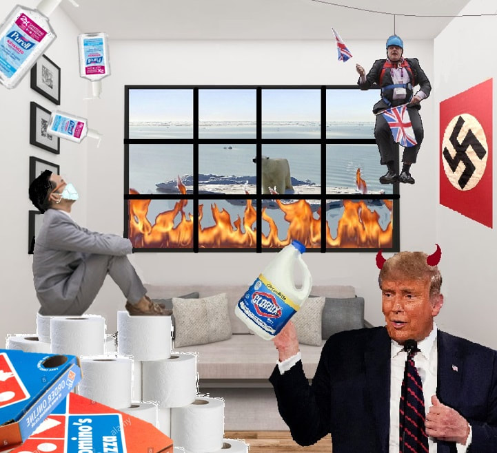
| Our blog task for this session required us to create our own version of Hamilton's collage, depicting the ideology and gist of 2020. Unfortunately, as we all know, this year has not been one for focusing on scarce positives. Instead of welcoming new innovation and promising advancements, 2020 has welcomed a global pandemic, a |
painfully orange dictator, and panic amongst those of us who have the sense to see the dire importance of climate change. In my opinion, these were the main themes of 2020, and thus inspired my attempt.
Firstly, I chose a living room scene for the background - since lockdown confined most of us to this room for much of the year, I thought it was an appropriate starting point. I went on to include the issue of global warming by making the melting ice caps and wildfires visible through the window - I chose to combine ice and fire because they are two of the most prominent images the term "global warming" brings to mind.
To the left of the collage I focused more on the Covid-19 pandemic, and the new ways of living we have had to adapt to. I combined some defining factors into one image - a man in a business suit (referring to working from home) sat atop a throne of toilet roll and pizza boxes (referring to panic buying and increased takeaway orders), wearing a facemask and being rained on by hand sanitizer (pretty self explanatory). I tried to make it as bizarre as possible to reflect the surreal oddness of the times we now live in.
To the right, I focused more on the political highlights of the year. I had to include Boris at the top, hanging from his zipwire in probably the single most infamous picture of him in existence. The image itself automatically gives off a sense of absurdity and incompetence, in turn referencing nationwide doubt of Johnson's abilities to lead, especially in crisis. Below Johnson, I have included Donald Trump below the Nazi swastika, since his deplorable actions during his presidential term have led many to compare him to the dictator Adolf Hitler. I added devil horns to highlight the worldwide threat this man poses - the danger of his choices and actions exceeds the borders of his own country, impacting the entire globe. The bleach was added just as a reminder of the stunningly bad ideas of our so-called world leaders - reading deeper into this, one could question the very direction humanity is heading in if we are willingly electing people like this to lead us into the future.
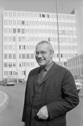
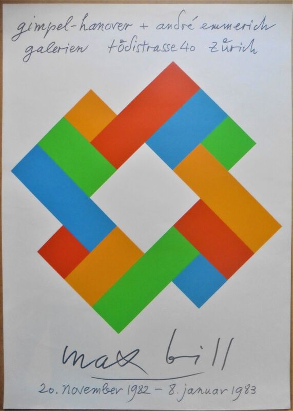
Max Bill
Max Bill was born on December 22nd 1908 in Winterthur, Switzerland. From 1924 to 1927 he trained as a silversmith apprentice before going on to study at the Bauhaus until 1929. He then moved to Zurich, where he worked as a graphic designer for modern buildings. It was here that he built his first work - his own house and studio.
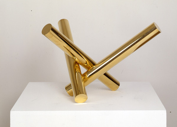
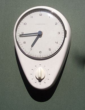
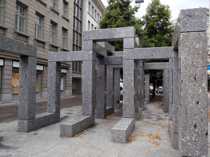
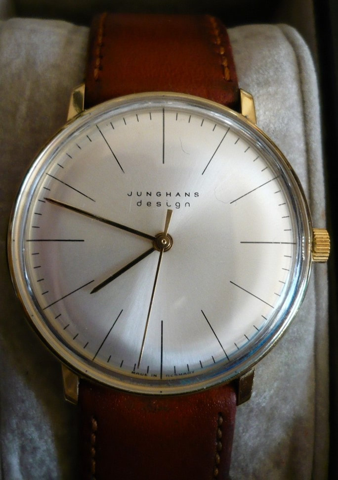
As an artist and industrial designer, Bill was highly regarded for the major influence his work had on Swiss graphic design. Clear, elegant precision is a trademark of his work - he was also a driving force in pioneering the Concrete Art movement, which focused heavily on geometrical abstraction. Some well-known examples of his work include the clocks and watches he designed for Junghans, the 'Pavillon-Skulptur' in Zurich, and the 'Endless Stairs' in Ludwigshafen.
Bill became a professor at the Zurich University of the Arts in 1944, and later at the Hamburg University of Fine Arts in 1967. As well as teaching as a lecturer, he produced a vast amount of both factual and theoretical literature on art, architecture and design. He travelled to conferences worldwide to share his knowledge and became a member of multiple well-known art academies and societies. But perhaps his biggest legacy may be designing and cofounding the Ulm School of Design in Germany, which went on to integrate art with science and the study of semiotics.
Bill died of a heart attack en-route to hospital at the age of 85 in 1994. His work lives on in galleries, museums and exhibitions, and the influence he had on Brazilian artists in particular with the concrete art movement.
Bill died of a heart attack en-route to hospital at the age of 85 in 1994. His work lives on in galleries, museums and exhibitions, and the influence he had on Brazilian artists in particular with the concrete art movement.
I will admit, I was incredibly intimidated when I read the brief for this project. I don't know how long I must have stared at these three images in horror, wondering how on earth I was going to recreate them. At first glance, I had absolutely no idea where to start - but that's what this course is about, isn't it? Learning and improving?
Anyways, I started by doing a little research on each of the artists - hoping to learn more about their style, technique and mediums - before I went on to practice what I'd learned, and finally attempt a firm copy.
Anyways, I started by doing a little research on each of the artists - hoping to learn more about their style, technique and mediums - before I went on to practice what I'd learned, and finally attempt a firm copy.
HENRY LAMB (1883 - 1960)
Henry Lamb was an Australian-born British painter. He initially studied medicine, but abandoned that track to follow his passion for art. WWI saw him return to his medical studies to qualify, and he served as a battalion medical officer. After being demobilised by a gas attack on the Western Front in 1919, Lamb worked on a commission for the Hall of Remembrance.
Before he was appointed as a full-time war artist during WWII, Lamb was well-known for his rather unusual portraits. He produced many oil paintings, his most famous being 'Death of a Peasant' (1911), which employed the use of bold colours and dramatic lighting. He was also known for his pencil sketches, such as the one we were tasked to copy - 'Portrait of Lady Ottoline Morrell, 1910-11'.
As captioned, the original is on the left with my attempted copy on the right. After researching the artist and looking at some of his other works, my second port of call was to study the portrait carefully and figure out how it had been done. After some experimentation with different graphite pencils and a little practice, I came to the conclusion that Lamb had used a mixture of both soft, dark pencils and harder, lighter ones, using them to structure his portrait with bold lines, crosshatching and loose "scribble colouring". For my final copy above I did trace the main outline, but you can see my rough notes below:
Surprisingly, I quite enjoyed trying to recreate this portrait. The soft, sketchy linework is very different from what I would usually draw, and contrary to my expectations, I found myself enjoying the looseness. I learned to work quickly without agonising over perfection, whilst simultaneously developing my understanding of facial anatomy.
MERVYN PEAKE (1911 - 1968)
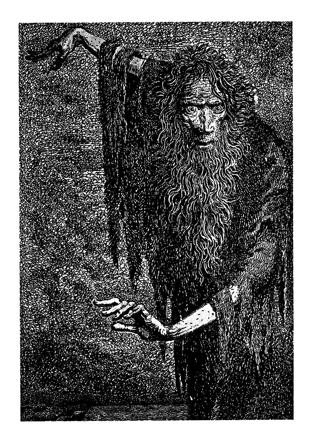
Mervyn Peake was an English artist and illustrator, as well as a writer and a poet. He studied art at the same time as writing his own surreal fiction, influenced by his love for Charles Dickens and Robert Louis Stevenson. Like Lamb, he was commissioned for a short while to depict war scenes, but eventually went on to write and illustrate his own work as well as illustrating for other writers.
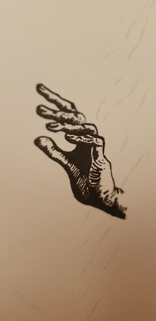
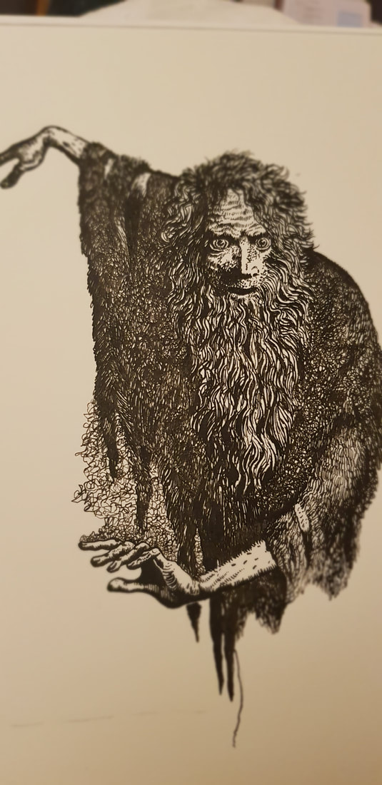
He had little reputational success in his lifetime, but is now regarded as one of England's most loved writers and the famed illustrator of books such as 'Alice's Adventures in Wonderland'. He has a very surreal, often cartoon-like style, working mainly in black-and-white pencil or pen and ink, employing fine strokes, scribbles and crosshatching to create stark shading. The image we were asked to recreate was a pen and ink illustration from 'The Rime of the Ancient Mariner'.
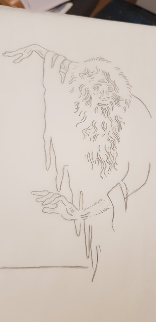
I had used ink before in calligraphy, but I had never drawn with it; the closest experience I had was with brush pens, which I use quite often in my own art. In all honesty, I didn't do much practice before attempting a firm copy - I inked a few lines, working out how to change the thickness by angling the nib, and I covered small areas in scribbles and strokes in an attempt to mimic Peake's techniques. I then traced the basic outline and began to ink the final. You can see some progress photos below:
I think I may have enjoyed this one even more than the Henry Lamb sketch. Fine detail is closer to my normal style, but I have never used this sort of "scribbling" technique to block whole areas. Most of all, I loved the smooth flowing feel of the ink. I learned to be bold with my shadow/light contrast (something I struggle with), and again it was good anatomical practice. I have since bought myself a bunch of ink and nib pens and will most definitely be returning to this medium.
CLARE LEIGHTON (1898 - 1989)
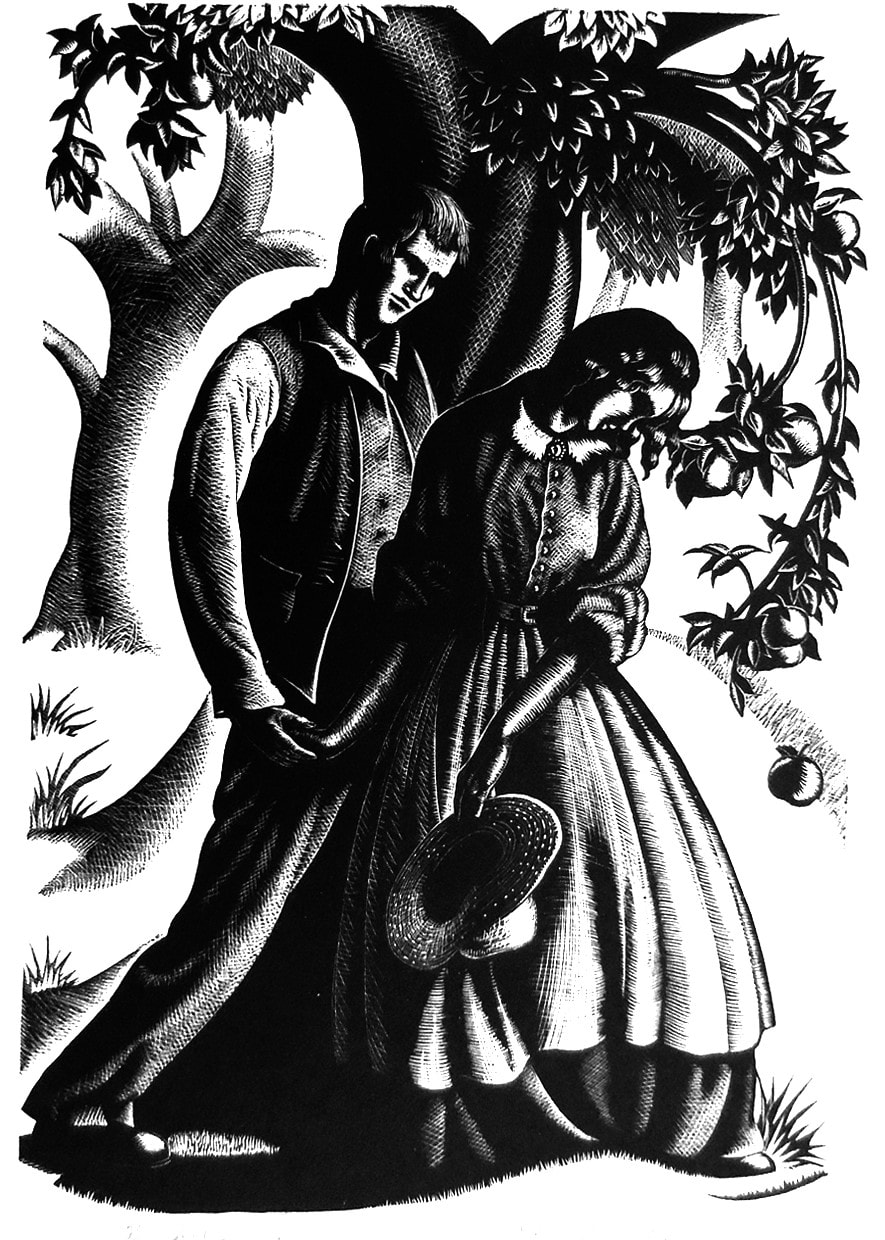
Clare Leighton was an English-born American artist, writer and illustrator. Her parents were both authors; despite her efforts to follow in their artistic footsteps, Clare's mother was rather dismissive of her daughter's talent (and person in general) and favoured her older brother. Clare's passion for art was instead encouraged by her father and uncle - her uncle, in particular, was an illustrator, and took her on sketching trips until she eventually went on to study art.
After graduating, Clare travelled Europe and developed a love for rural life. This was the main focus of her literature and artwork; even as the world grew more industrial around her, she continued to document rural life, nature and farming. She emigrated to America in 1939, and became famous for her wood engravings, such as the one we were presented with in this project:
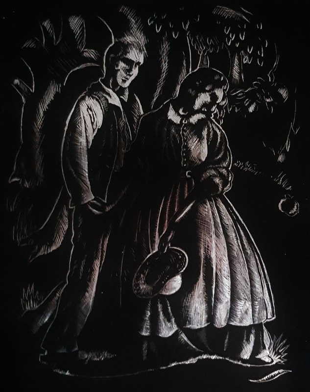
Well... As you can see, I had absolutely no idea what I was doing. There is no point in lying when the truth is so visibly, painfully obvious. It was without a doubt the most difficult and least enjoyable for me.
Instead of wood engraving, the project required us to recreate this on scraperboard. Unfortunately, I couldn't acquire proper scraperboard and had to use those metallic-backed ones you buy in the kid's arts and crafts section - that was my first mistake. I then could not figure out how to trace onto scraperboard, and had to freehand my attempt. The metallic backboard was so scratchy and uneven that I decided it was better to leave the background black instead of having it a messy, scratched silver. I found it really difficult to control how much weight I was putting on the scraper tool, and thus a lot of my lines are thick where they should be very fine.
All in all, though I missed the opportunity to experiment with the proper medium, I learned that I need to practice controlling the heaviness of my lines, and that I need to work on steadying my hands.
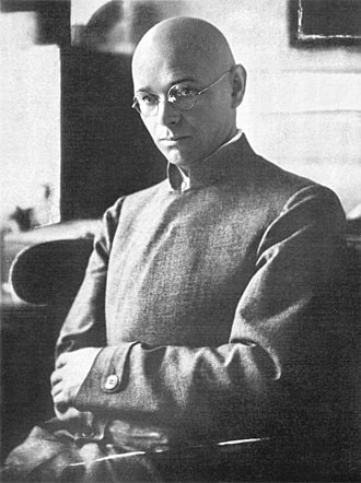
There are many notable names associated with the Bauhaus. However, the artist that immediately piqued my interest was Johannes Itten. I felt drawn to his work because of its connection to psychology, as this is both an interest and a passion of mine alongside art.
Johannes Itten
| Johannes Itten was born on November 11th 1888 in Südern-Linden, Switzerland. At the age of sixteen he began an elementary teaching course, and taught using the psychoanalysis and nurturing methods of Friedrich Fröbel. Quite the skilled academic, Itten graduated with a diploma for secondary teaching alongside another degree in natural science and mathematics. He |
Tremained interested and in tune with the psychology of his students, and preferred to teach without criticising an individual's creativity for fear of dulling their spark.
Returning from his teaching ventures in 1912, Itten studied abstract painting under Eugène Gilliard, drawing heavy influence from painter/teacher Franz Cižek, and realist-turned-abstractionist Adolf Hölzel (who later became his mentor at Stuttgart Academy). In Vienna, 1916, he met the founder of the Bauhaus Walter Gropius, who appointed him one of the earliest Bauhaus instructors. There, he was a master of multiple trades, and a valuable teacher who helped develop the Bauhaus preliminary course. However, he eventually left to pursue his own path.
Itten's work focused heavily on abstract form and colours; he developed and deeply explored his own colour contrast theories, describing them in his book The Art of Colour. Believing there was a strong connection between emotional psychology and creativity, he would often employ music and relaxation methods to teach. In his own words:
"He who wants to become a master of colour must see, feel, and experience each individual colour in its endless combinations - colours must have a mystical capacity for spiritual expression without being tied to objects."
Itten died on March 25th 1967 in Zürich, but his legacy lives on in his colour theories and the influence they have had on cosmetologists and artists.
Modernism (mid 1800s - late 1900s) was a sustained period of innovation and expansion. It was characterised by accelerated advances in science, technology and industry, plus changes in political ideas and power structures. In this session's blog task, we were asked to focus on constructivism.
Constructivism
Following in the footsteps of Italian poet-novelist Marinetti, Russia adopted futurism in a rather violent rejection of the past and celebration of the new. Russian Constructivism was soon developed post-WWI from roots in futurism, headed largely by the pre-revolutionary ideas of Vladimir Tatlin.
The idea of constructivism completely rejected the western definition of an artist - instead, constructivists used art as a means of spreading social messages, particularly communist propaganda. Ultimately, "constructed" from bold text and images to appeal to a semi-literate society, art was used to service revolution. One of the best artistic forms of mass communication is, of course, posters.
Comparing Constructivist Posters
| This is a constructivist agitprop poster by Gustav Klutsis. It utilises both photography and graphic design in a collage. Personally, the first thing that catches my eye here is the stark contrast in colours. Straight off the bat, the colour red has natural connotations of danger, activating the primal fight or flight response. With the viewer already emotionally charged at a mere glance, they will be more open to |
the message. The bold black text against ivory also implies powerful projection, allowing the viewer to almost "hear" the words being shouted. This effect is amplified by the directional composition of the lines of text, all originating from the mouth of the man on the left.
That, in turn, brings us neatly to the topic of composition. The large size and solitary placement of said man marks him as the main figure, implying a sense of power and authority and encouraging the viewer to "listen" to him. When we then come to actually read the text, we notice the circular shape of the red area - its resemblance to an eyeball with the stark black pupil pointed directly at the speaker implies that many eyes are on him, simultaneously giving the viewer a crawling paranoia that they are being watched too. This feeling might even pressure them to follow and support the poster's message for fear of consequence.
That, in turn, brings us neatly to the topic of composition. The large size and solitary placement of said man marks him as the main figure, implying a sense of power and authority and encouraging the viewer to "listen" to him. When we then come to actually read the text, we notice the circular shape of the red area - its resemblance to an eyeball with the stark black pupil pointed directly at the speaker implies that many eyes are on him, simultaneously giving the viewer a crawling paranoia that they are being watched too. This feeling might even pressure them to follow and support the poster's message for fear of consequence.
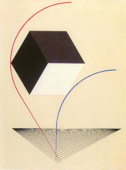
| This second image is a more supremacist example of constructivism by El Lissitzky. Lissitzky called these pieces "prouns" (roughly translating to "project for the affirmation of the new"). Despite being so different from Klutsis' collage, this illustration utilises similar techniques to convey its message. Again, we have the use of vibrant colour against muted sepia, this time in the form of red |
and blue lines. Both lines stem from the same point before diverging, implying the possible split of the Russian nation (note the coordination between the image's colours and those of the Russian flag).
The bulky form and placement of the cube between the lines is suggestive of some kind of "blockage" that has caused the split. In Marinetti's futurism manifesto - the ancestor of Russian constructivism - he notably argued that new ventures were being blocked by attachment to the old. In this sense, we can take the red line as a symbol of those "ascending" into a communistic future, whilst the blue line represents those holding on to the historical concept of a monarchy.
The bulky form and placement of the cube between the lines is suggestive of some kind of "blockage" that has caused the split. In Marinetti's futurism manifesto - the ancestor of Russian constructivism - he notably argued that new ventures were being blocked by attachment to the old. In this sense, we can take the red line as a symbol of those "ascending" into a communistic future, whilst the blue line represents those holding on to the historical concept of a monarchy.
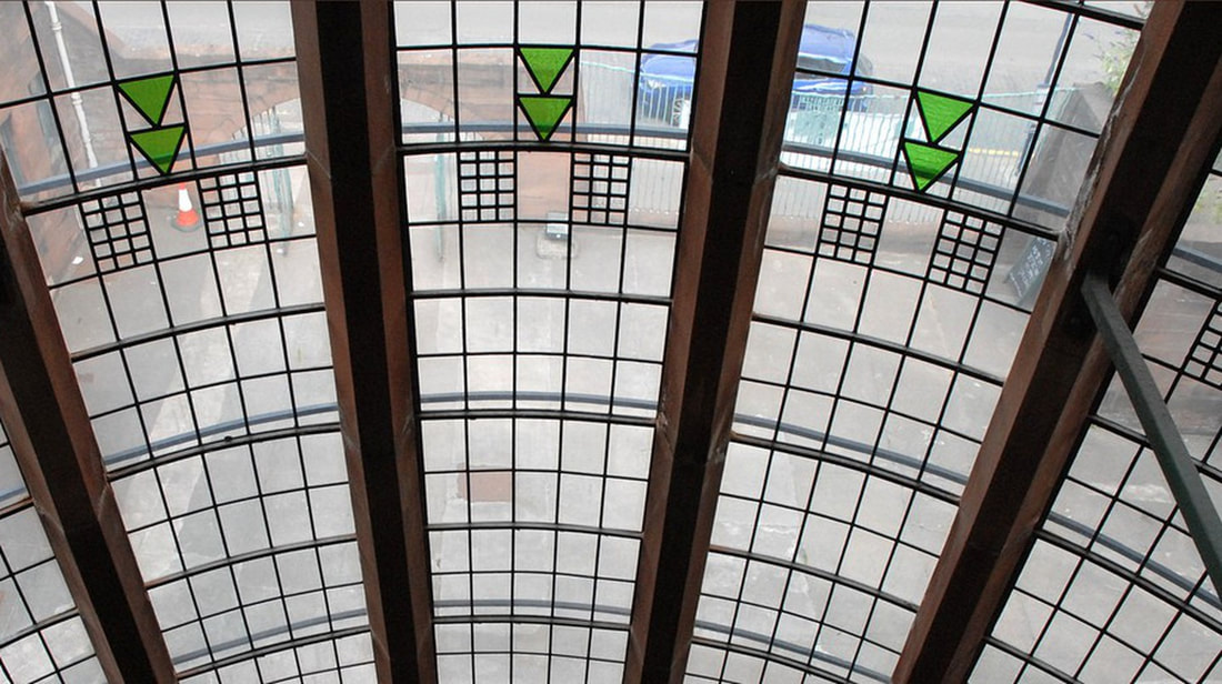
Art Nouveau was an international style that flourished between the late 1800s and the early 1900s. It arose as an opposition to the conservative historicism of the 19th Century, and largely concerned itself with breaking the discriminatory barrier between fine arts and applied arts.
The style stemmed from the Arts & Crafts Movement in Britain, driven by the likes of Morris, Crane and Beardsley. The flat florals and flowing curves in the work of these artists were somewhat early prototypes of Art Nouveau, which grew to be typically characterised by whiplash lines and nature-inspired designs. However, each country had its own interpretation of the style.
The style stemmed from the Arts & Crafts Movement in Britain, driven by the likes of Morris, Crane and Beardsley. The flat florals and flowing curves in the work of these artists were somewhat early prototypes of Art Nouveau, which grew to be typically characterised by whiplash lines and nature-inspired designs. However, each country had its own interpretation of the style.
'Modern Style' in Glasgow
Also known as 'Glasgow Style', this was Britain's interpretation of Art Nouveau. It was particularly prevalent in the Scottish city of Glasgow, which became a national hotspot for the style.
Arguably the most well-known Scottish artist to be associated with Art Nouveau was Charles Rennie Mackintosh, an architect heavily influenced by Japonisme and modernism. Together with his wife Margaret MacDonald, her sister Frances and Frances' husband Herbert MacNair (collectively known as 'The Four' in The Glasgow School), he was one of the main names to drive the style forwards in Britain.
Britain's take on Art Nouveau focused on the idea of restraint and simplicity versus extravagance and ornament. Mackintosh's work in particular is a prime example of this, featuring bold and simple geometric patterns with subtle, contrasting curves, often in the form of floral flourishes (the "Mackintosh rose"). Such patterns clearly showed influence from Japonisme, the Arts & Crafts movement, and the Celtic revival - Glaswegian Art Nouveau manages to blend the nationalistic aesthetics of traditional Scotland with the organic simplicity of the orient, combining them into functional, yet visually striking art.
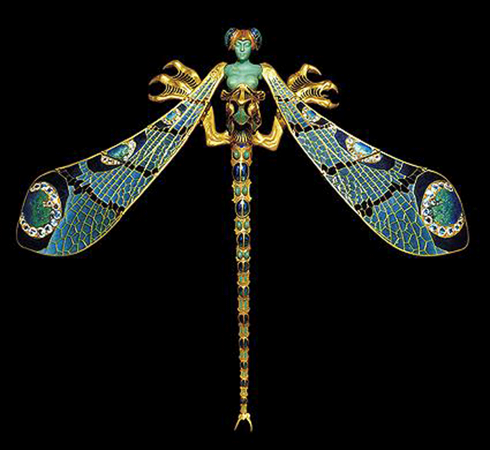
'École de Nancy' in France
Aside from Paris, the city of Nancy in the Lorraine region was France's capital of Art Nouveau. At the time, with the influx of French artisans from Lorraine after it was claimed by the Germans, Nancy became a political, cultural and manufacturing capital. Then, led by glassmaker Émile Gallé, the 'École de Nancy' was founded in 1901.
The group consisted of craftsmen who sought to adapt the arts to the industrial methods of manufacture; the goal was to mass produce ordinary objects but with fine craftmanship and original flair, providing works of art for the everyday home. The École believed in "art in all, art for all", and sought to link the arts with industry whilst upsetting the hierarchy that held fine arts above applied arts.
Their style was heavily inspired by nature, favouring flora and fauna local to the region. Gallé in particular, as a trained botanist, focused his designs on floral and botanical motifs. Decadent detail was also a recognised feature of the style, along with Japonisme-inspired simplicity that sought to capture the essence of nature. Overall - seen best in the works of Gallé, furniture maker Louis Majorelle and glassmaker René Lalique - the Art Nouveau of Nancy was both decadent and ordinary, in a way, adapting traditional craftmanship to new industrial processes.
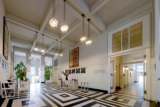
'Vienna Secession' in Vienna
The Viennese variation of Art Nouveau emerged as the 'Vienna Secession', a group of artists and artisans founded in 1897. They were concerned primarily with opposing Vienna's conservative orientation towards historicism and more traditional styles - they wanted to renew the reputation of decorative arts, and equally unite all artistic trades under one broad label.
Viennese Art Nouveau was typically characterised by geometric designs, and a tendency to put function before form. Notable members of the Secession included artist Koloman Moser, and architects Josef Hoffmann and Otto Wagner (interestingly, Mackintosh reappears as a driving force in Viennese Art Nouveau as well as British). One quote in particular, the words of Hoffmann, sums the entire style up rather well in my opinion - "a harmonious ensemble of great simplicity adapted to the individual".
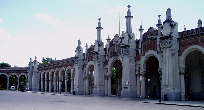
'Modernismo Madrileño' in Madrid
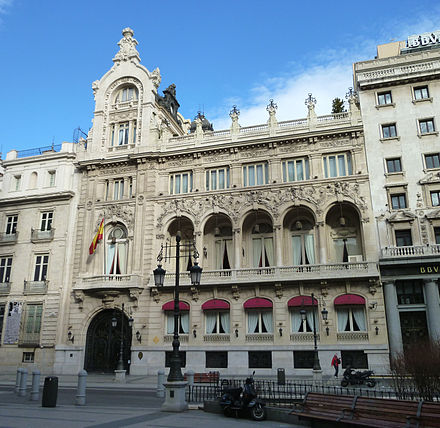
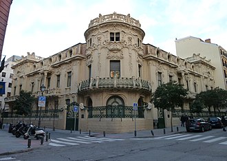
Madrid's variation of Art Nouveau was somewhat more eclectic than others; it drew influence from a range of other variations, including French, Viennese, Belgian and Italian as well as its own traditional Catalan. Though it still featured natural and vegetal motifs, it was less decorated and somewhat less colourful than other forms of Art Nouveau, often favouring plain, pale, natural colours in its architecture.
Mainly focusing on architecture, prominent features of modernismo madrileño include the use of wrought iron, ceramic and mosaic, and floral stained glass. Notable names include the architects José López Sallaberry, Fernando Arbós y Tremanti and José Grases Riera.
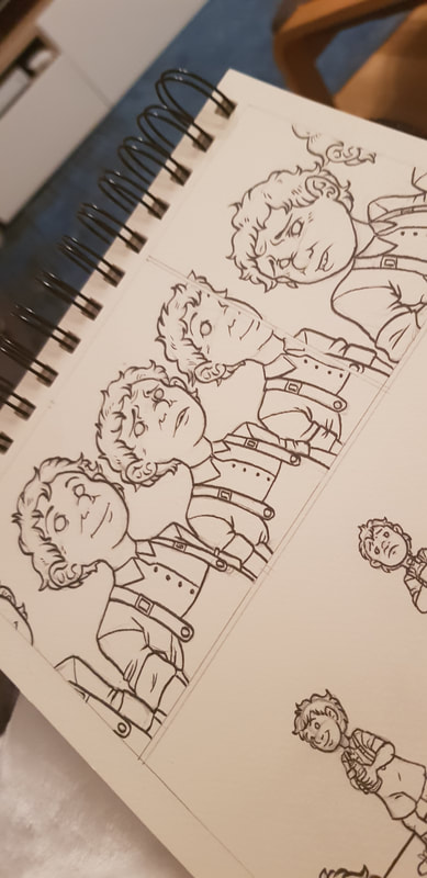
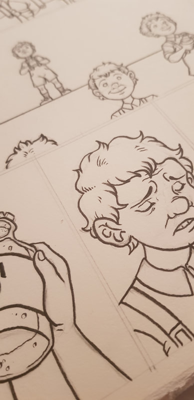
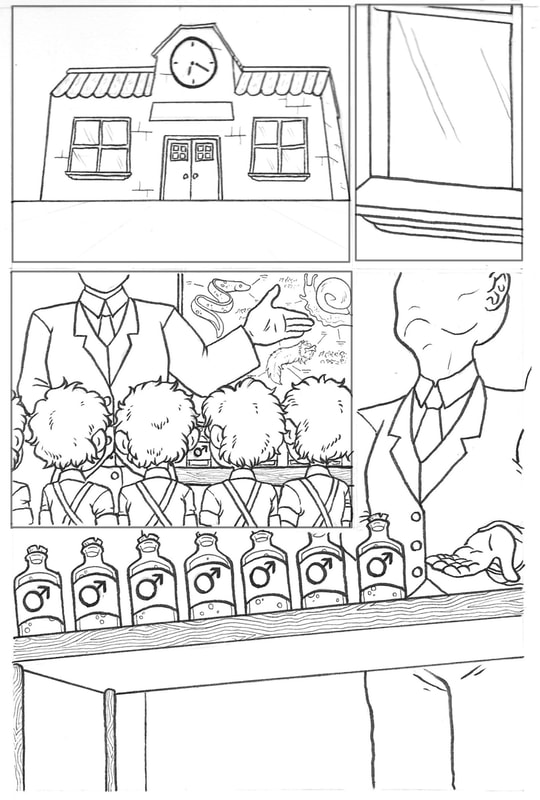
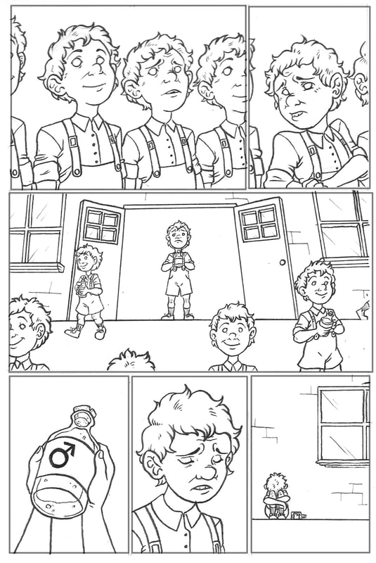
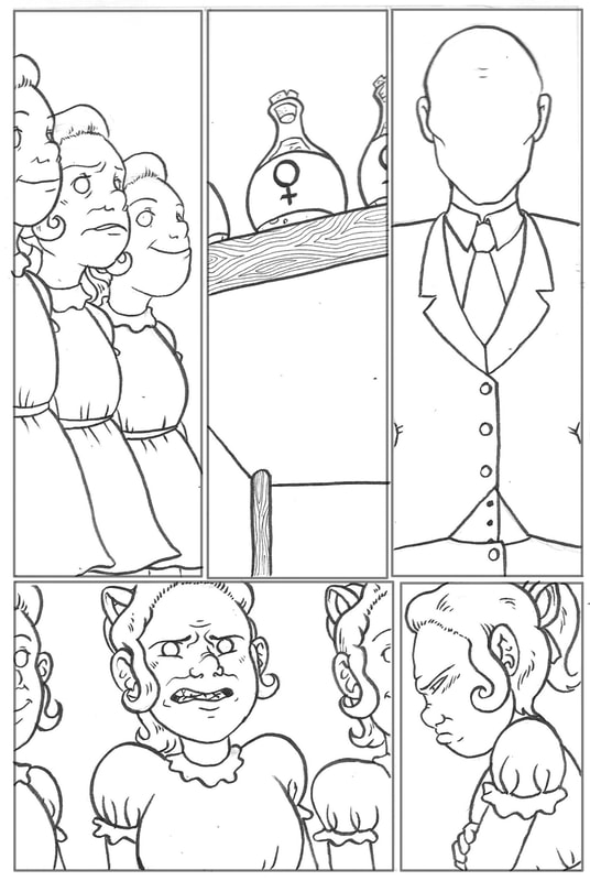
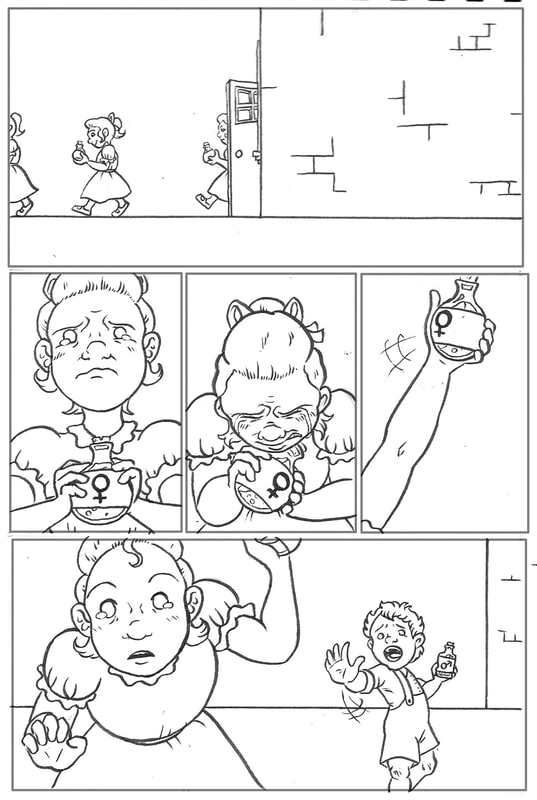
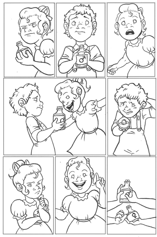
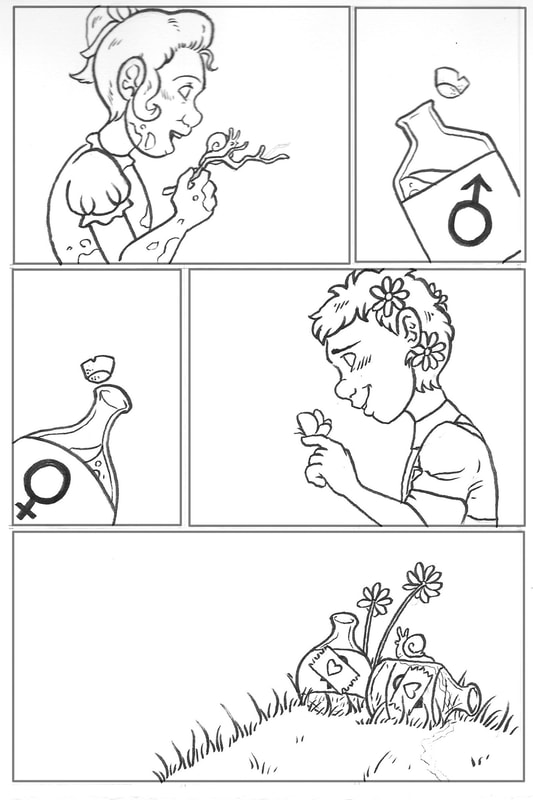
We've just completed our first project this semester. In groups, we were to make a 9 page comic based on our interpretation of the nursery rhyme we were assigned. For our group, our nursery rhyme was 'What Are Little Boys Made Of'.
I'll admit I was really quite excited that the first thing we were tasked with was a comic. I am a lover of graphic novels; I write a lot of fantasy literature, and I often try to put those stories into comic form as well. However, I am not the greatest at doing so - I was keen to learn more about the mechanics of comics in this project to help me develop this skill.
I'll admit I was really quite excited that the first thing we were tasked with was a comic. I am a lover of graphic novels; I write a lot of fantasy literature, and I often try to put those stories into comic form as well. However, I am not the greatest at doing so - I was keen to learn more about the mechanics of comics in this project to help me develop this skill.
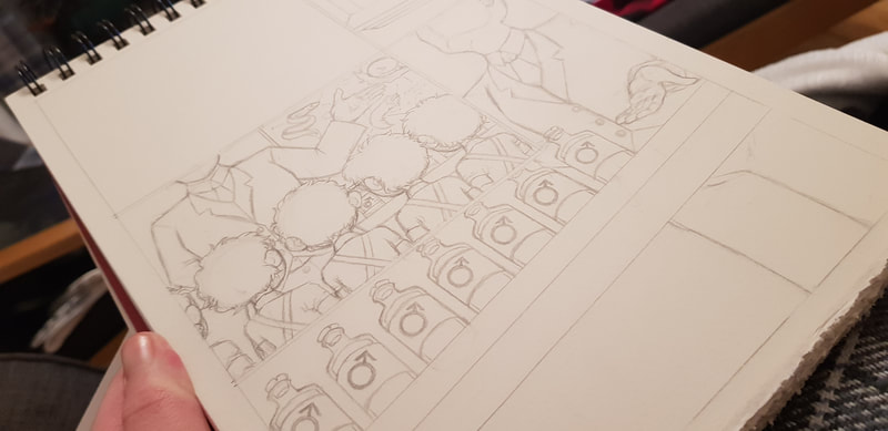
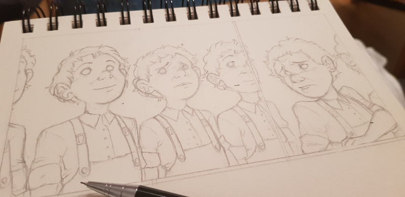
We decided the best way to split our workload between the three of us was to have one doing the linework, one on colouring and background/fine detail, and one pulling everything together with digital editing and layout. I was responsible for the linework; below you can see some pencil sketches plus the penned finals.
The entire project was a learning curve. For me personally, the most important things I learned were:
- TEAMWORK: the collaboration aspect of this project did prove to be a challenge. I have always found working in a group difficult; I struggle to put ideas forward, and feel like I'm talking out of turn when I do. I can stutter and ramble quite a bit when I'm nervous, and I am less adept at explaining myself verbally than I am in writing, which isn't helpful to the team. I had to learn to try and overcome these insecurities, and in doing so I learned the importance of communication; listening to my teammates, and suggesting things too. Brainstorming, narrowing down ideas and linking them together is what ultimately led us to our end result.
- TIMEKEEPING: once again, this is not something I am great at. In fact, I am rather terrible at time management. I learned that good timekeeping and organising your workload is extremely important in both solo and group work. Keeping on top of your work - and communicating with any teammates about where you are with it - ensures there is enough time for everything to be done to the best of your ability. Unfortunately for my team, I learned this the hard way by being late with the linework; this resulted in me rushing it a little, and leaving my teammates with less time to do their parts. This stress could have been avoided if I had a better grasp of time management, and I am determined to improve this throughout the course.
- COMIC COMPOSITION: from the reading materials we were given, I learned a lot about the mechanics of comics and how they actually work. A lot more work goes into the layout than I was previously aware of; the size and shape of the panels, the way they fit together, and the placement of their contents is key to creating a good flow. Something I found particularly useful was researching the "line of sight" method; an implied directional line that guides the eye smoothly with subtle, subconscious cues. These cues can be a character's position/movement/line of sight, visual background clues, or dialogue placement. Careful and deliberate placement of these cues moves the reader's eye smoothly from panel to panel, focal point to focal point, creating flow. In addition, panel size/shape/content can be manipulated to convey different impressions, senses and emotions.
LECTURE NOTES
Prior to 1853, much of Asia was unknown to Europeans. Early historical accounts were often distorted - the likes of Marco Polo and Voltaire painted a wildly inaccurate picture of China. However, despite their inaccuracy, these accounts still piqued the interest of the western world - they saw it as a primitive land of decadent secrets, open to their exploitation.
Japan itself was largely isolated for 220 years under the 'sakoku' ("closed country") policy, which severely restricted trade and contact between them and other countries. However, having piqued the interest of the west, they were forcibly opened by the Americans by threat. Thus began Europe's love affair with Japanese art.
The traditional Japanese art style, the precursor to what we now call manga, was completely new to Europe. Traditionally done on woodblocks, they were unlike anything seen before; such unusual rarities were of great value in the west, and the Victorian era saw them sold at incredibly high prices. Soon, the obsession with Japanese art and culture grew so intense it birthed the Japonisme movement.
Japan's Influence on Van Gogh
Many European artists were influenced by Japonisme, but I have chosen to focus on Vincent Van Gogh. I have a particular fascination with Van Gogh; not just his artwork, but his ideas and mentality. I was unaware of his interest in Japan, and it was intriguing to pull away from the "stereotypical" Van Gogh pieces and look at some of his lesser-known work that displayed this influence.
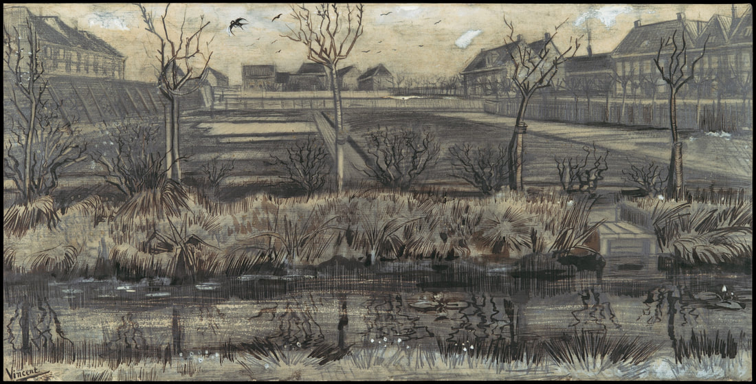
Van Gogh was a Dutch artist. He was born in 1853 - exactly the year Japan was opened to Europe, as aforementioned. This means that much of his work is influenced by Japonisme, but he did have a few different painting phases where the influence was much less noticeable. First, let's look at two pieces in which he heavily drew from Japanese art:
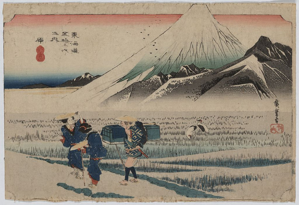
These pieces took my personal interest because they are so far from the stereotypical style we picture when we think of Van Gogh. We tend to think of the likes of 'Starry Night' (which, coincidentally, is also influenced by Hokusai's ukiyo-e woodblock print 'The Great Wave'), but his lesser-known work is equally interesting. Let's compare these two Van Gogh pieces to similar-looking examples of traditional Japanese art:
The piece on the left is ink on silk scroll, and the piece on the right is a ukiyo-e woodblock print (carved and inked). Even at a glance between these two traditional Japanese works and Van Gogh's later pieces, it's clear this style had a massive influence on him as an artist.
Before the emergence of Japonisme, European art in the early 1800s was largely characterised by paints and oils on canvas. However, driven by his fascination of the Japanese technique, Van Gogh broke from the norm by using pen and ink - dip pens, quill pens, reed pens - to mimic their style. As well as using similar mediums, he employed similar techniques - fine brush strokes and dots to detail foliage, grass and thatched rooftops, and bold lines of black ink brushed in a calligraphy-like way to outline the focal points of his paintings. Japonisme influenced his compositional technique as well; similar to traditional ukiyo-e, Van Gogh had a tendency to use trees, buildings and larger objects at the edge of his pieces to frame a bleaker central space. The use of fine, individual brush/pen strokes inspired by the Japanese ultimately led Van Gogh to develop the "unique" style we know him for.
Finally, for comparison, let's look at what Dutch artists before Van Gogh and the Japonisme movement were creating:
Wybrand Hendriks was born in Amsterdam in 1744, making him more than a century older than Van Gogh. As an artist, he existed between the Dutch Golden Age of painting and the Amsterdam Impressionism movement - as such, his paintings were very much realistic and done in oils. He was influenced by French realism, and had no influence whatsoever from Japan; after all, he never saw the opening of the country in his lifetime. Overall, 'The Milkmaid' is a stark contrast to the post-impressionist, Japonisme-inspired work of Van Gogh, which appears much less realistic and more abstract in appearance.
In this session, we focused on 'cultural texts'. Cultural texts can be works of design, art, film and so on; they are created by an individual or a group, but are informed by their surrounding society. This means that they often reflect, promote or even subvert cultural norms. We also looked at 'semiotics'; the study of signs, symbols... anything capable of conveying meaning.
We thought in particular about clothing as both a cultural text and an example of semiotics in society. Clothes obviously have a practical function in protecting us from the elements, but they definitely serve other purposes as well. As a lover of symbolism and a writer who often designs outer appearance to reflect inward character, I found this quite interesting to think about.
We thought in particular about clothing as both a cultural text and an example of semiotics in society. Clothes obviously have a practical function in protecting us from the elements, but they definitely serve other purposes as well. As a lover of symbolism and a writer who often designs outer appearance to reflect inward character, I found this quite interesting to think about.
- DISGUISE: clothes can conceal our bodies for modesty, and in some sense to mitigate our animalistic nature and origins. They can also affect visual impact by changing the way the body looks and moves; they can even change the way you feel (like "power dressing" to feel more confident).
- CULTURAL MARKERS: clothes show culture in flux; it is ever-changing. Clothes visually mark different time periods and eras (even down to how we commercially market certain clothes in "seasons" or "trends").
- PERSONAL EXPRESSION: clothes can express an individual's character, mood and identity. First impressions are often visual - we may not realise it but, subconsciously, what someone looks like and what they are wearing will contribute to our initial judgement.
- EXPRESSING ALLEGIANCE: clothes can signify an individual's bias, viewpoints and political leanings. They can mark separation from the mainstream, and allegiance to subcultures (eg. goth, punk, gangs, etc.).
- SOCIAL STATUS: visual appearance can directly correlate to social ranking, making clothes a mark of status which can be used as controlling devices (eg. workplaces, military uniform, etc.). They can also denote societal roles (eg. age, gender, career, religion, etc.).
- SYMBOLIC ENCODING: colour, pattern or the way something is worn can mean different things in different cultures. For example, we familiarise the colour white with weddings and sacrament, whereas in traditional Japanese culture it was used in mourning.
| BLOG TASK I chose my burgundy bomber jacket to analyse for this task. Bomber jackets originated from military flight jackets; originally designed for the pilot's warmth at high altitude, they were made of heavy duty leather with a cinched waist and cuffs. Original jackets were a dark blue, evolving to sage green during the Vietnamese war for forest camouflage. |
My jacket, however, is quite different from its original ancestors. It is still made of leather, but it is no longer heavy duty - it is lightweight, and would be rather impractical for flight. The colour has also diverged from the discreet sage green to a stand-out red. This suggests this jacket was designed for style rather than practicality (form over function).
From a different perspective, despite the material being lightweight, it is still leather; a material with an ingrained connotation of toughness and durability in harsh conditions. This strikes me as symbolic for a "thick skin"; a hard shell masking a much more vulnerable interior. Personally, I feel this is rather accurate - I will often joke around or react defensively to hide my nerves. The colour adds to this idea; red is often associated with danger and warning, but burgundy is a rather muted shade. This could be interpreted as the wearer giving a "back off" signal, but likely because they are more nervous than aggressive.
The shape of the jacket is rather gender-neutral and athletic. Its looseness and generous chest space can conceal a stereotypical feminine silhouette, accurately suggesting that I do not identify as a stereotypical female (or, in other words, a "girly girl"). The tailored waist and cuffs give off a sense of neatness.
The manufacturer is a low-grade, practically unheard-of brand, suggesting that I am not one for capital pleasures and do not aim to impress or flaunt status. Bomber jackets are typically adopted by subcultures (eg. punk), implying a divergence from the mainstream.

