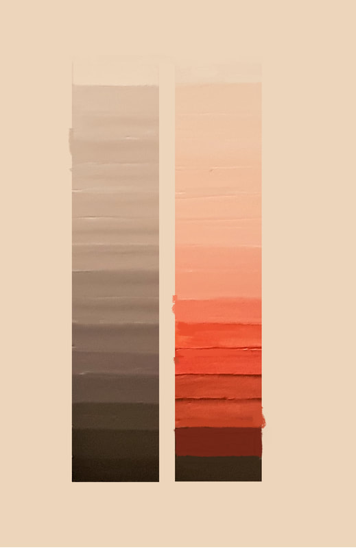
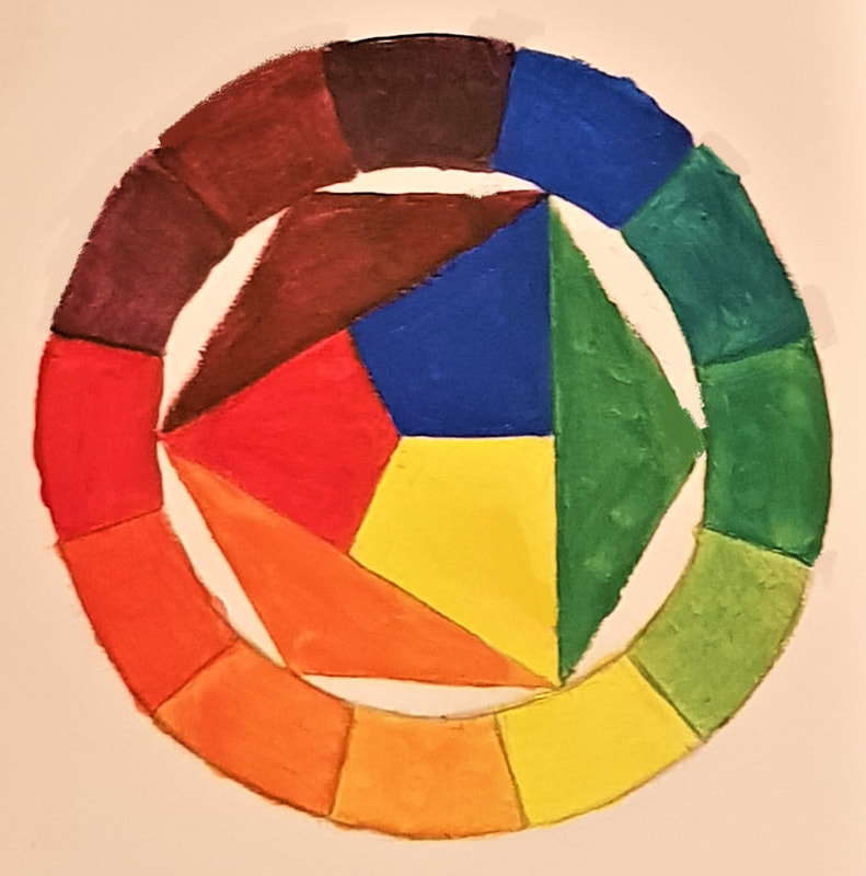
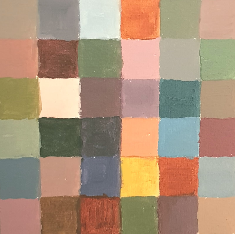
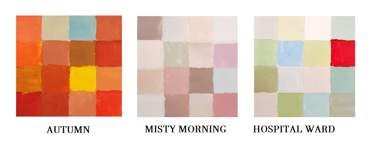
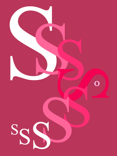
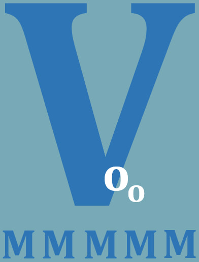
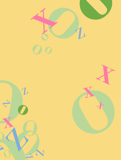
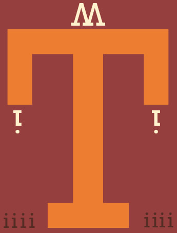
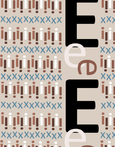
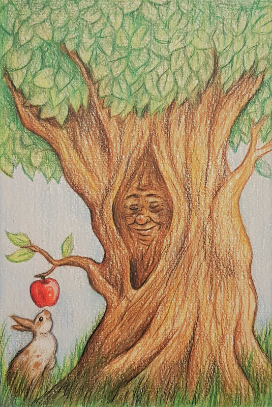
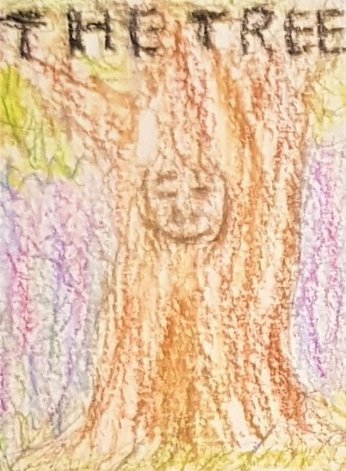
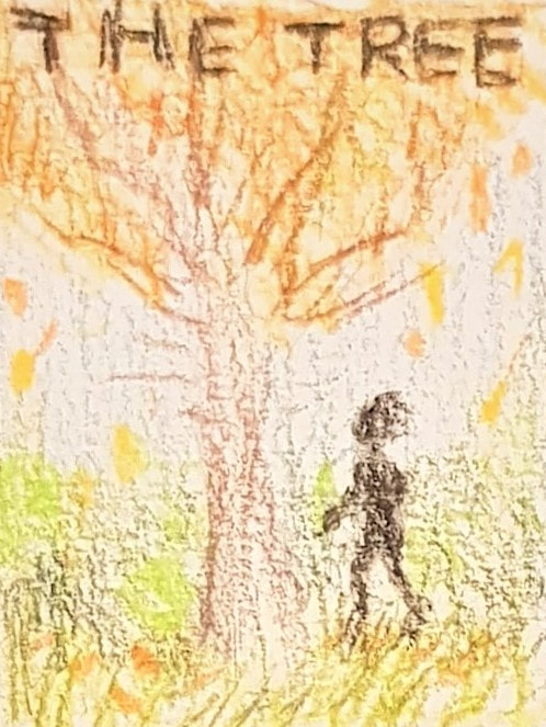
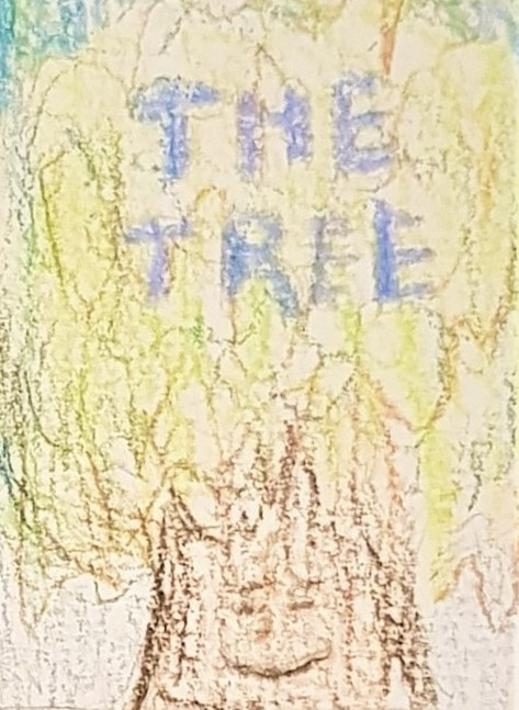
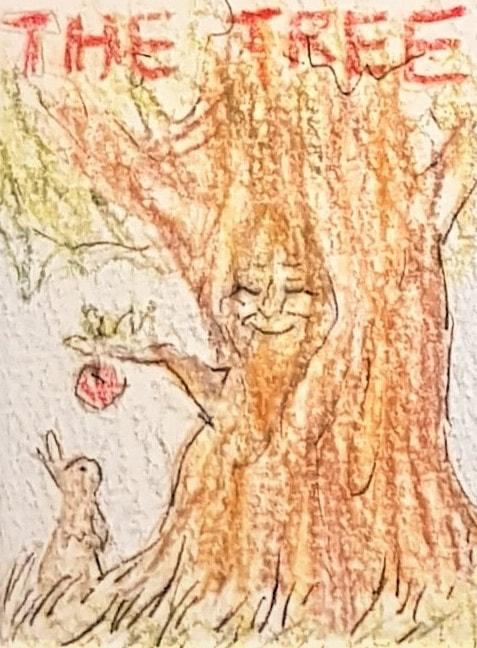
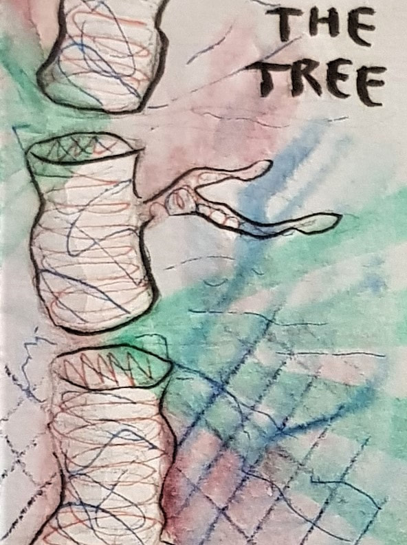
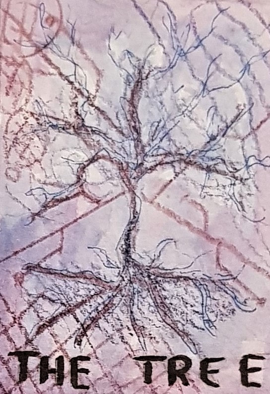
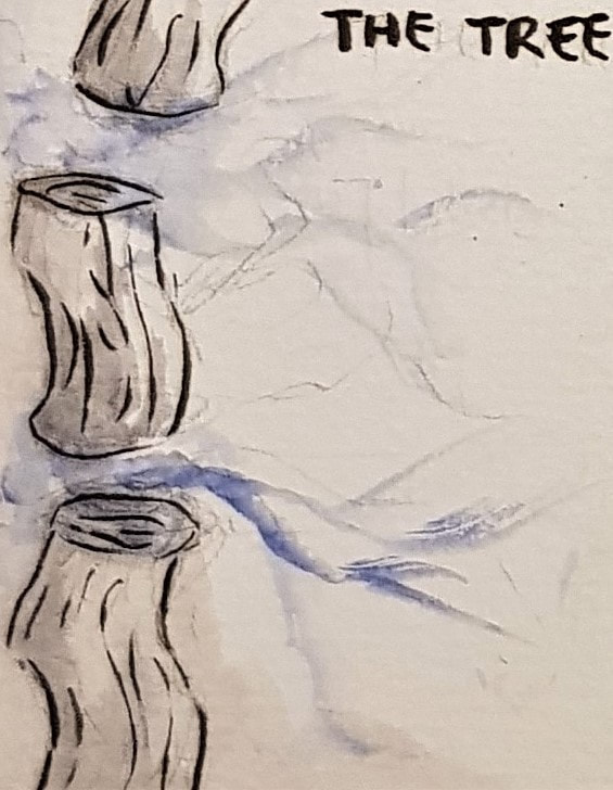
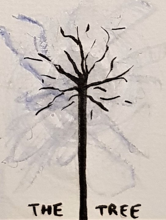
Colour Theorycolour exercises in acrylic These exercises using paint were interesting, and useful for developing my understanding of colour and tone. Of all mediums, paint is definitely one of my least used and most feared. I often work with ink and markers, so having to mix my own shades was quite challenging. I particularly found the 16 step scale difficult, as I struggled to match "equal" tones between different colours. My attempt is not the best, but at least it lets me know what I need to work on. For the Bauhaus personality exercise, we were to mix colours we found appealing. In doing so, I ended up with a rather eclectic collection. This fits me quite well, in a sense - I am a terribly indecisive, open-minded "shades of grey" person, so a lot of different colours appeal to me for different reasons. Saying that, however, one similarity between the majority of my chosen colours is that they can be found in the natural world. This is very much my comfort zone; I am instinctively drawn to natural colours (florals, etc), and repelled by more synthetic-looking ones (I have a burning hatred for hot pink, lime green, and anything neon). Bauhaus theme exercises in acrylic The next part of the exercise was fun. We had to do smaller versions of the Bauhaus square exercise, but using colours we associated with prompt titles this time. I particularly enjoyed the natural settings and the hospital ward - since I have spent a lot of time in these settings, I found it interesting to think of the most prominent colours my brain associates with them. Designing with TypeFor the typography exercise we were given a list of fonts, and a list of concepts to convey. We had to match each concept to the font we thought represented it best, and construct visuals consisting only of letterforms. For "feminine", I chose Helvetica - the supple curve of this font seemed to fit well with the typical idea of the feminine shape. I chose curvy letters to emphasise this, and based the shape of the design on the female reproductive system. For "masculine", I chose Clarendon - this is a slightly thicker, stiffer font than Helvetica, so I thought it fitted well with the idea of the male body biologically consisting of more muscle than fat. I chose the letter V as the focal point of the design as a reference to the typical idea of the male shape. For "playful", I chose Bodoni - I tried to make the design as eclectic and random as possible to convey the speed and humour of someone's dialogue when they're feeling playful. I also incorporated the idea of childhood by using pastel colours and "tumbling" letters to look like building blocks. For "power", I chose Rockwell - this is a very bold and imposing font which I thought fitted the concept well. Personally "power" made me think of society, so I used one giant letter as the 'figure of authority' (with a 'crown' and 'high-profile individuals' at their fingertips) with the 'commoners' down below. For "pattern", I chose Calibri - this is a very 'general' font, which made it the most suitable for the binary-style visual I wanted to create. Other influences for the design were tartan and argyle patterns. For "scale", I chose Myriad Pro - this seemed like the most clinical font, which suited the idea of scale and technical measurement. I incorporated three scale ideas into one visual tone, general size (technical scale) and height - and chose a letter that stacked well to show this effectively. CompositionFor this activity, we were tasked with creating three book covers - a children's book, a science fiction novel, and a psychological horror - all titled 'The Tree'. Each cover had to be in the style of one of the illustrators mentioned in the brief, and we had to choose which fitted which book genre. I chose to match Anne Yvonne Gilbert's style with the children's cover. Gilbert's work features coloured pencils and a vast array of tone, particularly soft florals and naturals. I found the pleasant, fantastical feel of her illustrations almost fairytale-like, and thus well-suited a children's novel. I tried to use similar colour schemes and a fantasy approach, whilst keeping the image bright and positive to appeal to a youthful audience. I added a rabbit and an apple, to give a secondary sentient focal point and a bright contrast, which would hopefully hint at a storyline and pique a child's attention. For the science fiction cover, I tried to replicate the style of Charles Keeping. Keeping used pen and ink, often utilising abstraction and vibrant clashing colours to give a surreal feel to his work. I thought the illusionary, ethereal vibes of his style were suited to the concept of science fiction. I aimed to use clean black brushstrokes and a white base colour for the main focus (the tree), and contrast that with a coloured background and some more vibrant, abstract highlights. I had the idea to split the tree into sections and have electronic pathways emerging from the gaps - this was an attempt to give the 'tree' a dual identity as a wire, with reference to a motherboard,
0 Comments
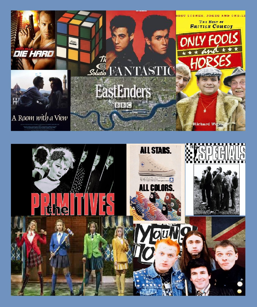
The cultural texts of 1980s Britain can be separated into official culture and unofficial culture. The former consists of popular media - films, TV, art and design - that was mainstream, commercially produced and reflected cultural norms. The latter consists largely of small scale media that appealed to the working class and cult followings - inspired by the political events of the times, unofficial culture was contrarian and rebelled against the Thatcherite zeitgeist.
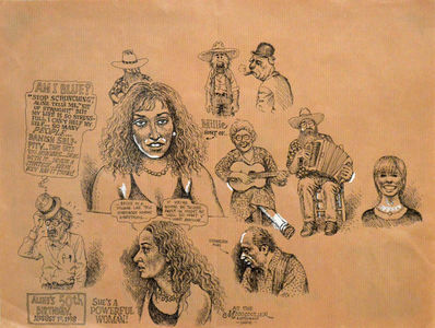
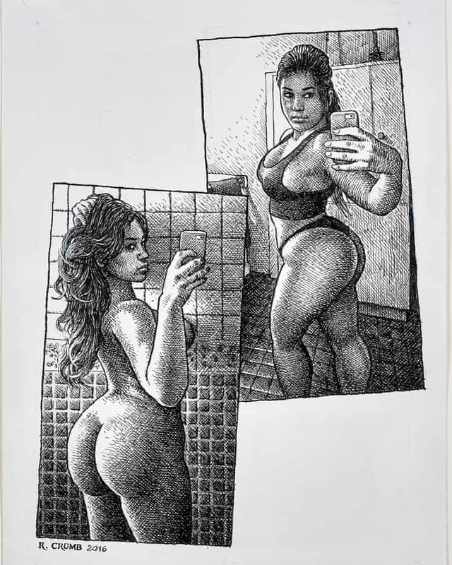
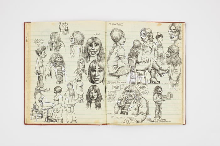
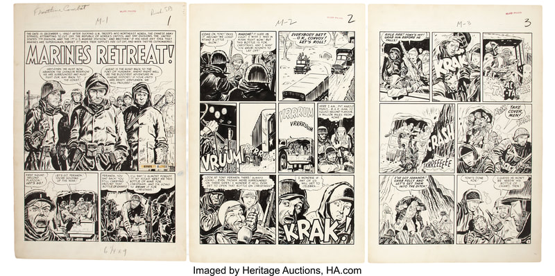
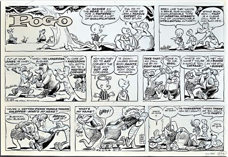
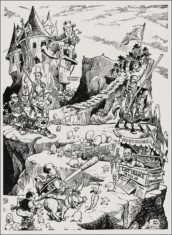
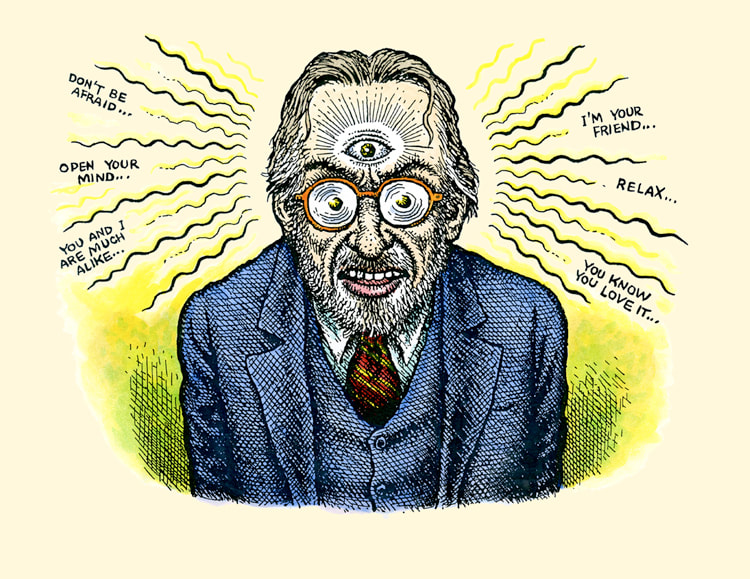
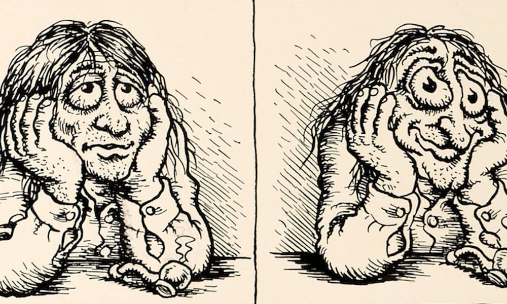
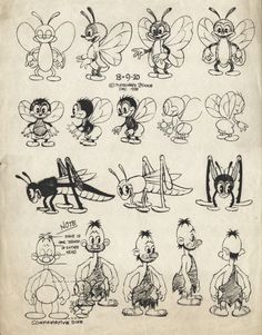
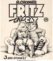
The task for this session was to create a visual moodboard halved into examples of official and unofficial culture. On the top half of my moodboard are official examples, such as the TV show 'Only Fools and Horses' which gained a mass commercial following in 80s Britain. On the bottom half of the moodboard are unofficial examples, such as the indie band 'The Primitives' which earned a more cult following. Robert Dennis Crumbillustrations by Robert Crumb Robert Dennis Crumb (commonly signing his works as 'R. Crumb') is an American counterculture cartoonist. Born into an age where traditional cultural norms were being actively challenged, Crumb became a huge name in the world of counterculture art. Crumb's sketchbook (above) compared to the work of Kurtzman (below left) and Kelly (below right) - note the similarities in fine, black and white linework and crosshatch shading In terms of technical form, Crumb's style is very reminiscent of late 19th-/early 20th-century cartoons, which he drew from heavily. Inspired by the likes of animator Max Fleischer and cartoonist Carl Banks, his illustrations feature heavily crosshatched pen and ink, mostly done in black and white. However, following a particularly intense LSD trip, his style developed into a slightly more surreal, psychedelic one. This can be seen clearly in the work he produced during his time working with Underground Comix, inspired by his own trips and psychedelic poster art. psychedelic inspired cartoons by Robert Crumb In terms of subject and outlook, Crumb's work conveys a certain contempt for contemporary American life. He employs scathing satire, an erotic fixation and a bold irreverence which ultimately made his name famous. He was particularly inspired by the use of satire in cartoonist Harvey Kurtzman's work, who was his mentor for a number of years. Interestingly, contrary to the inappropriate nature of his own work, Crumb also drew influence from Walt Disney animator Walt Kelly. Crumb's cartoon 'Fritz the Cat' (right) compared to the work of Max Fleischer, creator of 'Felix the Cat' (left) - note the similarities in exaggerated cartoon features such as the eyes, anthropomorphism, and blatant character-lifting Though perhaps not an "artistic" influence, I feel it is well worth mentioning the effects Crumb's personal life had on his work. Born into a heavily Catholic family, Crumb has stated he was "born weird". Intrigued, I researched further and found a number of striking facts about his early life which, from a psychological perspective, I believe correlate directly to his erotic fetishes.
His father was a military illustrator, suggesting a strict (and religious) upbringing, and his mother reportedly abused diet pills and other medications. He had four siblings - two sisters, and two brothers (both of whom suffered from mental illnesses also related to sexual fixation and urges). He attended a Catholic school, taught by nuns and teachers who discouraged his interest in cartoons. All this combines into what I personally interpret as a horrendously stressful and oppressive environment for a growing child - one which could fuel hatred and mental stability as an adult. Crumb has confirmed some of this in interviews. He has spoken of his painful struggle to fit in during his adolescence, stating that it allowed him to develop his own aesthetic ideals contrary to Hollywood's concept of attractiveness. With much of his work featuring graphic, sexual imagery of women, he admits that the fixation is partly fuelled by a hatred for the female sex. He states that the nuns terrified him, he was rejected by girls throughout his youth... That alongside the knowledge of the image he probably had of his addict mother as a child, you can kind of see a root to his anger towards women in general.
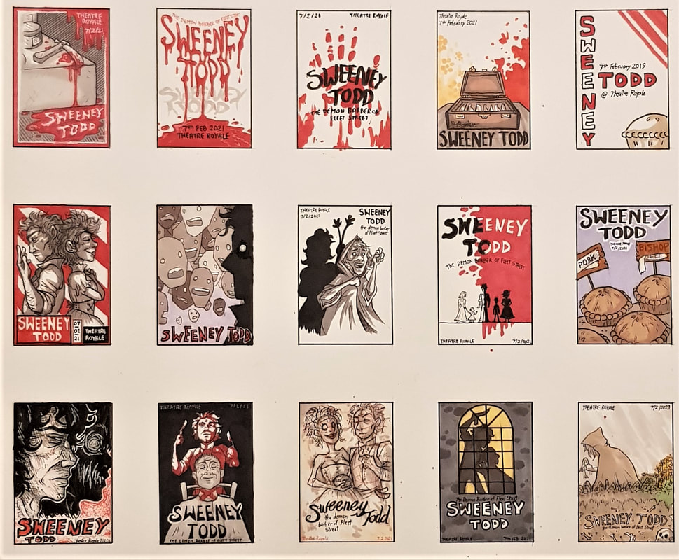
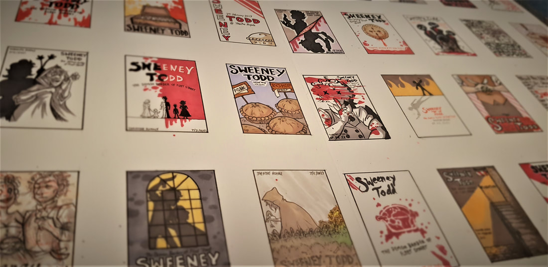
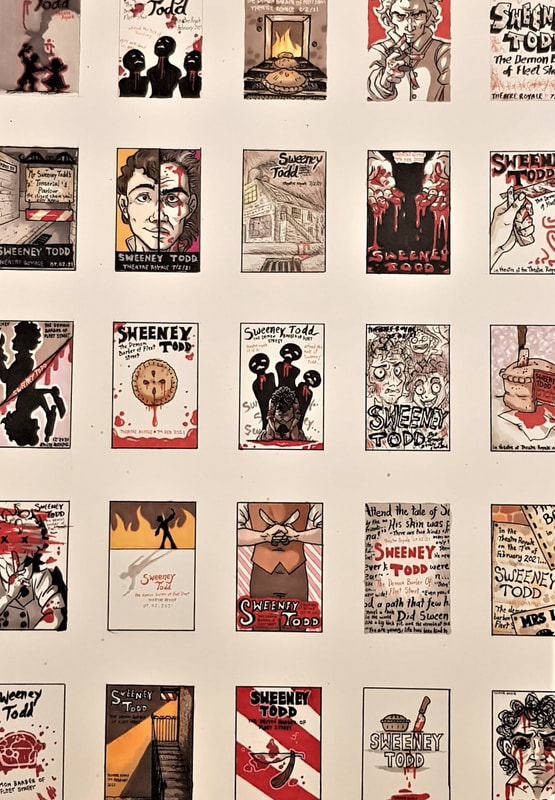
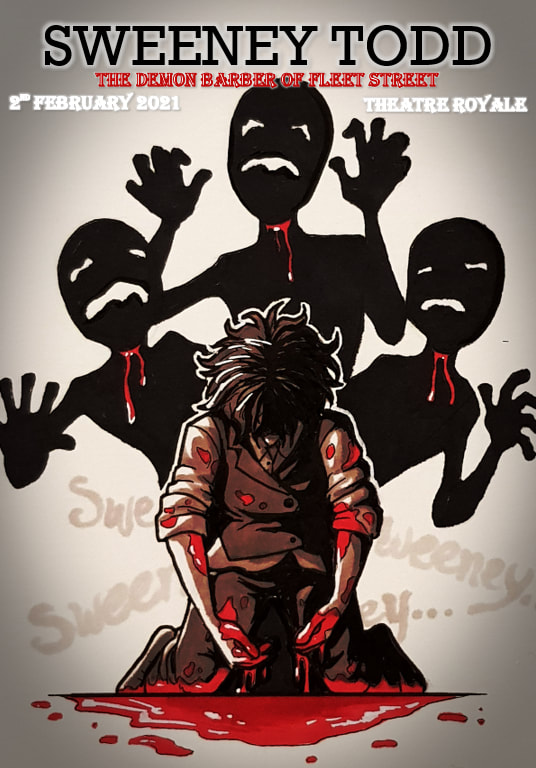
perspective from multiple angles. I am glad I chose to do this, since coming up with 40 different ideas for thumbnails proved to be quite difficult. Having knowledge of the play, its script, its music and the film adaptation definitely helped with generating ideas. Some of the thumbnails use symbolism and subtle details from the script, whilst others are much more literal - either way, I tried to create images that didn't give too much of the plot away, 40 thumbnail visuals I also made sure to keep in mind that our task was to produce a theatre poster, not a film poster. I find the two often differ greatly; film posters tend to be more cinematic, utilising modern photography and digital effects. Theatre was around long before we had these tools at our disposal - traditionally, other than word of mouth, the only real way to advertise an upcoming play was via illustration. Many modern theatre posters still champion this method, favouring illustration and graphic design over photography and often appearing more stylised than realistic. The aim of any advertisement poster is to draw the viewer's attention to the product. Ideally, it should visually pique their interest, encouraging them to consider said product. To do this, an effective combination of colour, composition and subject must be used. Right away, with Sweeney Todd as my "product", I knew I would be making good use of a bleak and minimalistic colour scheme. 3 final client visuals I chose to use only red, black and white in my finals. Red and white are of course the trademark colours of a barber - historically, this was to symbolise their practice of bloodletting, and the white bandages used to stem the bleeding. This (rather beautifully) correlates directly to the plot of Sweeney Todd. Adding black provided depth and contrast, resulting in stark images that both draw the eye and convey the morbid themes of the play.
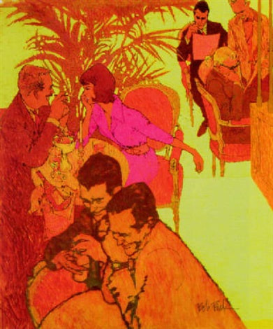
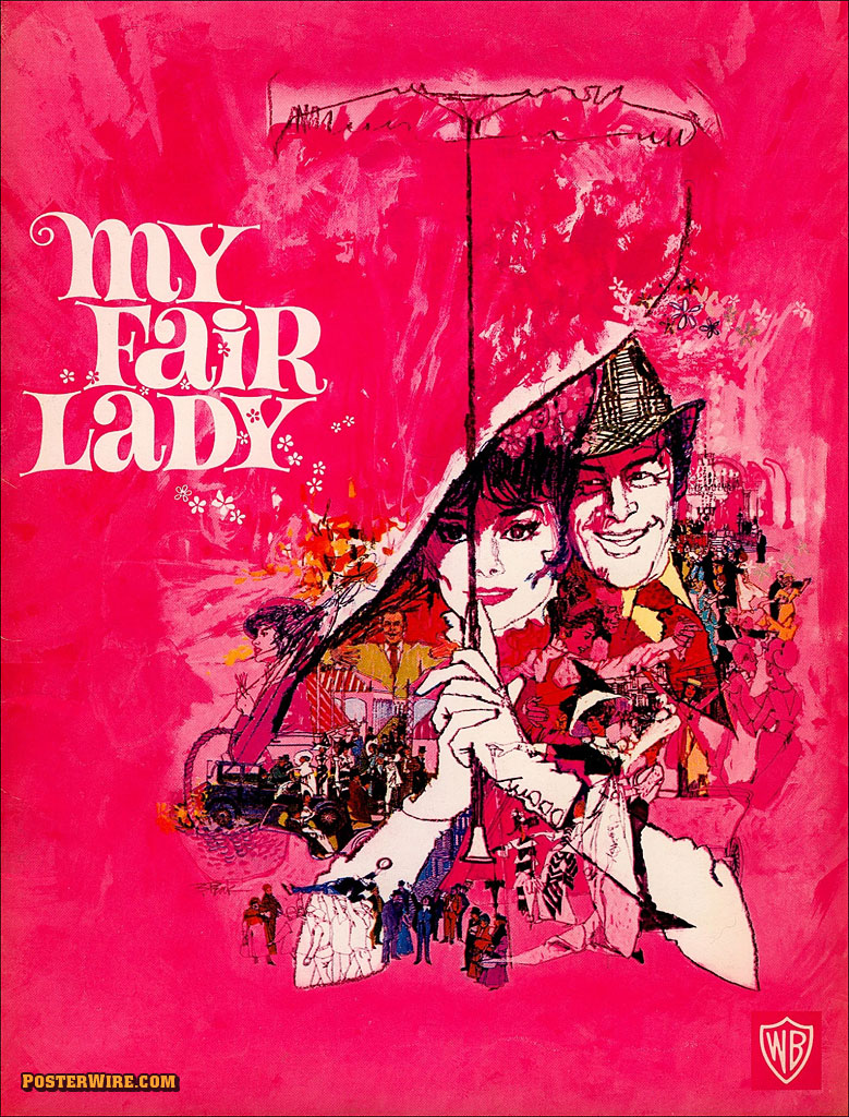
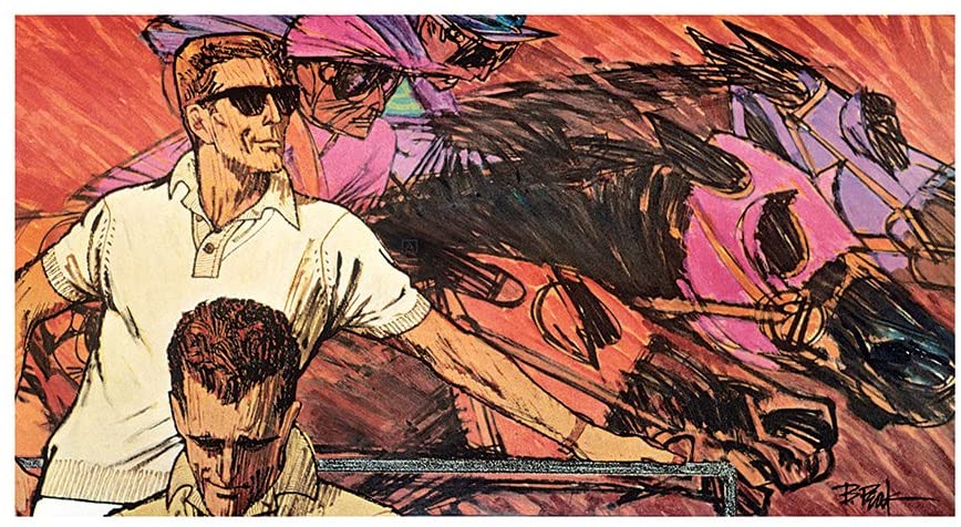
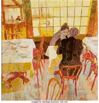
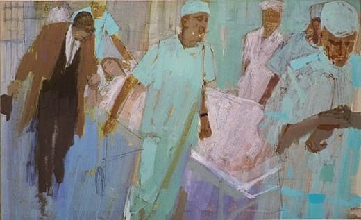
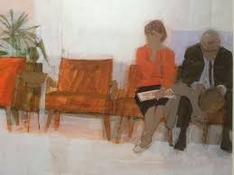
The three ideas I chose to finalise experimented with differing perspectives and interpretations. For example, I explored the use of the worm's view in one; placing Todd behind his unknowing victim to create dramatic effect, and convey a predatory sense of power. For the others, I chose to portray Todd himself as the victim. He states in the play that his former self is "dead" - this made me visualise his tragic past as a fatal wound, slowly bleeding out as he tortures himself with his pursuit of revenge. It seemed effective to make this fatal wound the same one he inflicts on his victims. Bob Peakillustrations by Bob Peak An American commercial illustrator, Bob Peak eventually came to be known as 'the father of the modern movie poster'. He earned this title through his famous poster work in the mid 90s - gaining a reputation after being hired to illustrate a poster for 'West Side Story', he went on to be hired as the illustrator for many other famous posters. He also illustrated for advertisements, alongside producing his own original illustrations. Though some of his illustrations lapse into more cartoon-like territory, Peak's work is mainly defined by a realistic style featuring unnaturally bright, often neon colours. Take his poster for the film 'My Lady Fair' - the entire background is a very "out there" shade of hot pink. Such an unmissable colour would catch the viewer's eye even from a distance. In contrast, the central illustration is done mostly in stark blacks and whites; only the figures of the main characters are lined and shaded boldly, highlighting their importance as protagonists. The eye then moves progressively to smaller detailed scenes around the focal point; these are coloured in an orange so similar to the pink that they appear undefined from afar. This is a clever trick to draw the viewer closer, making them pay more attention to the poster to quench their curiosity. Overall, the eye-catching combination of bright colours and stark contrasts is extremely effective for advertisement - whether it be a new clothing range or an upcoming film, his work was sure to draw the attention of the public to the product at hand. This ultimately lead to his famed reputation and his rise to success in commercial illustration. Bernie Fuchsillustrations by Bernie Fuchs Another notable mid-90s American illustrator was Bernie Fuchs. As a trumpet player, Fuchs' initial ambition was to be a musician. However, after losing three fingers in an industrial accident, he turned his attention to art despite having no experience. After graduating from university, he began his career illustrating car advertisements - word of his talent spread fast and soon he was a much sought-after illustrator, going on to work in magazines and portraiture. Fuchs had somewhat of a fascination with mundane scenes - the everyday man and his everyday activities. In theory, these should be boring concepts for an illustration. But Fuchs had a gift for making the mundane extraordinarily eye-catching. His paintings lacked bold lining, instead using stark colour contrasts to define people and objects. He had a tendency to use warm tones, but would tailor his colour schemes to the subject of the painting (note the pale clinical colours of the hospital illustration against the warmth of the café scene). However, the defining quality of Fuchs' style is the bizarre angles he chooses to illustrate from. His odd use of perspective hints at abstraction. By showing everyday life from rarely-used angles, he creates art from the ordinary - turning familiar scenes into new ones, if you will. This draws the viewer's attention despite the lack of action in his scenes. Practical Task |
Site powered by Weebly. Managed by 34SP.com

