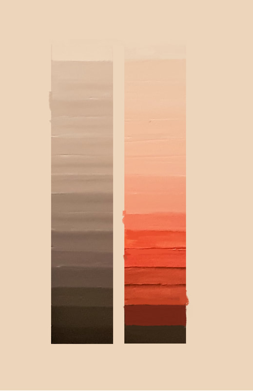
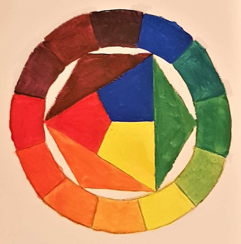
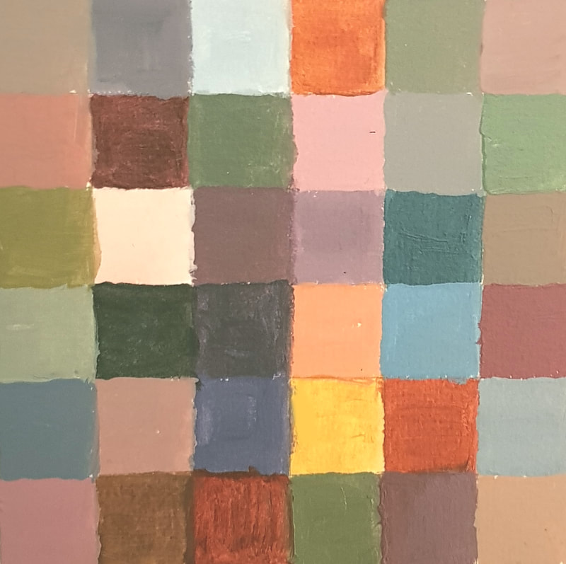
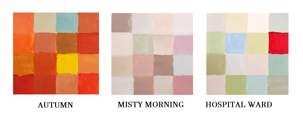
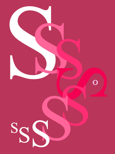
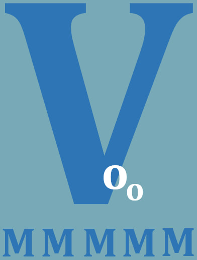
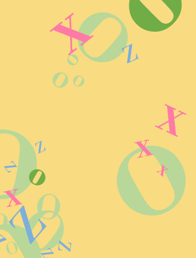
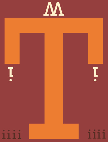
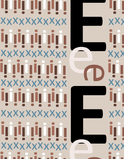
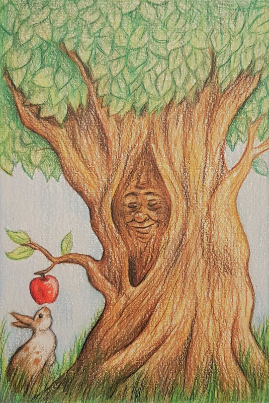
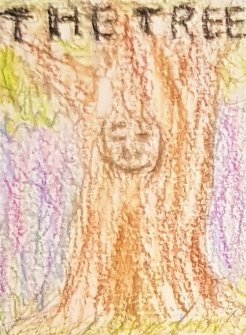
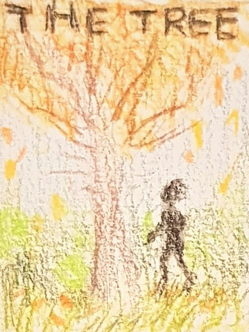
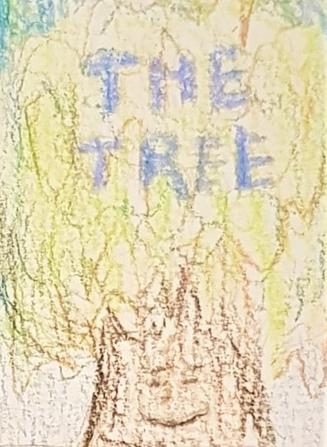
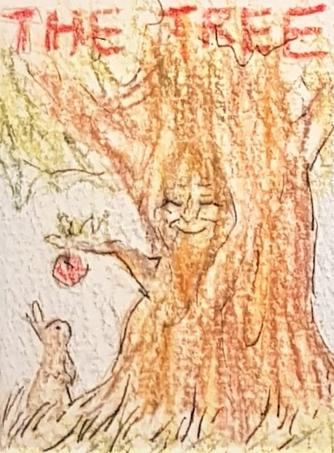
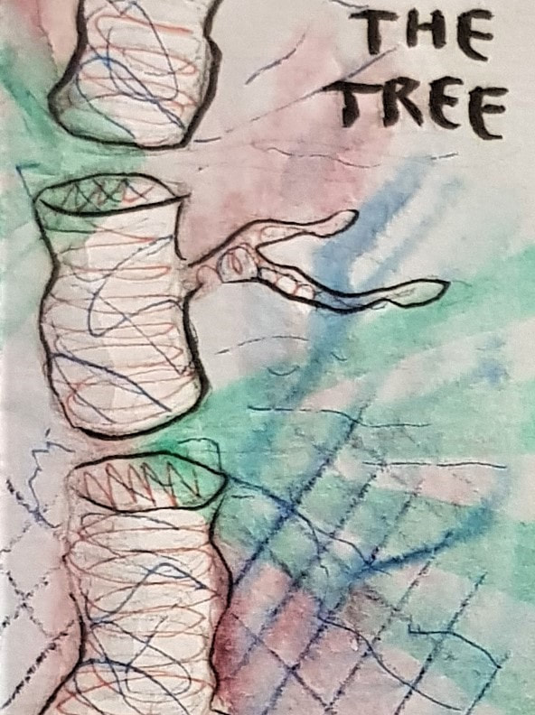
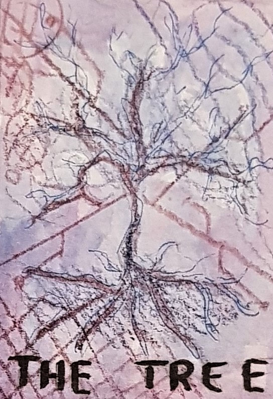
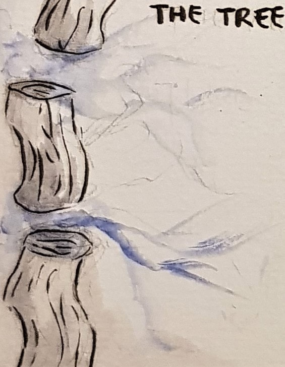
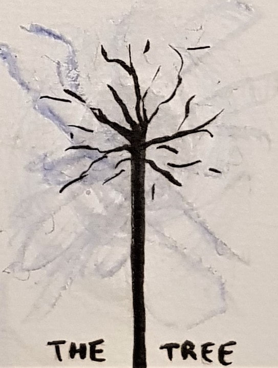
Colour Theorycolour exercises in acrylic These exercises using paint were interesting, and useful for developing my understanding of colour and tone. Of all mediums, paint is definitely one of my least used and most feared. I often work with ink and markers, so having to mix my own shades was quite challenging. I particularly found the 16 step scale difficult, as I struggled to match "equal" tones between different colours. My attempt is not the best, but at least it lets me know what I need to work on. For the Bauhaus personality exercise, we were to mix colours we found appealing. In doing so, I ended up with a rather eclectic collection. This fits me quite well, in a sense - I am a terribly indecisive, open-minded "shades of grey" person, so a lot of different colours appeal to me for different reasons. Saying that, however, one similarity between the majority of my chosen colours is that they can be found in the natural world. This is very much my comfort zone; I am instinctively drawn to natural colours (florals, etc), and repelled by more synthetic-looking ones (I have a burning hatred for hot pink, lime green, and anything neon). Bauhaus theme exercises in acrylic The next part of the exercise was fun. We had to do smaller versions of the Bauhaus square exercise, but using colours we associated with prompt titles this time. I particularly enjoyed the natural settings and the hospital ward - since I have spent a lot of time in these settings, I found it interesting to think of the most prominent colours my brain associates with them. Designing with TypeFor the typography exercise we were given a list of fonts, and a list of concepts to convey. We had to match each concept to the font we thought represented it best, and construct visuals consisting only of letterforms. For "feminine", I chose Helvetica - the supple curve of this font seemed to fit well with the typical idea of the feminine shape. I chose curvy letters to emphasise this, and based the shape of the design on the female reproductive system. For "masculine", I chose Clarendon - this is a slightly thicker, stiffer font than Helvetica, so I thought it fitted well with the idea of the male body biologically consisting of more muscle than fat. I chose the letter V as the focal point of the design as a reference to the typical idea of the male shape. For "playful", I chose Bodoni - I tried to make the design as eclectic and random as possible to convey the speed and humour of someone's dialogue when they're feeling playful. I also incorporated the idea of childhood by using pastel colours and "tumbling" letters to look like building blocks. For "power", I chose Rockwell - this is a very bold and imposing font which I thought fitted the concept well. Personally "power" made me think of society, so I used one giant letter as the 'figure of authority' (with a 'crown' and 'high-profile individuals' at their fingertips) with the 'commoners' down below. For "pattern", I chose Calibri - this is a very 'general' font, which made it the most suitable for the binary-style visual I wanted to create. Other influences for the design were tartan and argyle patterns. For "scale", I chose Myriad Pro - this seemed like the most clinical font, which suited the idea of scale and technical measurement. I incorporated three scale ideas into one visual tone, general size (technical scale) and height - and chose a letter that stacked well to show this effectively. CompositionFor this activity, we were tasked with creating three book covers - a children's book, a science fiction novel, and a psychological horror - all titled 'The Tree'. Each cover had to be in the style of one of the illustrators mentioned in the brief, and we had to choose which fitted which book genre. I chose to match Anne Yvonne Gilbert's style with the children's cover. Gilbert's work features coloured pencils and a vast array of tone, particularly soft florals and naturals. I found the pleasant, fantastical feel of her illustrations almost fairytale-like, and thus well-suited a children's novel. I tried to use similar colour schemes and a fantasy approach, whilst keeping the image bright and positive to appeal to a youthful audience. I added a rabbit and an apple, to give a secondary sentient focal point and a bright contrast, which would hopefully hint at a storyline and pique a child's attention. For the science fiction cover, I tried to replicate the style of Charles Keeping. Keeping used pen and ink, often utilising abstraction and vibrant clashing colours to give a surreal feel to his work. I thought the illusionary, ethereal vibes of his style were suited to the concept of science fiction. I aimed to use clean black brushstrokes and a white base colour for the main focus (the tree), and contrast that with a coloured background and some more vibrant, abstract highlights. I had the idea to split the tree into sections and have electronic pathways emerging from the gaps - this was an attempt to give the 'tree' a dual identity as a wire, with reference to a motherboard,
0 Comments
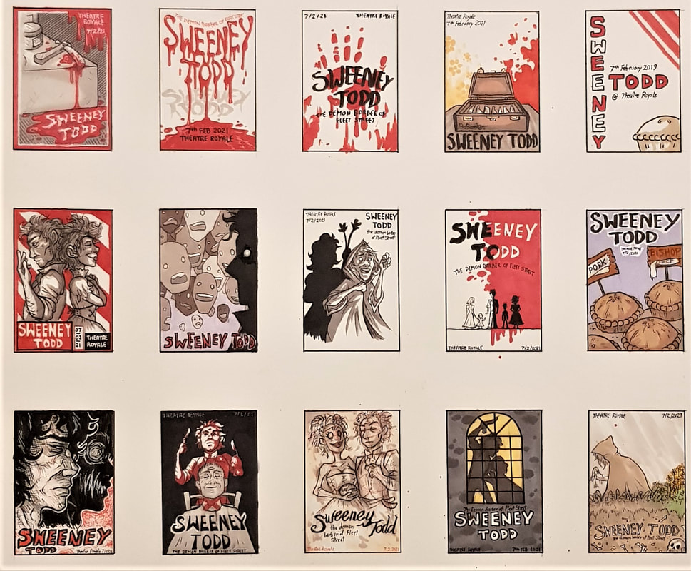
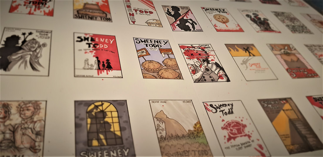
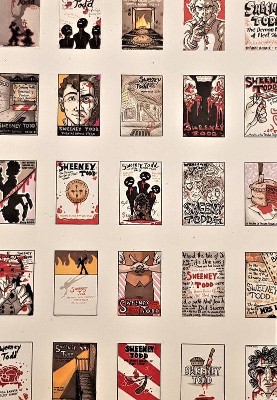
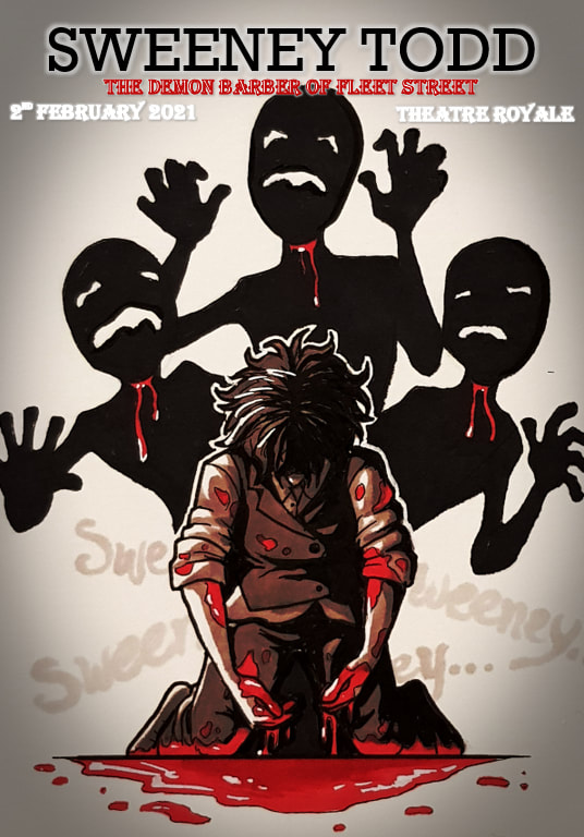
perspective from multiple angles. I am glad I chose to do this, since coming up with 40 different ideas for thumbnails proved to be quite difficult. Having knowledge of the play, its script, its music and the film adaptation definitely helped with generating ideas. Some of the thumbnails use symbolism and subtle details from the script, whilst others are much more literal - either way, I tried to create images that didn't give too much of the plot away, 40 thumbnail visuals I also made sure to keep in mind that our task was to produce a theatre poster, not a film poster. I find the two often differ greatly; film posters tend to be more cinematic, utilising modern photography and digital effects. Theatre was around long before we had these tools at our disposal - traditionally, other than word of mouth, the only real way to advertise an upcoming play was via illustration. Many modern theatre posters still champion this method, favouring illustration and graphic design over photography and often appearing more stylised than realistic. The aim of any advertisement poster is to draw the viewer's attention to the product. Ideally, it should visually pique their interest, encouraging them to consider said product. To do this, an effective combination of colour, composition and subject must be used. Right away, with Sweeney Todd as my "product", I knew I would be making good use of a bleak and minimalistic colour scheme. 3 final client visuals I chose to use only red, black and white in my finals. Red and white are of course the trademark colours of a barber - historically, this was to symbolise their practice of bloodletting, and the white bandages used to stem the bleeding. This (rather beautifully) correlates directly to the plot of Sweeney Todd. Adding black provided depth and contrast, resulting in stark images that both draw the eye and convey the morbid themes of the play.
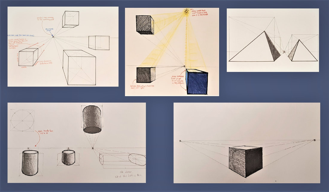
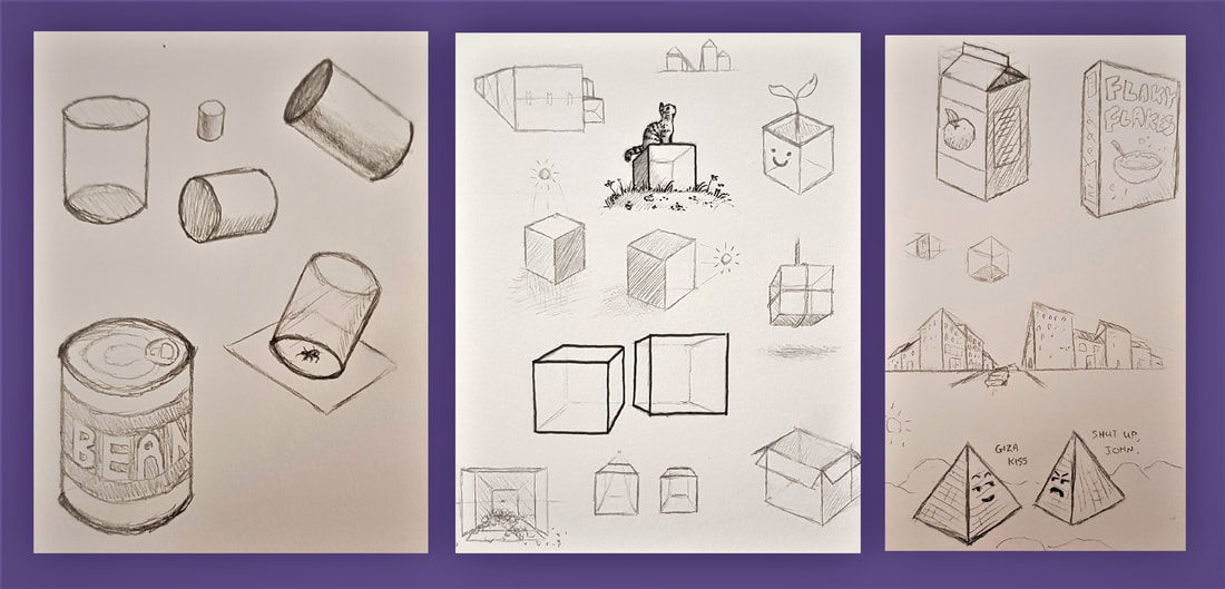
The three ideas I chose to finalise experimented with differing perspectives and interpretations. For example, I explored the use of the worm's view in one; placing Todd behind his unknowing victim to create dramatic effect, and convey a predatory sense of power. For the others, I chose to portray Todd himself as the victim. He states in the play that his former self is "dead" - this made me visualise his tragic past as a fatal wound, slowly bleeding out as he tortures himself with his pursuit of revenge. It seemed effective to make this fatal wound the same one he inflicts on his victims. Perspective has always been something I have struggled with in my artwork; technical measures and spatial positioning have always confused me. I was apprehensive to have a go at these activities, but on the other hand I was eager to learn how perspective really works in order to better my work. Even learning the basic concepts (eg. oblique projection vs. realistic convergence) and getting to grips with the three dimensions was a useful starting point. We started off with 1 point perspective, which only distorts depth by using one vanishing point. We had a go at drawing some cubes, cylinders and pyramids using this technique. Out of these, I found the cylinders and ellipses the most challenging. After many failed attempts, I eventually felt a little more comfortable constructing a cylinder by using what I like to refer to as "the phantom box". 2 point perspective was relatively straightforward - using two vanishing points to construct shapes angled towards the viewer, distorting depth and width this time. You can see some of my notes and attempts above and below. In another 1PP exercise, we constructed "railroads" and "chessboards". I found this extremely useful when drawing an object that extends into the distance - the "zigzag" technique, points of distance, and the use of aerial perspective really helped me develop my proportional accuracy. You can see some of my attempts below. Something I was very keen to learn was how to better the anatomy of my sketches using perspective. Again, proportion is something I struggle with - especially when it comes to facial structure, limb length, placement of a figure on the page, and so on. I found the techniques we learned in these activities very useful, and have since noticed a visible improvement in my figure sketching.
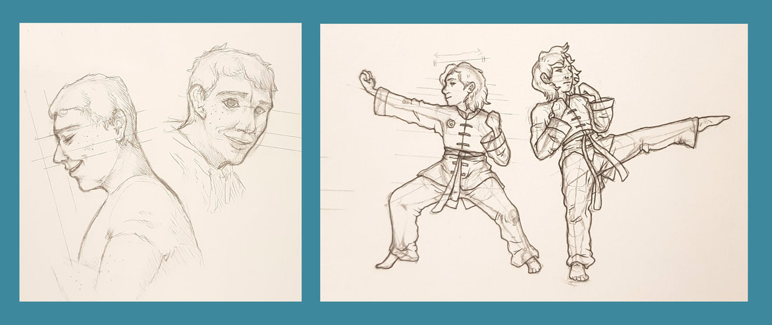
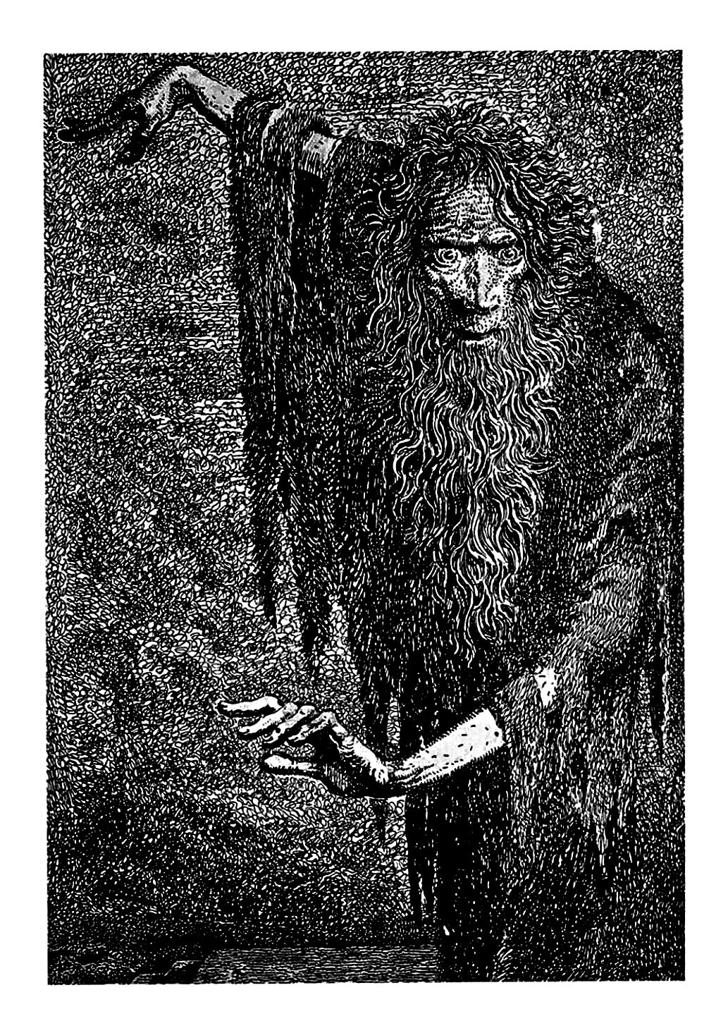
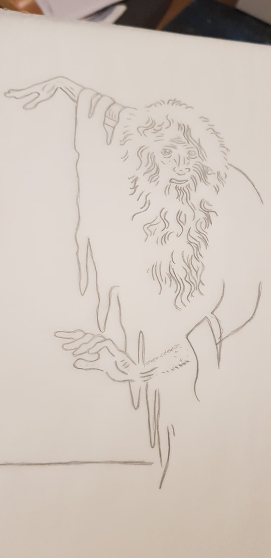
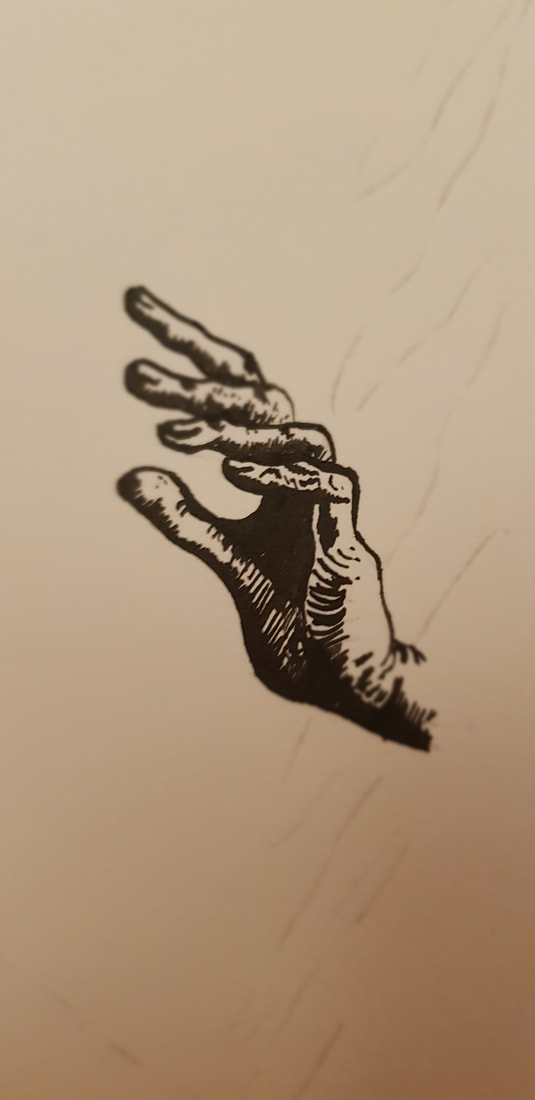
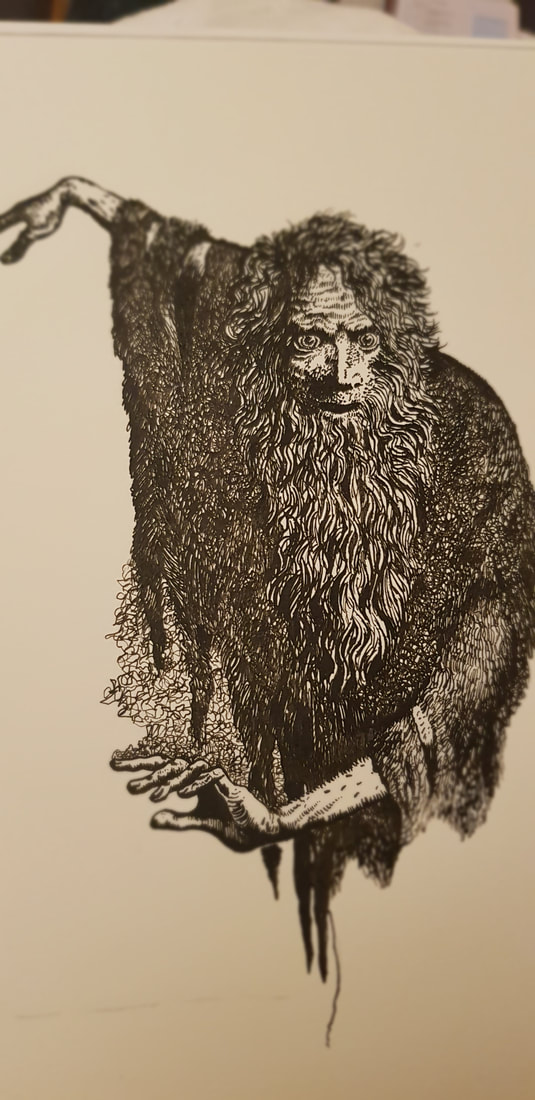
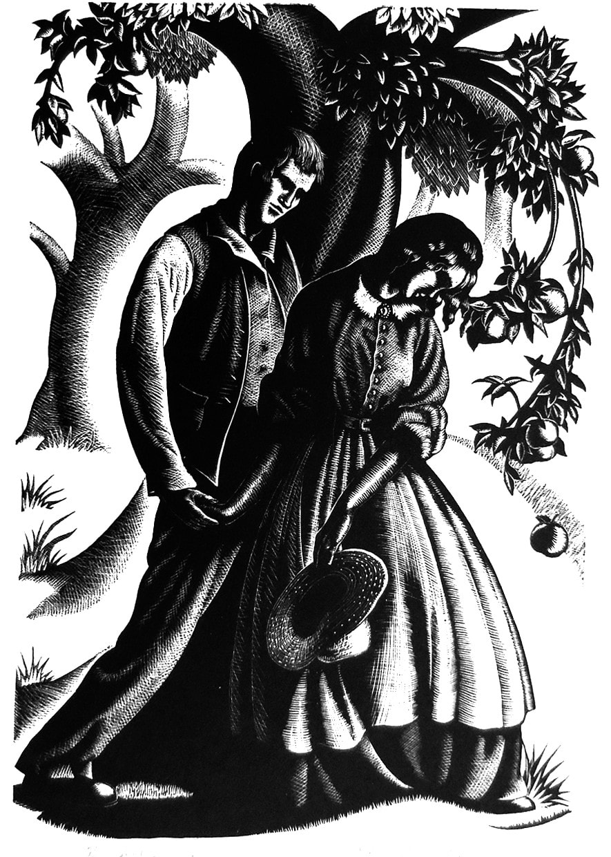
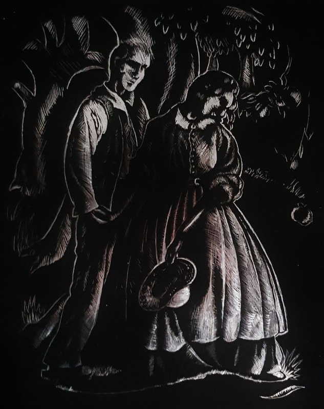
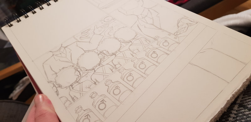
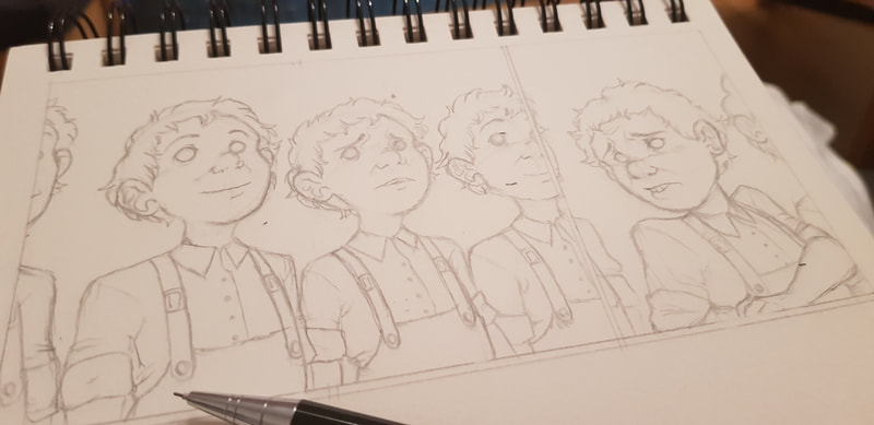
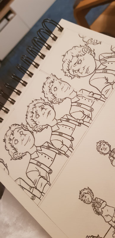
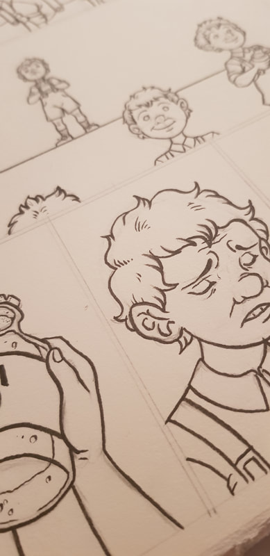
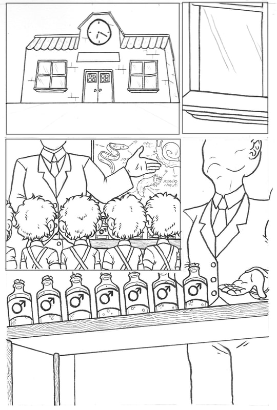
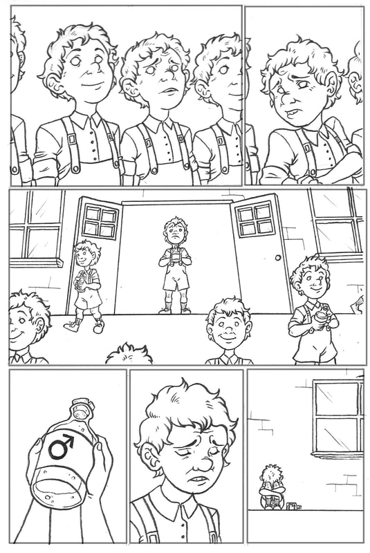
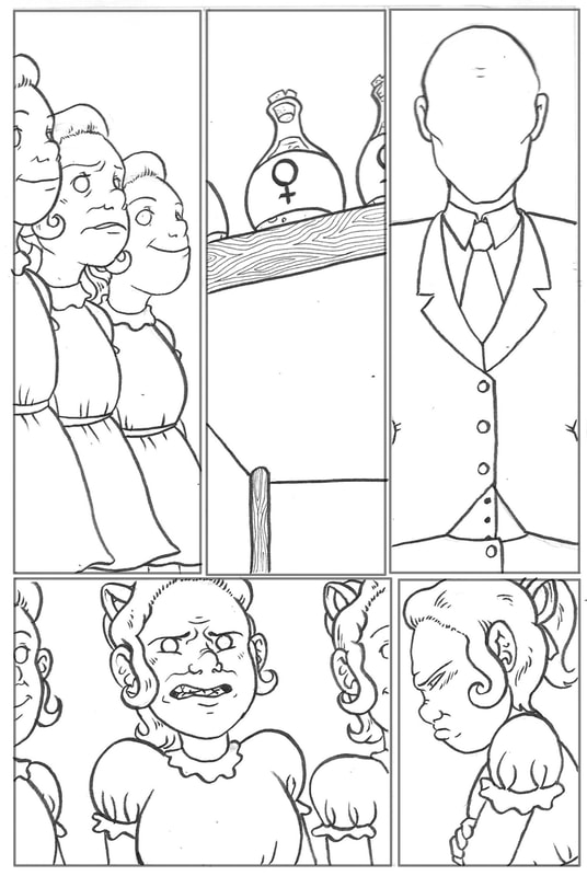
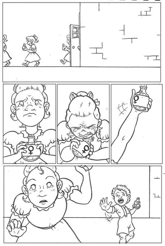
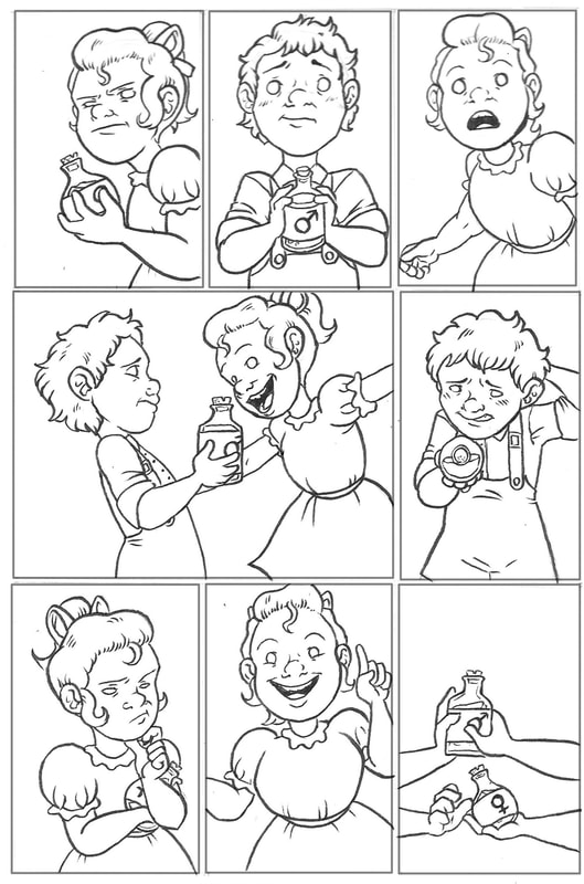
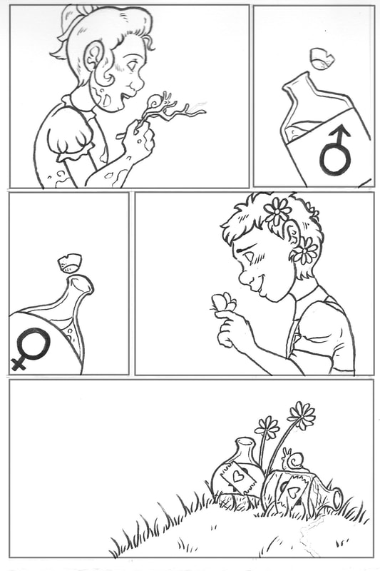
Below you can see some practice and development sketches of figures and busts. I took pictures of my fiancé (who grudgingly agreed) and used them as references to develop my understanding of facial proportions. To practice full body figures and movement, I used screenshots from a video of myself during martial training. I particularly learned a lot about drawing figures that aren't all at the same distance from the viewer - the bent knees in the first stance and the torso bending backwards in the second were useful challenges. I will admit, I was incredibly intimidated when I read the brief for this project. I don't know how long I must have stared at these three images in horror, wondering how on earth I was going to recreate them. At first glance, I had absolutely no idea where to start - but that's what this course is about, isn't it? Learning and improving? Anyways, I started by doing a little research on each of the artists - hoping to learn more about their style, technique and mediums - before I went on to practice what I'd learned, and finally attempt a firm copy. HENRY LAMB (1883 - 1960)Henry Lamb was an Australian-born British painter. He initially studied medicine, but abandoned that track to follow his passion for art. WWI saw him return to his medical studies to qualify, and he served as a battalion medical officer. After being demobilised by a gas attack on the Western Front in 1919, Lamb worked on a commission for the Hall of Remembrance. Before he was appointed as a full-time war artist during WWII, Lamb was well-known for his rather unusual portraits. He produced many oil paintings, his most famous being 'Death of a Peasant' (1911), which employed the use of bold colours and dramatic lighting. He was also known for his pencil sketches, such as the one we were tasked to copy - 'Portrait of Lady Ottoline Morrell, 1910-11'. As captioned, the original is on the left with my attempted copy on the right. After researching the artist and looking at some of his other works, my second port of call was to study the portrait carefully and figure out how it had been done. After some experimentation with different graphite pencils and a little practice, I came to the conclusion that Lamb had used a mixture of both soft, dark pencils and harder, lighter ones, using them to structure his portrait with bold lines, crosshatching and loose "scribble colouring". For my final copy above I did trace the main outline, but you can see my rough notes below: Surprisingly, I quite enjoyed trying to recreate this portrait. The soft, sketchy linework is very different from what I would usually draw, and contrary to my expectations, I found myself enjoying the looseness. I learned to work quickly without agonising over perfection, whilst simultaneously developing my understanding of facial anatomy. MERVYN PEAKE (1911 - 1968)Mervyn Peake was an English artist and illustrator, as well as a writer and a poet. He studied art at the same time as writing his own surreal fiction, influenced by his love for Charles Dickens and Robert Louis Stevenson. Like Lamb, he was commissioned for a short while to depict war scenes, but eventually went on to write and illustrate his own work as well as illustrating for other writers. He had little reputational success in his lifetime, but is now regarded as one of England's most loved writers and the famed illustrator of books such as 'Alice's Adventures in Wonderland'. He has a very surreal, often cartoon-like style, working mainly in black-and-white pencil or pen and ink, employing fine strokes, scribbles and crosshatching to create stark shading. The image we were asked to recreate was a pen and ink illustration from 'The Rime of the Ancient Mariner'. I had used ink before in calligraphy, but I had never drawn with it; the closest experience I had was with brush pens, which I use quite often in my own art. In all honesty, I didn't do much practice before attempting a firm copy - I inked a few lines, working out how to change the thickness by angling the nib, and I covered small areas in scribbles and strokes in an attempt to mimic Peake's techniques. I then traced the basic outline and began to ink the final. You can see some progress photos below: I think I may have enjoyed this one even more than the Henry Lamb sketch. Fine detail is closer to my normal style, but I have never used this sort of "scribbling" technique to block whole areas. Most of all, I loved the smooth flowing feel of the ink. I learned to be bold with my shadow/light contrast (something I struggle with), and again it was good anatomical practice. I have since bought myself a bunch of ink and nib pens and will most definitely be returning to this medium. CLARE LEIGHTON (1898 - 1989)Clare Leighton was an English-born American artist, writer and illustrator. Her parents were both authors; despite her efforts to follow in their artistic footsteps, Clare's mother was rather dismissive of her daughter's talent (and person in general) and favoured her older brother. Clare's passion for art was instead encouraged by her father and uncle - her uncle, in particular, was an illustrator, and took her on sketching trips until she eventually went on to study art. After graduating, Clare travelled Europe and developed a love for rural life. This was the main focus of her literature and artwork; even as the world grew more industrial around her, she continued to document rural life, nature and farming. She emigrated to America in 1939, and became famous for her wood engravings, such as the one we were presented with in this project: Well... As you can see, I had absolutely no idea what I was doing. There is no point in lying when the truth is so visibly, painfully obvious. It was without a doubt the most difficult and least enjoyable for me. Instead of wood engraving, the project required us to recreate this on scraperboard. Unfortunately, I couldn't acquire proper scraperboard and had to use those metallic-backed ones you buy in the kid's arts and crafts section - that was my first mistake. I then could not figure out how to trace onto scraperboard, and had to freehand my attempt. The metallic backboard was so scratchy and uneven that I decided it was better to leave the background black instead of having it a messy, scratched silver. I found it really difficult to control how much weight I was putting on the scraper tool, and thus a lot of my lines are thick where they should be very fine. All in all, though I missed the opportunity to experiment with the proper medium, I learned that I need to practice controlling the heaviness of my lines, and that I need to work on steadying my hands. We've just completed our first project this semester. In groups, we were to make a 9 page comic based on our interpretation of the nursery rhyme we were assigned. For our group, our nursery rhyme was 'What Are Little Boys Made Of'. I'll admit I was really quite excited that the first thing we were tasked with was a comic. I am a lover of graphic novels; I write a lot of fantasy literature, and I often try to put those stories into comic form as well. However, I am not the greatest at doing so - I was keen to learn more about the mechanics of comics in this project to help me develop this skill. We decided the best way to split our workload between the three of us was to have one doing the linework, one on colouring and background/fine detail, and one pulling everything together with digital editing and layout. I was responsible for the linework; below you can see some pencil sketches plus the penned finals. The entire project was a learning curve. For me personally, the most important things I learned were:
LECTURE NOTES |
Site powered by Weebly. Managed by 34SP.com

