|
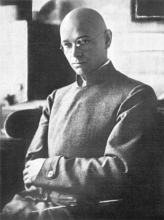
There are many notable names associated with the Bauhaus. However, the artist that immediately piqued my interest was Johannes Itten. I felt drawn to his work because of its connection to psychology, as this is both an interest and a passion of mine alongside art. Johannes Itten
Tremained interested and in tune with the psychology of his students, and preferred to teach without criticising an individual's creativity for fear of dulling their spark.
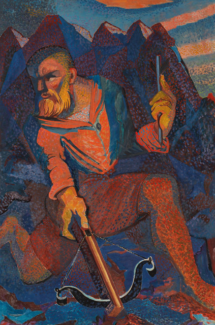
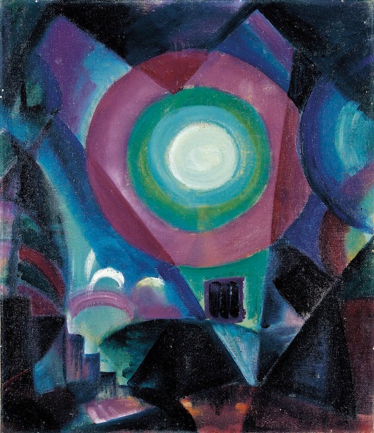
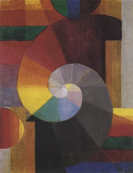
Returning from his teaching ventures in 1912, Itten studied abstract painting under Eugène Gilliard, drawing heavy influence from painter/teacher Franz Cižek, and realist-turned-abstractionist Adolf Hölzel (who later became his mentor at Stuttgart Academy). In Vienna, 1916, he met the founder of the Bauhaus Walter Gropius, who appointed him one of the earliest Bauhaus instructors. There, he was a master of multiple trades, and a valuable teacher who helped develop the Bauhaus preliminary course. However, he eventually left to pursue his own path. Itten's work focused heavily on abstract form and colours; he developed and deeply explored his own colour contrast theories, describing them in his book The Art of Colour. Believing there was a strong connection between emotional psychology and creativity, he would often employ music and relaxation methods to teach. In his own words: "He who wants to become a master of colour must see, feel, and experience each individual colour in its endless combinations - colours must have a mystical capacity for spiritual expression without being tied to objects." Itten died on March 25th 1967 in Zürich, but his legacy lives on in his colour theories and the influence they have had on cosmetologists and artists.
0 Comments
Modernism (mid 1800s - late 1900s) was a sustained period of innovation and expansion. It was characterised by accelerated advances in science, technology and industry, plus changes in political ideas and power structures. In this session's blog task, we were asked to focus on constructivism. ConstructivismFollowing in the footsteps of Italian poet-novelist Marinetti, Russia adopted futurism in a rather violent rejection of the past and celebration of the new. Russian Constructivism was soon developed post-WWI from roots in futurism, headed largely by the pre-revolutionary ideas of Vladimir Tatlin. The idea of constructivism completely rejected the western definition of an artist - instead, constructivists used art as a means of spreading social messages, particularly communist propaganda. Ultimately, "constructed" from bold text and images to appeal to a semi-literate society, art was used to service revolution. One of the best artistic forms of mass communication is, of course, posters. Comparing Constructivist Posters
the message. The bold black text against ivory also implies powerful projection, allowing the viewer to almost "hear" the words being shouted. This effect is amplified by the directional composition of the lines of text, all originating from the mouth of the man on the left. That, in turn, brings us neatly to the topic of composition. The large size and solitary placement of said man marks him as the main figure, implying a sense of power and authority and encouraging the viewer to "listen" to him. When we then come to actually read the text, we notice the circular shape of the red area - its resemblance to an eyeball with the stark black pupil pointed directly at the speaker implies that many eyes are on him, simultaneously giving the viewer a crawling paranoia that they are being watched too. This feeling might even pressure them to follow and support the poster's message for fear of consequence.
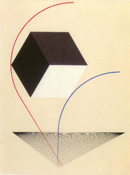
and blue lines. Both lines stem from the same point before diverging, implying the possible split of the Russian nation (note the coordination between the image's colours and those of the Russian flag).
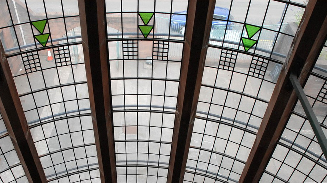
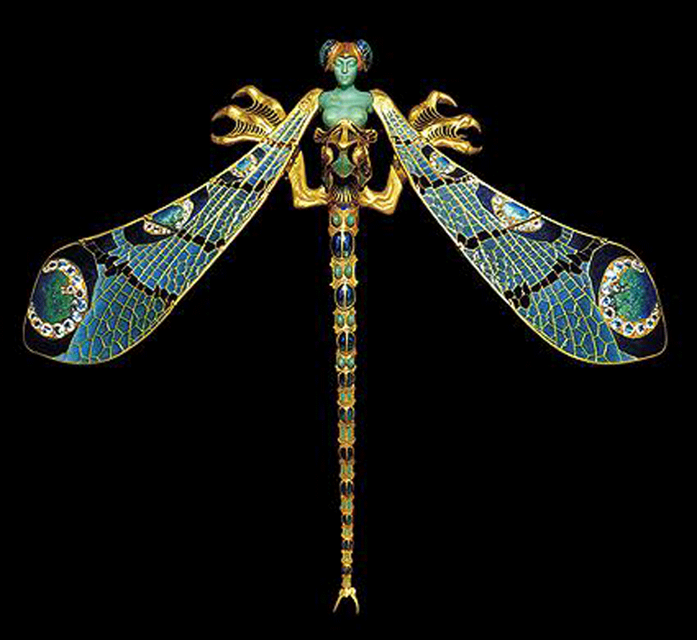
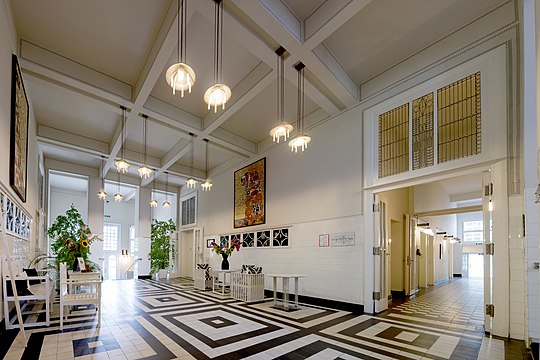
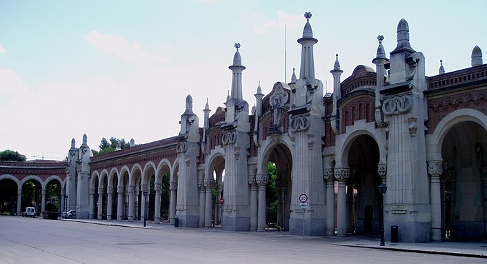
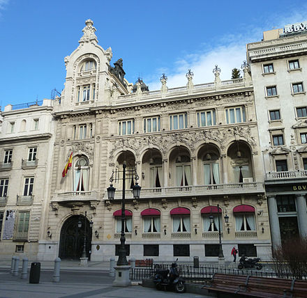
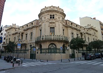
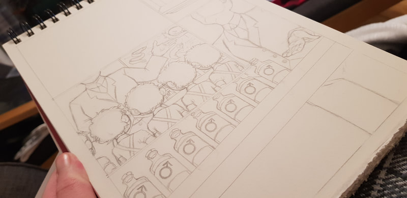
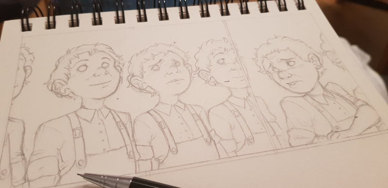
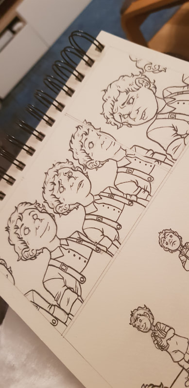
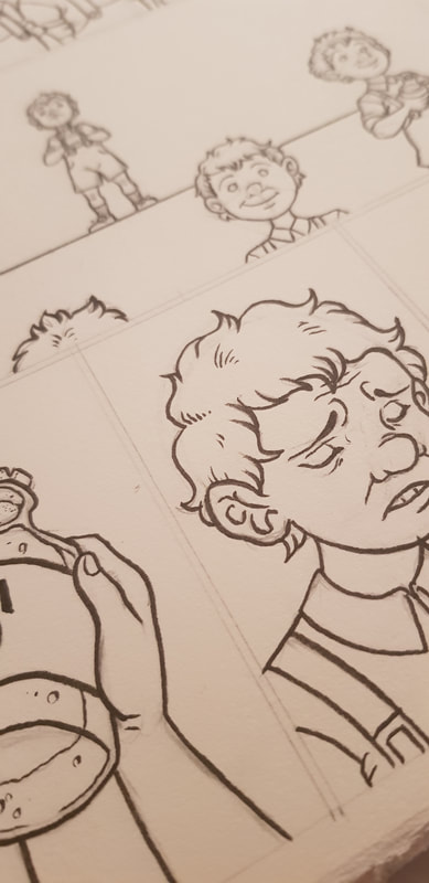
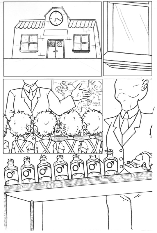
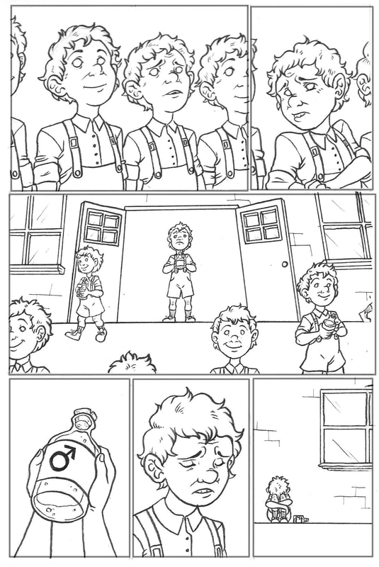
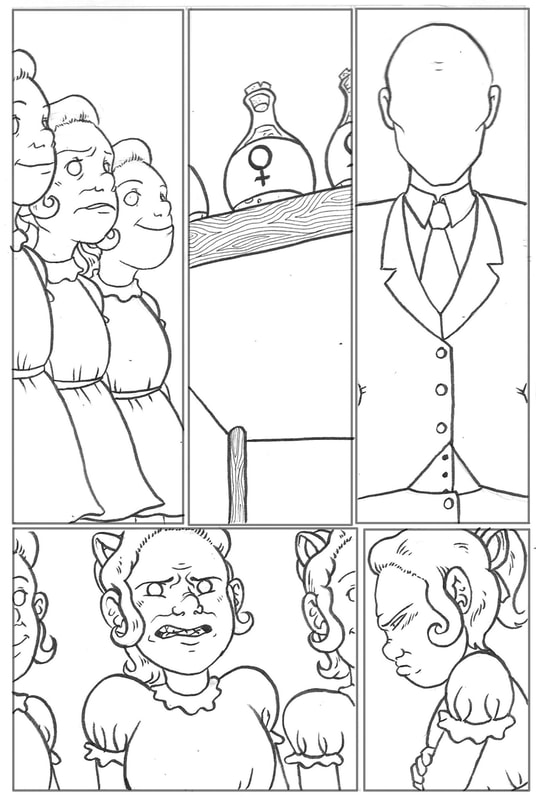
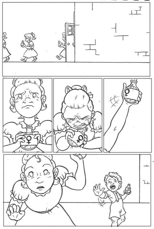
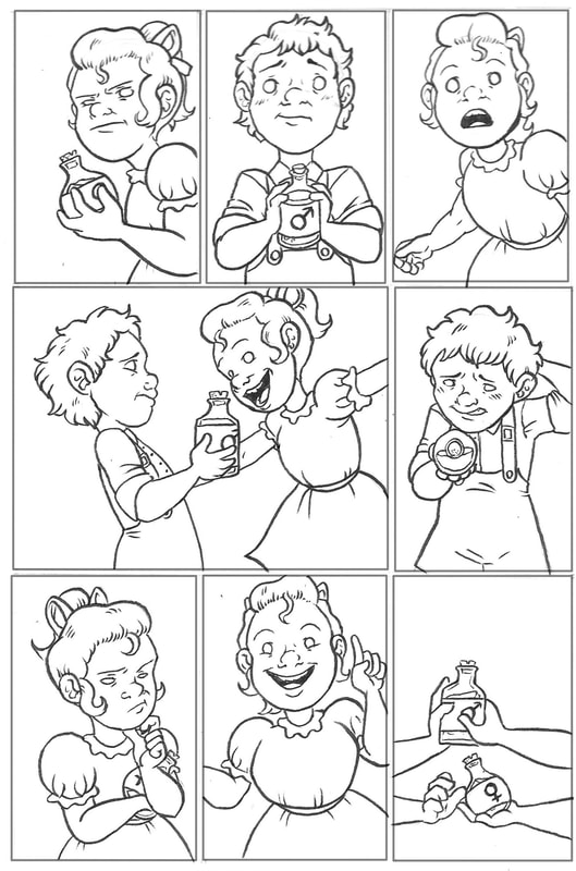
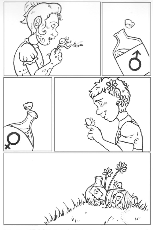
The bulky form and placement of the cube between the lines is suggestive of some kind of "blockage" that has caused the split. In Marinetti's futurism manifesto - the ancestor of Russian constructivism - he notably argued that new ventures were being blocked by attachment to the old. In this sense, we can take the red line as a symbol of those "ascending" into a communistic future, whilst the blue line represents those holding on to the historical concept of a monarchy. Art Nouveau was an international style that flourished between the late 1800s and the early 1900s. It arose as an opposition to the conservative historicism of the 19th Century, and largely concerned itself with breaking the discriminatory barrier between fine arts and applied arts. The style stemmed from the Arts & Crafts Movement in Britain, driven by the likes of Morris, Crane and Beardsley. The flat florals and flowing curves in the work of these artists were somewhat early prototypes of Art Nouveau, which grew to be typically characterised by whiplash lines and nature-inspired designs. However, each country had its own interpretation of the style. 'Modern Style' in GlasgowAlso known as 'Glasgow Style', this was Britain's interpretation of Art Nouveau. It was particularly prevalent in the Scottish city of Glasgow, which became a national hotspot for the style. Arguably the most well-known Scottish artist to be associated with Art Nouveau was Charles Rennie Mackintosh, an architect heavily influenced by Japonisme and modernism. Together with his wife Margaret MacDonald, her sister Frances and Frances' husband Herbert MacNair (collectively known as 'The Four' in The Glasgow School), he was one of the main names to drive the style forwards in Britain. Britain's take on Art Nouveau focused on the idea of restraint and simplicity versus extravagance and ornament. Mackintosh's work in particular is a prime example of this, featuring bold and simple geometric patterns with subtle, contrasting curves, often in the form of floral flourishes (the "Mackintosh rose"). Such patterns clearly showed influence from Japonisme, the Arts & Crafts movement, and the Celtic revival - Glaswegian Art Nouveau manages to blend the nationalistic aesthetics of traditional Scotland with the organic simplicity of the orient, combining them into functional, yet visually striking art. 'École de Nancy' in FranceAside from Paris, the city of Nancy in the Lorraine region was France's capital of Art Nouveau. At the time, with the influx of French artisans from Lorraine after it was claimed by the Germans, Nancy became a political, cultural and manufacturing capital. Then, led by glassmaker Émile Gallé, the 'École de Nancy' was founded in 1901. The group consisted of craftsmen who sought to adapt the arts to the industrial methods of manufacture; the goal was to mass produce ordinary objects but with fine craftmanship and original flair, providing works of art for the everyday home. The École believed in "art in all, art for all", and sought to link the arts with industry whilst upsetting the hierarchy that held fine arts above applied arts. Their style was heavily inspired by nature, favouring flora and fauna local to the region. Gallé in particular, as a trained botanist, focused his designs on floral and botanical motifs. Decadent detail was also a recognised feature of the style, along with Japonisme-inspired simplicity that sought to capture the essence of nature. Overall - seen best in the works of Gallé, furniture maker Louis Majorelle and glassmaker René Lalique - the Art Nouveau of Nancy was both decadent and ordinary, in a way, adapting traditional craftmanship to new industrial processes. 'Vienna Secession' in ViennaThe Viennese variation of Art Nouveau emerged as the 'Vienna Secession', a group of artists and artisans founded in 1897. They were concerned primarily with opposing Vienna's conservative orientation towards historicism and more traditional styles - they wanted to renew the reputation of decorative arts, and equally unite all artistic trades under one broad label. Viennese Art Nouveau was typically characterised by geometric designs, and a tendency to put function before form. Notable members of the Secession included artist Koloman Moser, and architects Josef Hoffmann and Otto Wagner (interestingly, Mackintosh reappears as a driving force in Viennese Art Nouveau as well as British). One quote in particular, the words of Hoffmann, sums the entire style up rather well in my opinion - "a harmonious ensemble of great simplicity adapted to the individual". 'Modernismo Madrileño' in MadridMadrid's variation of Art Nouveau was somewhat more eclectic than others; it drew influence from a range of other variations, including French, Viennese, Belgian and Italian as well as its own traditional Catalan. Though it still featured natural and vegetal motifs, it was less decorated and somewhat less colourful than other forms of Art Nouveau, often favouring plain, pale, natural colours in its architecture. Mainly focusing on architecture, prominent features of modernismo madrileño include the use of wrought iron, ceramic and mosaic, and floral stained glass. Notable names include the architects José López Sallaberry, Fernando Arbós y Tremanti and José Grases Riera. We've just completed our first project this semester. In groups, we were to make a 9 page comic based on our interpretation of the nursery rhyme we were assigned. For our group, our nursery rhyme was 'What Are Little Boys Made Of'. I'll admit I was really quite excited that the first thing we were tasked with was a comic. I am a lover of graphic novels; I write a lot of fantasy literature, and I often try to put those stories into comic form as well. However, I am not the greatest at doing so - I was keen to learn more about the mechanics of comics in this project to help me develop this skill. We decided the best way to split our workload between the three of us was to have one doing the linework, one on colouring and background/fine detail, and one pulling everything together with digital editing and layout. I was responsible for the linework; below you can see some pencil sketches plus the penned finals. The entire project was a learning curve. For me personally, the most important things I learned were:
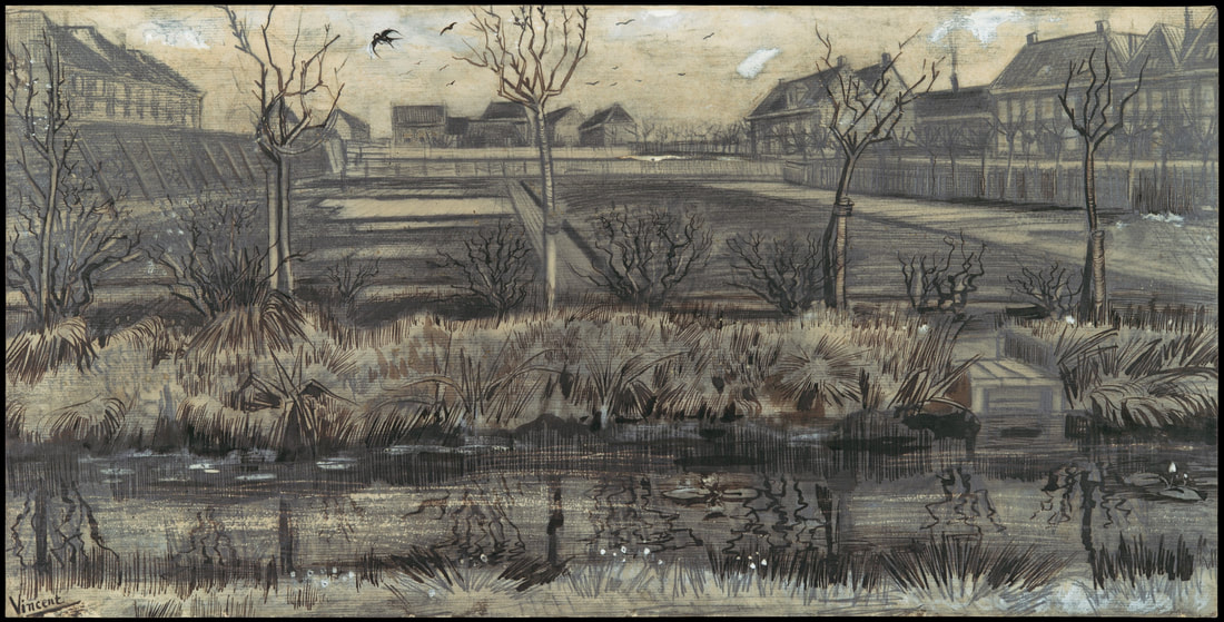
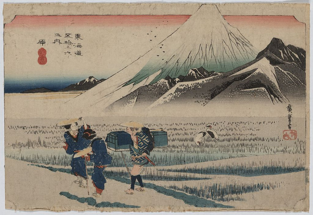
LECTURE NOTESPrior to 1853, much of Asia was unknown to Europeans. Early historical accounts were often distorted - the likes of Marco Polo and Voltaire painted a wildly inaccurate picture of China. However, despite their inaccuracy, these accounts still piqued the interest of the western world - they saw it as a primitive land of decadent secrets, open to their exploitation. Japan itself was largely isolated for 220 years under the 'sakoku' ("closed country") policy, which severely restricted trade and contact between them and other countries. However, having piqued the interest of the west, they were forcibly opened by the Americans by threat. Thus began Europe's love affair with Japanese art. The traditional Japanese art style, the precursor to what we now call manga, was completely new to Europe. Traditionally done on woodblocks, they were unlike anything seen before; such unusual rarities were of great value in the west, and the Victorian era saw them sold at incredibly high prices. Soon, the obsession with Japanese art and culture grew so intense it birthed the Japonisme movement. Japan's Influence on Van GoghMany European artists were influenced by Japonisme, but I have chosen to focus on Vincent Van Gogh. I have a particular fascination with Van Gogh; not just his artwork, but his ideas and mentality. I was unaware of his interest in Japan, and it was intriguing to pull away from the "stereotypical" Van Gogh pieces and look at some of his lesser-known work that displayed this influence. Van Gogh was a Dutch artist. He was born in 1853 - exactly the year Japan was opened to Europe, as aforementioned. This means that much of his work is influenced by Japonisme, but he did have a few different painting phases where the influence was much less noticeable. First, let's look at two pieces in which he heavily drew from Japanese art: These pieces took my personal interest because they are so far from the stereotypical style we picture when we think of Van Gogh. We tend to think of the likes of 'Starry Night' (which, coincidentally, is also influenced by Hokusai's ukiyo-e woodblock print 'The Great Wave'), but his lesser-known work is equally interesting. Let's compare these two Van Gogh pieces to similar-looking examples of traditional Japanese art: The piece on the left is ink on silk scroll, and the piece on the right is a ukiyo-e woodblock print (carved and inked). Even at a glance between these two traditional Japanese works and Van Gogh's later pieces, it's clear this style had a massive influence on him as an artist. Before the emergence of Japonisme, European art in the early 1800s was largely characterised by paints and oils on canvas. However, driven by his fascination of the Japanese technique, Van Gogh broke from the norm by using pen and ink - dip pens, quill pens, reed pens - to mimic their style. As well as using similar mediums, he employed similar techniques - fine brush strokes and dots to detail foliage, grass and thatched rooftops, and bold lines of black ink brushed in a calligraphy-like way to outline the focal points of his paintings. Japonisme influenced his compositional technique as well; similar to traditional ukiyo-e, Van Gogh had a tendency to use trees, buildings and larger objects at the edge of his pieces to frame a bleaker central space. The use of fine, individual brush/pen strokes inspired by the Japanese ultimately led Van Gogh to develop the "unique" style we know him for. Finally, for comparison, let's look at what Dutch artists before Van Gogh and the Japonisme movement were creating: Wybrand Hendriks was born in Amsterdam in 1744, making him more than a century older than Van Gogh. As an artist, he existed between the Dutch Golden Age of painting and the Amsterdam Impressionism movement - as such, his paintings were very much realistic and done in oils. He was influenced by French realism, and had no influence whatsoever from Japan; after all, he never saw the opening of the country in his lifetime. Overall, 'The Milkmaid' is a stark contrast to the post-impressionist, Japonisme-inspired work of Van Gogh, which appears much less realistic and more abstract in appearance. In this session, we focused on 'cultural texts'. Cultural texts can be works of design, art, film and so on; they are created by an individual or a group, but are informed by their surrounding society. This means that they often reflect, promote or even subvert cultural norms. We also looked at 'semiotics'; the study of signs, symbols... anything capable of conveying meaning. We thought in particular about clothing as both a cultural text and an example of semiotics in society. Clothes obviously have a practical function in protecting us from the elements, but they definitely serve other purposes as well. As a lover of symbolism and a writer who often designs outer appearance to reflect inward character, I found this quite interesting to think about.
My jacket, however, is quite different from its original ancestors. It is still made of leather, but it is no longer heavy duty - it is lightweight, and would be rather impractical for flight. The colour has also diverged from the discreet sage green to a stand-out red. This suggests this jacket was designed for style rather than practicality (form over function). From a different perspective, despite the material being lightweight, it is still leather; a material with an ingrained connotation of toughness and durability in harsh conditions. This strikes me as symbolic for a "thick skin"; a hard shell masking a much more vulnerable interior. Personally, I feel this is rather accurate - I will often joke around or react defensively to hide my nerves. The colour adds to this idea; red is often associated with danger and warning, but burgundy is a rather muted shade. This could be interpreted as the wearer giving a "back off" signal, but likely because they are more nervous than aggressive. The shape of the jacket is rather gender-neutral and athletic. Its looseness and generous chest space can conceal a stereotypical feminine silhouette, accurately suggesting that I do not identify as a stereotypical female (or, in other words, a "girly girl"). The tailored waist and cuffs give off a sense of neatness. The manufacturer is a low-grade, practically unheard-of brand, suggesting that I am not one for capital pleasures and do not aim to impress or flaunt status. Bomber jackets are typically adopted by subcultures (eg. punk), implying a divergence from the mainstream. LECTURE NOTES |
Site powered by Weebly. Managed by 34SP.com

