|
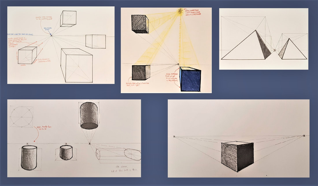
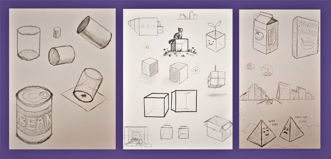
Perspective has always been something I have struggled with in my artwork; technical measures and spatial positioning have always confused me. I was apprehensive to have a go at these activities, but on the other hand I was eager to learn how perspective really works in order to better my work. Even learning the basic concepts (eg. oblique projection vs. realistic convergence) and getting to grips with the three dimensions was a useful starting point. We started off with 1 point perspective, which only distorts depth by using one vanishing point. We had a go at drawing some cubes, cylinders and pyramids using this technique. Out of these, I found the cylinders and ellipses the most challenging. After many failed attempts, I eventually felt a little more comfortable constructing a cylinder by using what I like to refer to as "the phantom box". 2 point perspective was relatively straightforward - using two vanishing points to construct shapes angled towards the viewer, distorting depth and width this time. You can see some of my notes and attempts above and below. In another 1PP exercise, we constructed "railroads" and "chessboards". I found this extremely useful when drawing an object that extends into the distance - the "zigzag" technique, points of distance, and the use of aerial perspective really helped me develop my proportional accuracy. You can see some of my attempts below. Something I was very keen to learn was how to better the anatomy of my sketches using perspective. Again, proportion is something I struggle with - especially when it comes to facial structure, limb length, placement of a figure on the page, and so on. I found the techniques we learned in these activities very useful, and have since noticed a visible improvement in my figure sketching.
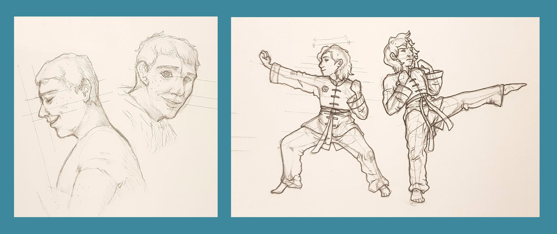
Below you can see some practice and development sketches of figures and busts. I took pictures of my fiancé (who grudgingly agreed) and used them as references to develop my understanding of facial proportions. To practice full body figures and movement, I used screenshots from a video of myself during martial training. I particularly learned a lot about drawing figures that aren't all at the same distance from the viewer - the bent knees in the first stance and the torso bending backwards in the second were useful challenges.
0 Comments
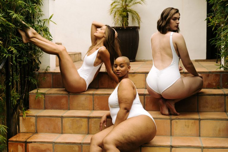
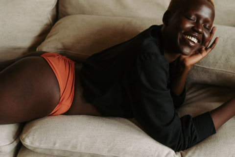
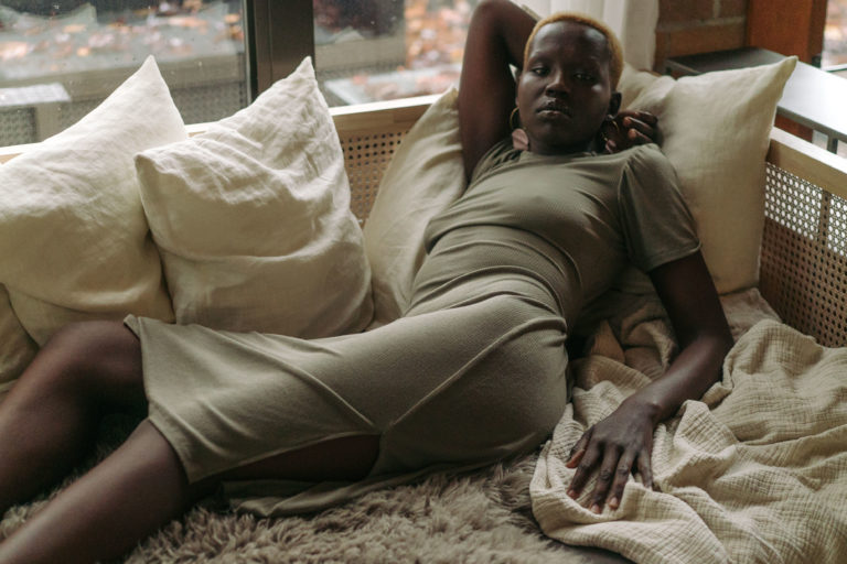
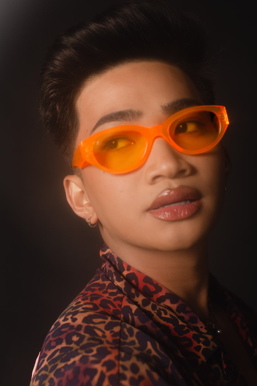
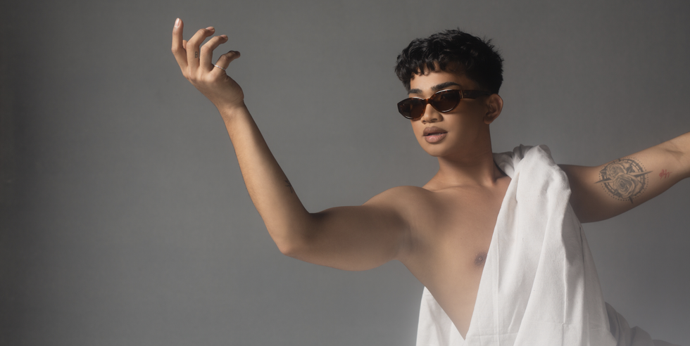
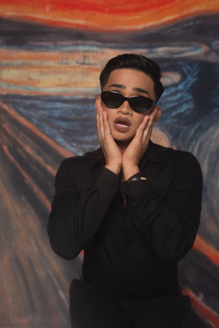
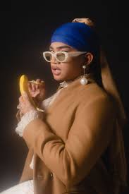
This session looked at the storytelling qualities of editorial fashion, and how it both reflects and influences visual culture. We considered fashion photography as an art form. Personally, I believe it is well worthy of that title; even as someone who is not a follower of fashion (and definitely not the side of it that champions a more materialistic society), I cannot deny the artistry in fashion and fashion photography. They both require skill, an eye for composition, and a knack for visual storytelling - in my opinion, this more than qualifies it as art. For our blog task, we were asked to discuss and critique two fashion articles of our choice. 'Londre Bodywear Founders on Values and Intuition' |
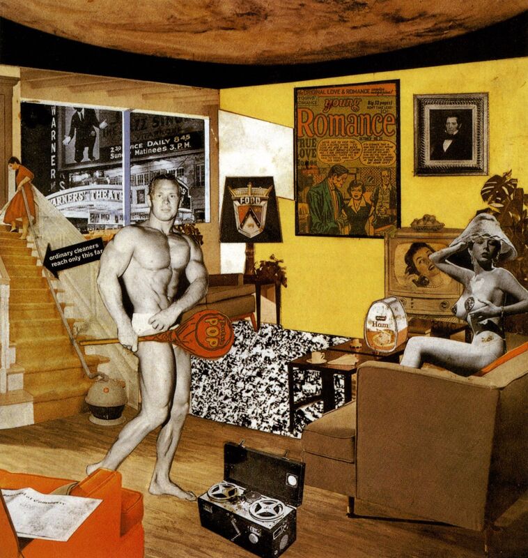
| In 1956, an exhibition called 'This is Tomorrow' took place in London, featuring a host of post-wartime British artwork. As time headed into the realms of modernism, the exhibition was considered the kickstarter for British pop art. Richard Hamilton was a contributing artist in the exhibition with his famous collage 'Just What Is It That Makes Today's Homes So Different, So Appealing?' |
The collage became a pop art icon depicting the rising consumerism as the 1950s progressed into a more modern age. In his own words, Hamilton aimed to "fill a cramped space with a representation of all the objects and ideas crowding post-war consciousness". Indeed, the collage depicts many developing ideas of the 1950s - the advancement of science and space exploration (the moon on the ceiling), new ventures in household appliances and foods, cars and technology, new 'standards' for the male and female body... Effectively, 1956 in a nutshell.
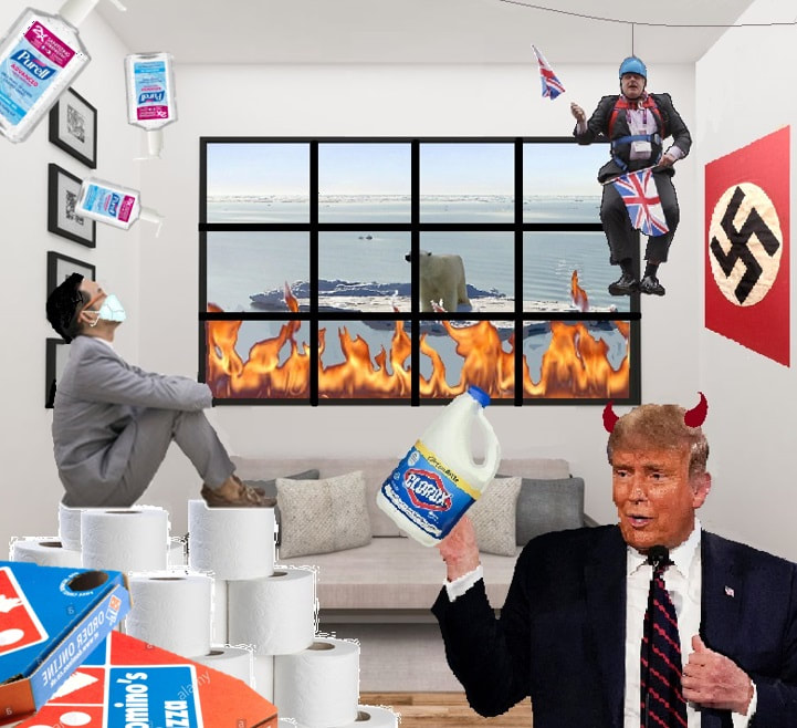
| Our blog task for this session required us to create our own version of Hamilton's collage, depicting the ideology and gist of 2020. Unfortunately, as we all know, this year has not been one for focusing on scarce positives. Instead of welcoming new innovation and promising advancements, 2020 has welcomed a global pandemic, a |
painfully orange dictator, and panic amongst those of us who have the sense to see the dire importance of climate change. In my opinion, these were the main themes of 2020, and thus inspired my attempt.
Firstly, I chose a living room scene for the background - since lockdown confined most of us to this room for much of the year, I thought it was an appropriate starting point. I went on to include the issue of global warming by making the melting ice caps and wildfires visible through the window - I chose to combine ice and fire because they are two of the most prominent images the term "global warming" brings to mind.
To the left of the collage I focused more on the Covid-19 pandemic, and the new ways of living we have had to adapt to. I combined some defining factors into one image - a man in a business suit (referring to working from home) sat atop a throne of toilet roll and pizza boxes (referring to panic buying and increased takeaway orders), wearing a facemask and being rained on by hand sanitizer (pretty self explanatory). I tried to make it as bizarre as possible to reflect the surreal oddness of the times we now live in.
To the right, I focused more on the political highlights of the year. I had to include Boris at the top, hanging from his zipwire in probably the single most infamous picture of him in existence. The image itself automatically gives off a sense of absurdity and incompetence, in turn referencing nationwide doubt of Johnson's abilities to lead, especially in crisis. Below Johnson, I have included Donald Trump below the Nazi swastika, since his deplorable actions during his presidential term have led many to compare him to the dictator Adolf Hitler. I added devil horns to highlight the worldwide threat this man poses - the danger of his choices and actions exceeds the borders of his own country, impacting the entire globe. The bleach was added just as a reminder of the stunningly bad ideas of our so-called world leaders - reading deeper into this, one could question the very direction humanity is heading in if we are willingly electing people like this to lead us into the future.
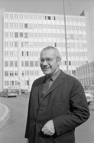
Max Bill
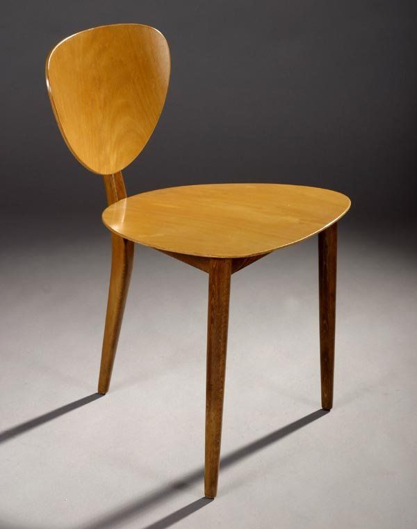
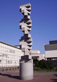
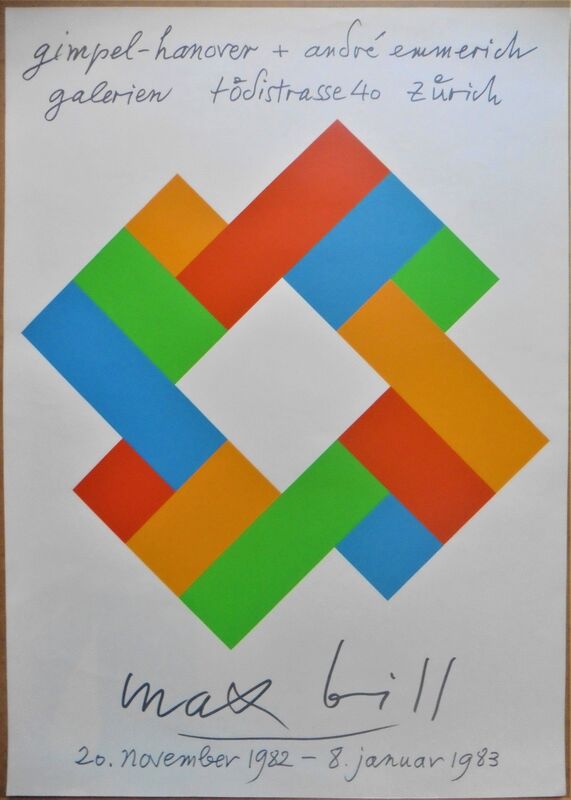
Max Bill was born on December 22nd 1908 in Winterthur, Switzerland. From 1924 to 1927 he trained as a silversmith apprentice before going on to study at the Bauhaus until 1929. He then moved to Zurich, where he worked as a graphic designer for modern buildings. It was here that he built his first work - his own house and studio.
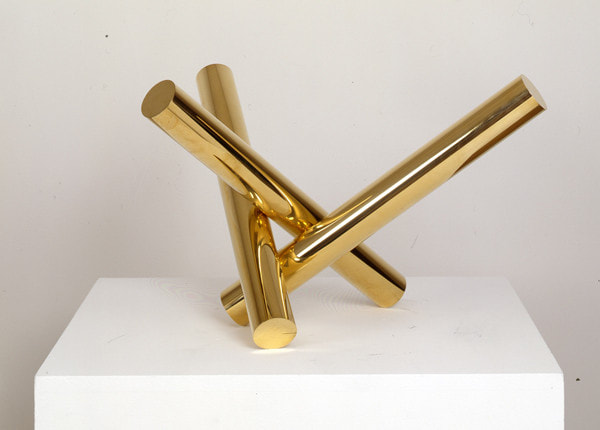
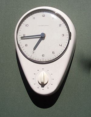
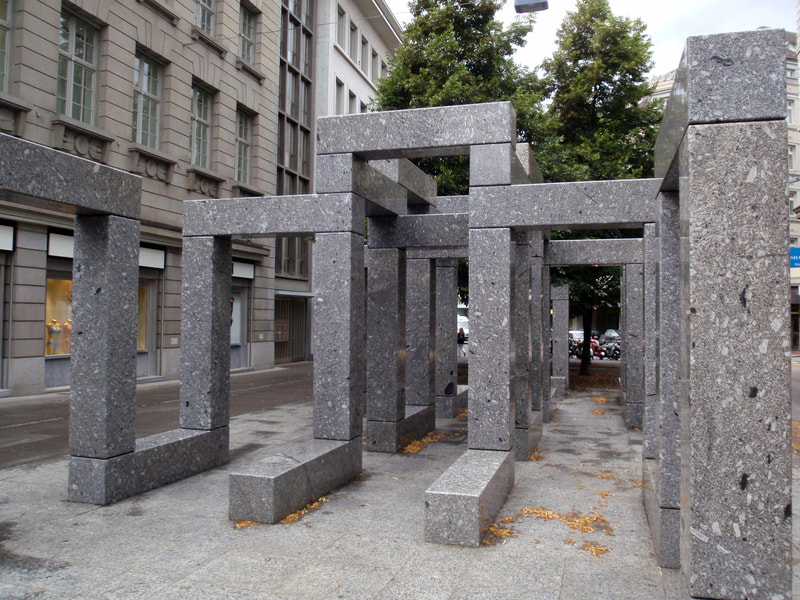
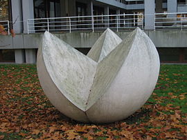
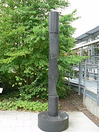
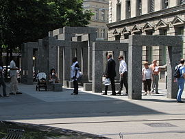
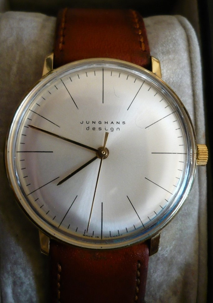
As an artist and industrial designer, Bill was highly regarded for the major influence his work had on Swiss graphic design. Clear, elegant precision is a trademark of his work - he was also a driving force in pioneering the Concrete Art movement, which focused heavily on geometrical abstraction. Some well-known examples of his work include the clocks and watches he designed for Junghans, the 'Pavillon-Skulptur' in Zurich, and the 'Endless Stairs' in Ludwigshafen.
Bill became a professor at the Zurich University of the Arts in 1944, and later at the Hamburg University of Fine Arts in 1967. As well as teaching as a lecturer, he produced a vast amount of both factual and theoretical literature on art, architecture and design. He travelled to conferences worldwide to share his knowledge and became a member of multiple well-known art academies and societies. But perhaps his biggest legacy may be designing and cofounding the Ulm School of Design in Germany, which went on to integrate art with science and the study of semiotics.
Bill died of a heart attack en-route to hospital at the age of 85 in 1994. His work lives on in galleries, museums and exhibitions, and the influence he had on Brazilian artists in particular with the concrete art movement.
Bill died of a heart attack en-route to hospital at the age of 85 in 1994. His work lives on in galleries, museums and exhibitions, and the influence he had on Brazilian artists in particular with the concrete art movement.
I will admit, I was incredibly intimidated when I read the brief for this project. I don't know how long I must have stared at these three images in horror, wondering how on earth I was going to recreate them. At first glance, I had absolutely no idea where to start - but that's what this course is about, isn't it? Learning and improving?
Anyways, I started by doing a little research on each of the artists - hoping to learn more about their style, technique and mediums - before I went on to practice what I'd learned, and finally attempt a firm copy.
Anyways, I started by doing a little research on each of the artists - hoping to learn more about their style, technique and mediums - before I went on to practice what I'd learned, and finally attempt a firm copy.
HENRY LAMB (1883 - 1960)
Henry Lamb was an Australian-born British painter. He initially studied medicine, but abandoned that track to follow his passion for art. WWI saw him return to his medical studies to qualify, and he served as a battalion medical officer. After being demobilised by a gas attack on the Western Front in 1919, Lamb worked on a commission for the Hall of Remembrance.
Before he was appointed as a full-time war artist during WWII, Lamb was well-known for his rather unusual portraits. He produced many oil paintings, his most famous being 'Death of a Peasant' (1911), which employed the use of bold colours and dramatic lighting. He was also known for his pencil sketches, such as the one we were tasked to copy - 'Portrait of Lady Ottoline Morrell, 1910-11'.
As captioned, the original is on the left with my attempted copy on the right. After researching the artist and looking at some of his other works, my second port of call was to study the portrait carefully and figure out how it had been done. After some experimentation with different graphite pencils and a little practice, I came to the conclusion that Lamb had used a mixture of both soft, dark pencils and harder, lighter ones, using them to structure his portrait with bold lines, crosshatching and loose "scribble colouring". For my final copy above I did trace the main outline, but you can see my rough notes below:
Surprisingly, I quite enjoyed trying to recreate this portrait. The soft, sketchy linework is very different from what I would usually draw, and contrary to my expectations, I found myself enjoying the looseness. I learned to work quickly without agonising over perfection, whilst simultaneously developing my understanding of facial anatomy.
MERVYN PEAKE (1911 - 1968)
Mervyn Peake was an English artist and illustrator, as well as a writer and a poet. He studied art at the same time as writing his own surreal fiction, influenced by his love for Charles Dickens and Robert Louis Stevenson. Like Lamb, he was commissioned for a short while to depict war scenes, but eventually went on to write and illustrate his own work as well as illustrating for other writers.
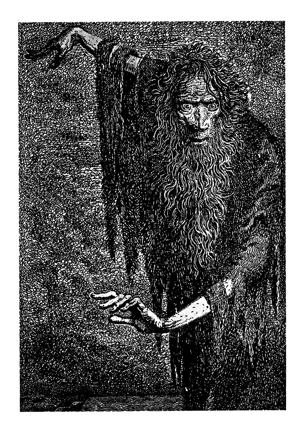
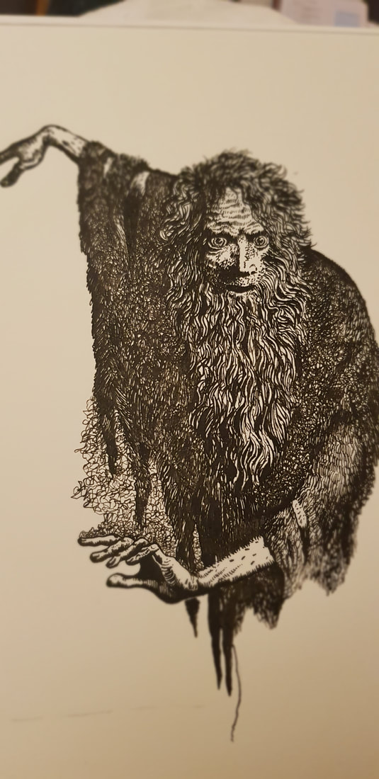
He had little reputational success in his lifetime, but is now regarded as one of England's most loved writers and the famed illustrator of books such as 'Alice's Adventures in Wonderland'. He has a very surreal, often cartoon-like style, working mainly in black-and-white pencil or pen and ink, employing fine strokes, scribbles and crosshatching to create stark shading. The image we were asked to recreate was a pen and ink illustration from 'The Rime of the Ancient Mariner'.
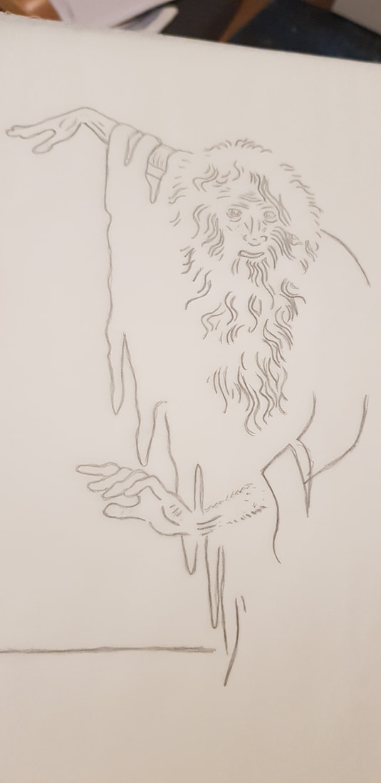
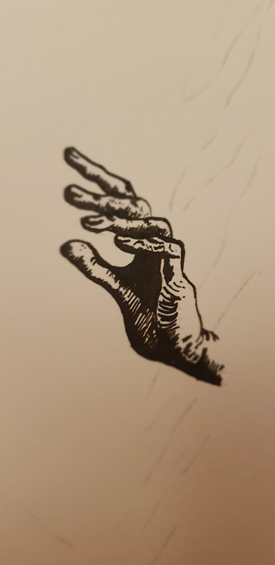
I had used ink before in calligraphy, but I had never drawn with it; the closest experience I had was with brush pens, which I use quite often in my own art. In all honesty, I didn't do much practice before attempting a firm copy - I inked a few lines, working out how to change the thickness by angling the nib, and I covered small areas in scribbles and strokes in an attempt to mimic Peake's techniques. I then traced the basic outline and began to ink the final. You can see some progress photos below:
I think I may have enjoyed this one even more than the Henry Lamb sketch. Fine detail is closer to my normal style, but I have never used this sort of "scribbling" technique to block whole areas. Most of all, I loved the smooth flowing feel of the ink. I learned to be bold with my shadow/light contrast (something I struggle with), and again it was good anatomical practice. I have since bought myself a bunch of ink and nib pens and will most definitely be returning to this medium.
CLARE LEIGHTON (1898 - 1989)
Clare Leighton was an English-born American artist, writer and illustrator. Her parents were both authors; despite her efforts to follow in their artistic footsteps, Clare's mother was rather dismissive of her daughter's talent (and person in general) and favoured her older brother. Clare's passion for art was instead encouraged by her father and uncle - her uncle, in particular, was an illustrator, and took her on sketching trips until she eventually went on to study art.
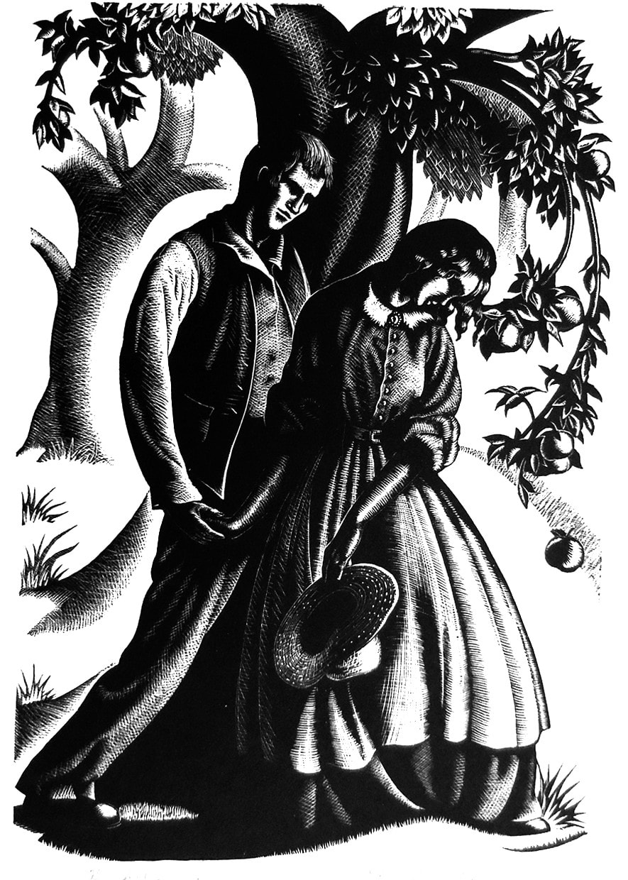
After graduating, Clare travelled Europe and developed a love for rural life. This was the main focus of her literature and artwork; even as the world grew more industrial around her, she continued to document rural life, nature and farming. She emigrated to America in 1939, and became famous for her wood engravings, such as the one we were presented with in this project:
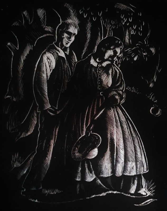
Well... As you can see, I had absolutely no idea what I was doing. There is no point in lying when the truth is so visibly, painfully obvious. It was without a doubt the most difficult and least enjoyable for me.
Instead of wood engraving, the project required us to recreate this on scraperboard. Unfortunately, I couldn't acquire proper scraperboard and had to use those metallic-backed ones you buy in the kid's arts and crafts section - that was my first mistake. I then could not figure out how to trace onto scraperboard, and had to freehand my attempt. The metallic backboard was so scratchy and uneven that I decided it was better to leave the background black instead of having it a messy, scratched silver. I found it really difficult to control how much weight I was putting on the scraper tool, and thus a lot of my lines are thick where they should be very fine.
All in all, though I missed the opportunity to experiment with the proper medium, I learned that I need to practice controlling the heaviness of my lines, and that I need to work on steadying my hands.

