This project focused on literal illustration - creating a straight-shooting, literal visual in response to the written word. We were each assigned a piece from 'The Collected Ghost Stories of M.R. James', and were asked to produce three accompanying illustrations - a full page, a chapter heading, and a cover/spine.
'THE MEZZOTINT' BY M.R. JAMES
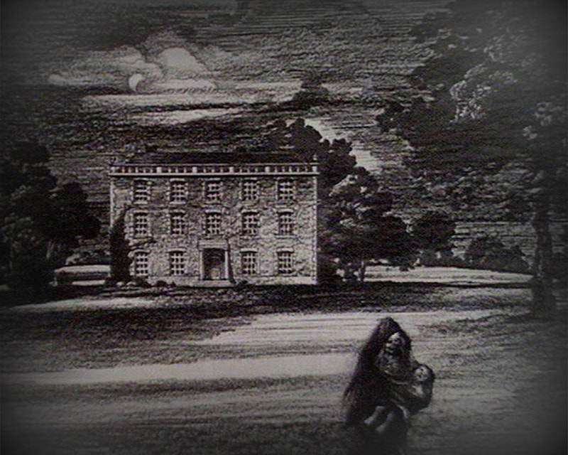
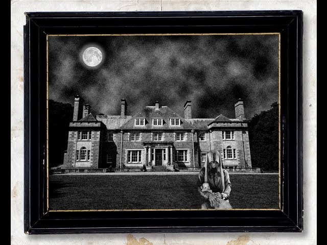
My story was 'The Mezzotint', which you can read here. Set sometime in the mid 1900s, it follows Williams - the curator of an art museum - and his discovery of a seemingly-indifferent mezzotint. At first, the mezzotint appears rather boring to Williams, and he cannot identify the place depicted. However, as time goes on, the mezzotint appears to change...
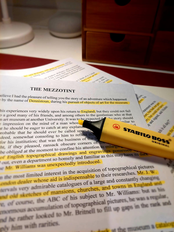
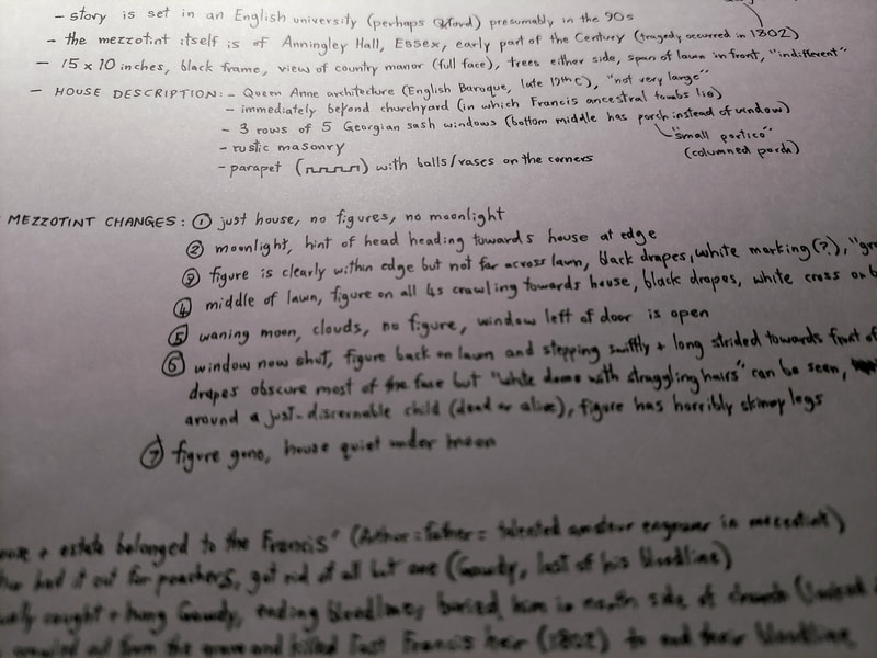
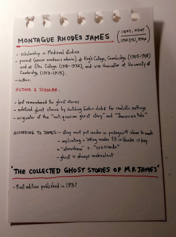
Of course, as always, first port of call was to read the story and annotate it. I made sure I understood the plot, and made a few notes on things like setting, background, important descriptions, etc. I also did some brief research on M.R. Williams and his work to get a feel for his writing.
Of course, as always, first port of call was to read the story and annotate it. I made sure I understood the plot, and made a few notes on things like setting, background, important descriptions, etc. I also did some brief research on M.R. Williams and his work to get a feel for his writing.
RESEARCH & REFERENCE
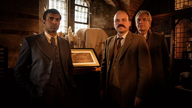
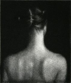
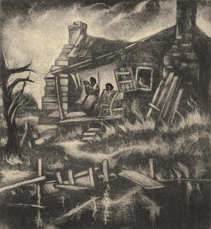
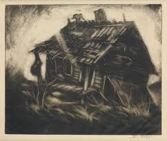
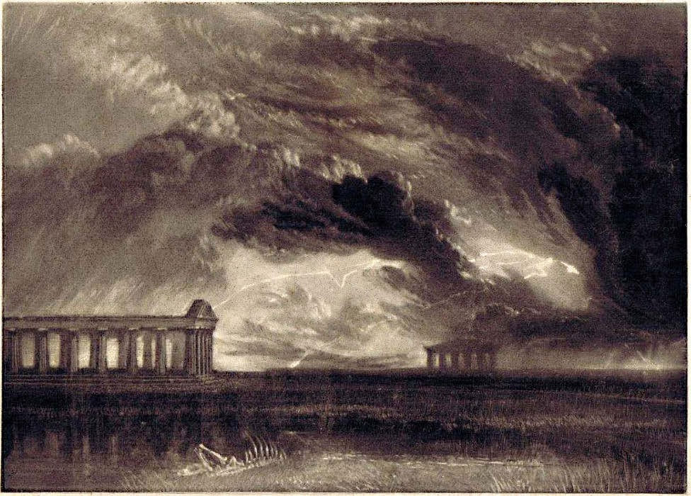
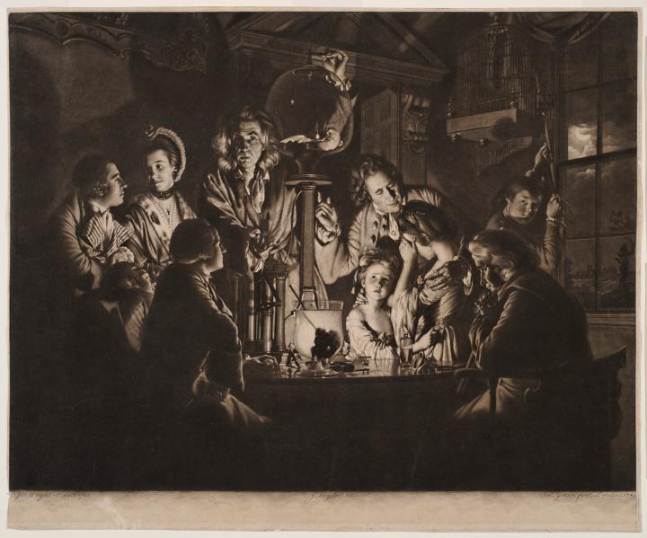
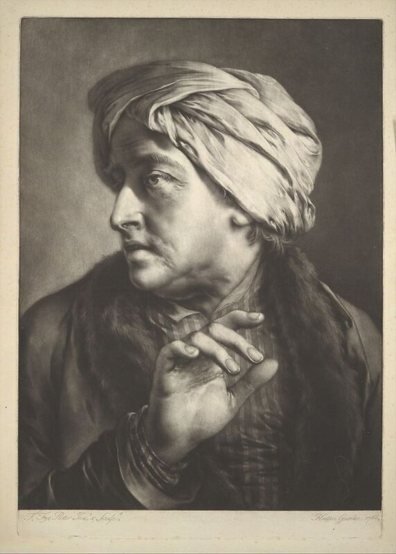
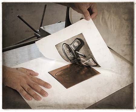
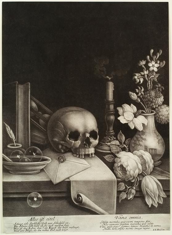
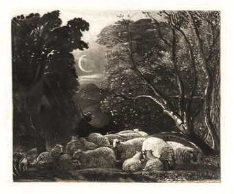
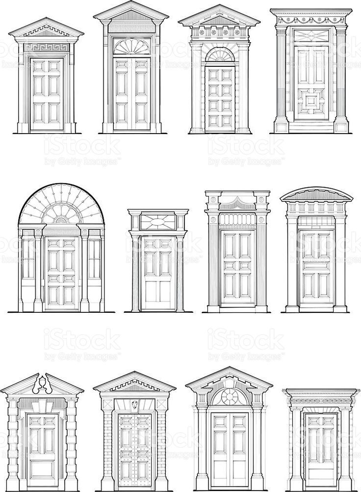
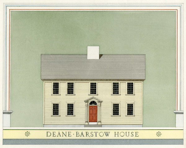
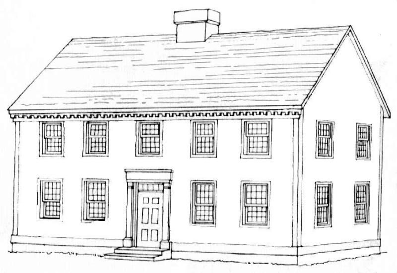
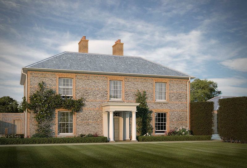
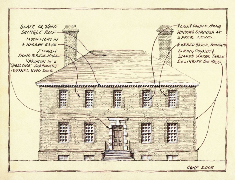
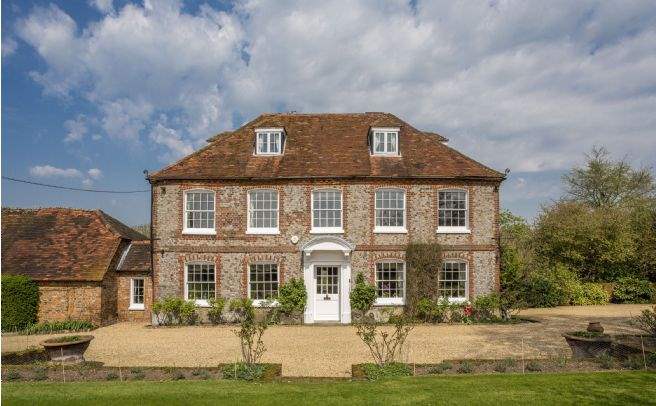
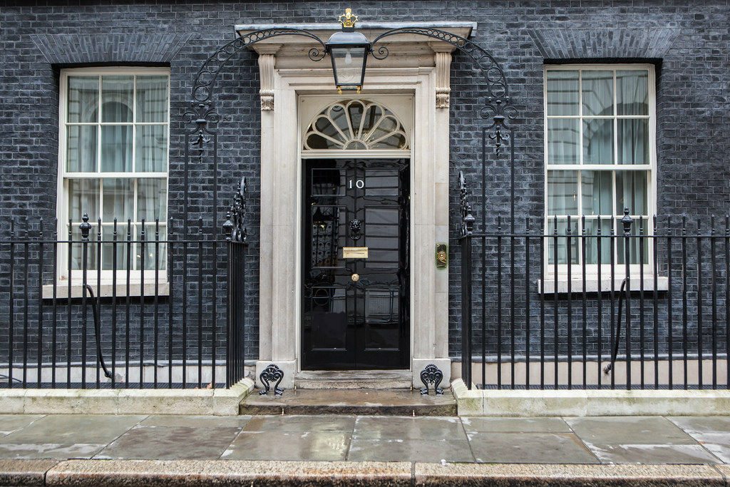
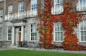
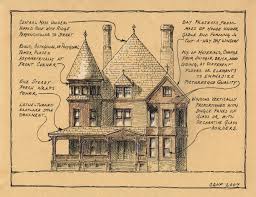
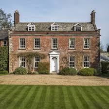
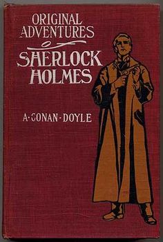
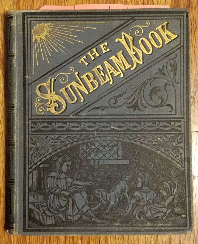
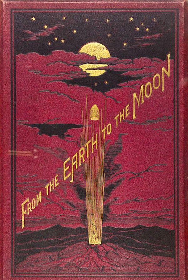
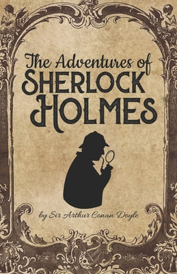
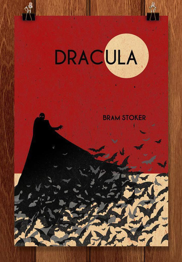
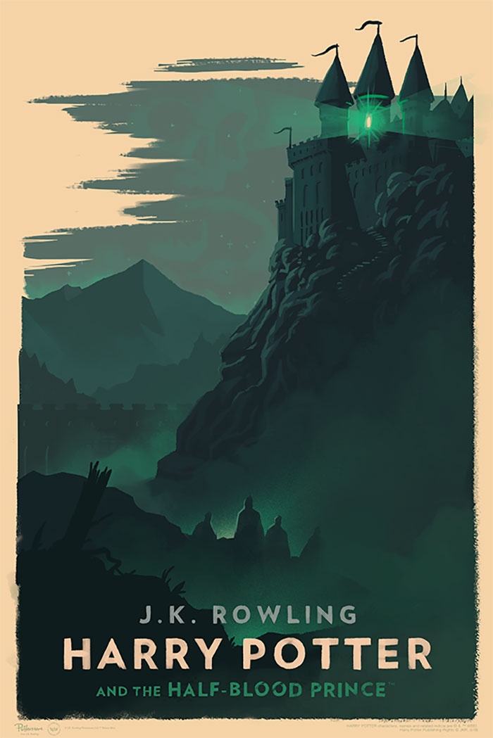
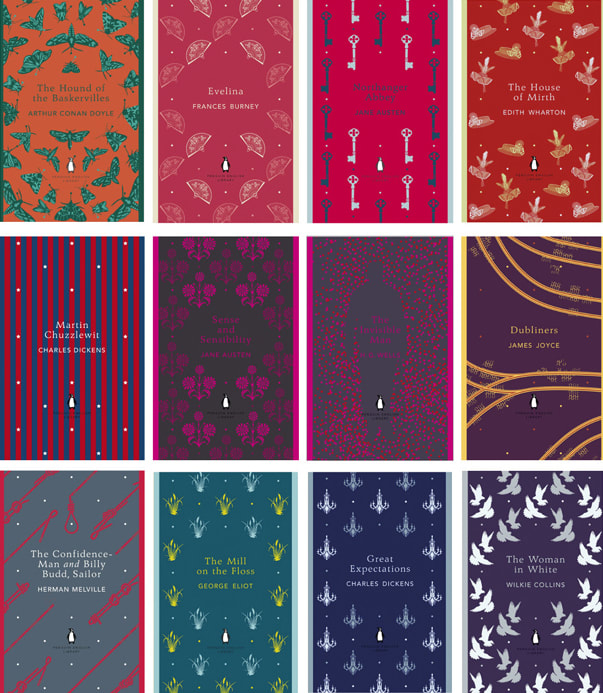
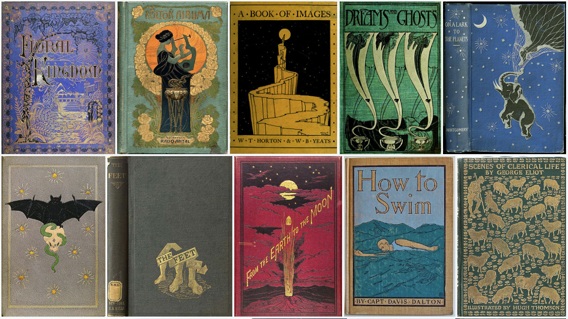
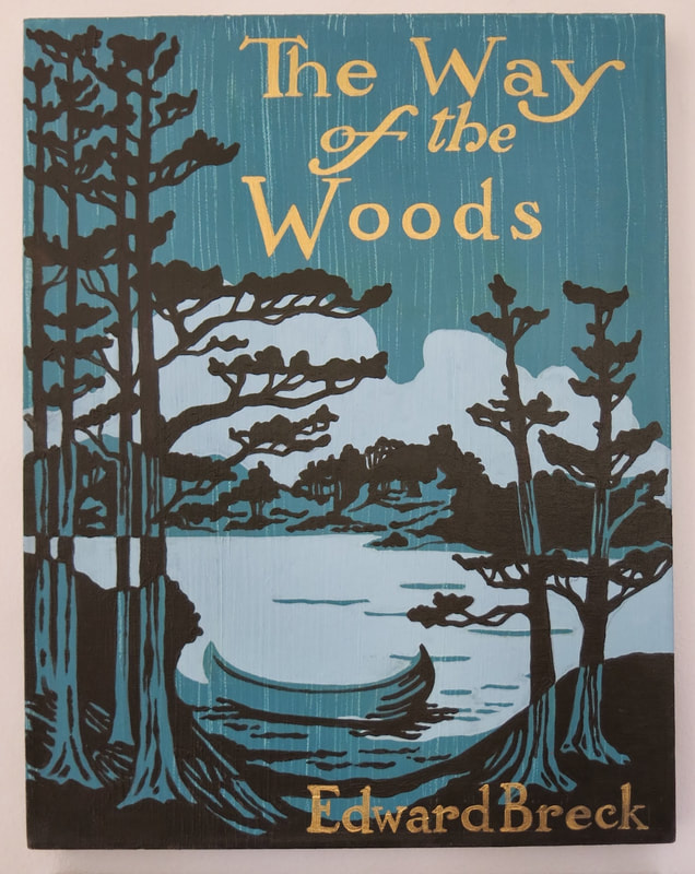
Next, I had a look at what illustrations and visual adaptations already existed for The Mezzotint - I used these both as inspiration, and as a reminder of what to try and avoid repeating (I did not see the point in just recreating something in the same way it had been done before - I wanted to put a personal spin on it, as I'd imagine any artist does). As the story is somewhat of a period piece, I spent some time gathering reference pictures - particularly Georgian architecture, mezzotint work and classic book covers.
I've included these "batches" of references below.
I've included these "batches" of references below.
THUMBNAILING
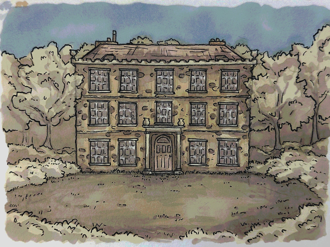
Immediately on reading the story and encouraged by further research, I felt the right way to illustrate this dark, mysterious period piece was with artwork I'd imagine finding in a book from its time. Think yellowed pages, ink, black-and-white printed illustrations... I wanted this to feel like the mid 1900s, not a book written and bound in 2022 - M.R. James has that particular writing style that demands it, really. I knew the house depicted in the mezzotint would likely feature heavily, so I started by doodling it out to get a feel for what I was picturing.
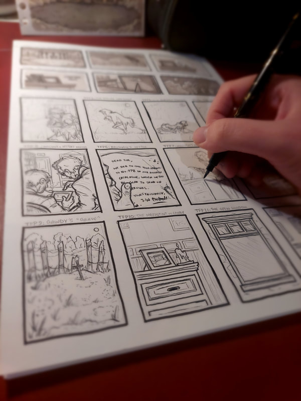
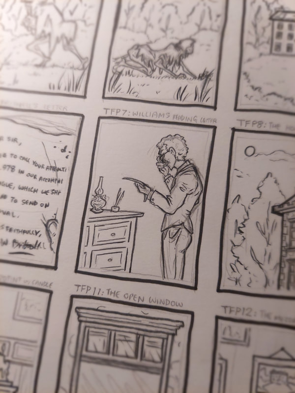
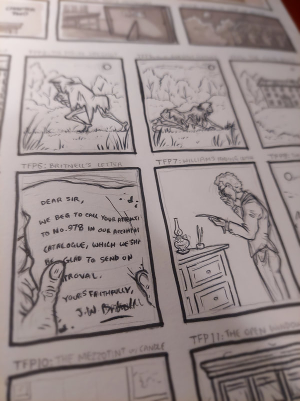
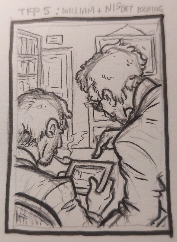
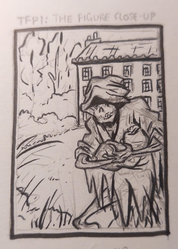
I then began thumbnailing ideas for each illustration (full page, chapter heading and cover), which you can see below. Using key scenes, interesting highlights from the text and inspiration from the references, I tried to keep my concepts literal but also clever and eye-catching. I was thinking to myself whilst doing this, that I'm probably more of a conceptual illustrator - I don't naturally gravitate towards literal illustrations, but I felt like this was particularly useful in developing compositional skill.
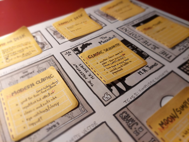
As always, there were ones I liked and ones that just didn't work, didn't fit the brief or weren't relevant enough. Narrowing down the favourites was the next step. I have personally found that "marking" my own work is useful here - you can see this in the picture with the yellow sticky notes, on which I have mused the advantages and disadvantages of each thumbnail to help me decide which would ultimately work.
As always, there were ones I liked and ones that just didn't work, didn't fit the brief or weren't relevant enough. Narrowing down the favourites was the next step. I have personally found that "marking" my own work is useful here - you can see this in the picture with the yellow sticky notes, on which I have mused the advantages and disadvantages of each thumbnail to help me decide which would ultimately work.
WORKING ON THE FINALS
After laying out my papers according to the project's size requirements, I started work on the finals. Though the brief stated the full page illustration could be in CMYK colour unlike the B&W chapter heading, I decided not to use any colour at all. This decision was made to keep the intended atmosphere running throughout the final illustrations.
To fit the feel of the story and its context (as mentioned earlier) I chose to illustrate via stippling and light linework, in ink on Bristol board. I saw dots in my sleep afterwards.
To fit the feel of the story and its context (as mentioned earlier) I chose to illustrate via stippling and light linework, in ink on Bristol board. I saw dots in my sleep afterwards.
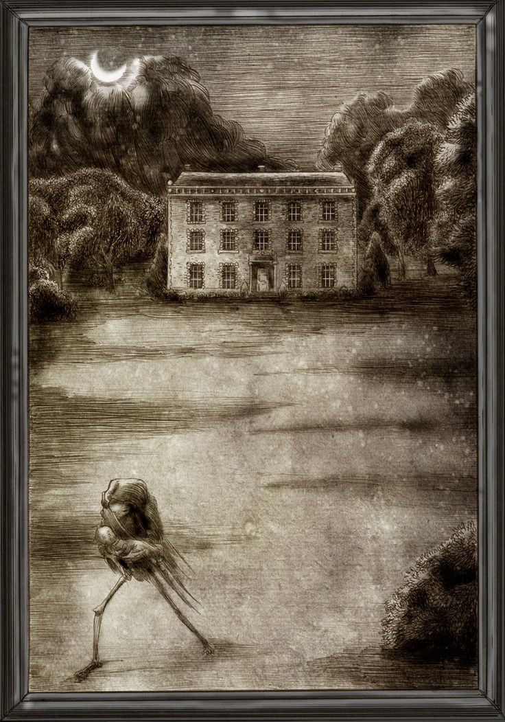
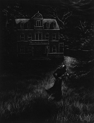
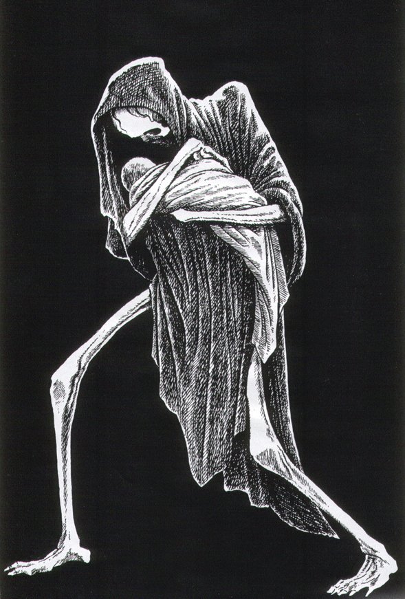
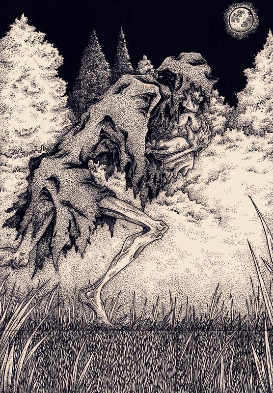
In the end, I chose to illustrate 'the figure' for the full page piece. Initially I wanted to avoid this, as it is what has been done in all previous illustrated adaptations, but the more I worked through the project the more I realised how integral and iconic a scene it was - so much so, it was the most relevant to use and the idea that best answered the brief. You can see my process for this piece above; I had probably too much fun drawing those bony limbs.
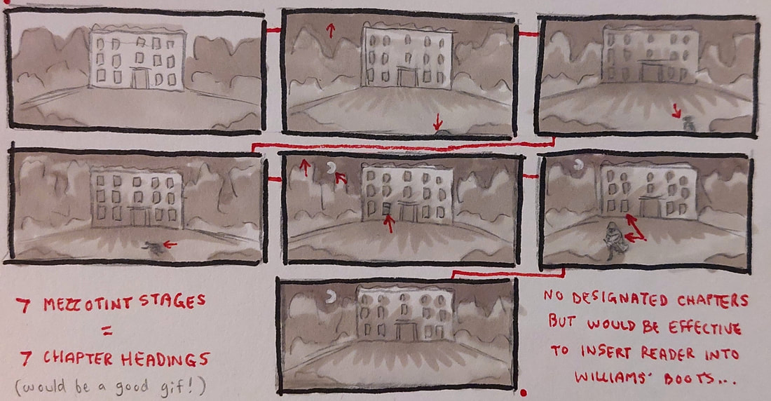
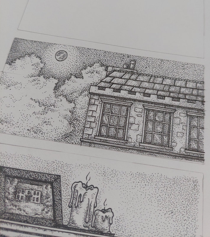
I chose to do a few chapter headings (in progress below) so that I could make sure they worked together in context. I tried to keep the feel of them similar so they'd feel natural in a book setting for this particular story.
In both the full page illustration and the chapter headings, I used different fineliner weights and different densities of stippling to differentiate tone and areas of the image (for example, 0.1 regular spacing for the cloak, 0.05 heavy-to-none on the figure's skin, 0.03 on the infant, etc). I am not the best at lighting so this was a challenge, but a welcome one as I need to improve this.
THE FINISHED ILLUSTRATIONS
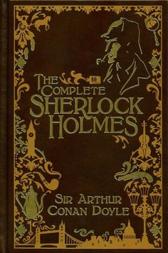
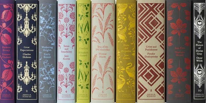
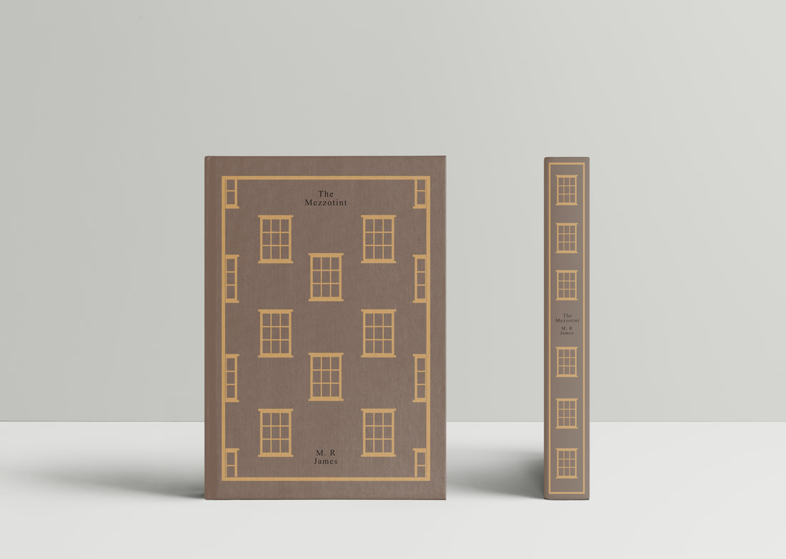
Below are my finished pieces for this project. Regarding the cloth-bound book cover and spine, despite having a few more 'out there' ideas for it, I eventually decided that emulating a Penguin modern classic cover would suit both the task and the nature/genre of the story. For the repetitive design, I chose the plain sash Georgian windows described in the mezzotint.
Site powered by Weebly. Managed by 34SP.com

