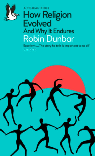
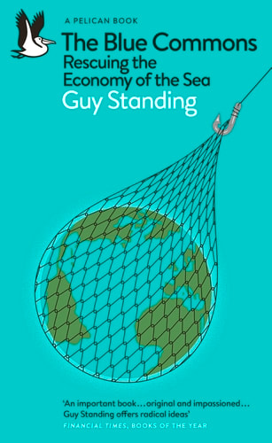
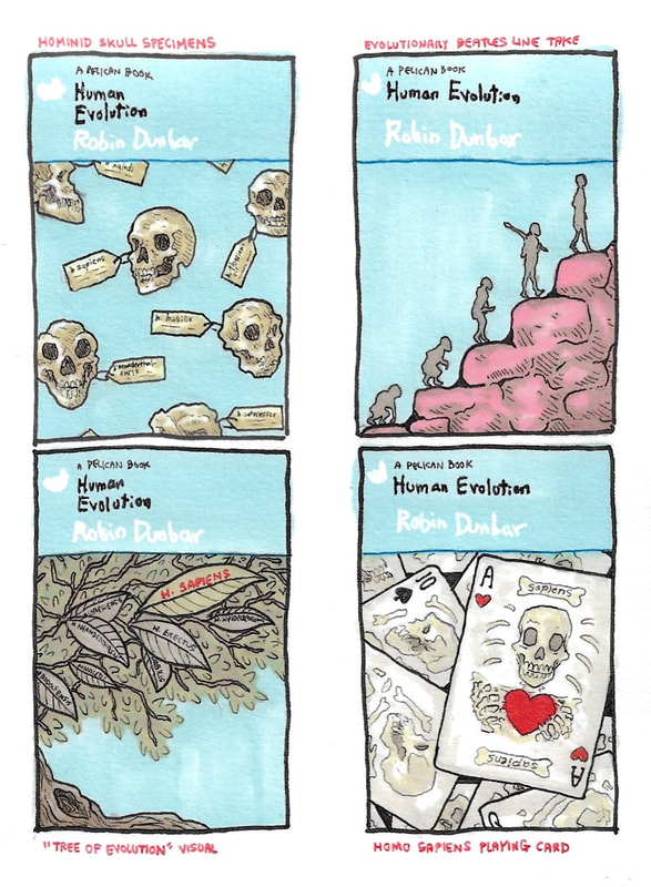
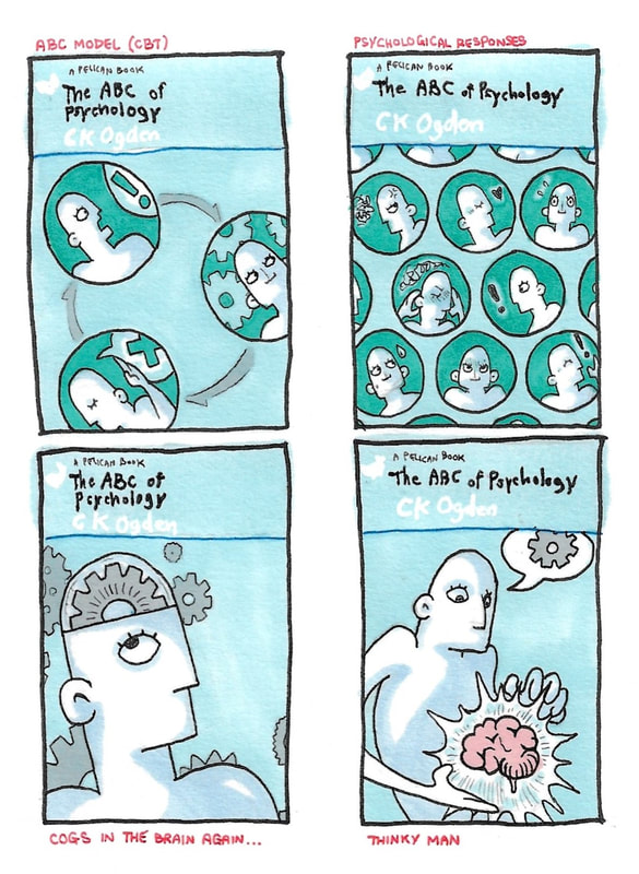
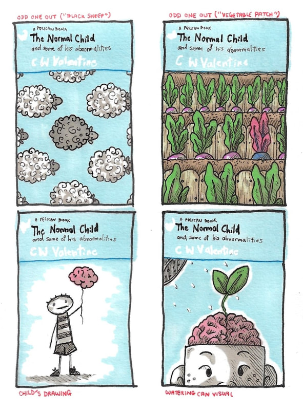
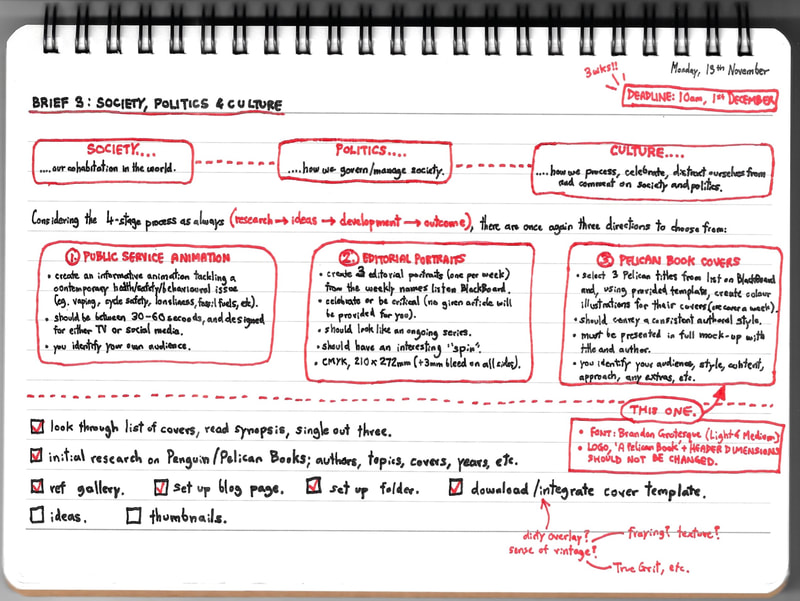
For this project, we were given a choice of three briefs: public service animation, editorial portraits and Pelican Book covers. I chose Pelican Book covers.
We were provided with a list of Pelican titles, and a Pelican Book cover template. The task was to select three of these titles and, using the template, produce colour illustrations for their covers. Style, content, approach and so on were up to us; full mock-ups of each cover were to be presented on outcome, and the resulting set of three had to convey a consistent authorial style.
We were provided with a list of Pelican titles, and a Pelican Book cover template. The task was to select three of these titles and, using the template, produce colour illustrations for their covers. Style, content, approach and so on were up to us; full mock-ups of each cover were to be presented on outcome, and the resulting set of three had to convey a consistent authorial style.
Pelican Books: Educational Reading for the Everyday Person
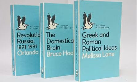
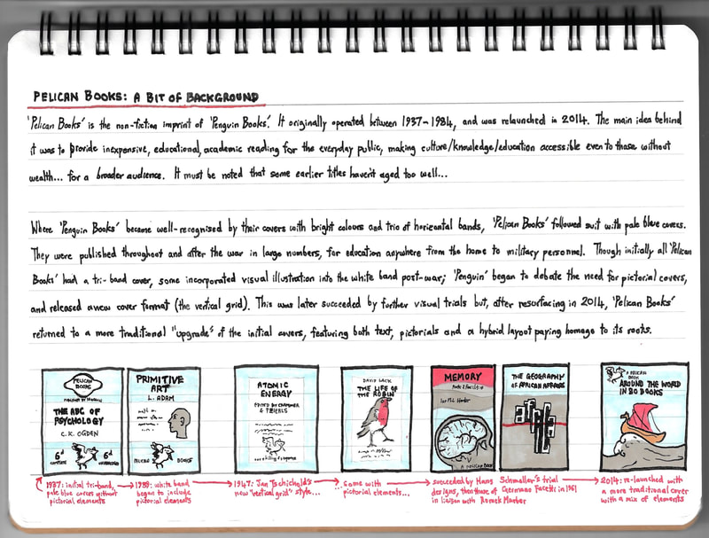
Pelican Books is the non-fiction counterpart of Penguin Books, originally operating from 1937 - 1984 until its recent relaunch in 2014. It aimed to provide affordable and accessible academic reading for a broad, public audience. Many Pelican titles were published during and after the war, to be found on bookshelves everywhere from households to military ranks.
Research
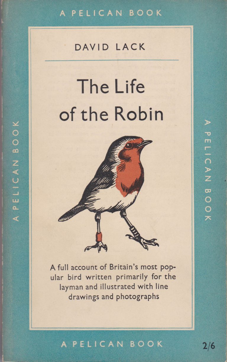
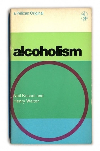
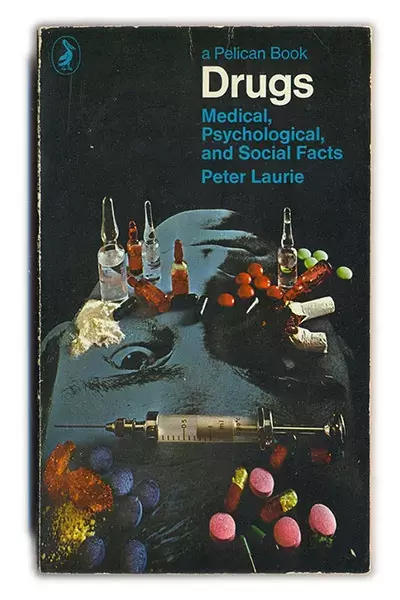
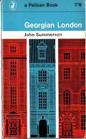
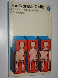
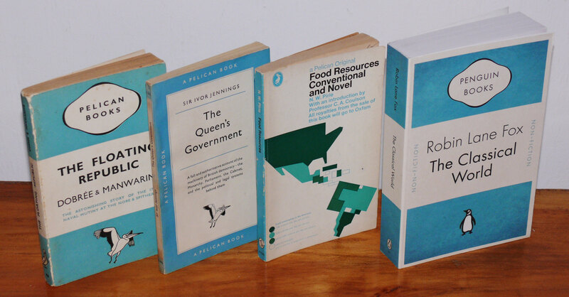
Although the template provided for us was a modern, relaunch-style cover, I wanted to contextualise my work by better understanding Pelican Books; its history, and the transformative journey of its covers. I read up on the different designs we've seen over the years, and the artists behind them.
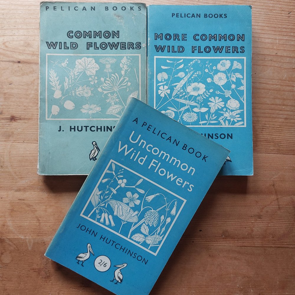
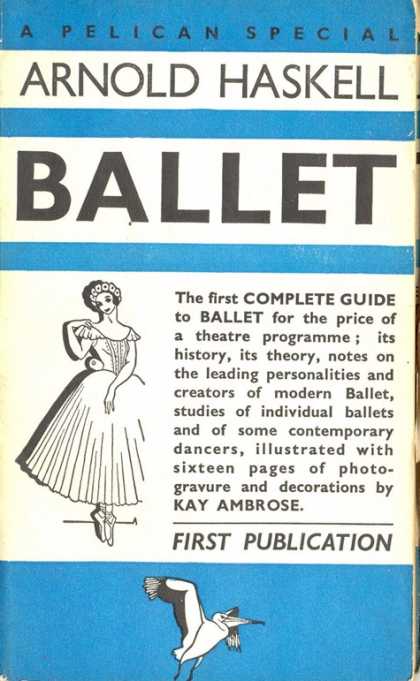
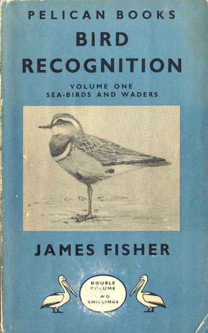
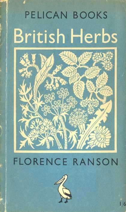
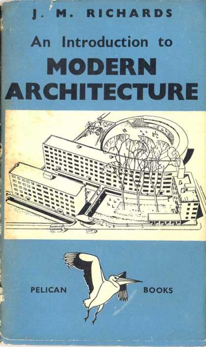
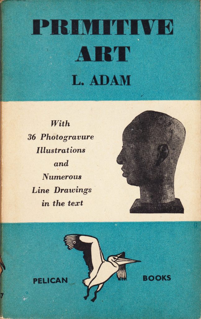
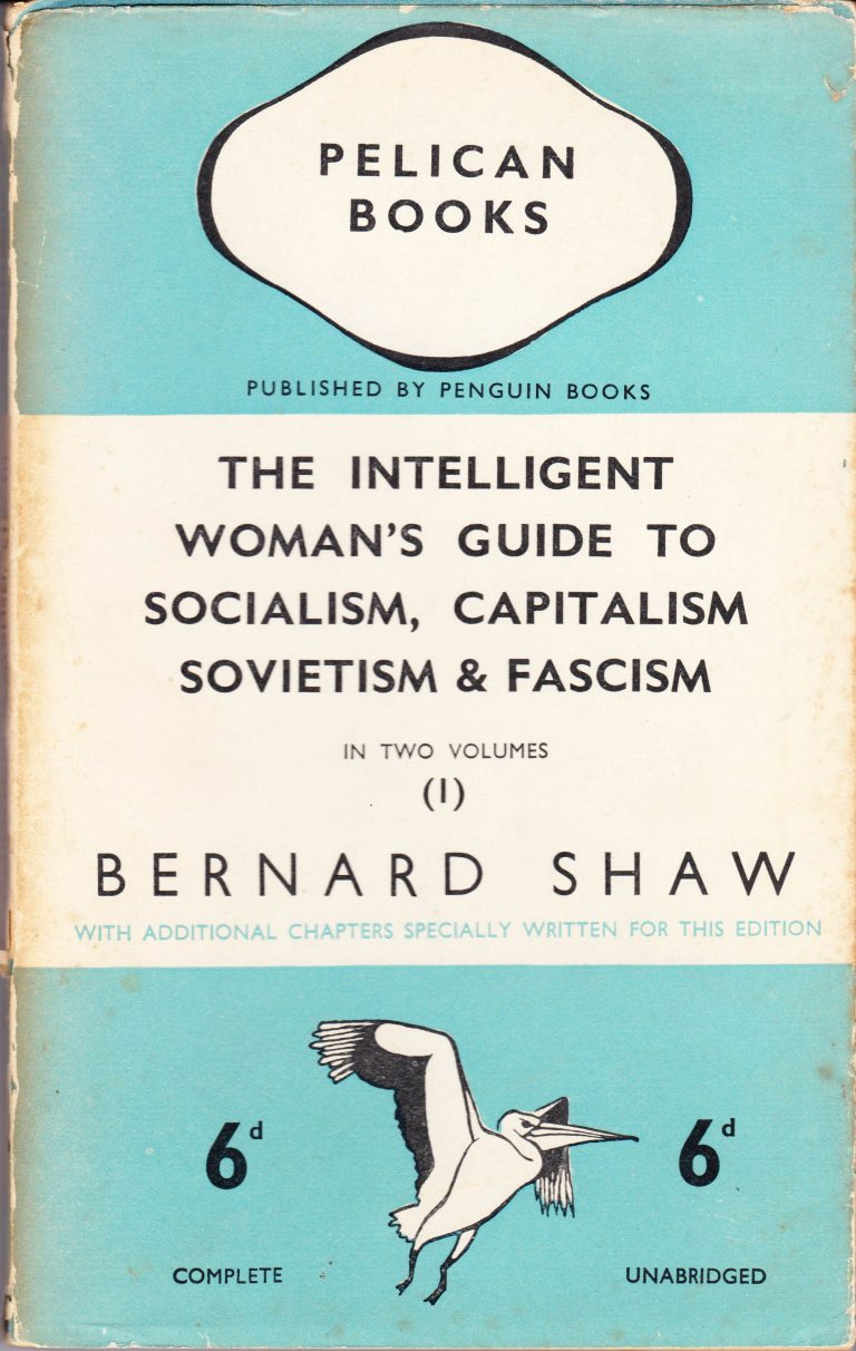
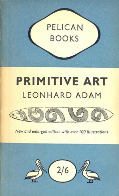
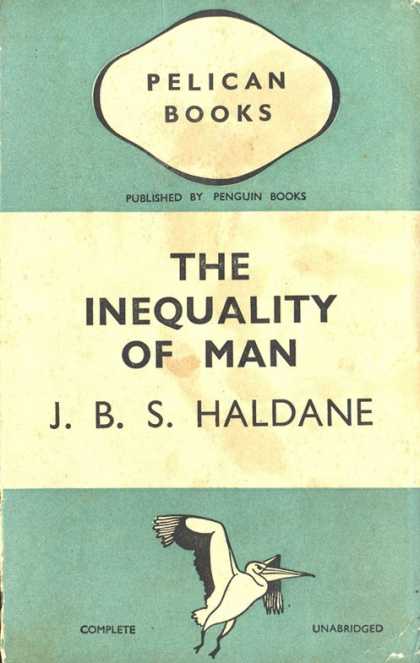
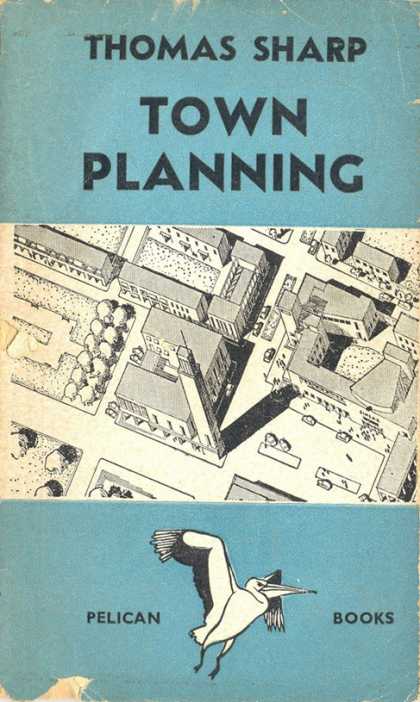
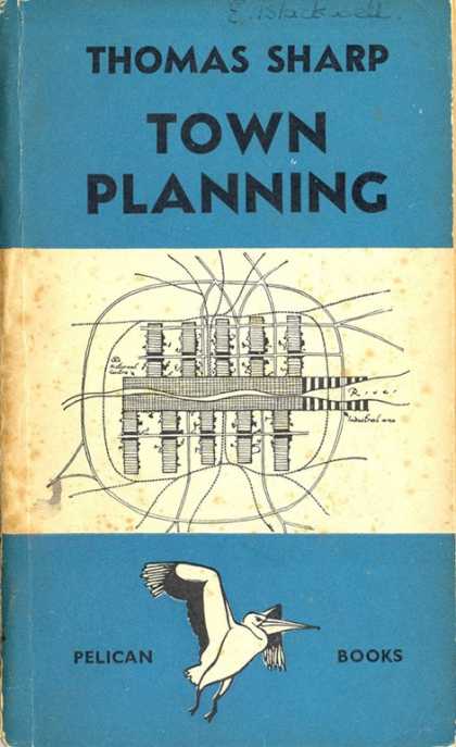
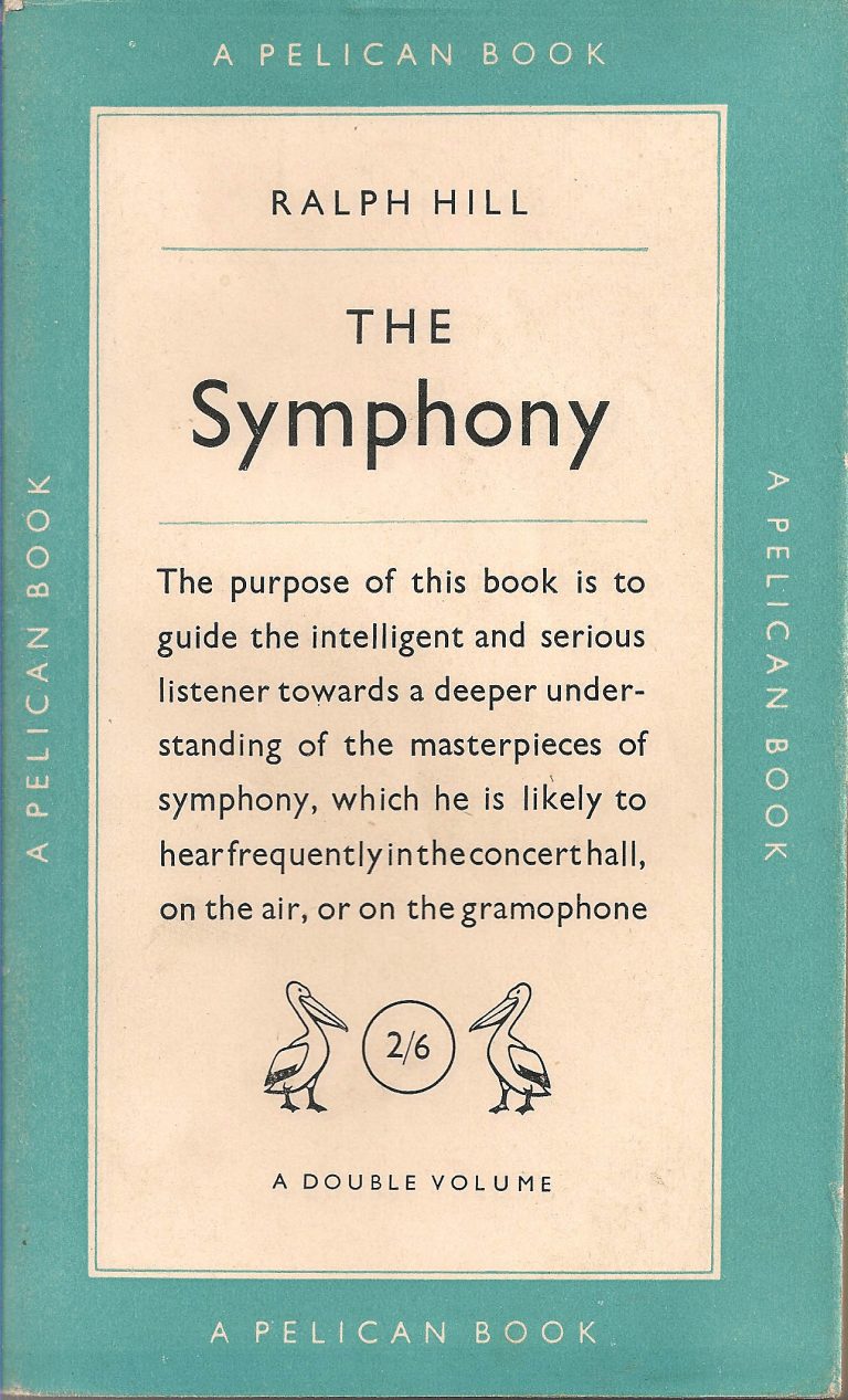
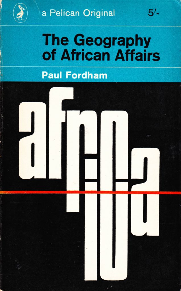
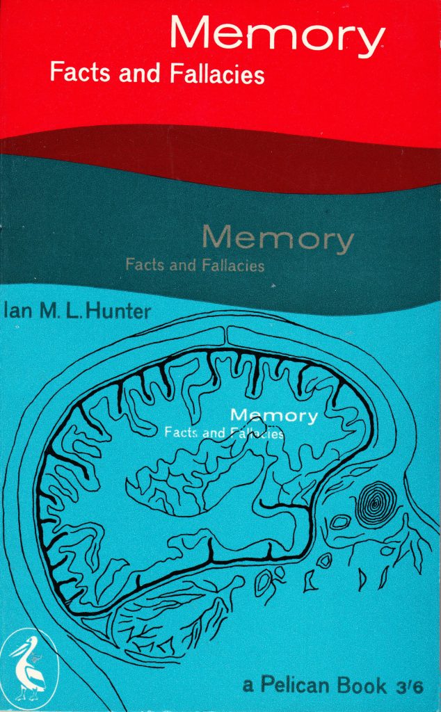
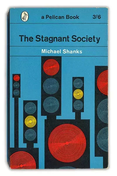
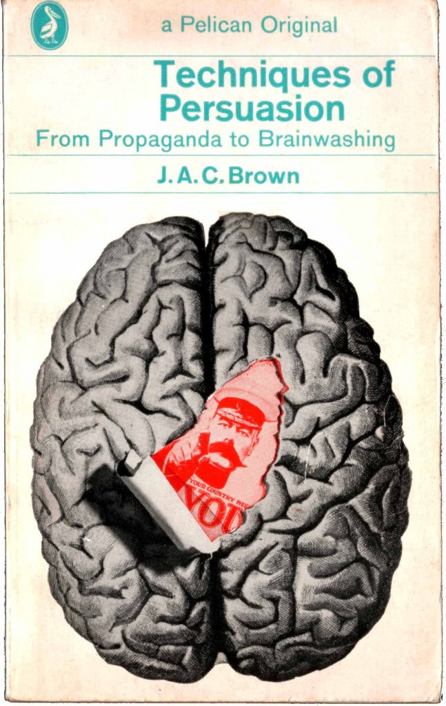
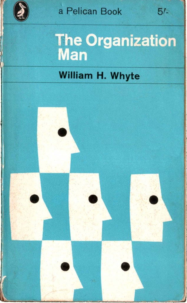
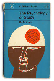
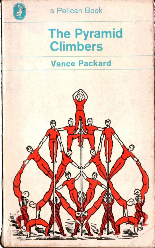
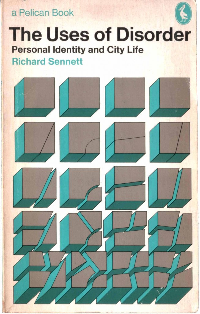
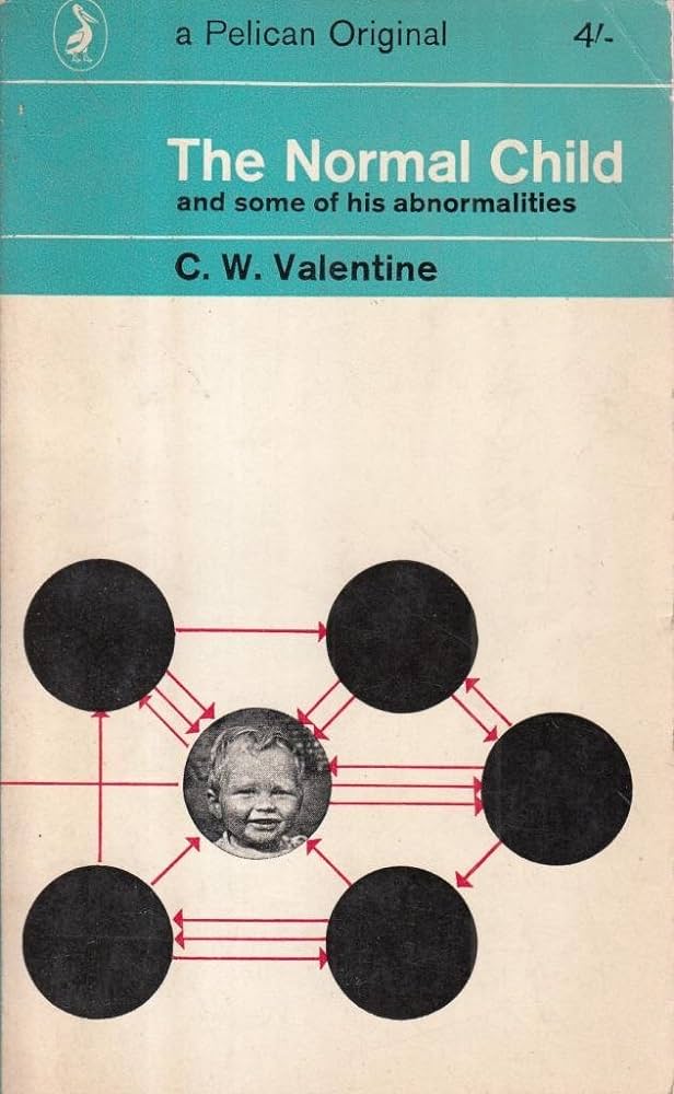
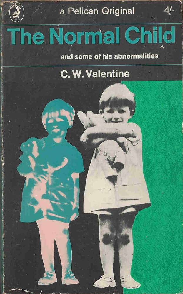
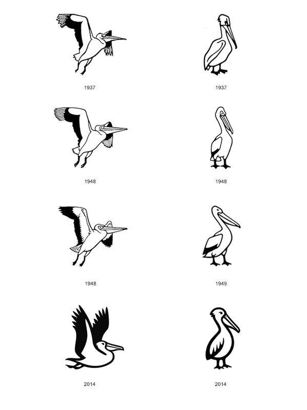
They changed to Jan Tschichold's vertical grid style in 1947, then again to Hans Schmaller's trial designs, and again to a wildly-different look by Germano Facetti in 1961.
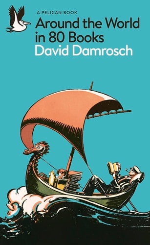
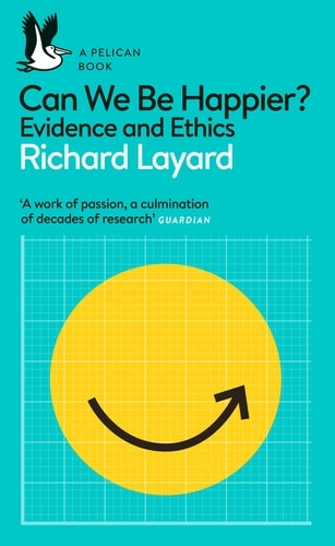
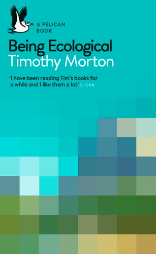
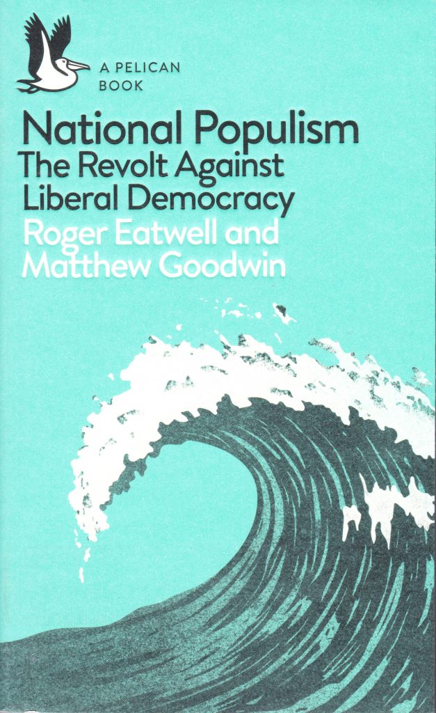
In 2014, the relaunch returned Pelican covers to an 'upgrade' of their traditional style. They now feature text and pictorial elements, with modernised, hybrid layouts.
Choosing From the List of Titles
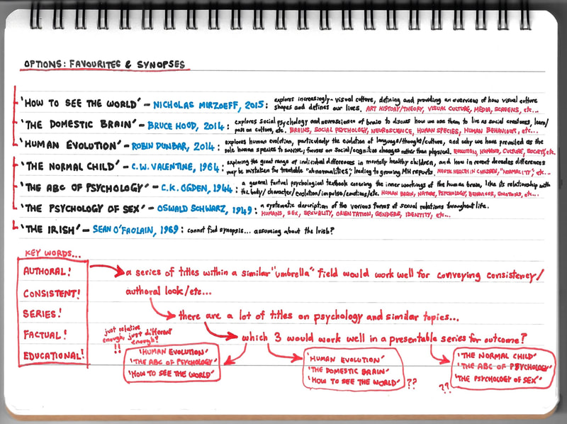
As for the list of titles we were provided for in this project, here they are with author, date and brief descriptions:
|
|
|
At this point, I did some brief research on all of the above, including:
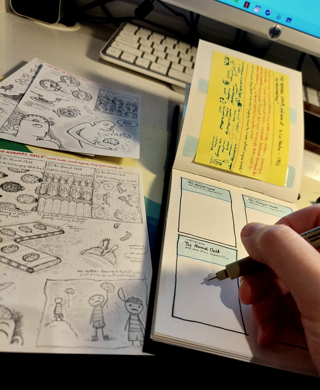
- synopses and themes - editions and timeframe - and any covers already produced (see right). I also made made notes to identify the running theme and any specific sub-themes; this helped me decide which titles would be best presented together in a trio. Given that the brief required the three outcomes to convey an authorial style, I was trying to envision titles that would look well presented together; a kind of 'box set' idea. I was looking for relevance within the running theme, and thinking of what would fit within the same illustrative and conceptual styles. |
Development
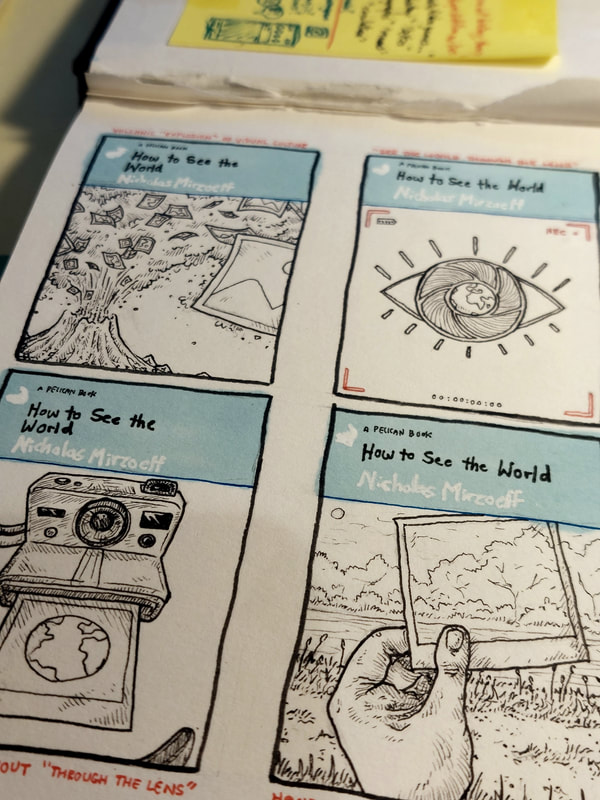
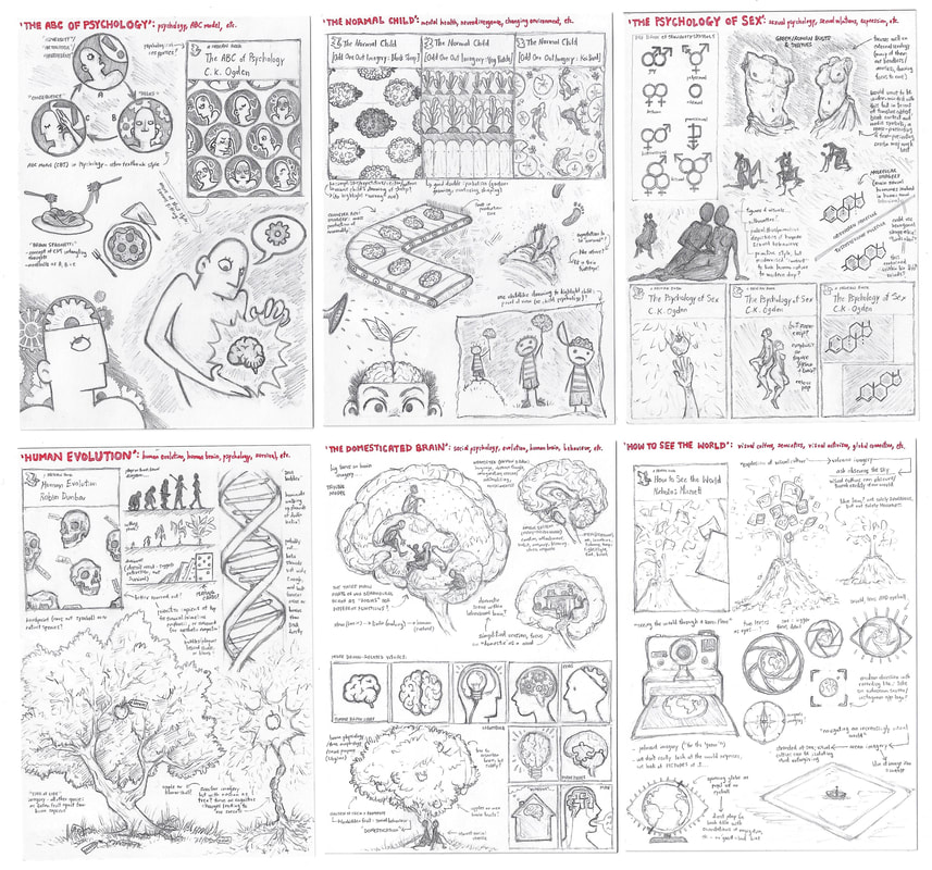
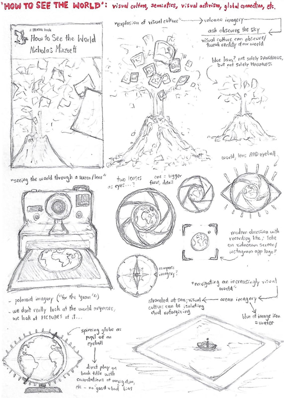
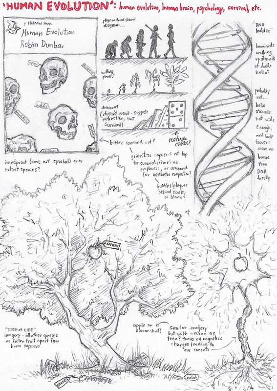
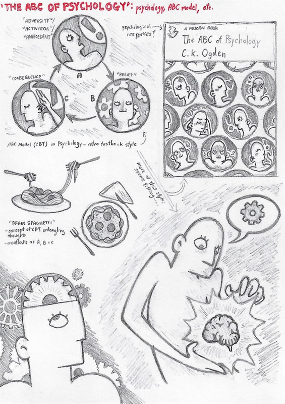
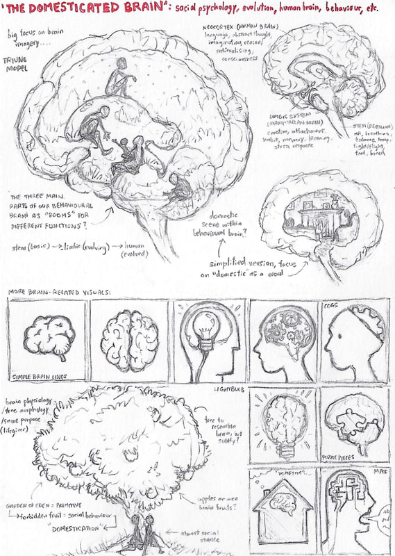
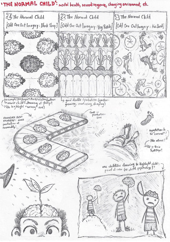
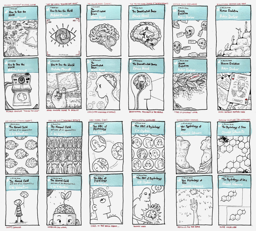
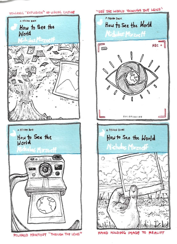
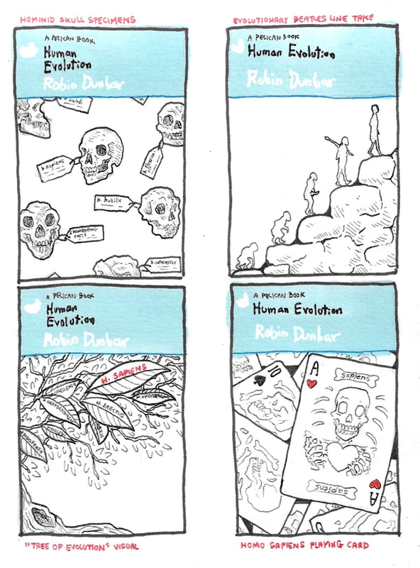
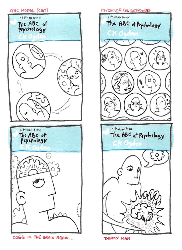
Alongside these notes I was sketching out visual notes and thumbnails, to see how well they translated from idea to paper. Looking at existing Pelican covers, especially the modern ones, I noticed the visuals regularly employed symbolism - simple enough symbolism to retain the appeal to a broad audience, but symbolism nonetheless. I enjoy reading into symbolism and have become quite fond of conceptual illustration, so I headed in that kind of direction.
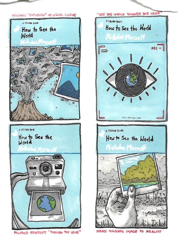
Initially I simplified the synopses into main themes and thought of "buzz words" - for example, "lens", "eye" and "visual" for 'How to See The World'. From there I developed relative conceptual visuals, and built these into cover ideas relative to the respective titles.
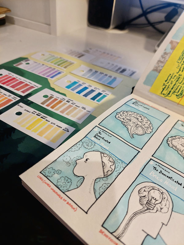
Once I had a few developed concepts for each title, I thought more on colour and composition and experimented with this. I was looking at how to pay homage to the traditional Pelican look (incorporating a main triad of blue, red and grey, though modern covers do contain a broader spectrum), and how to cleanly incorporate the visual with the titular banner.
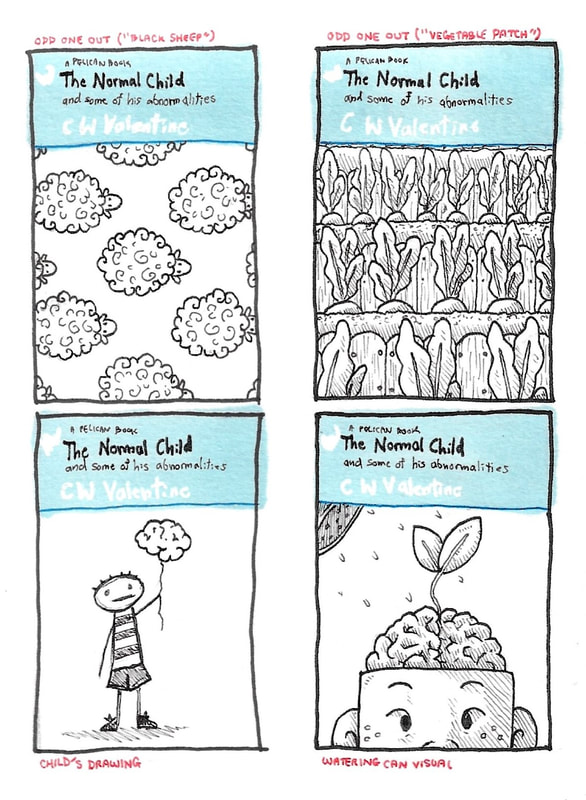
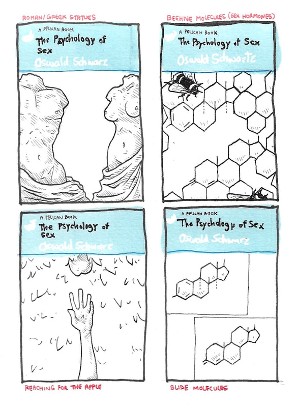
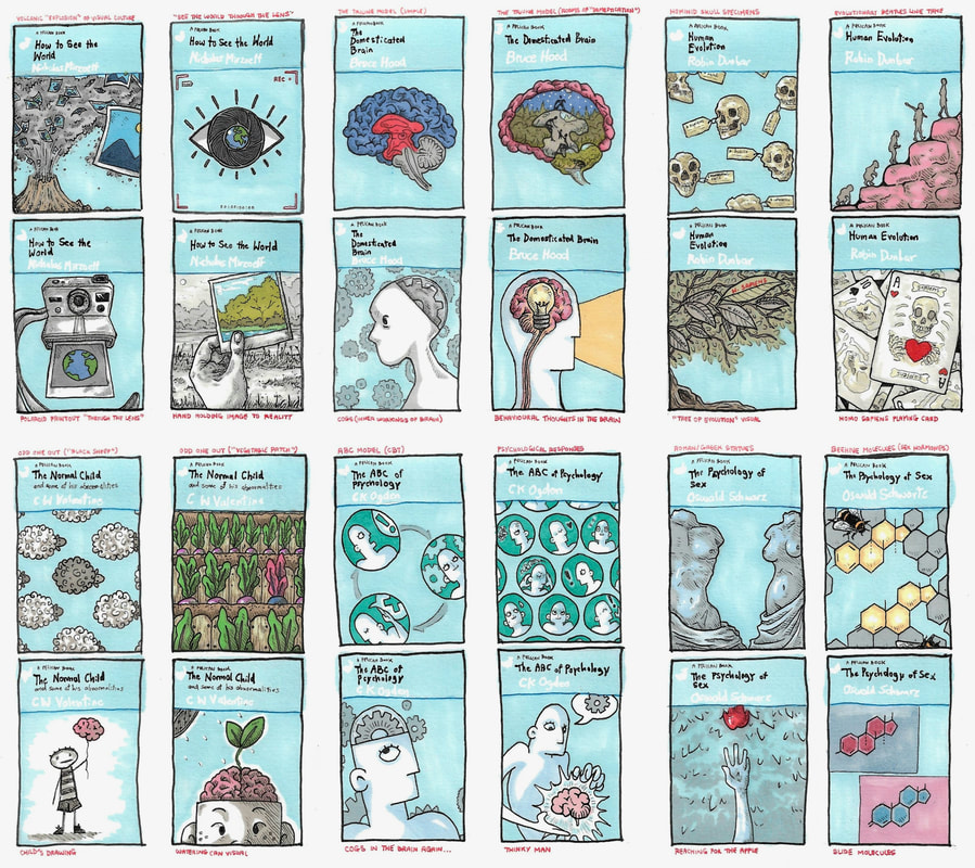
As mentioned earlier, I had to narrow all this down and choose a trio of titles and visuals that went well together in terms of theme and authorial style. My process of decision can be seen mapped out in the notes below; I ultimately landed on a different option, but it was still a necessary process for me to trial the others.
Designing the Final Covers
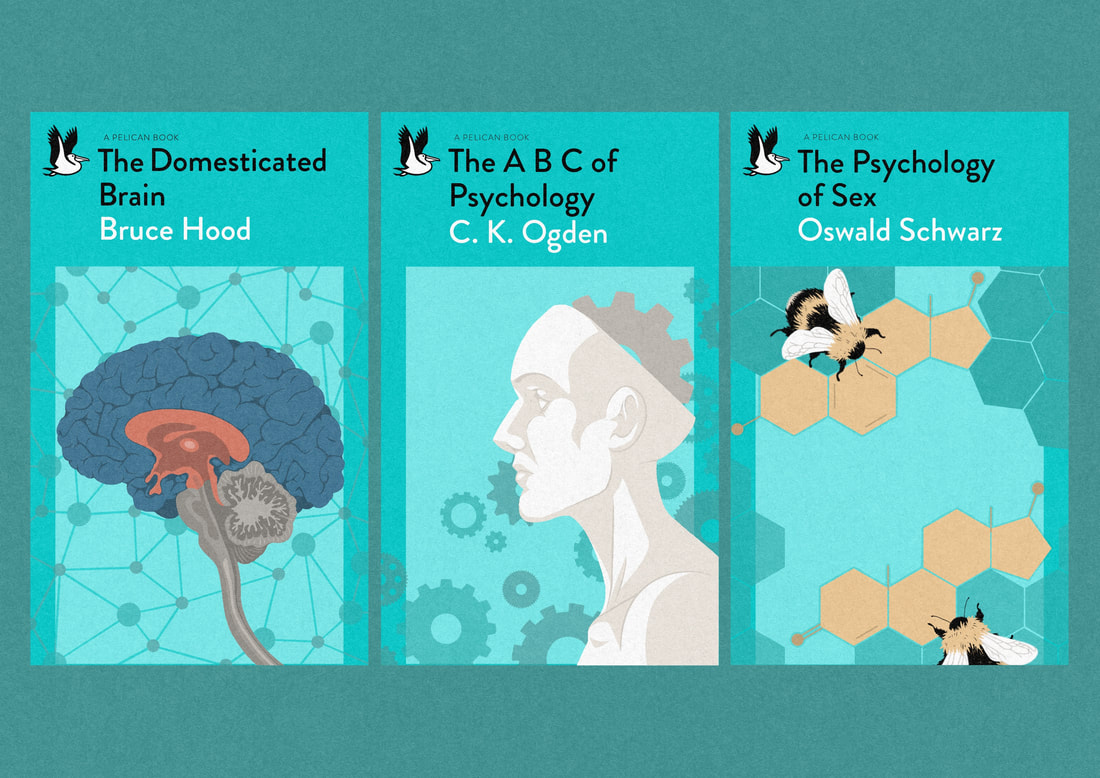
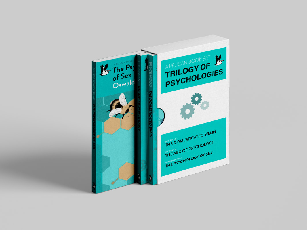
The titles I chose are 'The Domesticated Brain', 'The ABC of Psychology' and 'The Psychology of Sex'. The more I experimented with different combinations, the clearer the potential for themed triads became. I felt these three titles worked particularly well as a set relative to psychology, specifically social and behavioural psychology pertaining to grown humans. To me, that seemed the most fitting combination for a themed or sequential set, given both the educational purpose of Pelican books and their adult audience. I could realistically picture these titles in a sort of "Pelican box set"; a pack that introduced behavioural psychology in three major areas of adulthood, on bookshelves from a college library to the personal guidance section in a bookstore.
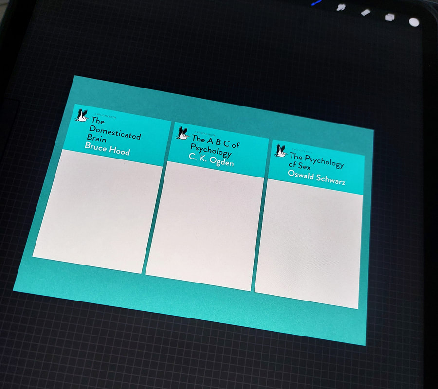
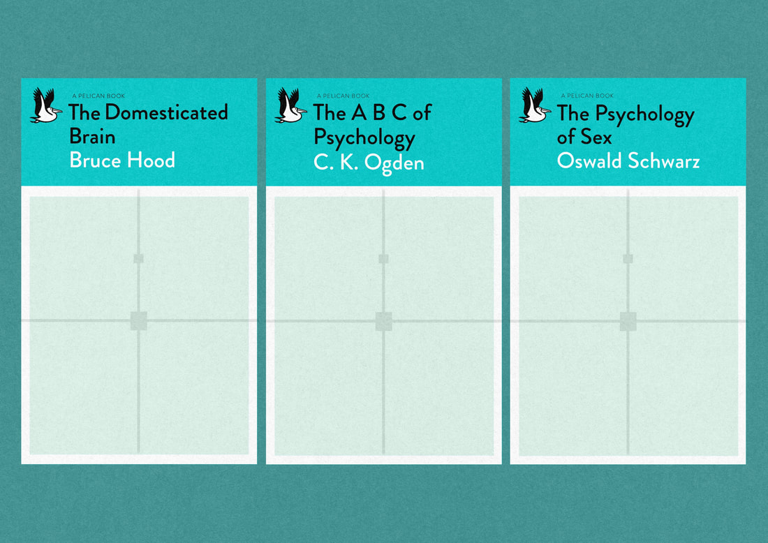
Before creating the final visuals, I laid the groundwork by preparing my canvas. The template resolution wasn't great, so I sharpened that and scaled it to a realistic Pelican book size. I installed the typeface used by Pelican (Brandon Grotesque), made up the banners of my three chosen titles, and added some bleed/central guidelines to keep me right. To give the finals as close to a paperback look as I could, I also applied a clipping mask paper texture.
Before creating the final visuals, I laid the groundwork by preparing my canvas. The template resolution wasn't great, so I sharpened that and scaled it to a realistic Pelican book size. I installed the typeface used by Pelican (Brandon Grotesque), made up the banners of my three chosen titles, and added some bleed/central guidelines to keep me right. To give the finals as close to a paperback look as I could, I also applied a clipping mask paper texture.
As well as the set looking authorial to me as the artist, I wanted them to look fairly fitting with other existing Pelican covers. Since the template we were given was clearly from the 2014 relaunch, I kept to that layout and went for a similar level of visual symbolism - I aimed my style heavily towards the look of newer titles, but I did want to incorporate the Facetti's eye-catching colour palettes.
The concepts I felt went best together as a visual triad were:
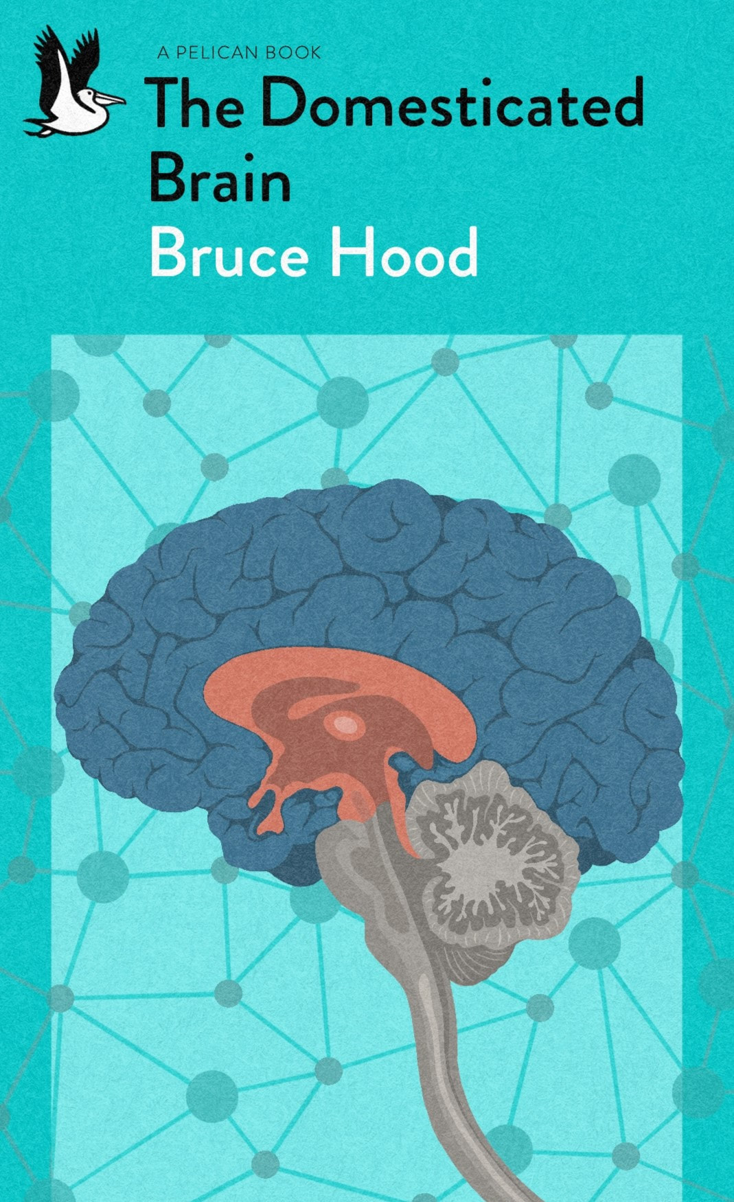
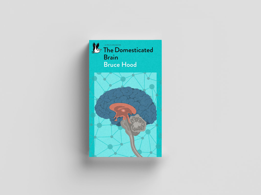
- the triune brain model for 'The Domesticated Brain'
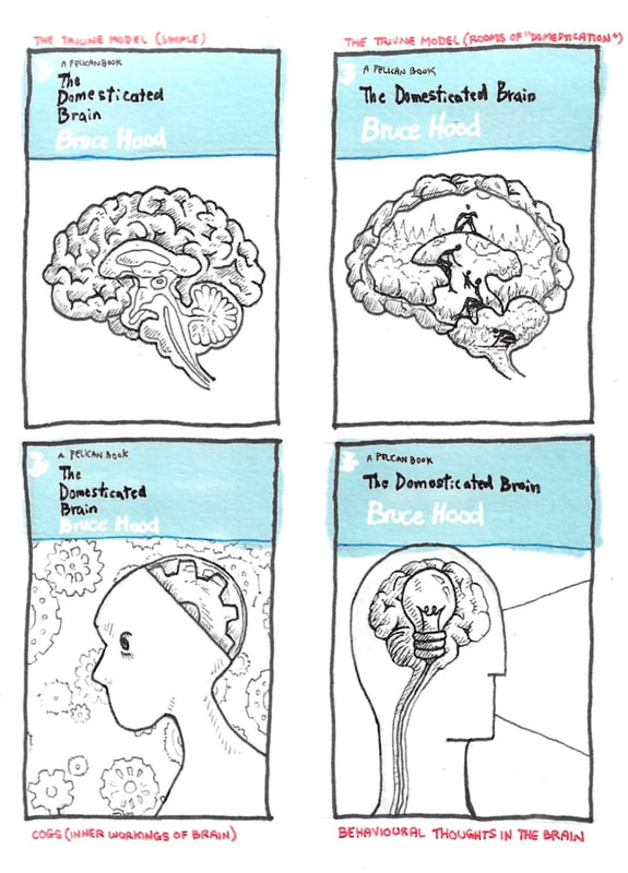
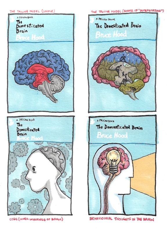
This title has a clinical feel to title and contents, so I felt the illustration should be slightly less conceptual and a little more factual like a scientific diagram. The 'triune model' is a cross-section model showing the three evolutionary parts of the brain responsible for our social and behavioural development throughout history, which I felt was a fitting visual for this title.
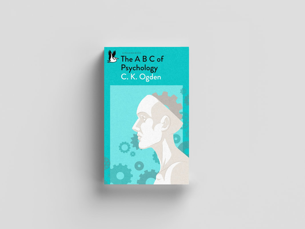
- the cog-brain side profile for 'The ABC of Psychology'
Also a clinical/scientific diagram, but the topic of psychology has more scope for conceptual visuals. Given the title and contents pertain to the inner workings of the human brain, I thought the depiction of the brain itself as a "cog in the works" was appropriate.
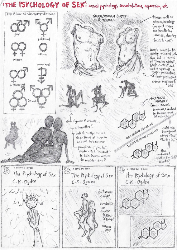
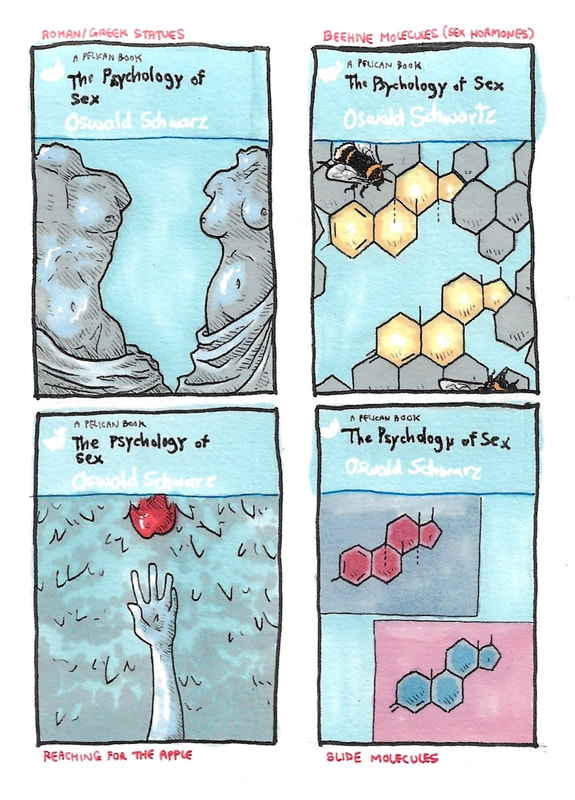
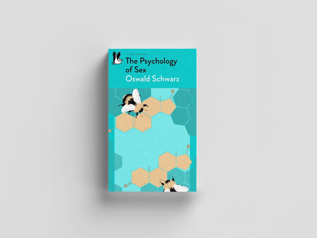
- and the molecular bees for 'The Psychology of Sex'
I'd figured out at this point that more "mature" visuals didn't really fit with the vibe of the other two covers in the set, so I wanted something subtler - something that might not have related to the title at a glance, but revealed its ties through symbolism on closer inspection. The main and most widely-known sexual hormones in any human being are oestrogen and testosterone (key elements of the system that ultimately influences our sexual behaviour), and their molecular structures just so happen to be composed mainly of hexagons. I felt there was a lot of symbolism at my disposal here; bees build honeycomb with hexagons for efficiency of purpose, as the human reproductive system is primally designed to be efficient for purpose. To be considered was also the link to the saying "the birds and the bees" - the bird was already present (the pelican), so I just added the bees.
|
|
I looked at various different visuals of the triune - from textbook diagrams to models to organic cross sections - to understand the composition of it before I imposed my own stylistic choices onto that. The brain itself worked best central, with the brainstem leading down to the bottom right-hand corner as a line-of -sight encouragement to open the book. I used simple, flat shading and no outline, which highlighted the separation of the brain parts by colour contrast.
The idea of neurons making up the backdrop was present from the start. However, when I tried this out initially with more realistically-shaped neurons, it was far too busy and had strayed from the simplistic style. I scaled it back to a more rudimentary depiction of neural connections, which worked much better and would also connect easier authorially to the other covers. |
|
I kept in line with the simplistic style for the next two covers, and I wanted to keep the flat shading going to highlight this. The cross section of the triune was flat, and the side-profile of the human in this visual didn't look right with rounded/softened shadows... but neither did it look quite right in geometric planes. I went for somewhere in the middle with elements of both, which I felt looked most appropriate. Using modified gridlines on Procreate to help me sketch out the cogs, I then layered them in the background and edited the colours and opacity. In all three covers, the background colour palette and opacity was carefully chosen to bring out the main illustration as well as keeping everything looking fairly Pelican-ish. |
|
|
|
I employed gridlines again to make sure my hexagons were properly hexagonal - I kept this initial shape as a base layer to duplicate and edit. I constructed the hormone molecules first before building the rest of the honeycomb around them. This took a couple of tries, as my initial placement left no room for the molecular bonds (which were a key part in identifying them as oestrogen and testosterone respectively). The final arrangement of hexagons was reached by planning the composition "not too symmetrically" around the central lines. Yellow didn't tend to be one of the colours Facetti incorporated in his covers, but I felt using a muted shade fitted in well. |
Final Outcome
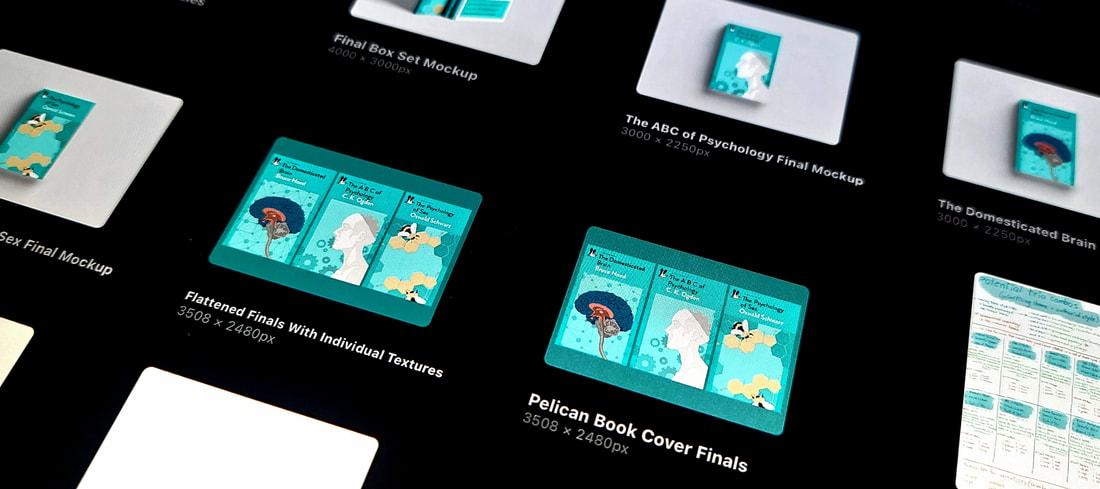
Above are my final designs for all three covers. I had created them side by side on the one canvas so that I could visually keep track of my choices as I went and ensure I ended up with an authorial look to the set - this meant consistently considering colour, composition, style and concept as well as keeping the target audience and the purpose of Pelican books in mind.
I am not well acquainted with using mock-up templates. This part of the brief proved to be tricky for me, and a frustrating but rewarding learning curve.
As a final step, I wanted to bring the "box set" idea to life. It was tempting to overcomplicate when designing the box cover, but the end result of a simplistic, clinical, "science textbook" sort of look seemed to be much more on brand with Pelican. The only visuals added were the trio of cogs in the middle - to indicate the set's psychological theme, and represent the three separate books and how they cooperated in a broader system.
As a final step, I wanted to bring the "box set" idea to life. It was tempting to overcomplicate when designing the box cover, but the end result of a simplistic, clinical, "science textbook" sort of look seemed to be much more on brand with Pelican. The only visuals added were the trio of cogs in the middle - to indicate the set's psychological theme, and represent the three separate books and how they cooperated in a broader system.
Site powered by Weebly. Managed by 34SP.com

