LAURELFLORIAN.GRILLUST.UK
  • Home
  • About Me
  • Portfolio
  • Student Blog
    • Year 1 >
      • Semester 1
      • Semester 2
    • Year 2 >
      • ILLU5020 - THE ILLUSTRATOR'S TOOLKIT >
        • Inkwork
        • Paintwork
        • DIGITAL
        • 3D EXPERIMENTAL
      • ILLU5040 - DRAWING >
        • SKETCHBOOKS
        • LIFE DRAWING
        • LOCKDOWN DIARY
      • ILLU5050 - ILLUSTRATION PROJECTS >
        • Conceptual
        • The Mezzotint
        • The Pied Piper
        • Protest Pack
      • ILLU5060 - THE CRITICAL ILLUSTRATOR
    • Year 3 >
      • Advanced Illustration Projects >
        • History
        • Science
        • Society, Politics & Culture
      • Final Projects >
        • Creative Identity & Branding (main page) >
          • Development
          • Outcomes
        • Visualising Pet Care >
          • Development
          • Outcomes
        • Botanical Folklore Tarot >
          • Development
      • The Degree Showcase
  • Get In Touch

THE CRITICAL ILLUSTRATOR

A blog documenting the theory sessions of the critical module.

WEEK 4: The Graphic Code of Comics

23/2/2022

0 Comments

 
Comics are essentially a set of graphic signs used to tell an artist's story. These signs are unique to comics - they've evolved over time, and are easily understood by most readers on a broad spectrum of literacy. Surface efficiency is more important than underlying complexity - sometimes less is more in the world of comics.

To create a comic page, an artist selects, renders and arranges codified elements (visual and lingual content, sound effects, symbolic icons, etc) to make a narrative for the reader.

To read that narrative, the viewer must make connections to decode both visual and lingual signs. They must also understand how to navigate the page. There are three levels on which a reader can approach the page:
​
  • Level of Page: to appreciate the composition.
  • Level of Strip: to appreciate the style, and the use of the strip as an intermediate ellipse in the narrative.
  • Level of Panel: to engage in visual and textual content, present anchorage, and the transition between panels.

COMPONENTS OF A COMIC PAGE


​THE MULTIFRAME


The multiframe is essentially the spacio-topical system of the page; the interrelation between all the frames involved. This definition was suggested by Thierry Groensteen, along with the idea of the hyperframe (the delineated space of the page).
​

PANELS


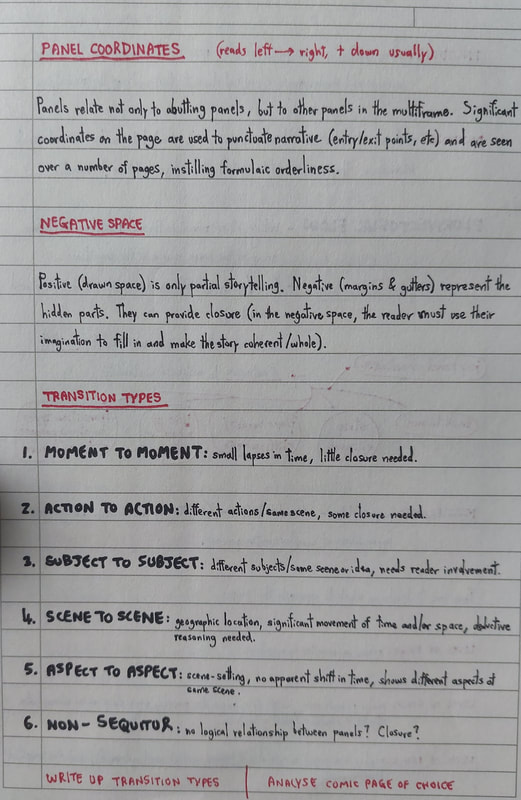
Panels are sequential frames for visual content; they keep the rhythm of the comic, giving it its vital heartbeat.

​The relationship between panels is fundamental - not only for abutting panels, but to others in the multiframe. Panel coordinates provide narrative punctuation and formulaic order for the reader.

GUTTERS & NEGATIVE SPACE


Gutters are the spaces between panels; together with the page margins, they make up the comic's negative space.

Despite its title, negative space is still 'active'. The positive (drawn) space only partially tells the story - the negative space represents an opportunity to invoke the reader's imagination, give closure, and essentially make the narrative whole.
​

SPEECH/THOUGHT BUBBLES


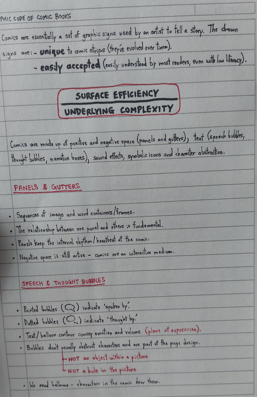
​The appearance of speech and thought bubbles is an evolved code. For example, pointed bubbles indicate the text is 'spoken by', and dotted bubbles indicate it is 'thought by' - the contouring of both the bubble and its text can effectively convey emotion and volume.

It is important to note that text bubbles should not be seen as an object or hole within the picture.
​

FLOW & TRANSITION


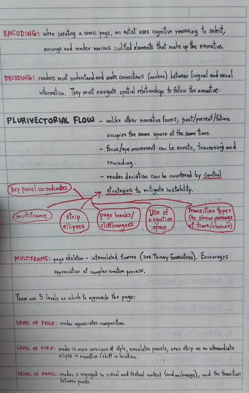
Comics, unlike other narrative forms, often feature the past, present and future occupying the same space. Groensteen describes this in his writing about plurivectorial flow. The reader's eye traverses and rewinds across panels and pages - unwanted deviation can be countered using control strategies.

To control narrative flow and reader direction, you can utilise:
​
- key panel coordinates.
- page breaks and cliffhangers.
- the use of negative space.
- different transition types to show passage of time.
​- etc.

The transition types themselves are as follows:
​
  • Moment-to-Moment: small lapses in time - little closure needed.
  • Action-to-Action: different actions / same scene - some closure needed.
  • Subject-to-Subject: different subjects / same scene or idea - requires reader involvement.
  • Scene-to-Scene: geographic location, significant movement of time and/or space - requires deductive reasoning.
  • Aspect-to-Aspect: scene-setting, no apparent shift in time, showing different aspects of the same scene.
  • Non-Sequitur: no logical relationship between panels.
​

 CASE STUDY: 'SWEET TOOTH' by Jeff Lemire
​

Picture
Jeff Lemire, in studio

​Jeff Lemire is a Canadian comic book author and artist. After originally studying at film school, deciding it didn't suit his solitary nature, Lemire switched tracks to forge a career in comics. He has a very particular style; with a dark approach to storytelling visualised in bold ink linework, he excels at incorporating a psychological horror element into much of his work.

Lemire has worked for numerous well-known publishers (including DC, Marvel and Dark Horse) and has produced a wide range of comics. However, 'Sweet Tooth' arguably remains his best-known work.
​
Picture
inkwork by Lemire
Picture
right to left: screenshot from the 'Sweet Tooth' Netflix adaptation, Jeff Lemire, artwork from the 'Sweet Tooth' comic series


'SWEET TOOTH'

Picture
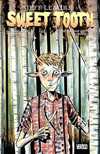
cover art of Lemire's 'Sweet Tooth', Book One

​'Sweet Tooth' 
is a post-apocalyptic work of fiction that fluently merges fantasy with horror. Set in a world ravaged by a deadly virus, the remaining human population struggles to survive; blamed for the onset of the virus, the mysterious hybrid generation are persecuted. Gus, a young deer-boy hybrid, is the key to the past and future.

A lot of Sweet Tooth fans have been introduced to the series via the recent Netflix adaptation, which garnered a huge number of viewers during the Covid-19 pandemic (ironically apt timing which probably boosted interest in the concept). Lemire's comics have sat on my bookshelf since long before the TV adaptation. Although I'm a huge fan of how Netflix has tackled the series so far, there's just a beautiful, macabre something to the comics that can't be recreated.
​

PAGE ANALYSIS
​

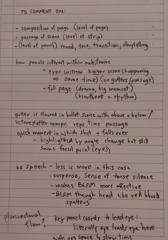
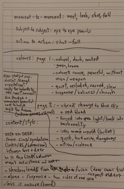
I have always been fascinated by the masterful art of graphic novelling; even at a mere glance, a comic can convey such complexity and make it feel effortless. The underlying graphic code is what allows this. Saying that, it felt odd to pick apart the whats and hows of something so subconscious; as if writing instructions for how to walk. You can find my rough scribblings for this task in the notes section.

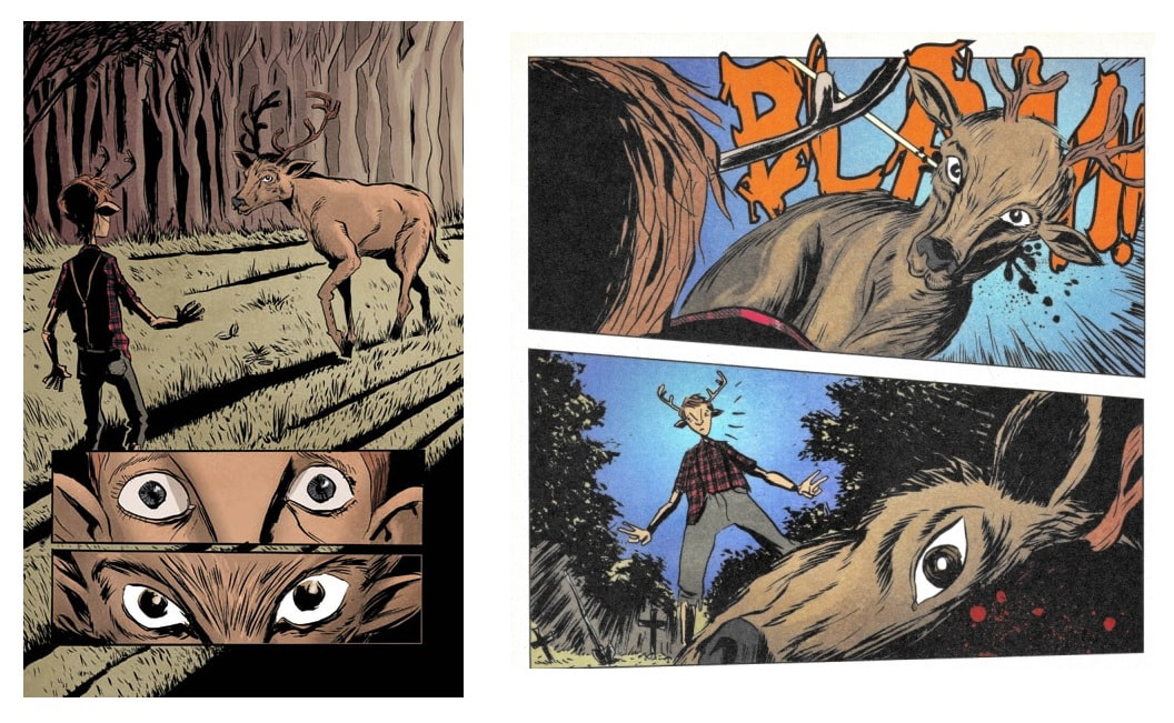
Below, I will be focusing on these two pages in Book One of the Sweet Tooth series. This scene takes place very early in the comic, towards the beginning of the issue, with a page turn separating it.
Picture
At first glance, the reader can appreciate the scene on three different levels. At page level, we get instant effect from the composition; at strip level, we gain a greater understanding of how the scene transitions; at panel level, we can appreciate the use of style and content to emphasise storytelling and tone.

​Like any other semiotics analysis, we can observe each page in terms of denotation and connotation, for both visual and linguistic content. 
​

VISUAL CONTENT
​

Let's take it literally first.

​The first page sports a full bleed panel, almost like a background - it takes up the entire page, and is overlaid towards the bottom by two long, smaller panels. In the larger panel, we see Gus being approached by a stag in the forest. In the smaller panels, we are shown the eyes of both subjects respectively.

The second page is comprised of two panels; one showing the stag being shot in the head (from Gus's perspective), the other showing Gus looking down at the now-dead stag (from ground perspective).
​
Now let's read into the connotations. 
​
​
There are only two subjects here; Gus and the stag. They are relatively small compared to their surroundings on the first page. The size and sparsity of the full-bleed panel infer a sense of privacy, telling us the interaction is slow and suspenseful - right away, we know this scene is an important moment.

The genetic similarities between Gus and the stag are obvious, but this goes beyond simple denotation. More than "they both have antlers". This is a symbolic moment in which Gus effectively stares down his own reflection, as inferred by the eye closeups - he and the stag are two sides of one coin, both the same and different simultaneously. Gus' hybrid features emphasise that he is the link between the animal and human worlds, reinforced by their literal 'meeting' in this scene. Considering Sweet Tooth's concept of human extinction and hybrid succession, he may also represent the link between the Earth's past and future (and the key to its survival).

Another striking element of that first page is its lighting; it is stark and dramatic, creating an intense atmosphere. The light's golden hue suggests a certain holiness that, when paired with the woodland setting, may prompt us to consider the Garden of Eden. The light's source being placed behind the stag also supports a sacred theme, bearing similarity to religious imagery in which the subject is approached by a god or holy messenger. 

It is important to note the interaction too. If we look at Gus, we can see his hand is raised tentatively; his body language signals that he is wary, unsure, perhaps a little afraid. In contrast, the approaching stag's gait leads heavily with his head; he is calm, confident and purposeful. Running with the idea of a celestial encounter, the stag may be a symbol of higher power - a messenger silently giving Gus his task. Gus is also situated in the shadow cast by the stag, which could reinforce religious hierarchy and the idea that animal preceded both human and hybrid in evolution.*
​
* these points actually foreshadow a plot development later in the series, detailing Gus' link to the Inuit deer god of hunting Tekkeitsertok 

The main effect of the second page is its contrast to the first, particularly regarding colour palette, speed and volume (yes, volume). Previously, as mentioned, the colours were very natural - dark, muted greens and browns that created a sense of nature's peace, devoid of man and weapon. The sudden introduction of vibrant blues and reds feels like being forced into blinding light, into a dangerous reality - like a deer in the headlights. You can almost feel the gravity of Gus' realisation as he is exposed to man's violence; you can almost hear the ringing in your ears from that sudden gunshot. The stark change in angle is effective in conveying the sudden drama of this moment.

Note also that the deer's expression doesn't change; it remains calm, both before and after its death. Revisiting the concept of hybrid succession, this could reinforce the idea that nature is about to give way to a new era - judging by Gus' innocent expression of shock, we can assume this new era is the right path to a peaceful Earth. The background detail of the shovel and graves here adds to the idea of 'burying the past'. 
​

LINGUISTIC CONTENT
​

There are no linguistics whatsoever on the first page. As much as words are often a key element in comics, sometimes less is more. We have already noted the sense of private, slow-moving sanctity in the first page - the lack of wording further emphasises the silence of this sacred interaction, almost imitating a churchlike atmosphere.

In addition, the lack of words on the first page greatly increases the effect of the sudden onomatopoeia on the second. 'BLAM' - the sound of the bullet piercing the skull of the stag in the silent forest, loud and sudden and startling. The placement of the text behind the head in a red, spluttering typeface adds to the shock by resembling blood spatter.

TRANSITION & FLOW


​The interrelationship between the panels in these two pages is vital in maintaining the heartbeat throughout.

The white of the stag's eyes serves as a focal point in all panels - this is what guides the reader's eye effectively through the scene - with the negative space suggesting the passage of time accordingly. The lack of gutters on the first page is our first example of this; the placement of the eye panels within the full-bleed panel emphasises that all three are taking place simultaneously, and the drawn-out interaction suggests a longer time frame. On the second page, the two panels are equal in size and separated by a slanted gutter; this is a visual representation of the split moment ​in which the stag is shot, reinforcing the rapid speed of the incident.

With regards to transition, I believe you could say a few different types are used in this scene:
​
  • Subject-to-subject: the movement between the panels showing Gus' eyes and the stag's eyes in sequence.
  •  Moment-to-moment: the panel-per-moment movement through the scene (Gus meets the stag; eye contact; stag is shot; stag falls to the ground).
  • Action-to-action: the movement between the panels showing the stag being shot and falling to the ground.


CONCLUSION
​

To summarise, I believe it is clear on analysis that Lemire is going for a sacred atmosphere in this scene. There are obvious connotations of a religious epiphany, and references to the failure of man as a species - we can see that Gus is the link between the Earth's disturbed past and its new, peaceful future.
​

LECTURE NOTES

0 Comments

WEEK 3: Decoding Advertising

16/2/2022

0 Comments

 
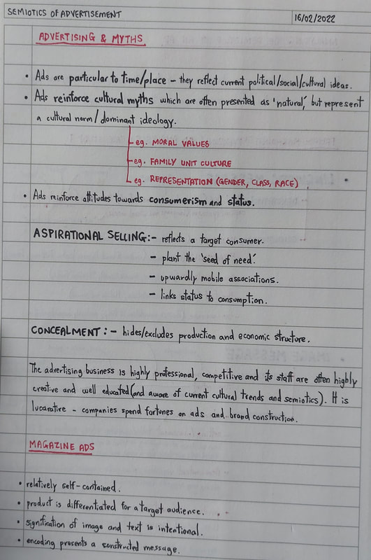
In this session, we focused on the semiotics of advertisement. The advertising business is highly professional, competitive and lucrative - companies spend fortunes on ads to construct and distribute their brands.

Ads themselves are particular to time and place, meaning they reflect current view (in society, politics, etc). They often reinforce cultural myths - dominant ideologies, or "cultural norms" - and attitude towards consumerism and status.

CASE STUDY: 'PANZANI' AD

Picture
'Panzani' advertisement

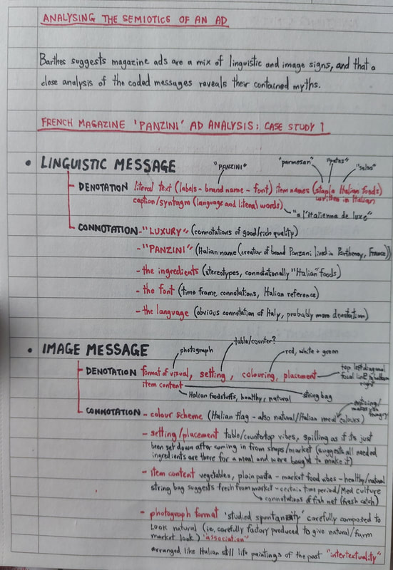
​Magazine ads in particular tend to combine both linguistic and image signs, to construct an encoded message for a target audience. We looked at the French 'Panzani' ad shown above as a case study for analysis.
​

​LINGUISTIC MESSAGE


The literal text on the labels denotes the brand name 'Panzani', and names of the pictured food items ("parmesan", "pates" and "salsa"). They are written in the French langue, as is the syntagmatic slogan "a l'Italienne de luxe" ("luxury Italian").

Thinking of the connotations, we can immediately link both the font, language and brand name to the idea of Italy. As a brand, 'Panzani' has Italian heritage and specialises in Italian cuisine - even the foodstuffs in the ad are stereotypically Italian. The mention of "luxury" in the slogan suggests the idea of rich, good quality ingredients, and a feeling of Italian authenticity.​
​

IMAGE MESSAGE


The image denotes a photograph of Italian foodstuffs in a string bag - pasta, onions, a tomato, a mushroom, sauce and parmesan. The colour scheme is strictly limited to reds, whites and greens.

The connotational value of the image really gives it its meaning here. The colour scheme is reminiscent of the Italian flag; reds, whites and greens are usually the dominant colours in a plate of authentic Italian pasta, too (effective in making the viewer hungry, prompting them to crave and buy the product). Again, as with the linguistic connotations, the ingredients are very much stereotypical of Italian cuisine - the addition of the string bag references a certain Mediterranean market culture, and the idea of a "fresh catch".

Also worth noting are the connotations of the format and placement of the photograph. The hinted countertop setting suggests the ingredients are freshly bought - you can almost imagine bringing them home and setting them on the counter, ready to make your meal. The fact that the ingredients are spilling out of the bag has connotations of abundance, suggesting that the bag contains everything needed to make the perfect authentic Italian dish. This careful arrangement is called ​studied spontaneity; it prompts the viewer to associate the ingredients with fresh produce and authenticity. Interestingly, the arrangement also seems to be an intertextual nod to Italian paintings of a certain time period.
​

ANCHORAGE


I personally think this ad is an example of dual message anchorage, since the text and image seem to convey and reinforce the same message. The inferred concept of authentic Italianicity is clear, alongside the promotion of a cultural Italian stereotype.

TASK: AN ANALYSIS OF OUR OWN

Picture
Lindt magazine advertisement

​For this task, we were to source a magazine ad of our own and conduct a similar semiotic analysis. I chose to look at this full-page advertisement for Lindt Lindor chocolates.
​

LINGUISTIC MESSAGE


Again beginning literally, the text denotes the brand name (Lindt) and the product name (Lindor). The slogan reads "melt into a moment of bliss", followed by a brief product description and the promise "you choose the moment, we'll provide the bliss". The font is elegant and predominantly white and gold, intersected with the amplification of "bliss" in a bolder, cursive typeface.

The repetition of the word "bliss" is prominent - combined with the use of descriptive words like "smooth" and "melting", this holds connotation of luxury. Even the words "milk chocolate" reinforce this idea of the smooth, creamy texture of a luxurious, melt-in-the-mouth treat (note the use of "moment" to suggest the idea of treat as opposed to staple). The fanciful cursive of "bliss" amplifies this upper-class feeling, as does the gold colouring of the brand name Lindt (suggesting that their products are top quality).
​

IMAGE MESSAGE


​In terms of denotation, the image portrays a single Lindor truffle on a red background, being filled with a stream of melted milk chocolate. We can also see the Lindt logo, a small image of the packaging and the trademark screenshot of the Lindt chocolatier at the edges of the ad.

For me, the thing that stood out first in terms of connotation was the background. Red has many connotations, but its intention here is clear. The deep, rich tone and the satin, velveteen rendering suggests a secluded, luxurious environment - the lighting is dark but warm, perhaps bringing to mind a luxurious candlelit room. Some may even connect the idea of red satin to lingerie; this cleverly and subtly infers an almost sensual feeling to the product, suggesting the "excitement" and "guilty pleasure" of this treat. The stream of melting chocolate reinforces this with a sense of slowness, and the idea of a "savoured moment".
​

ANCHORAGE


In my opinion, although dual message, the ad would also work as an example of image-specific anchorage. With or without the text, it effectively suggests the idea of a luxurious, velvety treat - the text merely amplifies what the image can convey alone.

LECTURE NOTES

0 Comments

WEEK 2: Reading Words & Images

9/2/2022

0 Comments

 
Carrying on from the last lecture, we looked further into semiotic terminology. It was particularly helpful to firstly compare both words and images as signs.

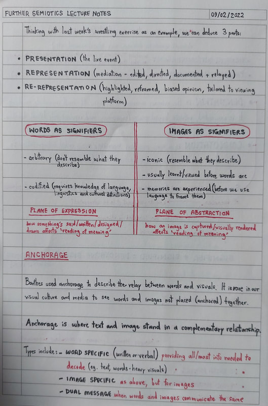
As a signifier, a word does not physically resemble what it describes - it is therefore an arbitrary sign. It requires knowledge (of language, linguistic rules and cultural definitions) to decode. How words are said or written affects the reading of meaning - this is the 'plane of expression'.

As a signifier, an images does resemble what it describes - it is therefore an iconic sign. Images are usually experienced before words are (as memories are experienced visually before we reframe them in words). How an image is captured or rendered affects the reading of meaning - this is the 'plane of abstraction'.

ANCHORAGE


​"Anchorage is where text and image stand in a complementary relationship."


​An important term to note is anchorage - used by Barthes, this describes the relay between words and visuals. There are different types of anchorage:
  • word-specific (written or verbal): providing all or most of the information needed to decode through words.
  • image-specific: providing all or most of the information needed to decode through images.
  • dual message (amplification): using words and images to communicate the same message in tone or content.
  • independent (convergent): words and images being used together but contributing independently, to convey a message neither could do alone.
  • parallel (divergent/multimodal): words and images being presented together, but on different paths.​​

PLANES OF MEANING


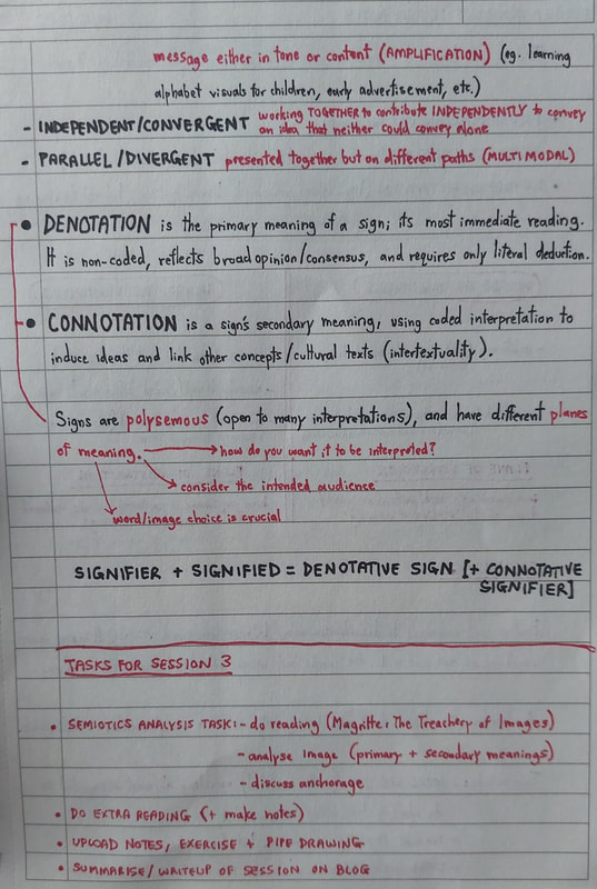
Signs are polysemous, meaning they are open to many interpretations. When using signs, consider the planes of meaning:
  • denotation (primary meaning): a sign's most immediate reading - non-coded, reflects broad consensus, and requires only literal deduction.
  • connotation (secondary meaning): a sign's underlying meaning - uses coded interpretation to invoke ideas and link other concepts (intertextuality).
​

SIGNIFIER + SIGNIFIED = DENOTATIVE SIGN [ + CONNOTATIVE SIGNIFIER ]


CASE STUDY: 'THE TREACHERY OF IMAGES' - RENE MAGRITTE, 1928/1929

Picture
'The Treachery of Images', Rene Magritte

Rene Magritte was a Belgian surrealist artist. His paintings, like the one above, were known for being dreamlike and thought-provoking. Arguably his most famous work, the image shown is the perfect exercise for a semiotic analysis.
​
Picture
raw notes on the exercise taken during lecture

We have to consider both the written and image messages here, and the primary and secondary meanings of both.

In terms of the image message, take the literal observations first. We can clearly see a smoking pipe - it has a gold band, and it is floating. The image seems to be an oil painting, and is rendered realistically. In terms of the text message, we can see the words "ceci n'est pas une pipe" in handwritten script - this translates to "this is not a pipe" in the French langue. These are our denotations.

​Taking the image on a secondary plane of meaning, we start to make connections based on our experience and knowledge of reference. The smoking pipe relates to the Victorian era - its gold band suggests it is well made, perhaps middle or upper class. We also know that in society, especially in Victorian culture, this kind of pipe was seen as a symbol of masculinity. The fact that the pipe is floating gives a sense of surrealism, bringing to mind 1920s surrealist paintings. The text reinforces this - the statement of "this is not a pipe" seems so bold and contradictory that it invokes skepticism in the viewer. We get a suspicious, dreamlike sense of "things are not what they seem". These are our connotations.

Both the image and text play off each other to encourage response; both are required together to convey the intended message, making this an example of convergent anchorage. In my view, the main anchored theme of this work of art is the surrealism - both the image and the text suggest a certain level of illusion, or trickery. When you think of the title, 'The Treachery of Images', you can begin to piece together what Magritte was going for.

At the end of the day, it isn't a pipe. It is a painting ​of a pipe.

LECTURE NOTES

0 Comments

WEEK 1: Semiotics

2/2/2022

0 Comments

 
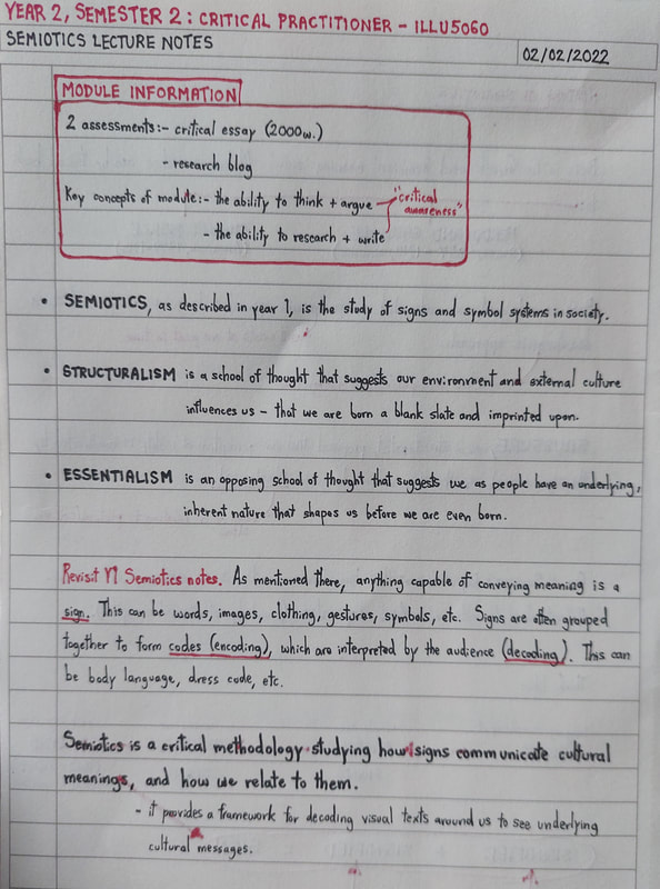
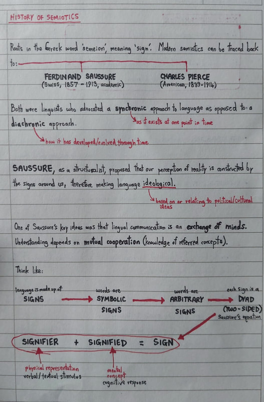
​Semiotics is the study of signs and their systems in society; how they communicate meaning, and how we relate to them.​

​As touched on in Y1, Semiotics is a critical methodology focusing on 'signs', and providing a framework for decoding them.

​A sign is anything capable of conveying meaning (eg. words, images, gestures, clothing, etc). Signs can be grouped together to form 'codes', to convey encoded messages (eg. body language, alphabets, dress code, etc).

​​Modern semiotics (as noted by Jonathan Bignell in 'Media Semiotics', 2002), owes itself to the work of two semioticians; Charles Peirce (1839-1914), and Ferdinand de Saussure (1859-1913). Both were linguists with a synchronic approach to language. Their ideas were relatively similar, but their stances were succinctly different; Peirce was an essentialist, whilst Saussure favoured a structuralist view.*

*Essentialism suggests our external environment influences us - that we are born a "blank slate" which is then imprinted on by our experience of reality.
 Structuralism suggests we have an underlying, inherent nature that shapes us even before we are born - that we are not moulded by our reality.

SAUSSURE & THE HISTORY OF SEMIOTICS

Picture
Ferdinand de Saussure

As a structuralist, Saussure proposed that language is ideological - relating to political and cultural ideas. He also viewed lingual communication as an 'exchange of minds', requiring mutual cooperation (reference and knowledge of reference) to work.

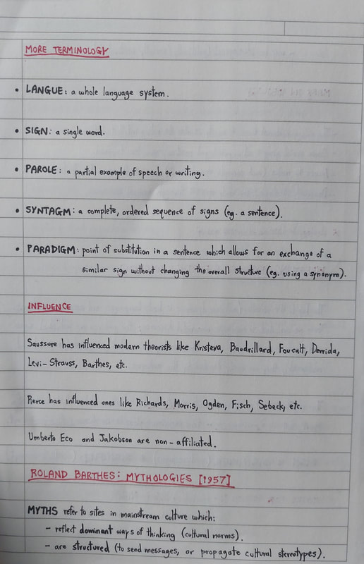
An entire language system (langue) is made up of words (signs, which are symbolic and arbitrary). This concept, that each sign is in fact dyadic, is the basis for Saussure's equation:
​
SIGNIFIER + SIGNIFIED = SIGN
(textual stimulus + stimulated concept = sign)

A syntagm would then be a complete, ordered sequence of signs (ie. a sentence). A paradigm  is a point of substitution in a sentence which allows for an exchange of a similar sign without changing the overall structure. Noting these two elements is essential in explaining the meaning of a parole.

BARTHES, CONNOTATION & MYTH

Picture
Roland Barthes

Another semiotician directly influenced by Saussure was Roland Barthes (1915-1980). Notably, Barthes' work built on Saussure's ideas and focused on their link to cultural media, coining the term myth (the bringing-together of a sign and its connotations).

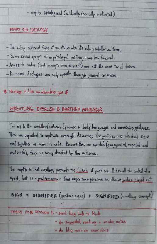
As Barthes mentioned in 'Mythologies', 1957, myths in mainstream media and culture may:
- reflect dominant ways of thinking ("cultural norms").
- be structured (to communicate messages or propagate stereotype).
- be ideological (politically/socially motivated).

An example in Bignell's text I found quite useful was that of the Rolls-Royce. The word, or linguistic sign, denotes a make of car. But beyond that, considering the connotations we've derived from our experience of reality, it becomes a connote or "symbol" of luxury and wealth.

CASE STUDY: THE WORLD OF WRESTLING


In lecture, we looked at wrestling and the wrestler/audience dynamic as another example of Barthes' mythology concept.

Exaggerated body language and excessive gestures are used in wrestling to emphasise meaningful discourse. These gestures can be seen as individual signs, used together to create a semiotic code - when repeated and reinforced, they can be easily decoded by the audience.
​
SIGNIFIER + SIGNIFIED = SIGN
(gestures + wrestling concept = sign)

Therefore, the myth here is that wrestling presents the illusion of passion. It has all the context of sport, but is actually a performance - fans derive pleasure from the illusion of dealt justice.

From this case study, we can separate the whole process into 3 parts:
- PRESENTATION: the live event.
- REPRESENTATION: mediation (editing, direction, relay).
- RE-REPRESENTATION: reframing (highlighting, biased opinions).


​LECTURE NOTES

0 Comments

    Archives

    March 2022
    February 2022

    Categories

    All
    Advertisements
    Gender Representation
    Global Culture
    Graphic Code Of Comics
    Postmodernism
    Semiotics
    Subculture

Site powered by Weebly. Managed by 34SP.com
  • Home
  • About Me
  • Portfolio
  • Student Blog
    • Year 1 >
      • Semester 1
      • Semester 2
    • Year 2 >
      • ILLU5020 - THE ILLUSTRATOR'S TOOLKIT >
        • Inkwork
        • Paintwork
        • DIGITAL
        • 3D EXPERIMENTAL
      • ILLU5040 - DRAWING >
        • SKETCHBOOKS
        • LIFE DRAWING
        • LOCKDOWN DIARY
      • ILLU5050 - ILLUSTRATION PROJECTS >
        • Conceptual
        • The Mezzotint
        • The Pied Piper
        • Protest Pack
      • ILLU5060 - THE CRITICAL ILLUSTRATOR
    • Year 3 >
      • Advanced Illustration Projects >
        • History
        • Science
        • Society, Politics & Culture
      • Final Projects >
        • Creative Identity & Branding (main page) >
          • Development
          • Outcomes
        • Visualising Pet Care >
          • Development
          • Outcomes
        • Botanical Folklore Tarot >
          • Development
      • The Degree Showcase
  • Get In Touch