|
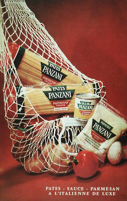
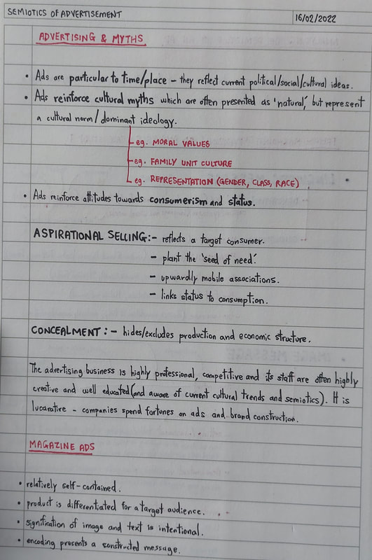
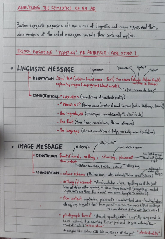
In this session, we focused on the semiotics of advertisement. The advertising business is highly professional, competitive and lucrative - companies spend fortunes on ads to construct and distribute their brands. Ads themselves are particular to time and place, meaning they reflect current view (in society, politics, etc). They often reinforce cultural myths - dominant ideologies, or "cultural norms" - and attitude towards consumerism and status. CASE STUDY: 'PANZANI' ADMagazine ads in particular tend to combine both linguistic and image signs, to construct an encoded message for a target audience. We looked at the French 'Panzani' ad shown above as a case study for analysis. LINGUISTIC MESSAGEThe literal text on the labels denotes the brand name 'Panzani', and names of the pictured food items ("parmesan", "pates" and "salsa"). They are written in the French langue, as is the syntagmatic slogan "a l'Italienne de luxe" ("luxury Italian"). Thinking of the connotations, we can immediately link both the font, language and brand name to the idea of Italy. As a brand, 'Panzani' has Italian heritage and specialises in Italian cuisine - even the foodstuffs in the ad are stereotypically Italian. The mention of "luxury" in the slogan suggests the idea of rich, good quality ingredients, and a feeling of Italian authenticity. IMAGE MESSAGEThe image denotes a photograph of Italian foodstuffs in a string bag - pasta, onions, a tomato, a mushroom, sauce and parmesan. The colour scheme is strictly limited to reds, whites and greens. The connotational value of the image really gives it its meaning here. The colour scheme is reminiscent of the Italian flag; reds, whites and greens are usually the dominant colours in a plate of authentic Italian pasta, too (effective in making the viewer hungry, prompting them to crave and buy the product). Again, as with the linguistic connotations, the ingredients are very much stereotypical of Italian cuisine - the addition of the string bag references a certain Mediterranean market culture, and the idea of a "fresh catch". Also worth noting are the connotations of the format and placement of the photograph. The hinted countertop setting suggests the ingredients are freshly bought - you can almost imagine bringing them home and setting them on the counter, ready to make your meal. The fact that the ingredients are spilling out of the bag has connotations of abundance, suggesting that the bag contains everything needed to make the perfect authentic Italian dish. This careful arrangement is called studied spontaneity; it prompts the viewer to associate the ingredients with fresh produce and authenticity. Interestingly, the arrangement also seems to be an intertextual nod to Italian paintings of a certain time period. ANCHORAGEI personally think this ad is an example of dual message anchorage, since the text and image seem to convey and reinforce the same message. The inferred concept of authentic Italianicity is clear, alongside the promotion of a cultural Italian stereotype. TASK: AN ANALYSIS OF OUR OWNFor this task, we were to source a magazine ad of our own and conduct a similar semiotic analysis. I chose to look at this full-page advertisement for Lindt Lindor chocolates. LINGUISTIC MESSAGEAgain beginning literally, the text denotes the brand name (Lindt) and the product name (Lindor). The slogan reads "melt into a moment of bliss", followed by a brief product description and the promise "you choose the moment, we'll provide the bliss". The font is elegant and predominantly white and gold, intersected with the amplification of "bliss" in a bolder, cursive typeface. The repetition of the word "bliss" is prominent - combined with the use of descriptive words like "smooth" and "melting", this holds connotation of luxury. Even the words "milk chocolate" reinforce this idea of the smooth, creamy texture of a luxurious, melt-in-the-mouth treat (note the use of "moment" to suggest the idea of treat as opposed to staple). The fanciful cursive of "bliss" amplifies this upper-class feeling, as does the gold colouring of the brand name Lindt (suggesting that their products are top quality). IMAGE MESSAGEIn terms of denotation, the image portrays a single Lindor truffle on a red background, being filled with a stream of melted milk chocolate. We can also see the Lindt logo, a small image of the packaging and the trademark screenshot of the Lindt chocolatier at the edges of the ad. For me, the thing that stood out first in terms of connotation was the background. Red has many connotations, but its intention here is clear. The deep, rich tone and the satin, velveteen rendering suggests a secluded, luxurious environment - the lighting is dark but warm, perhaps bringing to mind a luxurious candlelit room. Some may even connect the idea of red satin to lingerie; this cleverly and subtly infers an almost sensual feeling to the product, suggesting the "excitement" and "guilty pleasure" of this treat. The stream of melting chocolate reinforces this with a sense of slowness, and the idea of a "savoured moment". ANCHORAGEIn my opinion, although dual message, the ad would also work as an example of image-specific anchorage. With or without the text, it effectively suggests the idea of a luxurious, velvety treat - the text merely amplifies what the image can convey alone. LECTURE NOTES
0 Comments
|
Site powered by Weebly. Managed by 34SP.com


