|
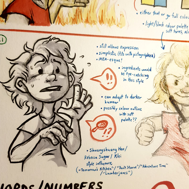
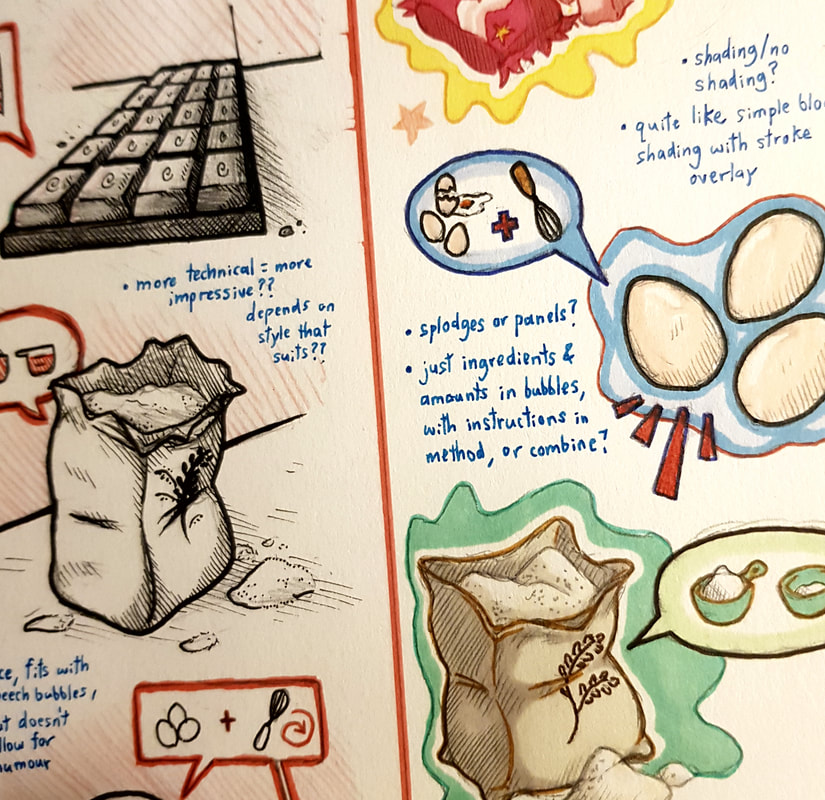
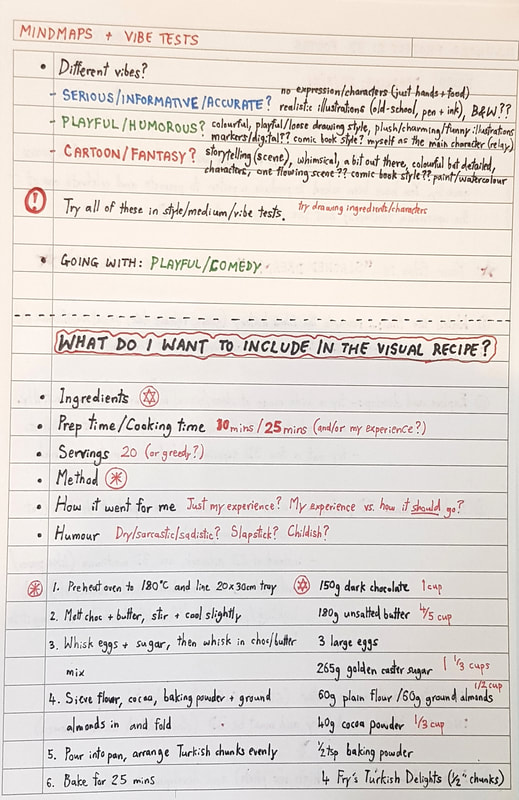
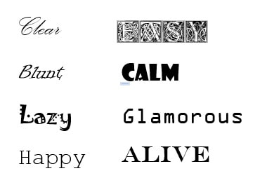
Running on from the bake-off, after documenting the process, it was time to move on to development. I made a few notes and mindmaps to brainstorm ideas. There were a few things I needed to make a decision on first - what kind of genre or "vibe" of recipe I was going for, what style it would be done in, in what medium and with what layout. Experimenting with Style and Layout |
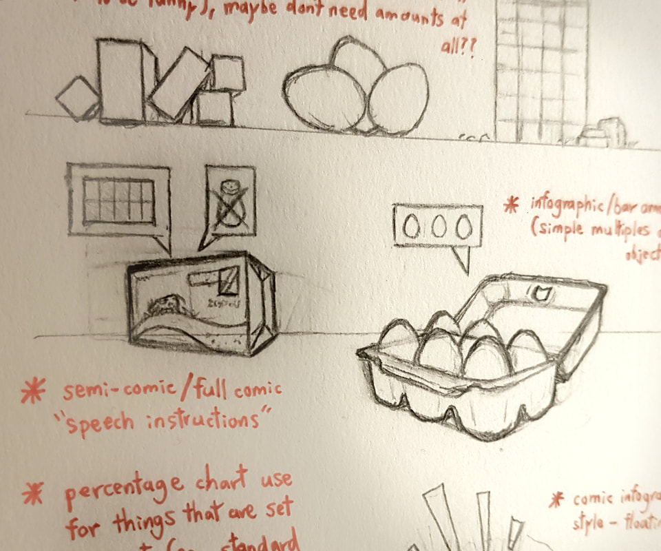
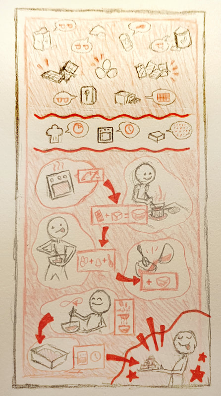
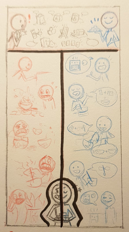
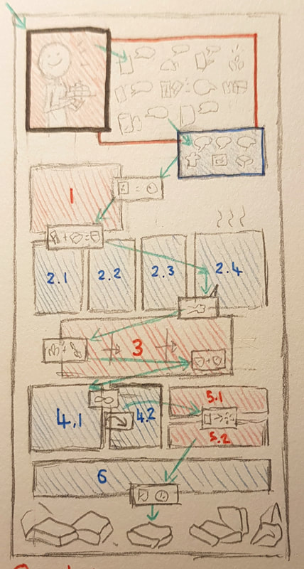
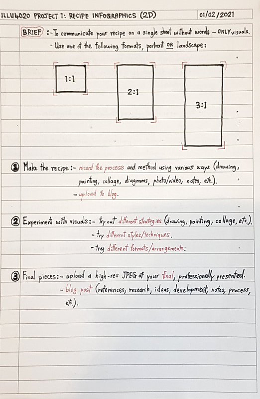
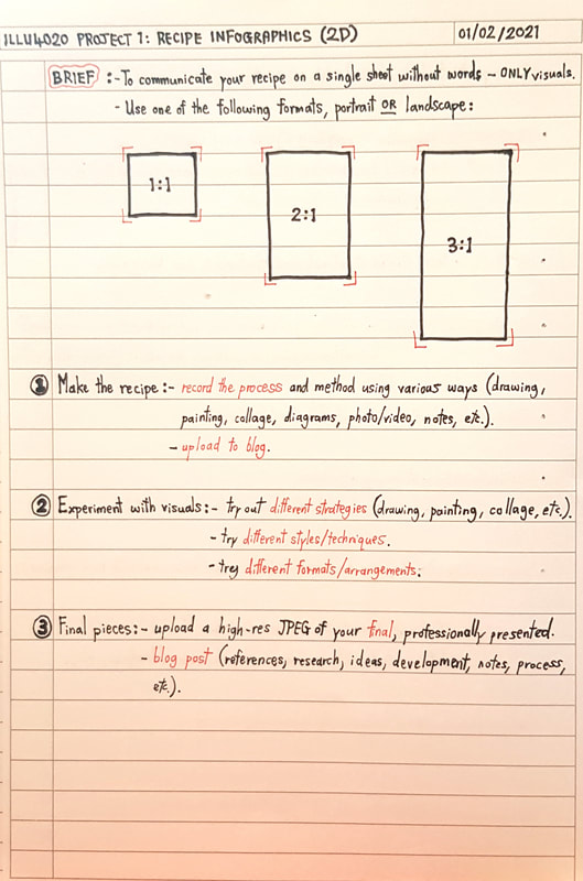
| developmental notes and sketches for layout As for layout, I knew I wanted to use a 2:1 ratio - 1:1 seemed too confined for my ideas, and 3:1 seemed too spaced out. I sketched out some thumbnails and narrowed them down to three; a simple infographic-style recipe, a comic-style recipe, and one that was kind of "half and half". |
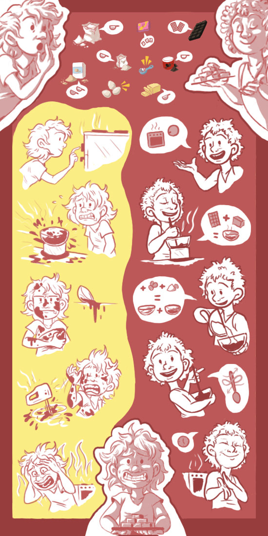
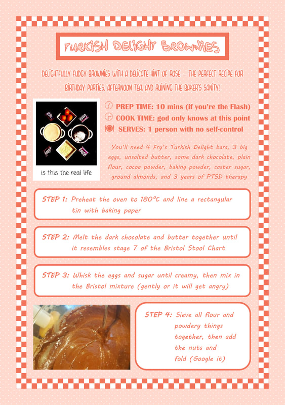
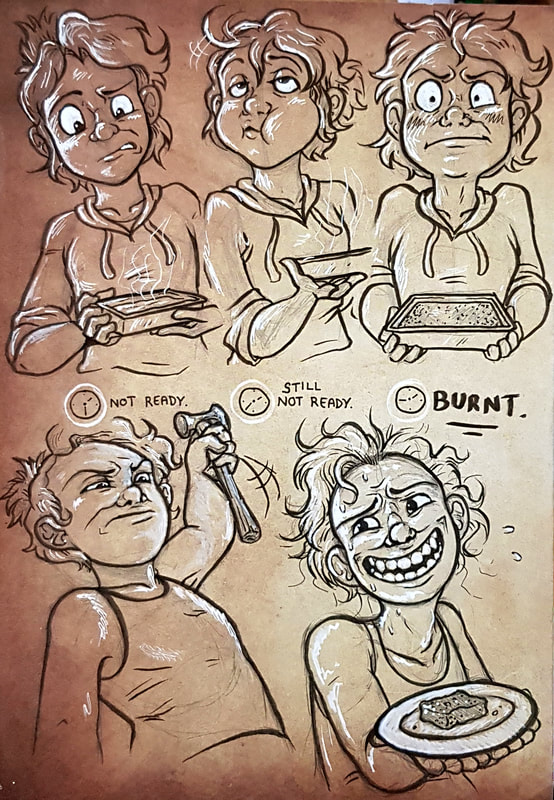
There were pros and cons to each of these. I liked the simplicity of the standard recipe, but the comic and 50/50 styles allowed for more expression. The comic layout made for slicker navigation and complete freedom of style, but I preferred the 50/50 layout for its ability to accommodate both the humour of the realistic experience and the stepwise recipe. This is the layout idea I moved forward with - a split view, humorous infographic depicting "how it went" vs "how it should have gone".
The Process
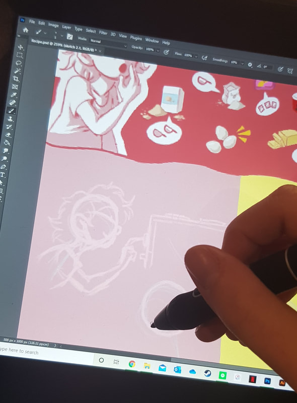
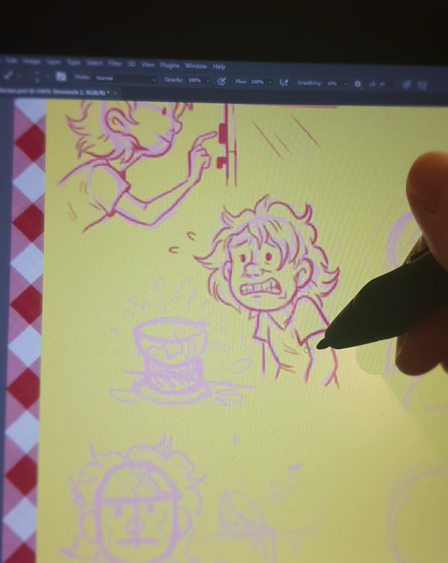
As I've mentioned before, my digital illustration skills leave a lot to be desired. However, given that this was one of the first things I ever attempted digitally, I think it went better than I expected; I had been so afraid to try it, but I actually really enjoyed using photoshop and drawing with a tablet (the same tablet that has been gathering dust for about a year because I've been too sheepish to touch it).
.....and with the obligatory positive evaluation out the way, I can list the downsides. This took way longer than I thought it would. I swore so much. I ate an entire packet of bourbon creams out of sheer frustration. I had a lot to learn about navigating photoshop, and the idea I thought was concrete kept morphing into something different. I lost count of how many times I moved things, cut things out, changed the colour scheme, added a background, took away a background... But it was al art of the process and learning curve. If anything, I now know for future projects to try out more ideas before settling on one.
The Finished Piece
project notes
0 Comments
Font Selfie
For our first workshop task, we had to choose a typeface we felt suited us - using our favourite character from that typeface, we then had to decorate it to represent our personality.I chose Forte as my typeface; with its bold thickness yet neat calligraphy-like strokes, I feel it is as self-contradictory as I am. I can be loud and outgoing, and often adjust the way I project myself to fit in with others - but really, I'm kind of a hermit nerd who just wants to write stories at my little white bureau and talk about Latin etymology. Which tends to kill a conversation.
For our first workshop task, we had to choose a typeface we felt suited us - using our favourite character from that typeface, we then had to decorate it to represent our personality.I chose Forte as my typeface; with its bold thickness yet neat calligraphy-like strokes, I feel it is as self-contradictory as I am. I can be loud and outgoing, and often adjust the way I project myself to fit in with others - but really, I'm kind of a hermit nerd who just wants to write stories at my little white bureau and talk about Latin etymology. Which tends to kill a conversation.
| As for the decoration, I decided to go simple instead of overfilling. Nature is the theme that resonates most with my personality; it is where I feel most connected to myself, and where I feel the most energy. I feel more at home in the woods than I do in my house! My favourite place has to be the near-untouched forest of Abernethy and its ancient pines against the mountains, as I've tried to show |
here. I kept the colour scheme pale and cold - muted greens, blues and lavenders - because the highlands always seem to have that misty hazy that gives everything a cooler tone. The sky phasing from light to dark represents the idea of beauty in both sides of the coin - clouds by day and stars by night - and the shadow with the Celtic knot was a nod to my pagan roots.
Type Quiz
1. Match the typeface to the description.
- Fraftur was born in 16th Century Germany and is a heavy metal favourite.
- Mistral looks like handwriting.
- Bembo is named after a Venetian poet, literary theorist and cleric.
- Colonel was inspired by stencil printing on army supplies.
- Didot is often found in fashion magazines for its sophisticated looks.
- Courier is inspired by letters produced by a typewriter.
- Helvetica is popular for signage but can seem boring and clinical.
2. Classification/Style Examples
3. What is the difference between a typeface and a font?
The typeface is the broad "umbrella term" for a complete matching set of characters with the same design. Fonts are subfamilies found within a typeface - a version of it that perhaps has a different style, weight or size.
4. Typefaces from oldest to newest
Baskerville, Franklin Gothic, Futura, Gill Sans, Times New Roman, Rockwell, Verdana, Gotham
5. Find the "antonym typeface" for each of these words.
6. Summarise this article.
As a typographer, you have a lot of control over your work; how well it projects, how it comes across, and what it implies. You must not only think about the typeface you are using, but also how you format it. Kerning, line spacing and alignment can make or break the legibility of your work/article, as can your choice of font/mixes of fonts.
As a typographer, you have a lot of control over your work; how well it projects, how it comes across, and what it implies. You must not only think about the typeface you are using, but also how you format it. Kerning, line spacing and alignment can make or break the legibility of your work/article, as can your choice of font/mixes of fonts.
Ampersands
Here are eight ampersands that attracted my eye. From left to right:
- 1st Century Roman Cursive - the ampersand itself can be traced back to its earliest form in Roman script (debatably sometime between 45-79AD). It was originally a ligature of the letters "e" and "t". The particular example pictured was unearthed from the ruins of Pompeii, preserved on a wall beneath the ash - it caught my eye because of the more ancient/primitive look it has compared to most others.
- Goudy Stout - this typeface was designed to appeal to the merchant whose signs required a bolder, more bizarre and fanciful look. I suppose catching my eye is therefor what it was supposed to do.
- Algerian - developed in the early 20th Century, the Algerian typeface has an eye-catching contrast between thick, bold black and a white shadow (hinted at by a thinner black line). This 3D effect gives it more body, which attracted my attention.
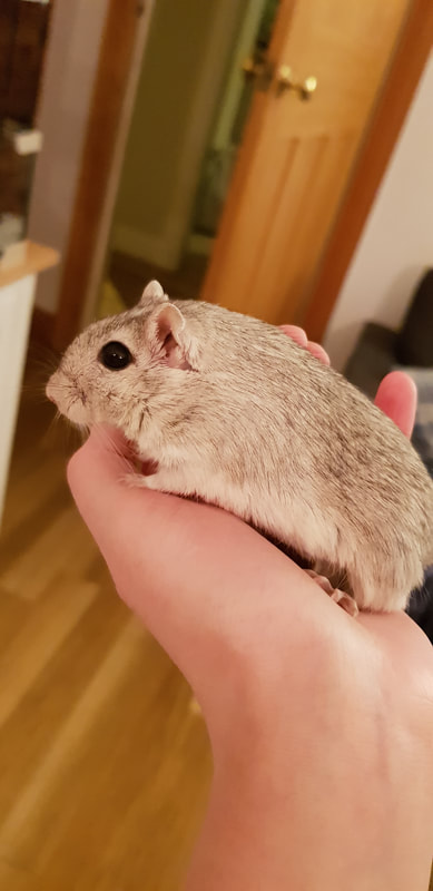
- Gigi - this is a pretty little typeface developed by Californian artist Jill Bell. It has the thin-thick curvy strokes of calligraphy ink, adorned with intricate curlicues. The tight curl below the ampersand's centre and the flick at the end of its tail made me smile because it reminds me of my oldest gerbil (who has a kink in his tail near the end).
- Brush Script MT - I really love the look of traditional ink calligraphy, so this ampersand naturally appealed to me with its elegant, sloping form.
- Baskerville - designed in the 1750s, Baskerville is a stunning old-style typeface developed in the hope of transforming the appearance of book text to give the best look possible. Though it is consistent and easy to read, it does have a certain beauty in its subtle serifs, particularly in the ampersand.
- Hoefler Text - another old-style serif font released later in 1991, Hoefler Text takes influence from classic fonts like Garamond. It is a legible body typeface but some characters and fonts within it are adorned with swashes and look a little more fanciful. My eye was drawn to the ampersand because it reminds me of the body of a treble clef in sheet music.
For the second part of the ampersands exercise, I chose these combinations of typefaces and themes for my quickfire sketches:
Bauhaus : My Street
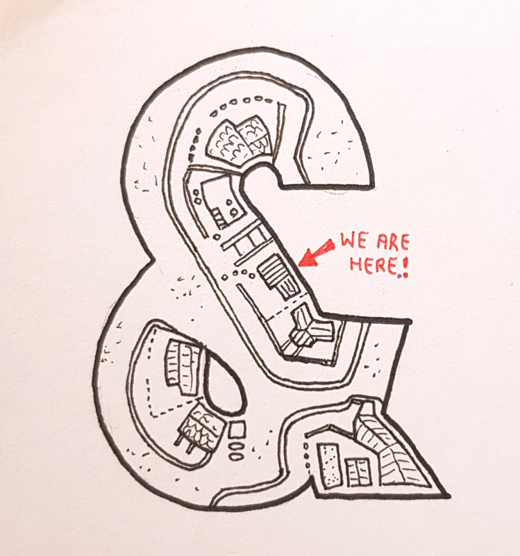
The Bauhaus ampersand is very thick and chunky, with a lot of space for illustrating the inside. It so happens that I live in a weird, curly little street that could resemble an ampersand if you squinted at it from above. This gave me the idea to draw a rough, quirky little map, with my house highlighted in the typical tourist board "you are here!"
Garamond Bold Italic : The Park/Garden
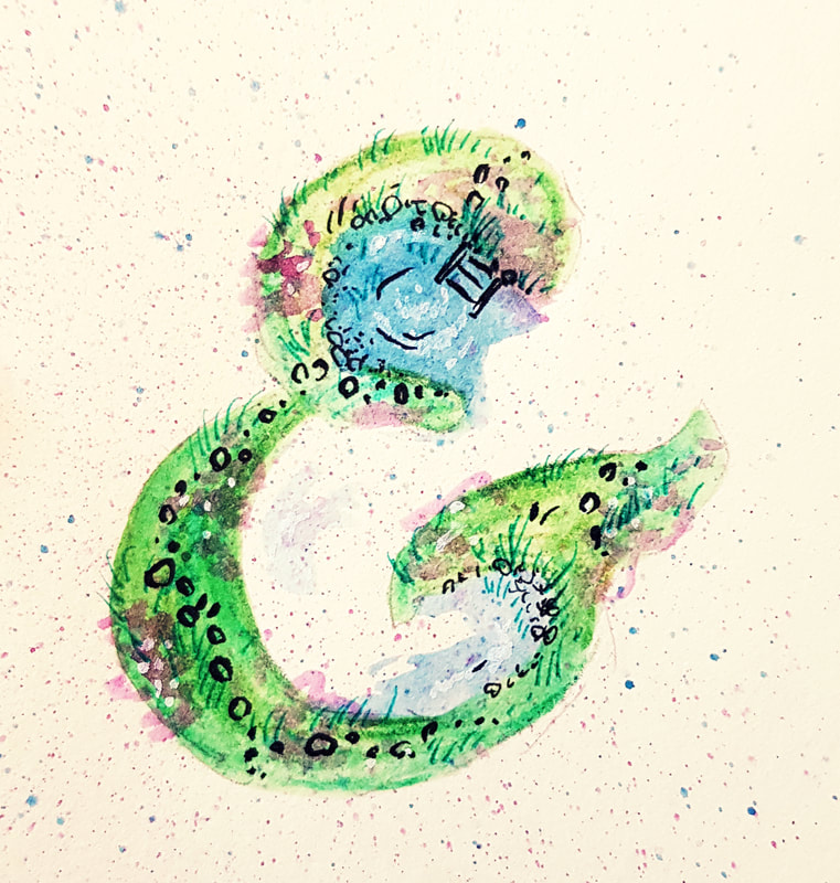
This ampersand is quite elegant, with delicate calligraphy-like strokes sloped to the side fancifully. It reminded me of a town park - circular little ponds enclosed by the upper bowl of the character. I used watercolour pencils and added some finer detail in pen, but all in all, it was somewhat of a wild experiment that didn't turn out right at all.
Futura : Afternoon Tea
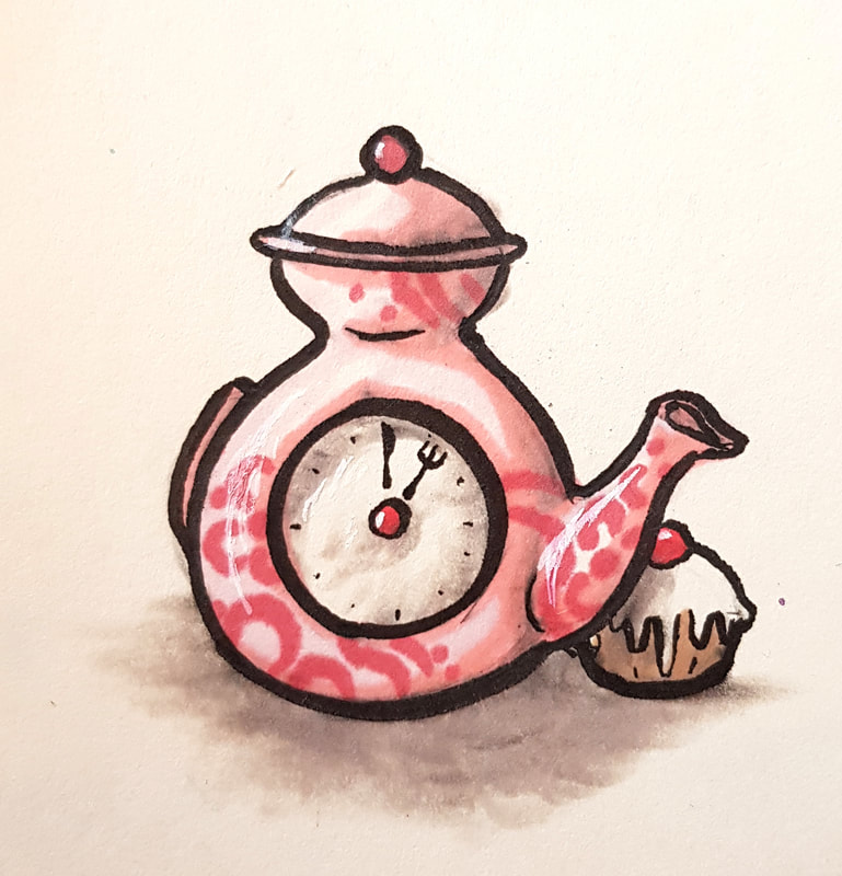
Futura has a very simple, clear and curvy appearance - the strokes are very narrow, so I admittedly took a few liberties here regarding shape and style. However, when creating the image of the teapot, I did try to stick to the original appearance of the Futura ampersand.
Semester 2 begins!
With semester 1 having come and gone in the blink of an eye, so begins the second. In all honesty, I didn't expect it to begin with a live baking task - but it did, so here we are.
At first I wasn't entirely sure what brownies had to do with illustration, but we were swiftly enlightened - as well as a fun and engaging start to the semester, the bake-off was an integral part of our first project! The first step was to document the baking process in a variety of different ways; this would later help us develop ideas to experiment with.
How To Document A Disaster?
Anyone that knows me well will be aware that I am possibly the worst baker in existence. It doesn't seem to matter how closely I follow a recipe, it always goes wrong. Ironically, I'm pretty decent at cooking - but ask me for cake and you'll either get a puddle of underbaked sludge or a burnt black slab. There is no inbetween.
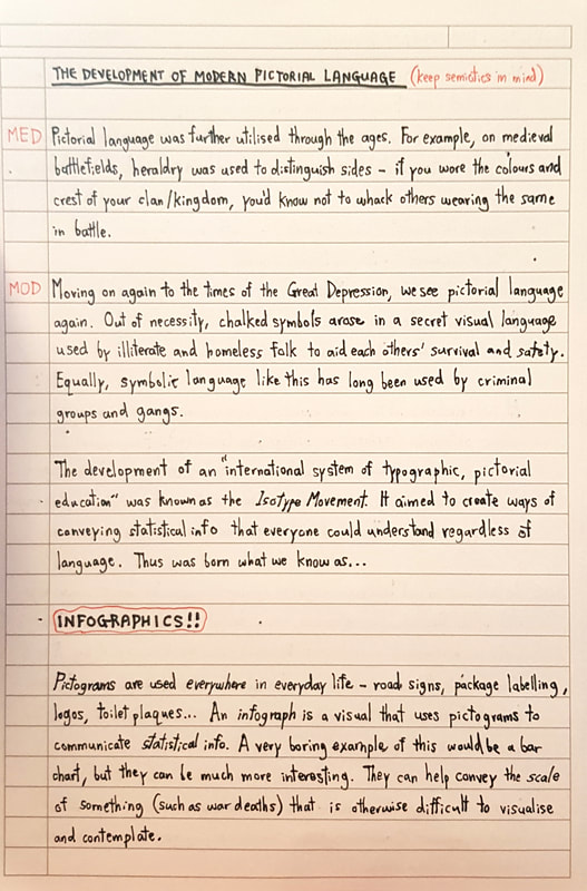
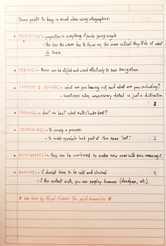
My point is, the vibe of my project is naturally leaning towards the humorous side. As stated in the project brief, the final visual recipe has to be entirely pictographic - no words allowed. But before figuring out how to tackle that and in what format, I thought it would be useful to use this session to determine the feel I wanted to go for. I particularly enjoyed the more humorous infographics in Wednesday's powerpoint - though I intend to keep an open mind during development, I do like the idea of a comedic recipe as opposed to a serious one.
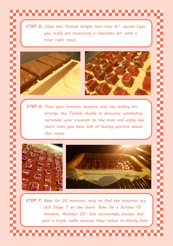
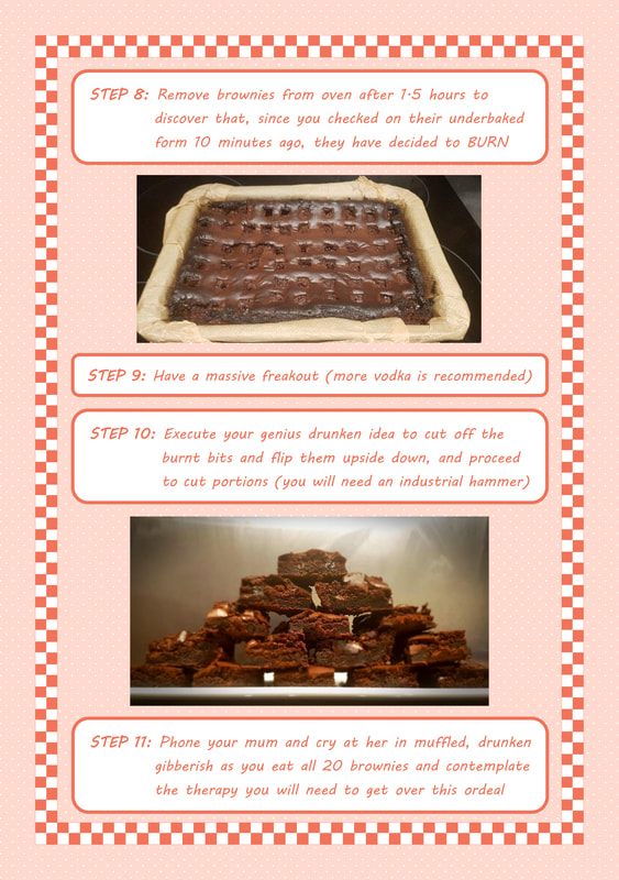
photographic documentation of the baking process
Taking photos gave me images to refer to later when creating visuals, and taking notes of the process documented my personal experience. To collate all this and play with ideas and humour, I made a quick copy of the recipe with altered steps - this gives me a basal idea of the kind of info I want to include, and what would translate well into visuals.
video documentation of the baking process
Documenting it via video also helped me experiment, and develop a suitable "voice" for the recipe. All the clips were taken in live time during the Monday task, so they accurately represent the process. I can use these as reference for experiments and sketches.
sketchbook documentation of the baking process
I also did some quick, rough doodles to document key and notable moments of the baking fiasco. Between sketches, photos and videos, I feel that documenting the process has helped spark some ideas for further development. The next step will be to refine my ideas, play with mediums, styles and formats, and figure out a definite direction I want to run in.
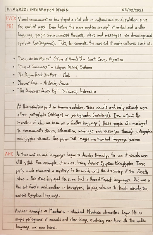
lecture notes
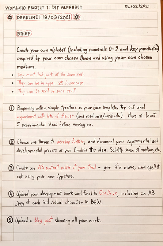
Our first VCOM project focused on typography. After studying the basics of this form of visual communication, we were asked to create our own alphabet - inspired by our own theme, and using a medium of our choice. Having really enjoyed the typography lecture, I was quite excited to have free reign to design my own typeface.
Development
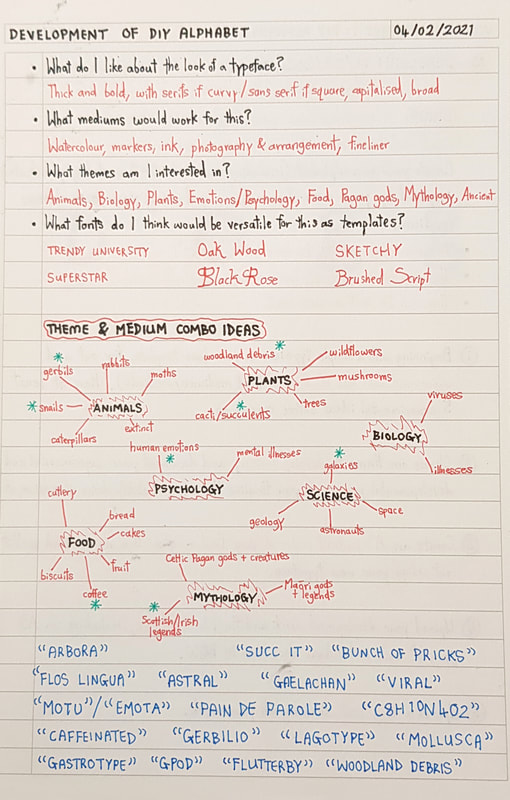
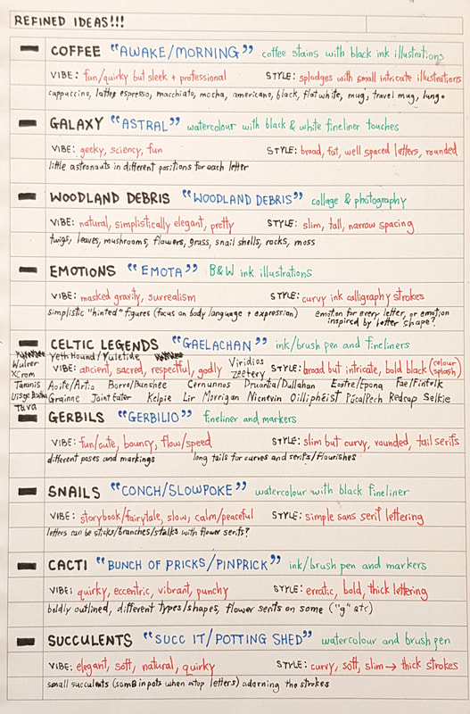
To start with, I had a think about themes I'd find interesting and fun to work with. I have quite an eclectic set of interests, so the horizon was broad - I narrowed my ideas down to a few to experiment with.
"ASTRAL" - galaxy themeI liked the idea of a galaxy theme, particularly the colours associated with nebulas - that scheme of cool blues and purples with hints of warm pink. After looking for inspiration, I chose a couple of fonts - Spacecard and Nicotine Stains - as rough templates to experiment with. I felt they suited because they were bold, eccentric and futuristic. |
I tried both marker pens and watercolours as mediums - the watercolours obviously blended better, but the boldness of the markers made the characters stand out more.
"GERBILIO" - gerbil themeI sought inspiration from my furry children on this one - with their lengthy tails and flexible bodies, gerbils seemed like an ideal muse for this project. I chose the font Curlygirl as a style reference, given the similarities between the flicking serifs and gerbil tail-tufts. I used fineliners and marker pens to |
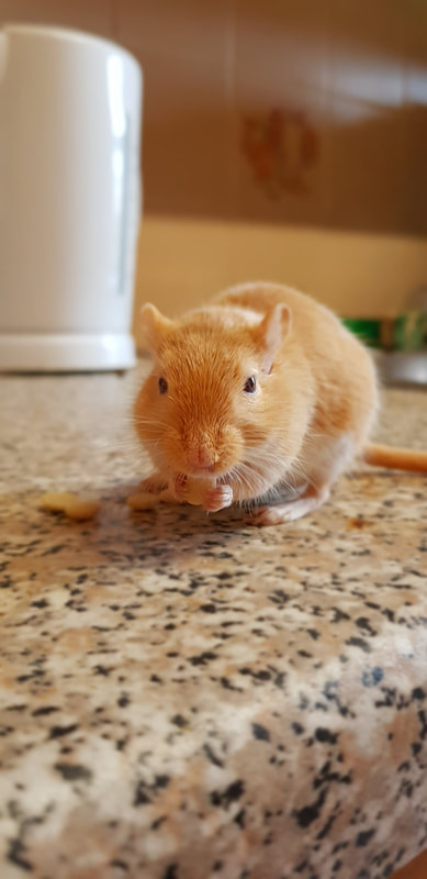
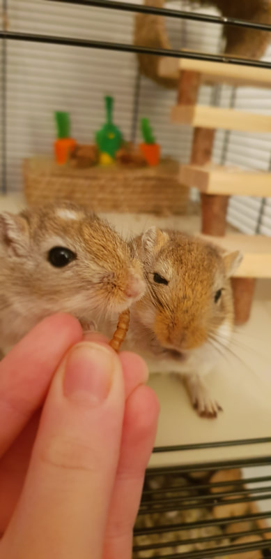
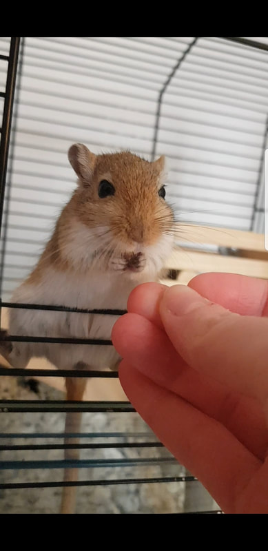
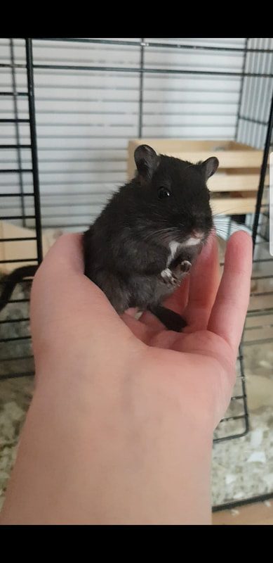
illustrate this concept. It may be unnecessary, but for whoever's interest it may pique, below are my models: Burton, McGhee, Peanut, Cashew, Macchiato and Bean!
"HASBEAN" - coffee themeI am a major caffeine addict, so I tried basing a font concept on this. To imitate the look of coffee spills, I used black coffee as a staining medium, using the Splatink font as reference for its splodgy, spattered appearance. Once it had dried, I added some coffee-related details on top with fineliners and markers. |
"PINPRICK" - cactus themeMy house has always been covered in houseplants thanks to my lifelong love affair with cacti and succulents. I'm not sure why, but I felt the font Colona MT was a fitting one to go with for this theme. I used any bowls and enclosed spaces as "terrariums" for the fineliner illustrations. |
"SLOWPOKE" - snail themeSnails have fascinated me for a long time; they're just so charming and comical, and pleasant to look at. This concept was inspired by the trails they leave on their travels - some might see it as disgusting, but I always found a kind of beauty in the way they become glittery patterns in the sunlight. |
I used Arial Rounded as a rough template, favouring it for its simplicity. Again, I used a fineliner for the outline of the snails, and watercolour to colour them and the trail. Personally, out of all the themes I experimented with, this was one of my favourites.
The Final Alphabet: "Slowpoke"
For the final piece, I ended up going for the snails. It was quite enjoyable to design - the soft curves and inferred slowness were gentle and soothing to draw, so I hope it invokes an equal calm in the viewer (unless you're squeamish about molluscan secretions).
I had a lot of fun mapping the trails into letterforms, and trying to find the balance between an "authentic snail trail look" and legibility. I tried to use calligraphic rules (stroke order and direction) to determine the placement of the snails themselves, popping them where the pen would leave the paper - as if they'd "written" this in their own biological medium.
(NO SNAILS WERE HARMED...)
Speaking of biology, I got a lot of inspiration from an AH Bio experiment I did once based on the mucosal pheromones of gastropods. I had three groups of "trailmaker" snails - control, fasted and fed - and a small number of "trailtester" snails. I would let the trailmaker cross a glass sheet while I traced the trail on paper beneath. After that, I would set a trailtester down at the base of that trail and trace its travels in a different colour. The results were pretty stark - the testers were far more likely to follow the trail if it had been left by a fed snail. If the trailmaker had been fasted, the tester would often ignore the trail altogether. This suggested that snails can tell not only the direction of a trail, but also if its maker had eaten well - a pheromonal "hint" that could help them locate a good food source. Anyway, after a lot of waffling, here's my point - hours of tracing snail trails have burned those patterns into my brain, and I used them as inspiration for this project.
project notes


