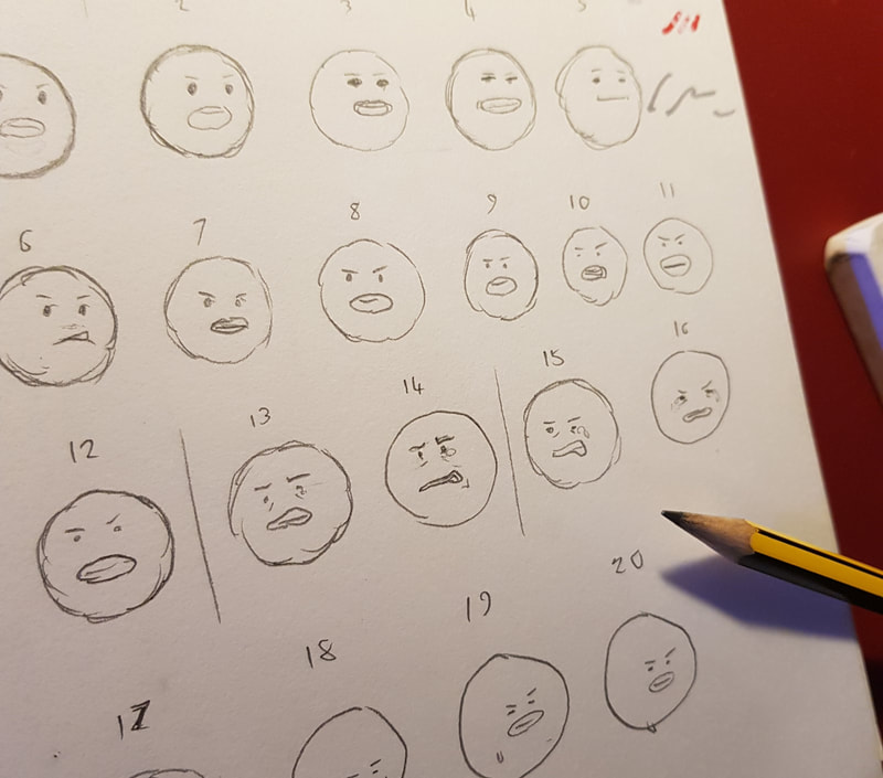
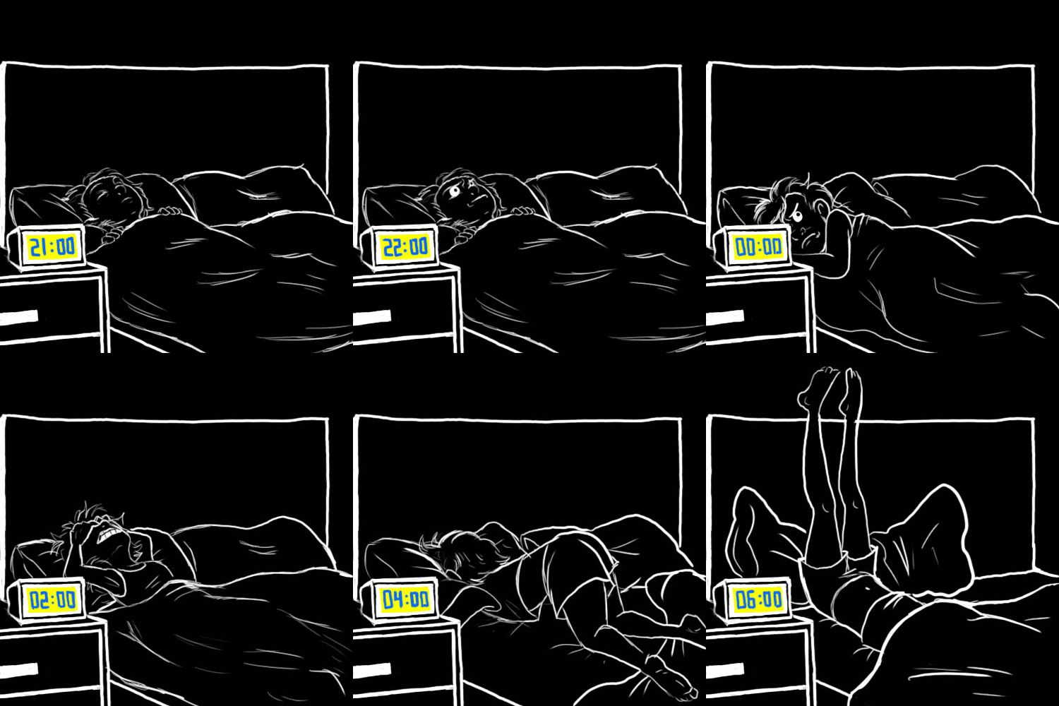
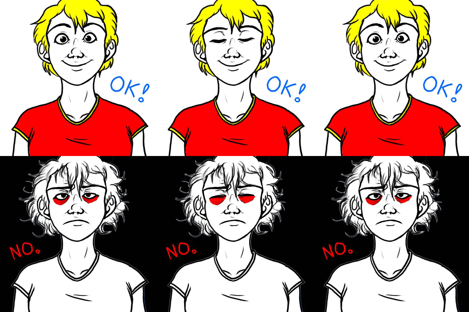
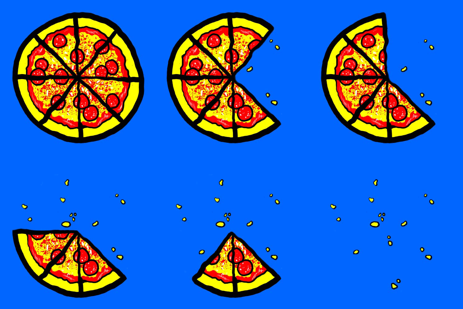
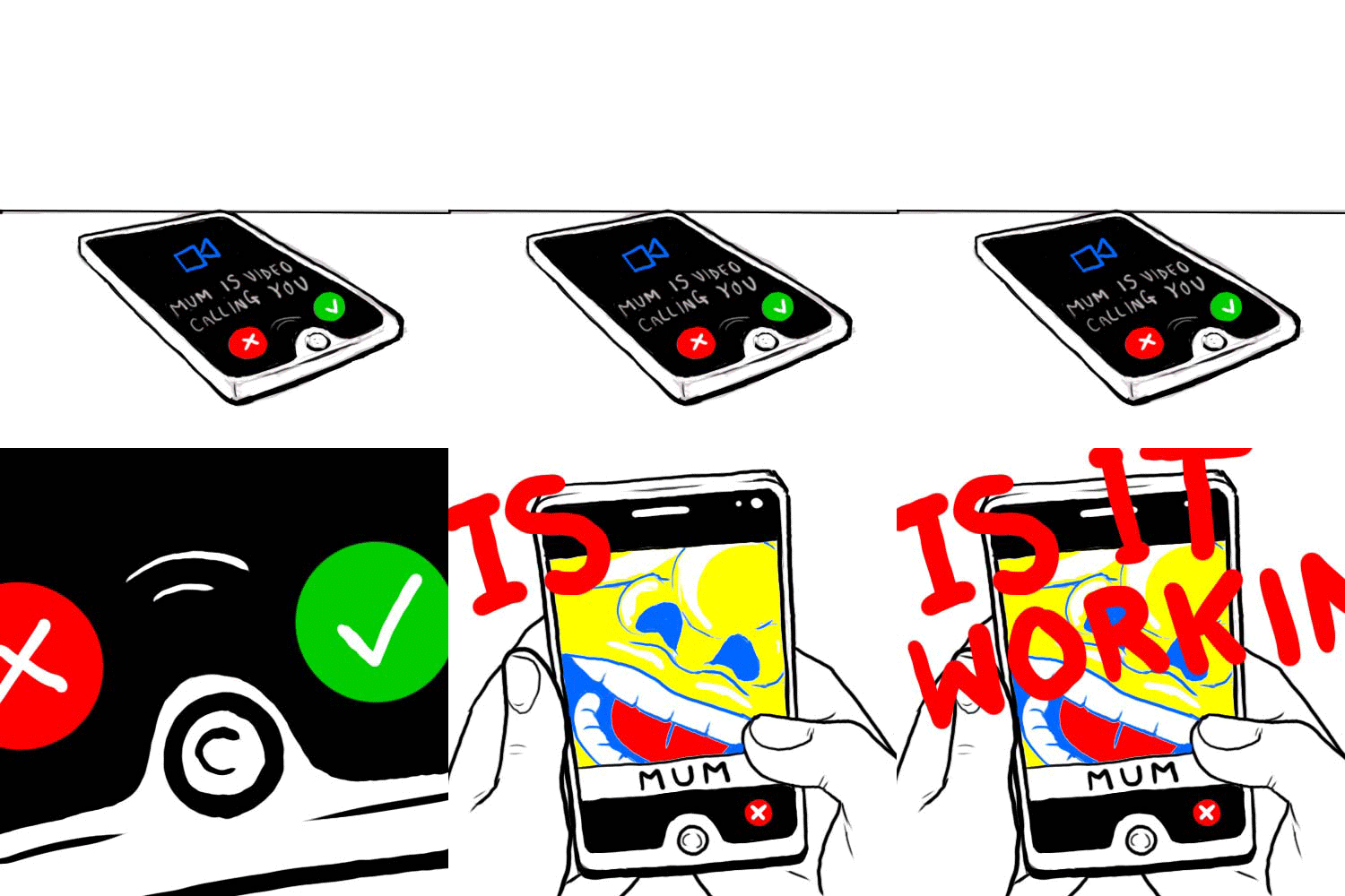
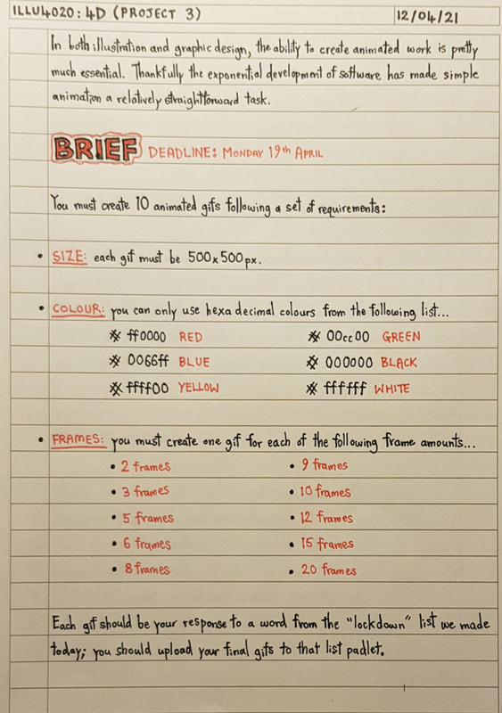
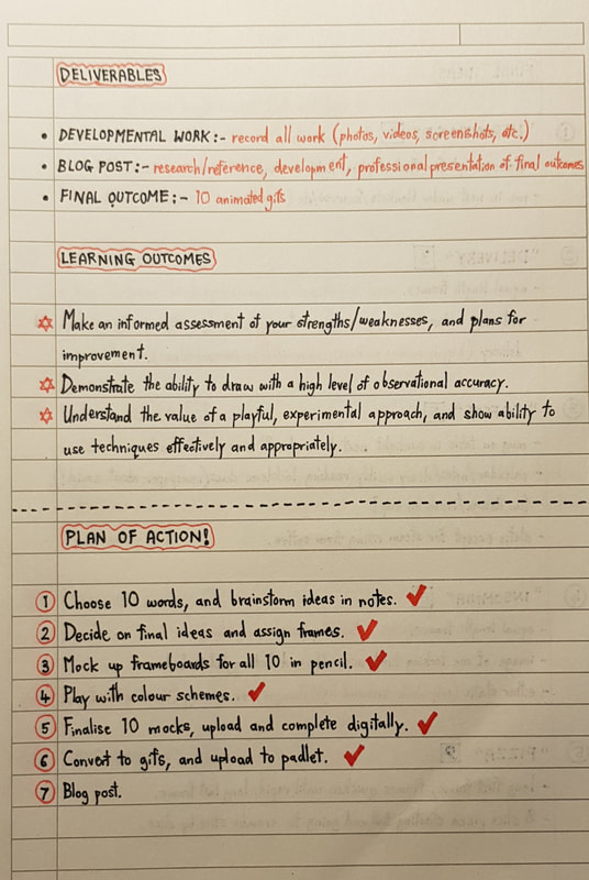
Introduction to 4DTo ease us from 3D into the realms of 4D, we started with a simple task: to create a rotational self portrait in gif format. I lack experience in the field of digital art, which I'll discuss later, so my attempt was really simplistic. But it was useful to get a feel, however basic, for what was required in the project to come. I drew the frames traditionally and took photos of them to transfer them into gif form. Below you can see some of the analogue sketches alongside the finished digital gif. Moving into our 4D project, the task was to create ten animated gifs. The yeargroup brainstormed lockdown themes together; themes our gifs were to then be based on. As per usual, there were a few rules to follow:
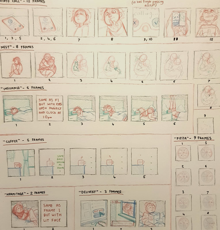
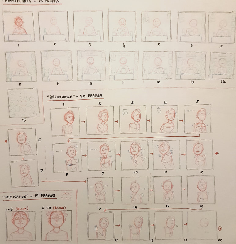
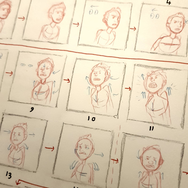
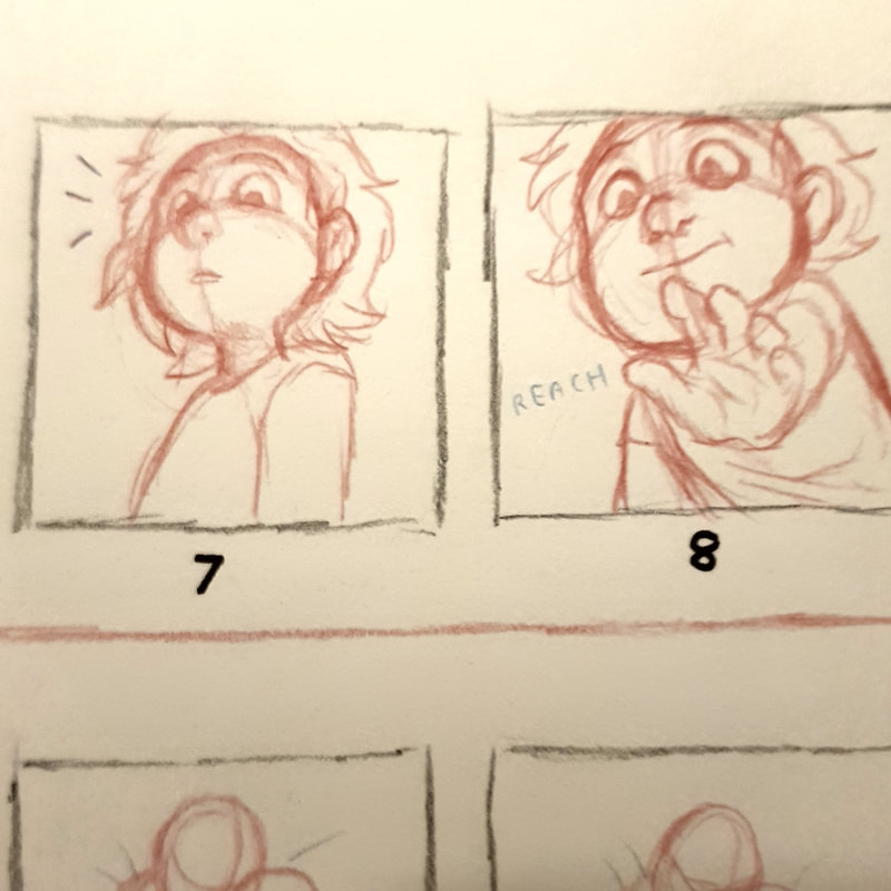
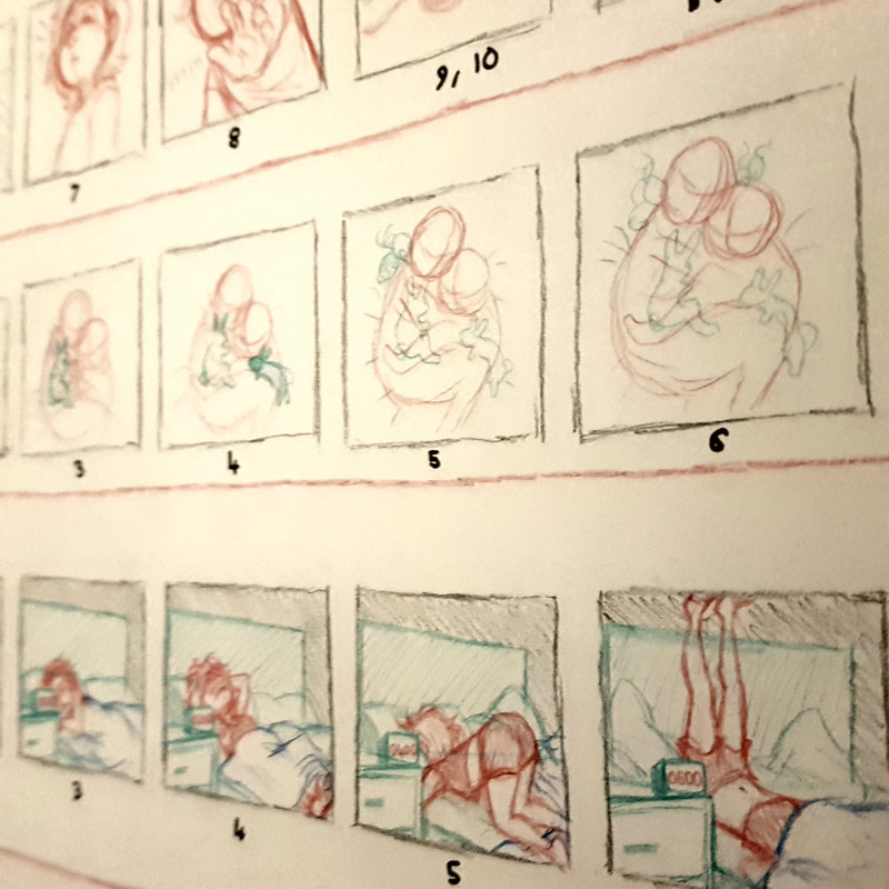
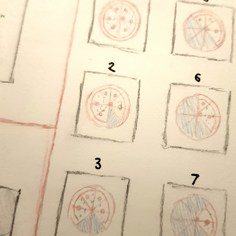
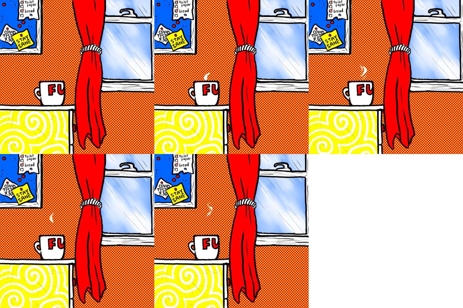
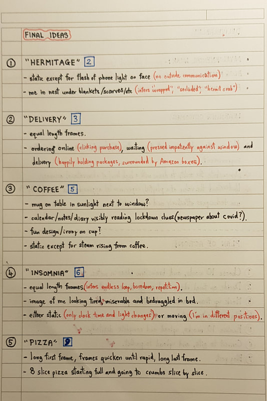
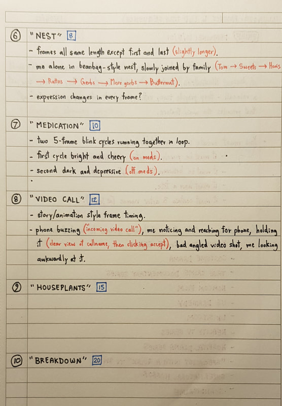
Getting StartedI am a huge fan of animation and animated movies - be it traditional, digital, stopmotion, whatever. Animation is one of my biggest influences, alongside the storyboarding and concept art development behind completed films, so naturally I am keen to learn the workings of it. However, despite my excitement, I was really nervous to move into 4D territory. Admittedly, prior to this module, I had practically not touched the digital medium. Photoshop, animation and digital art in general are all completely new to me, and are areas I am neither confident nor competent in. I knew from the start that my attempt at this project would be pretty damn rubbish, but I consoled myself with the fact that I'm here to learn how to improve on that. Analogue DevelopmentIronically, despite being so terrible at digital art and animation, I can visualise and "direct" moving scenes in my head pretty clearly. I think being such a fan of films, books and graphic novels, I have a decent sense of how a scene should flow; I just lack the actual skill to execute it. Regardless, all that time spent staring out bus windows and visualising music videos and fight scenes paid off in the sense that I was not short of ideas. I narrowed down my theme ideas to the ten I felt best suited gif format. I then laid them all these provisional "scene" concepts out on paper and assigned gif lengths to each; this process can be seen in my lecture notes at the foot of this post. Once the ideas were finalised, I moved on to create "storyboards" for each gif consisting of frame thumbnails. analogue thumbnails and frame planning This was where I had to move out of my comfort zone and use photoshop. I found it really difficult at first; even with the basics training in previous IT lectures, I found it difficult to navigate the tools and brushes. It took me quite a while to get a basic grip on it, but eventually I began to feel a little more confident. I even started to enjoy the feel of digital drawing and the multitude of tools available on photoshop - I am looking forward to learning more and improving my skills digitally for future projects. Putting the completed frames into motion was quite fun, and I think with a lot of practice I will be able to build on what I've learned here. One thing I will say I actively disliked about this project was the colour limitation. I am really not a fan of bold, bright schemes like this and found it difficult to force myself to stick to it - but that in itself was good practice. After all, in a professional setting, you can't turn around and tell a client "I don't like these requirements so I'm going to do something different". I have to be comfortable with pushing my own boundaries. Below are my completed gifs. lecture notes
0 Comments
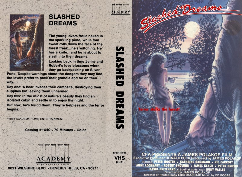
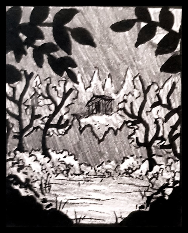
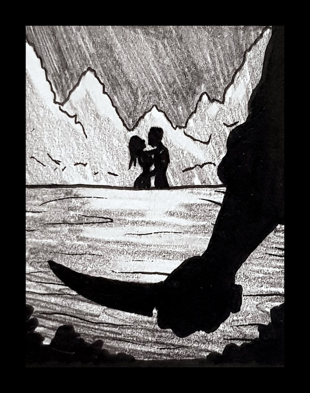
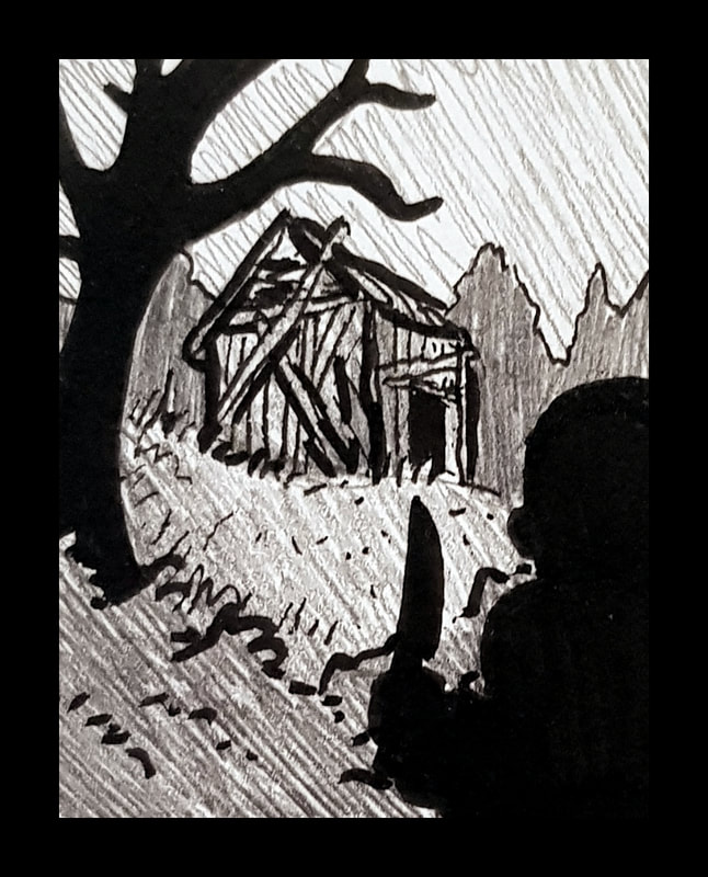
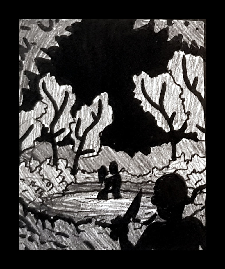
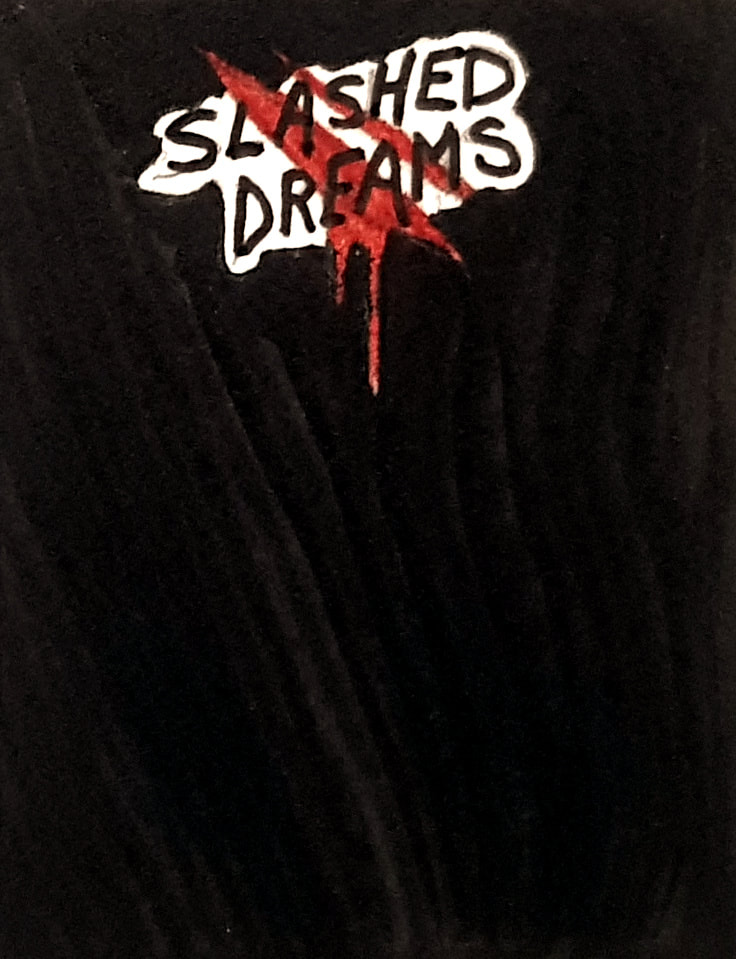
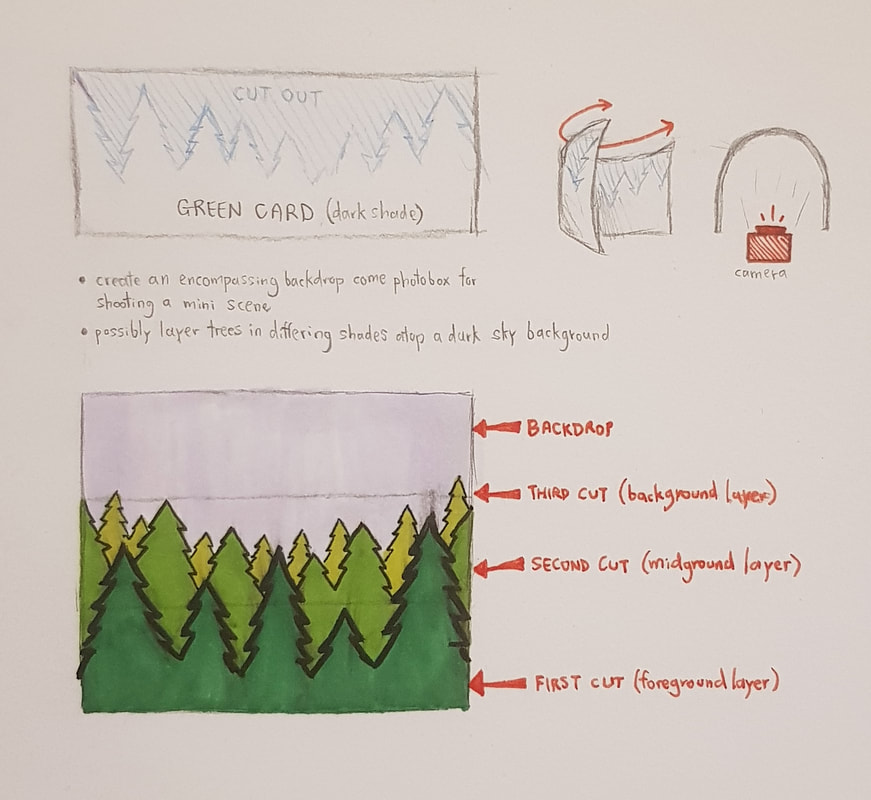
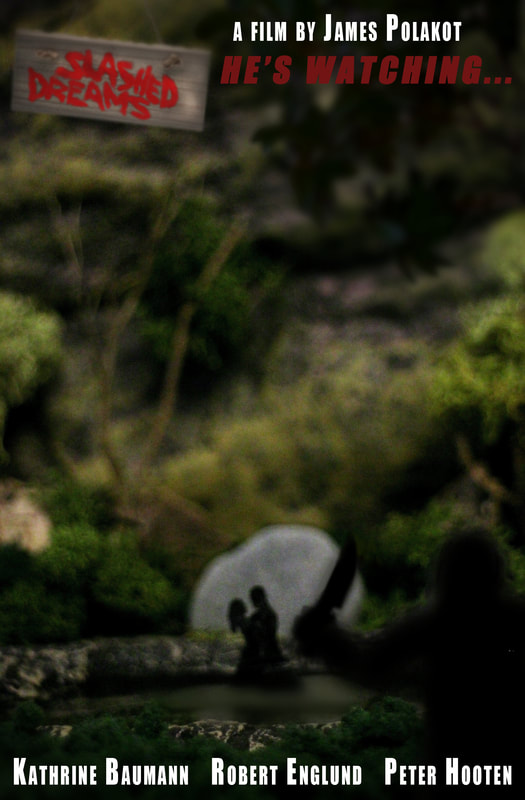
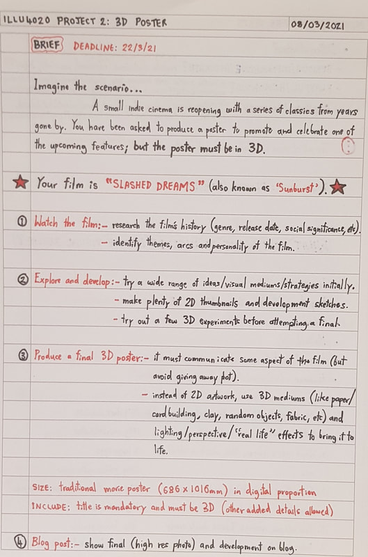
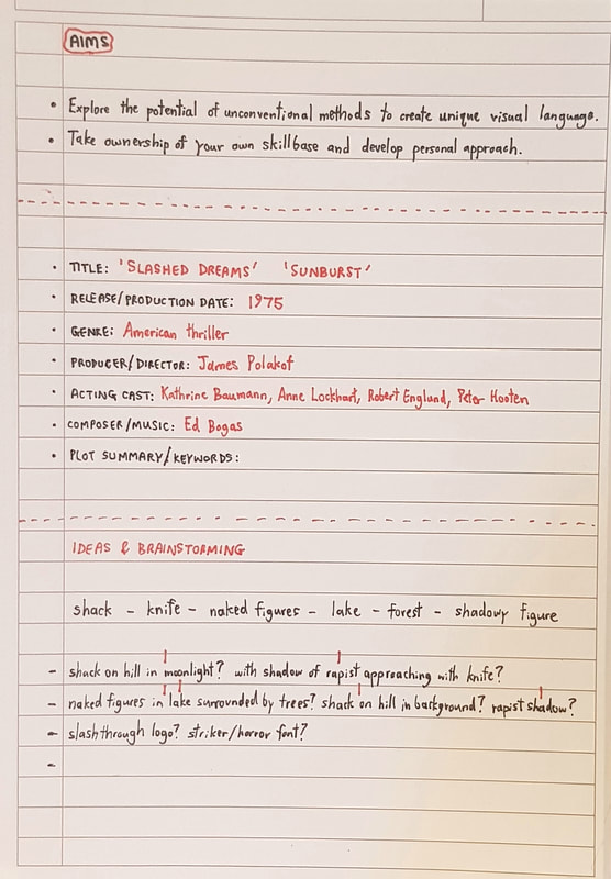
For this project, we were each assigned a film to watch and create a 3D poster for. My given film was 'Slashed Dreams', as linked to below: 'Slashed Dreams', also known as 'Sunburst', is a 1975 American thriller produced and directed by James Polakot. The plot follows a young couple, Jenny and Robert, whose love blooms on a camping trip over Silver Pond. The wilderness seems idyllic at first - hiking through the woods, swimming in a crystal lake, bedding down in an old log cabin - until they are warned of a mysterious danger lurking in the forest. Choosing to ignore the advice, Jenny and Robert venture further only to find themselves stalked and attacked by murderous rapists. "The young lovers frolic naked in the sparkling pond, while foul sweat rolls down the face of the forest freak... he's watching." In all honesty, even just from reading the synopsis, I could tell this was not going to be my cup of tea. Watching the actual film only proved me right - somebody had commented, I quote, "waste of 78 minutes". But, however bad, the film offered plenty of inspiration for poster ideas. I drew particular influence from the existing poster art for the film; I liked the idea of incorporating trees into my own poster, perhaps by layering card or playing with shadows. The forest freak's knife also seemed worth including for both symbolic purpose and ease of representation in 3D. Figures would be more difficult if I wanted to include those; card silhouetting or clay seemed like the best choices for that approach. With these thoughts in mind, I moved on to create some 2D thumbnails. 2D Development
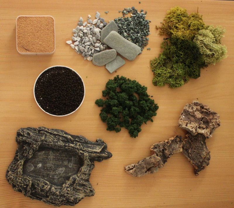
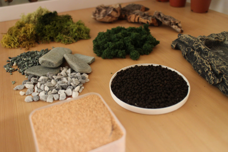
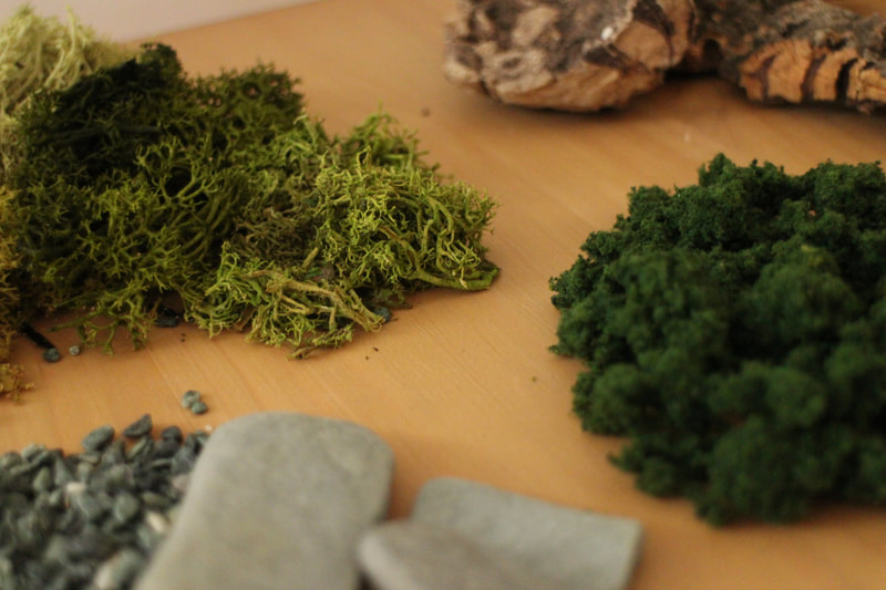
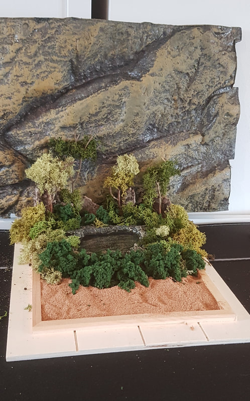
3D Development and ProcessI have a lot of pets, a lot of houseplants, I enjoy collecting little bits and pieces from mother nature and I love crafting miniature landscapes and scenes. What does all this have in common? It means I have a seemingly infinite supply of natural materials! With so much of this at hand, and a forest scene to construct for the poster, I got quite excited about recreating the scene in miniature. Some materials I started off with included:
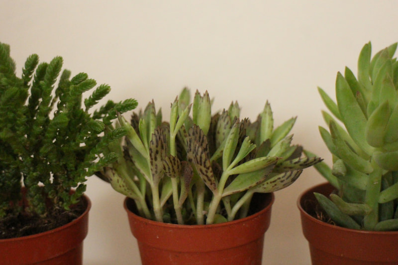
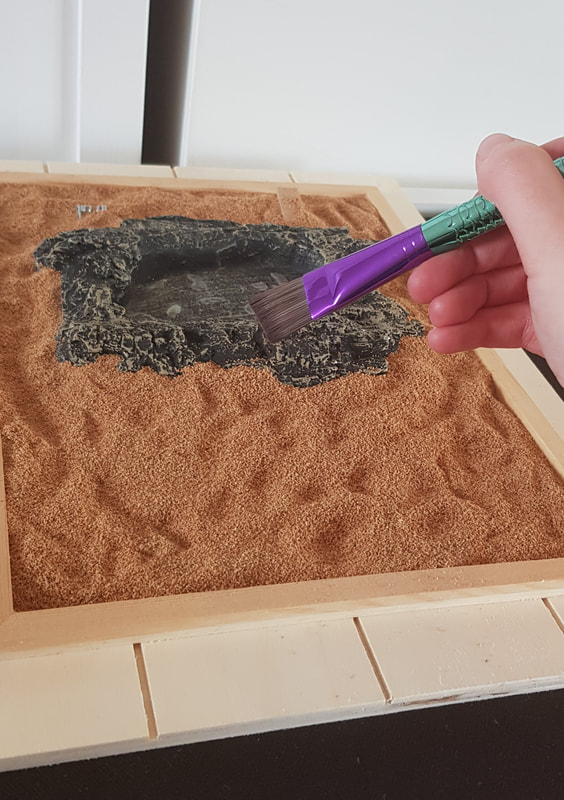
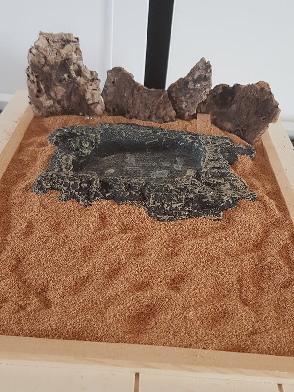
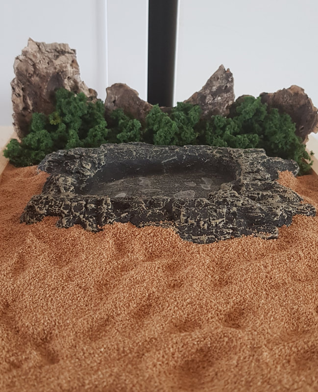
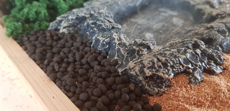
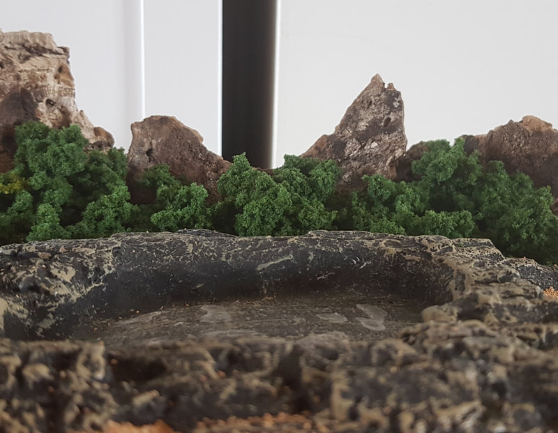
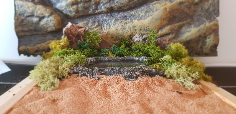
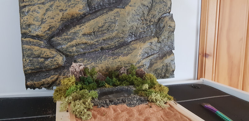
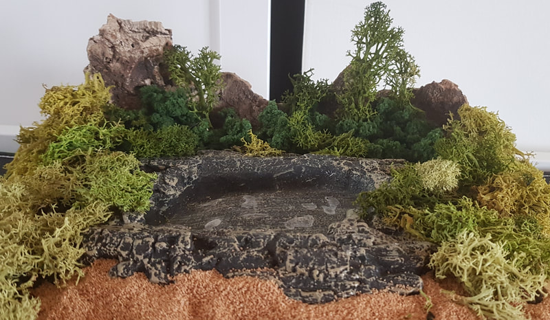
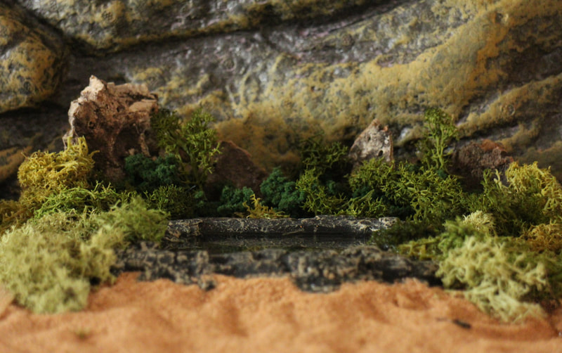
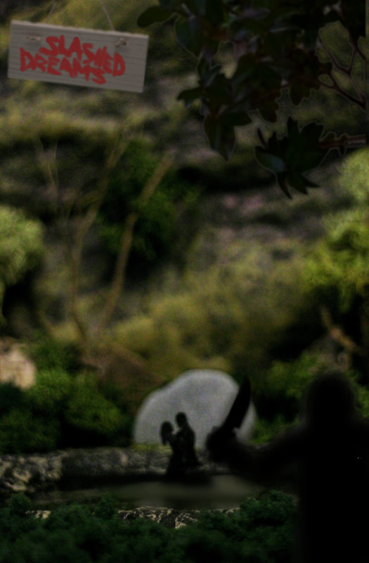
I did consider incorporating my army of succulents, especially the sedums and rattails that better resembled foliage, but decided against it due to their fragility. I ran with the idea of recreating the lake scene - where Robert and Jenny go skinny-dipping in Silver Pond. This seemed like a pivotal moment in the movie, and is also where we first meet the attackers - for dramatic effect, I wanted to include one of them watching the couple from the shadows, waiting with his knife. First of all, however, I had to build the miniature landscape. Enclosed in an upturned box frame, I laid a base layer of sand and placed the "lake" (the feeding dish), adding the bogwood and turf as background foliage. Having decided the sand was too pale in the eye of the camera, I layered the bio-soil over it to darken the scene. Silver Pond was not only the lake in the film, but the name of the hiking area the couple were backpacking in. It was mountainous and hilly, so I dug out the foam backing of my exo-terra to use as a backdrop. The grey-brown tones of the foam helped a lot to steady the colour balance during photos. I surrounded the feeding dish entirely with moss and turf to give the scene more depth, and provide a foreground of "bushes" for the attacker's silhouette to hide behind later.
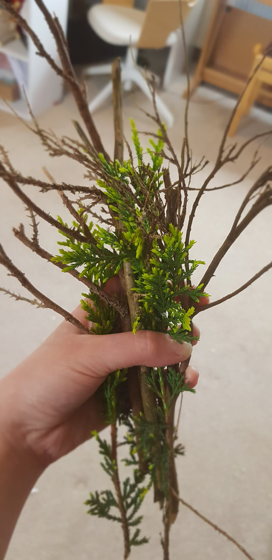
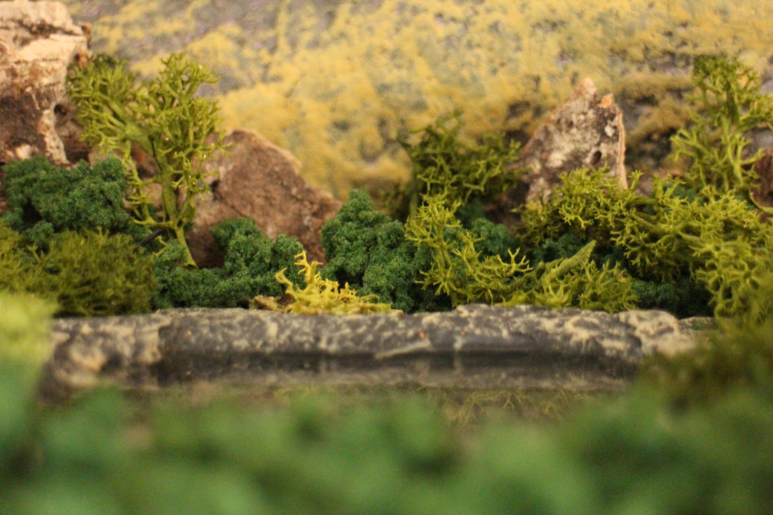
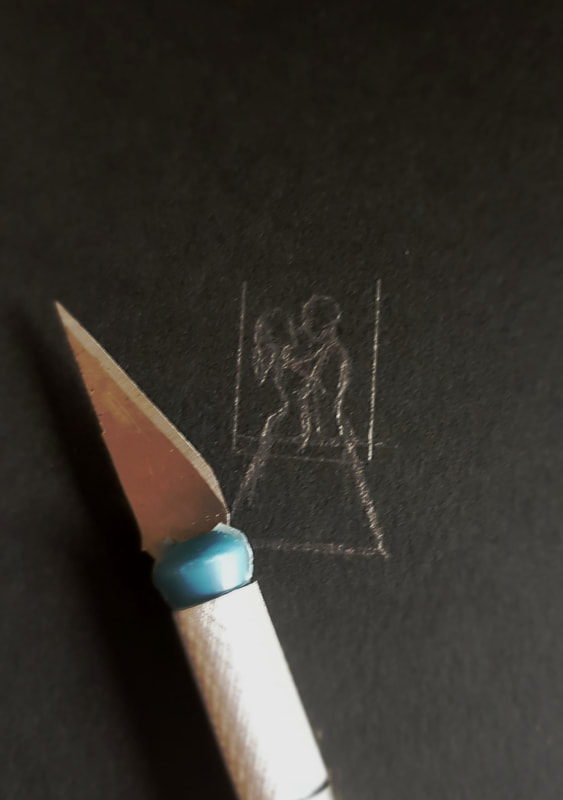
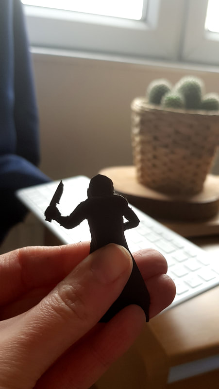
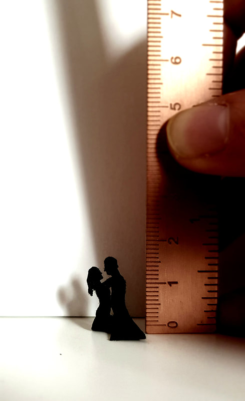
Speaking of foreground, I felt the scene was still missing something. Eventually my idiot brain figured out what my forest scene was missing; the bloody trees. We happen to have an old and dying hedge in the back garden which is coming down after nesting season anyway, so I borrowed some of its arms and fingers to make trees with. I separated them into different sizes for different depths of the scene to keep a believable perspective; with a little moss "foliage", they were good to go. With the landscape complete, I had a small photoshoot before constructing the figures just to experiment with perspective, focus and lighting. I tried different light sources, including daylight and both warm and white LEDs, and swapped lenses and distances until I felt I had the right shot. One I had that, it was time to make the tiniest card silhouettes I've ever made. They were a bit rough around the edges, but I didn't stress too much since the desired atmosphere needed a semi-blurred photograph anyway. The Finished PosterIt took quite a while, a second pair of hands, two lamps and a ridiculous half-crouch position to get the right shot; from just behind the attacker, peering over the foreground bushes at the focused midground where the couple bathe. I was fairly happy with how it turned out, and I enjoyed the hands-on crafting element of this project. project notes
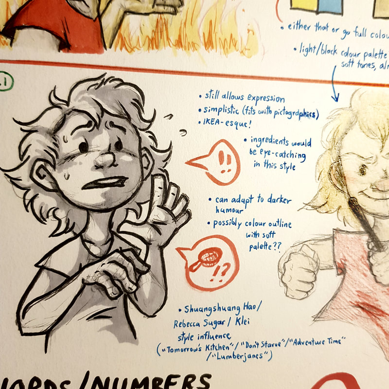
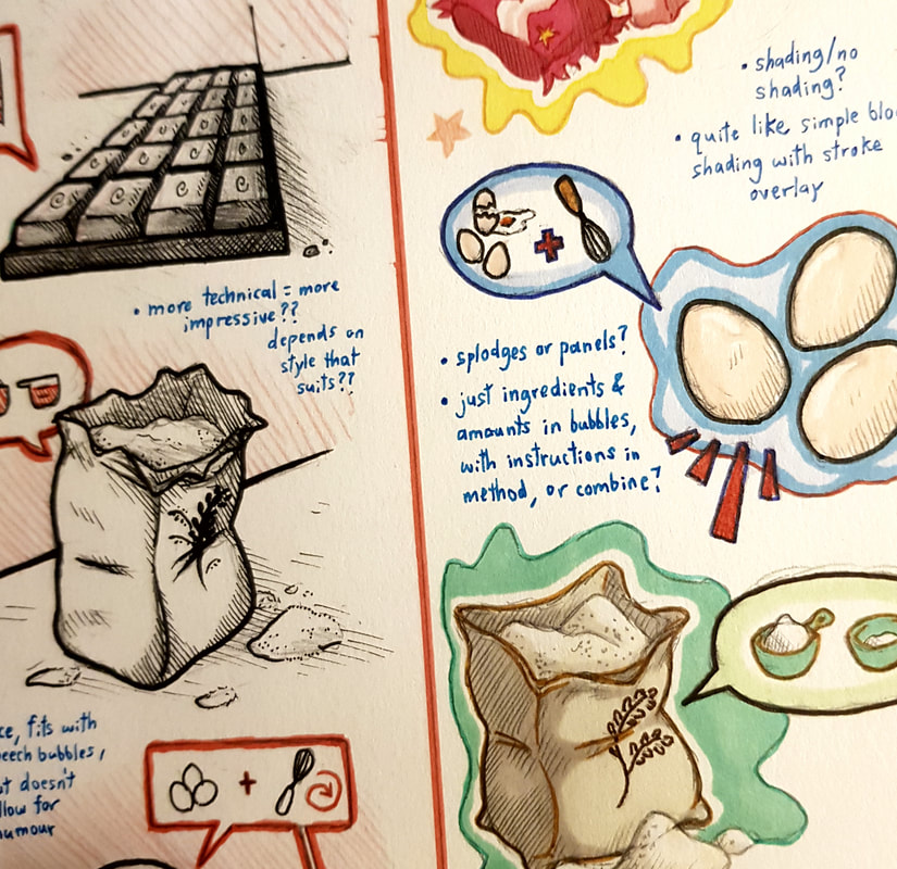
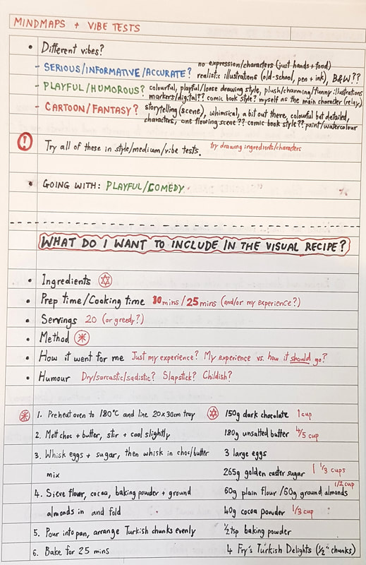
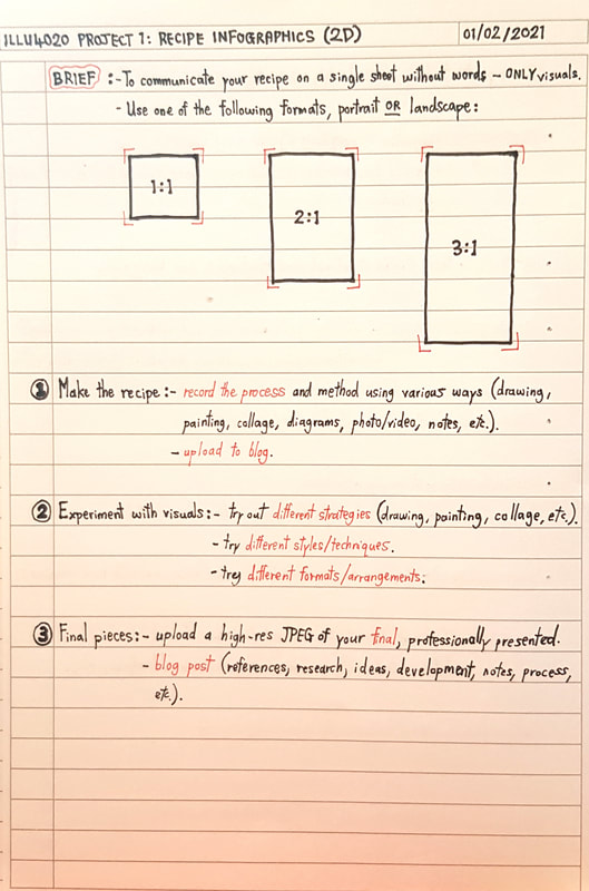
Running on from the bake-off, after documenting the process, it was time to move on to development. I made a few notes and mindmaps to brainstorm ideas. There were a few things I needed to make a decision on first - what kind of genre or "vibe" of recipe I was going for, what style it would be done in, in what medium and with what layout. Experimenting with Style and Layout |
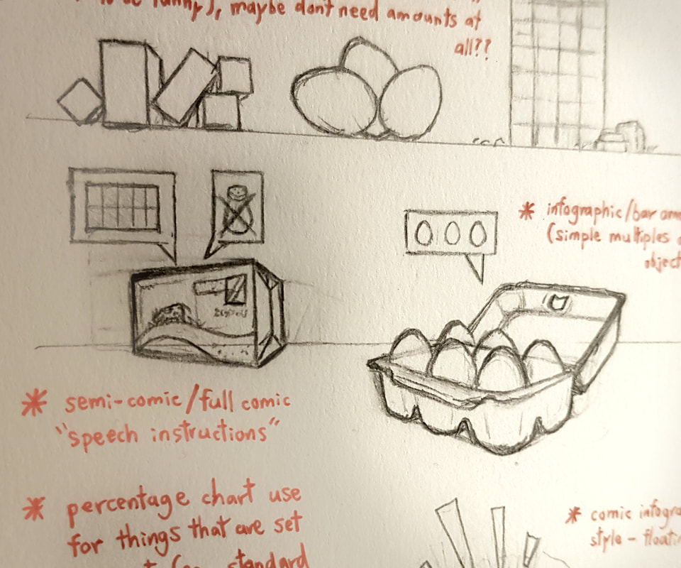
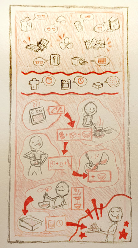
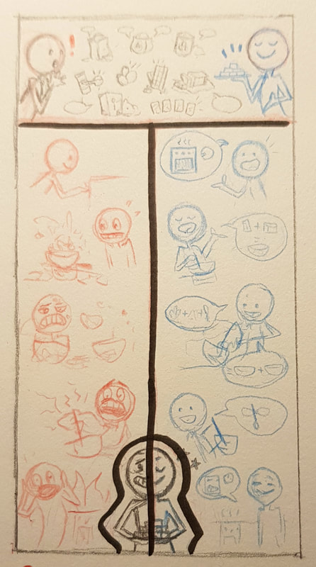
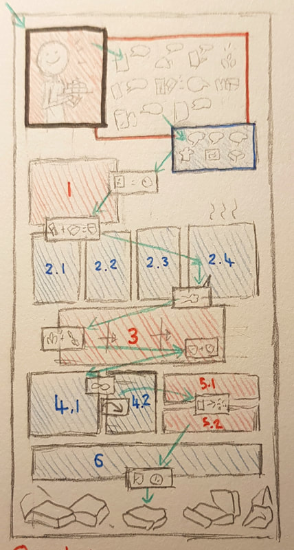
| developmental notes and sketches for layout As for layout, I knew I wanted to use a 2:1 ratio - 1:1 seemed too confined for my ideas, and 3:1 seemed too spaced out. I sketched out some thumbnails and narrowed them down to three; a simple infographic-style recipe, a comic-style recipe, and one that was kind of "half and half". |
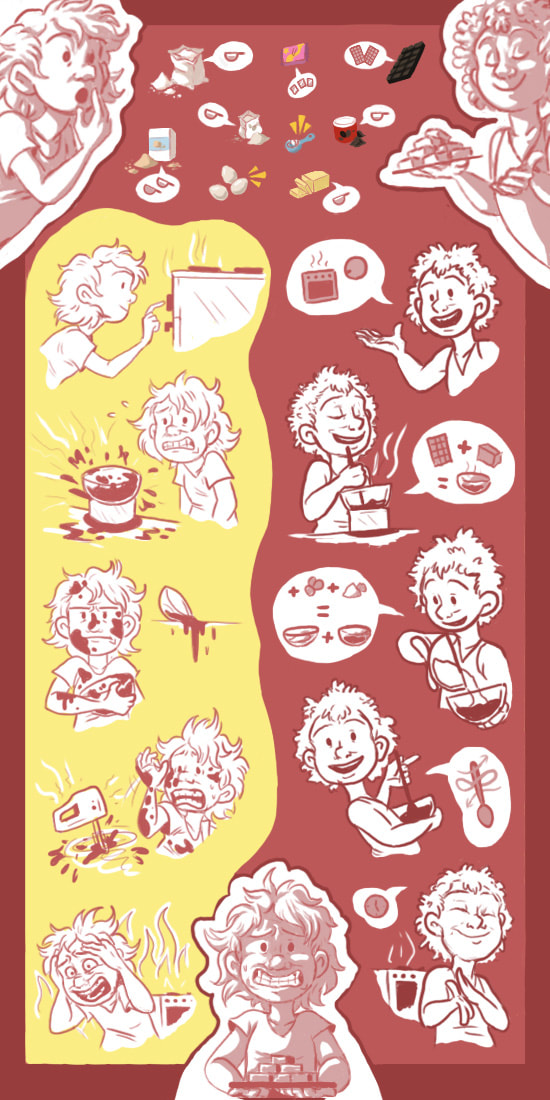
There were pros and cons to each of these. I liked the simplicity of the standard recipe, but the comic and 50/50 styles allowed for more expression. The comic layout made for slicker navigation and complete freedom of style, but I preferred the 50/50 layout for its ability to accommodate both the humour of the realistic experience and the stepwise recipe. This is the layout idea I moved forward with - a split view, humorous infographic depicting "how it went" vs "how it should have gone".
The Process
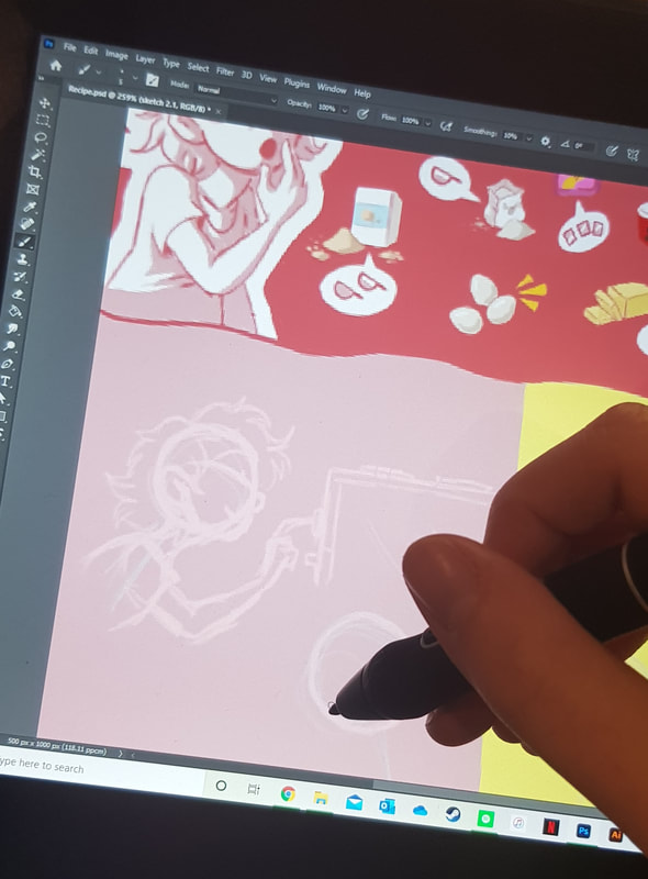
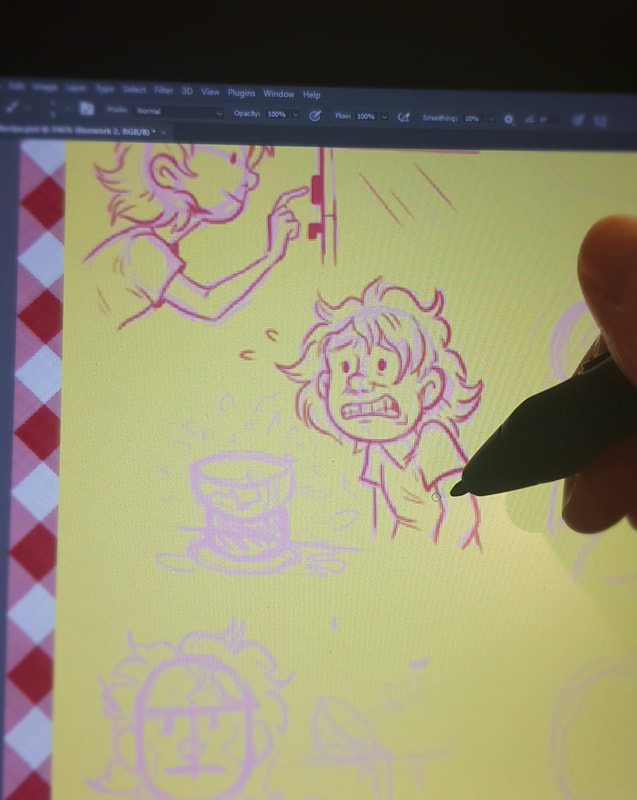
As I've mentioned before, my digital illustration skills leave a lot to be desired. However, given that this was one of the first things I ever attempted digitally, I think it went better than I expected; I had been so afraid to try it, but I actually really enjoyed using photoshop and drawing with a tablet (the same tablet that has been gathering dust for about a year because I've been too sheepish to touch it).
.....and with the obligatory positive evaluation out the way, I can list the downsides. This took way longer than I thought it would. I swore so much. I ate an entire packet of bourbon creams out of sheer frustration. I had a lot to learn about navigating photoshop, and the idea I thought was concrete kept morphing into something different. I lost count of how many times I moved things, cut things out, changed the colour scheme, added a background, took away a background... But it was al art of the process and learning curve. If anything, I now know for future projects to try out more ideas before settling on one.
The Finished Piece
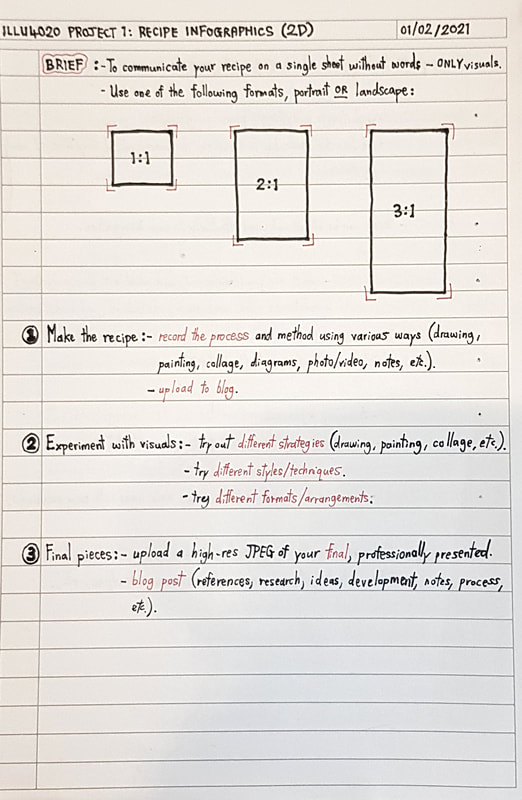
project notes
Semester 2 begins!
With semester 1 having come and gone in the blink of an eye, so begins the second. In all honesty, I didn't expect it to begin with a live baking task - but it did, so here we are.
At first I wasn't entirely sure what brownies had to do with illustration, but we were swiftly enlightened - as well as a fun and engaging start to the semester, the bake-off was an integral part of our first project! The first step was to document the baking process in a variety of different ways; this would later help us develop ideas to experiment with.
How To Document A Disaster?
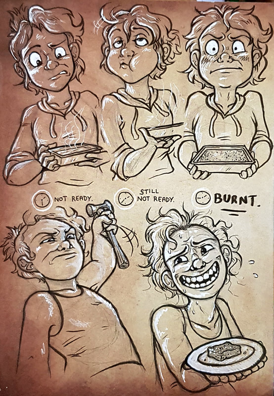
Anyone that knows me well will be aware that I am possibly the worst baker in existence. It doesn't seem to matter how closely I follow a recipe, it always goes wrong. Ironically, I'm pretty decent at cooking - but ask me for cake and you'll either get a puddle of underbaked sludge or a burnt black slab. There is no inbetween.
My point is, the vibe of my project is naturally leaning towards the humorous side. As stated in the project brief, the final visual recipe has to be entirely pictographic - no words allowed. But before figuring out how to tackle that and in what format, I thought it would be useful to use this session to determine the feel I wanted to go for. I particularly enjoyed the more humorous infographics in Wednesday's powerpoint - though I intend to keep an open mind during development, I do like the idea of a comedic recipe as opposed to a serious one.
photographic documentation of the baking process
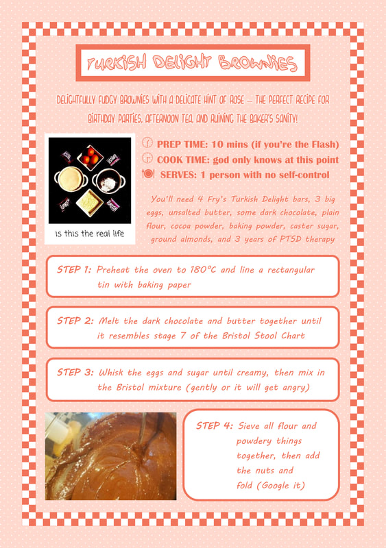
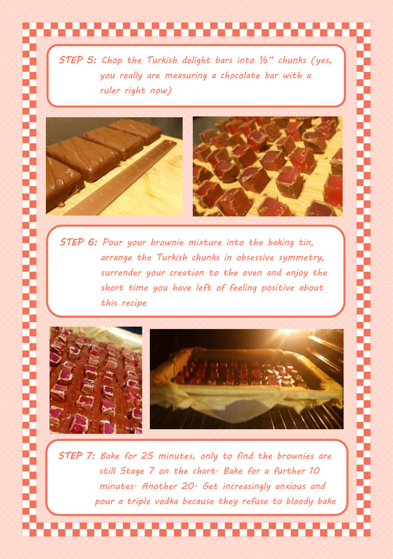
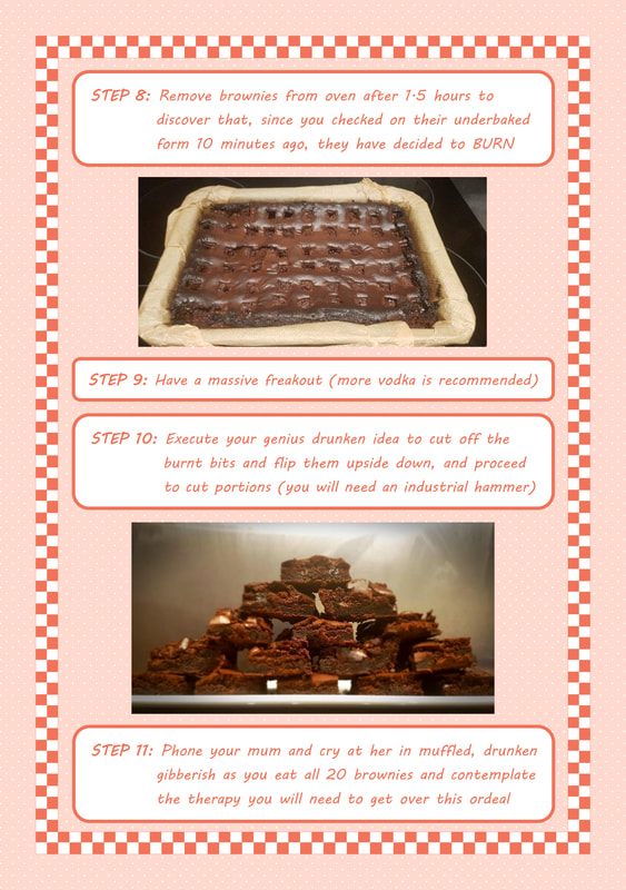
Taking photos gave me images to refer to later when creating visuals, and taking notes of the process documented my personal experience. To collate all this and play with ideas and humour, I made a quick copy of the recipe with altered steps - this gives me a basal idea of the kind of info I want to include, and what would translate well into visuals.
video documentation of the baking process
Documenting it via video also helped me experiment, and develop a suitable "voice" for the recipe. All the clips were taken in live time during the Monday task, so they accurately represent the process. I can use these as reference for experiments and sketches.
sketchbook documentation of the baking process
I also did some quick, rough doodles to document key and notable moments of the baking fiasco. Between sketches, photos and videos, I feel that documenting the process has helped spark some ideas for further development. The next step will be to refine my ideas, play with mediums, styles and formats, and figure out a definite direction I want to run in.
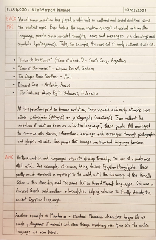
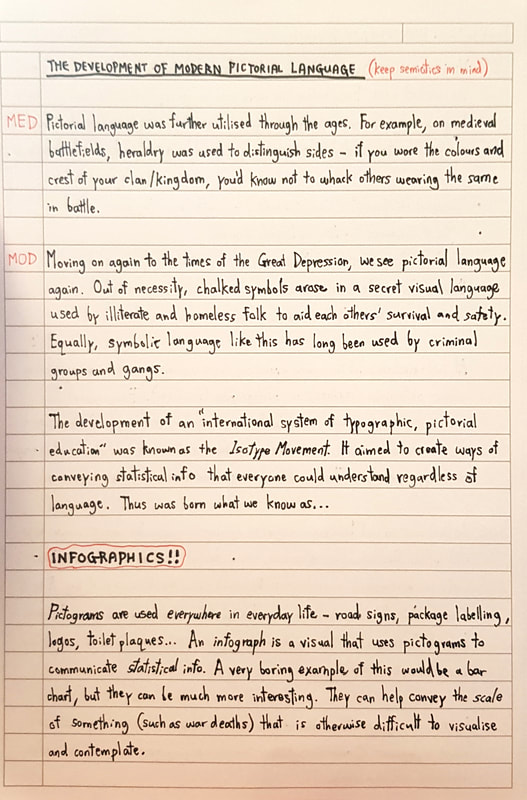
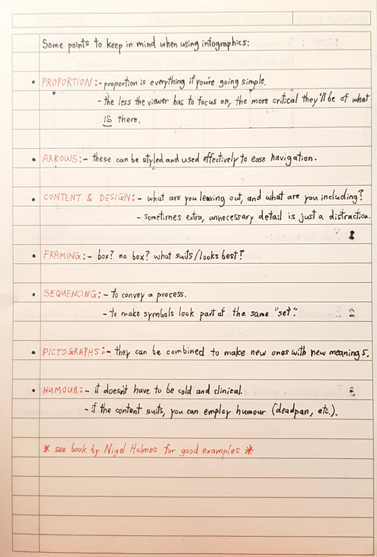
lecture notes


