|
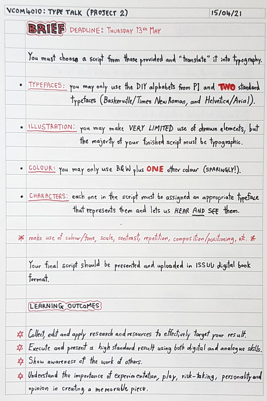
Semester 2's second type-based project tasked us with "translating" a script into digital format, using typography and the alphabets we created in the previous project. We were presented with four scripted film/TV scenes of varying genres; of these four, we had to choose one and follow a few rules of creation:
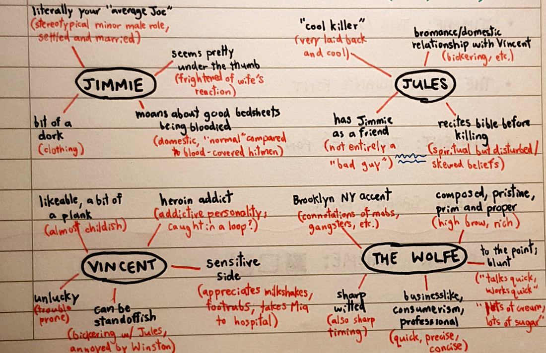
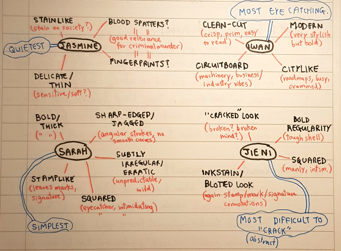
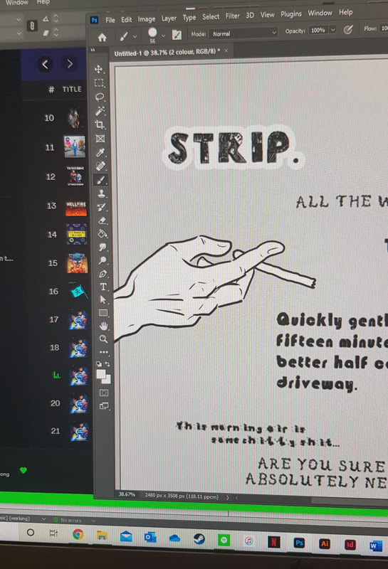
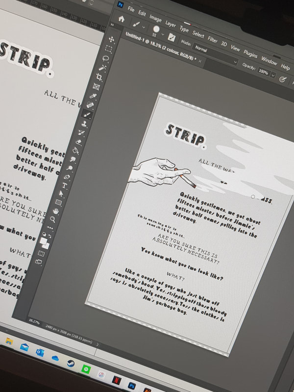
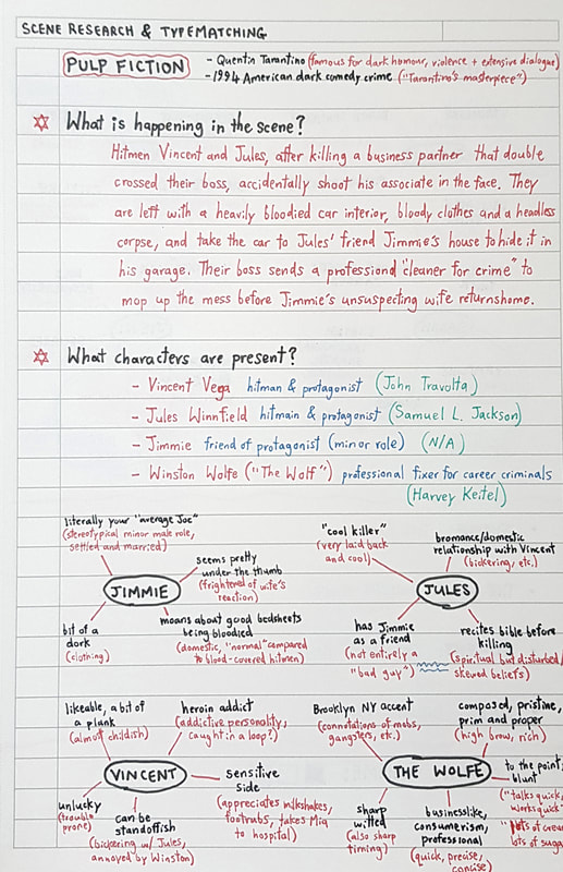
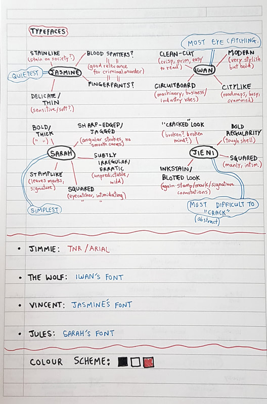
Out of the scrips presented, I felt most comfortable working with 'Pulp Fiction'. Unlike most of my schoolfriends, I actively disliked the Harry Potter franchise, I could not (and still can't) stand American sitcoms, and Blackadder never really appealed to me. If I'm perfectly honest, I'm not much of a Quentin Tarantino fan either, but Pulp Fiction seemed the most interesting and on-my-level to work with. 'Pulp Fiction' is a 1994 American black-comedy crime film directed by Quentin Tarantino. Tarantino is famous for his non-linear plotlines, dark humour and extensive use of violence, and Pulp Fiction is often said to be his "masterpiece". In the scripted scene, as linked above, hitmen Vincent Vega and Jules Winnfield have just murdered their boss's double-crossing business partner. On the road, Vincent accidentally shoots said business partner's associate in the face, leaving him, Jules and the interior of the car soaked in blood and accompanied by a headless corpse. They decide to hide the car at the residence of Jules' friend, Jimmie, but they only have so long before Jimmie's unsuspecting wife returns home to a crime scene in her garage. This is the iconic moment when 'The Wolf' is called upon to clean up the mess - Winston Wolfe, the professional fixer for career criminals. The job gets done, but not without the humiliation of Vincent and Jules. Research and "Typematching"After re-watching the scene a few times and analysing the script, my first port of call was to analyse the characters. I brainstormed my opinion on their personalities with mini mindmaps and some very scribbly notes; this allowed me to gauge the characters I was working with, in turn helping me to assign them a suitable typeface. After finalising my take on the scene and characters, I moved to the DIY alphabets from the first project to look through everyone's original typefaces. From these, I selected a few I felt might suit the script and downloaded the font files; after some testing, analysing and more mindmaps, I felt confident in the typefaces I wanted to represent each character. I have listed the characters below alongside their relative typefaces and my reasons for matching them: For Vincent Vega, I chose a typeface created by Jasmine. Vincent struck me as quite a likeable character with an almost childlike innocence seemingly lurking somewhere beneath his sin. I took from his heroin addiction that he had an addictive personality, and placed him in my head as a good guy caught in a bad loop. This is reinforced by the sensitive side we see in him regularly throughout the film; he shows an appreciation for finer, more "feminine" things (footrubs, milkshakes, etc), and rushes to save Mia when she overdoses. Jasmine's typeface was by far the most delicate out of those I had picked, and I felt this really showed off Vincent's sensitivity. However, though fragile, the letters are almost stain-like on closer inspection. The three things that came to mind here seemed to fit the character just as well; stains (the view of criminals as "stains on society"), blood spatters (Vincent's career as a hitman), and fingerprints (relative to criminal practice). For Jules Winnfield, I chose Sarah's typeface. In the film and in my opinion, Jules came across as the "cool killer" - a laid-back, cold-blooded, merciless hitman. However, he did have a few interesting quirks which gave his character that extra spark, such as his almost domestic relationship with his partner-in-crime Vincent (showing his ability to care and form meaningful bonds), and his tendency to recite from the Bible before killing (suggesting a spiritual but disturbed outlook on life). I chose Sarah's typeface to represent Jules for the subtle resemblance it bore to his character. For instance, the letters are sharp edged and jagged with very angular strokes, quite like Jules' cold-hearted actions and rigid religious mindset. They are also subtly irregularly-sized and a little erratic looking; I felt this fitted well with Jules' unpredictable actions and wild trigger finger. The most interesting comparison I saw between character and typeface was their stamp-like qualities - shown in the visual appearance of the letters, and in Jules' unique killing rituals which are much like a signature or a "stamp" on his victims. For The Wolf, I chose the typeface designed by Iwan. Despite not being a major fan of the film itself, I do think Winston Wolfe's character was masterfully written. His voice, appearance and subtle hints in his dialogue all contribute to a subconscious vibe which I found interesting to break down. In terms of appearance, The Wolf is pristine; prim and proper, and clad in expensive-looking business apparel. From the get-go, this suggests he is rather wealthy - criminal careers seem to pay well, after all, which is hinted at in his Brooklyn accent (the stereotypical New York dialect bears connotations of mobs, gangsters and crime). In his movement and speech he maintains a cold composure; though calm, he speaks very quickly which shows off his sharp wit. This makes complete sense given his time-critical job, and he adopts a very straight-to-the-point manner to ensure punctuality. I felt Iwan's typeface represented The Wolfe well in a number of ways. The letters are clean-cut with crisp outlines, much like Winston's sharp appearance. The font has a very modern, stylish look but is simultaneously bold and slightly intimidating - again, I felt this was very much a typographic mirror of the character. Both streetmaps and circuitboards come to mind when I look at Iwan's typeface, which both suit in their own ways. Streetmaps give off the same busy, citylike feel I would associate with Winston's mind, and circuitboard connections remind me of his quick-firing industrial wits. For poor Jimmie, I chose Arial. As a stereotypical American domestic and the very definition of "your average Joe", he struck me from the beginning as a standard typeface kind of guy. With such a minor role in the scene and such a plain character, I wanted the other characters to stand out more than he did - it was a toss-up between Times New Roman and Arial, and I went for the sans serif to "imitate" his simple-mindedness. Experimenting With LayoutIn terms of analogue development, I started by taking notes and sketching out page grids. I did this to get to know the anatomy of a page and its hidden workings; there's so much going on in there I didn't even think about, so I wanted to have a better grasp of it before leaping into the design. The script didn't contain a massive amount of dialogue; I felt a simplistic three-column grid fitted the minimalist idea I had in my mind's eye. In the pictures above, you can see me developing this idea through analogue mocks and annotation. As a writer, reader and an illustration student, I was keen to try a "hybrid" of comic and script formats to create a fitting layout; I used the same "line of sight" technique common in graphic novels, manipulating placement, colour and contrast to guide the eye through the scene. The idea of sparse, simplistic graphics was to hint at non-verbal action and stage direction, and I paid careful attention to the spacing of each line of dialogue to create a sense of time and sceneflow. Digital Development
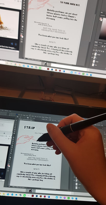
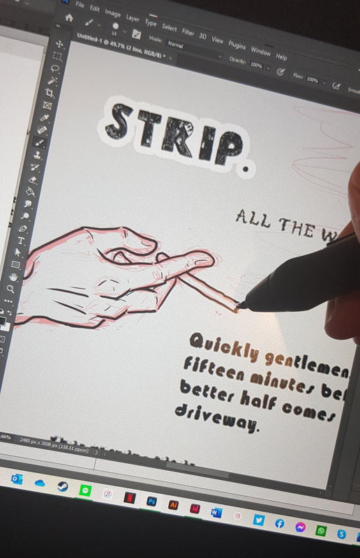
With the colour scheme decided, I went on to mock up a rough script plan in Word - you can see this above. This is the template I moved forward with, give or take a few minor changes, in InDesign. After setting the grid and margins and laying out the basic page design, I took screenshots of each page to layer graphics over in Photoshop; these would then be saved as transparent PNG files and integrated with the written script in InDesign. The Finished Scriptview the full version in ISSUU book format here This was relatively new territory for me in terms of using InDesign and Photoshop, but overall I really enjoyed this project. I got to integrate my love for writing with my interest in graphics and illustration, and learned a lot along the way. Although I have much to improve on and am looking forward to building on newfound skills, I am fairly happy with how the finished piece turned out. project notes
0 Comments
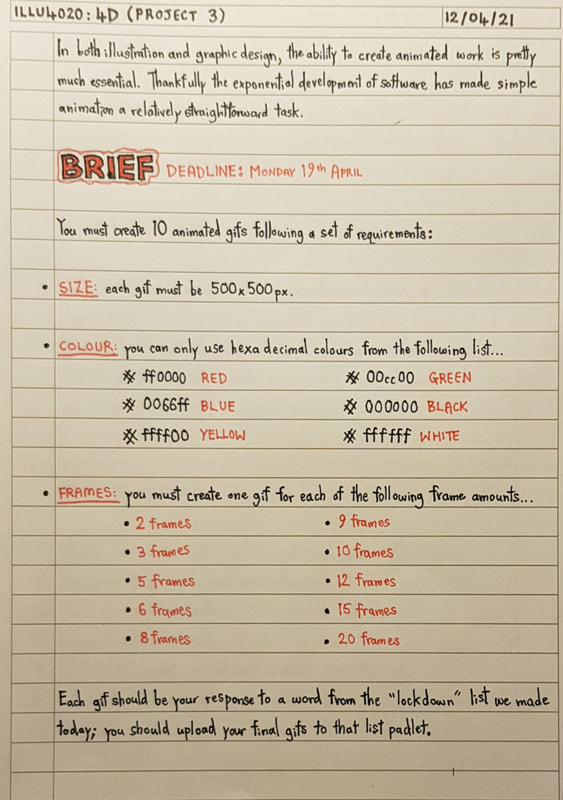
Introduction to 4DTo ease us from 3D into the realms of 4D, we started with a simple task: to create a rotational self portrait in gif format. I lack experience in the field of digital art, which I'll discuss later, so my attempt was really simplistic. But it was useful to get a feel, however basic, for what was required in the project to come. I drew the frames traditionally and took photos of them to transfer them into gif form. Below you can see some of the analogue sketches alongside the finished digital gif. Moving into our 4D project, the task was to create ten animated gifs. The yeargroup brainstormed lockdown themes together; themes our gifs were to then be based on. As per usual, there were a few rules to follow:
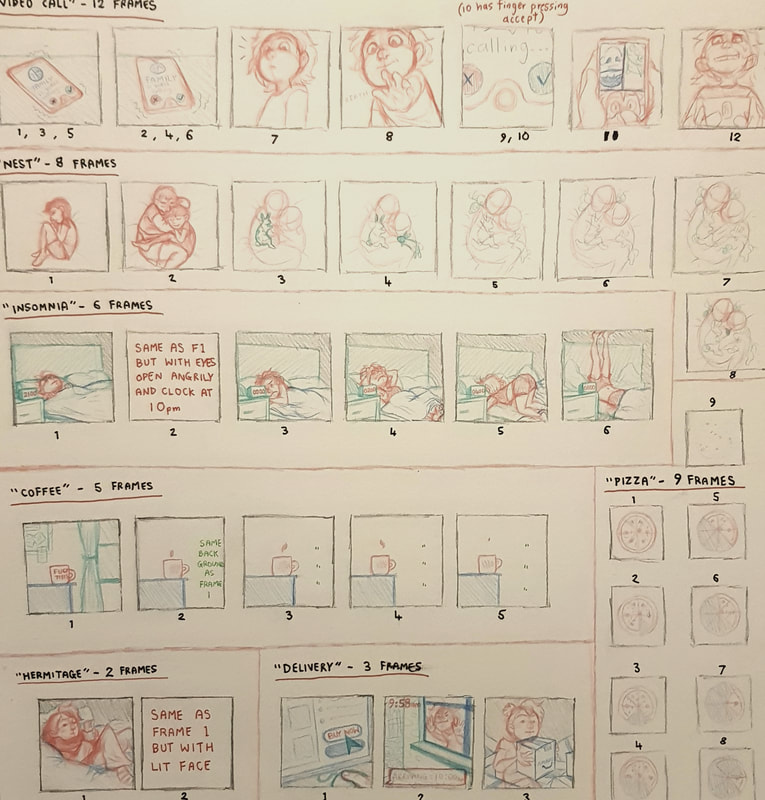
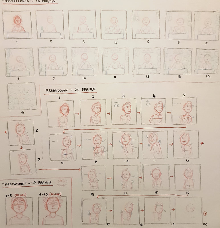
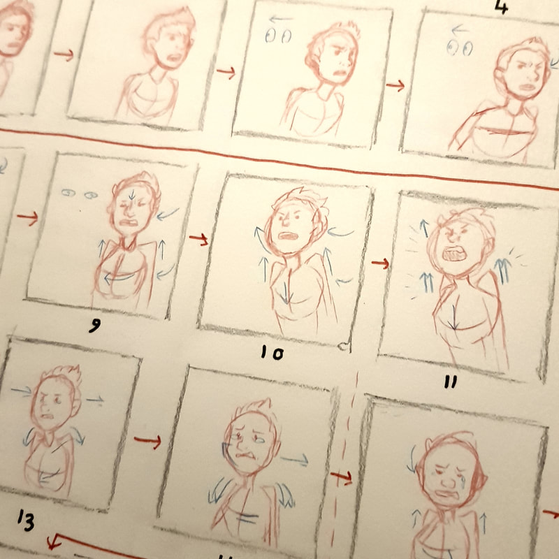
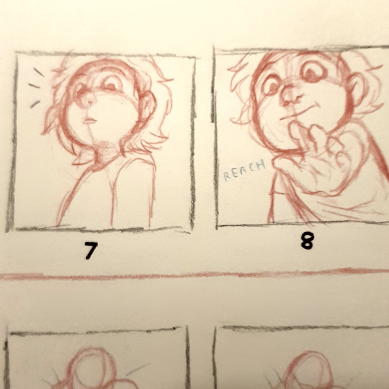
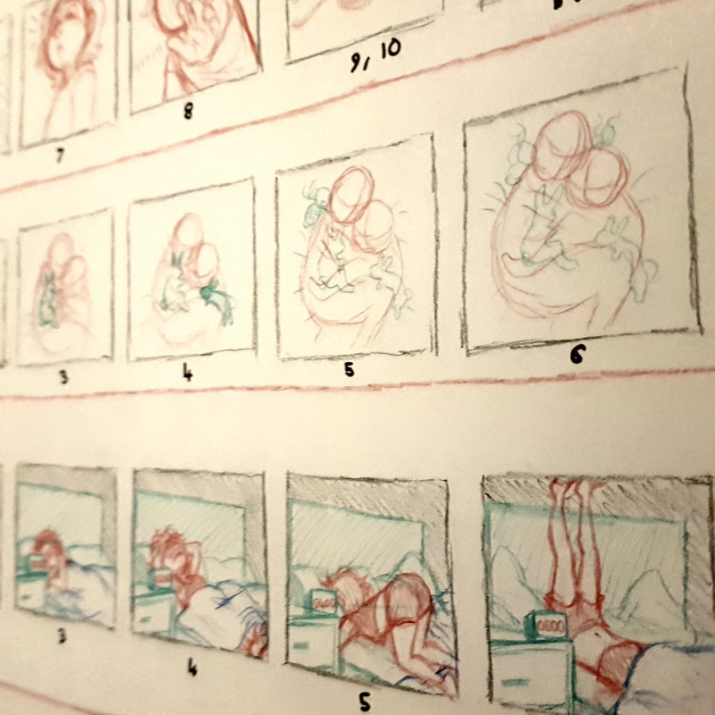
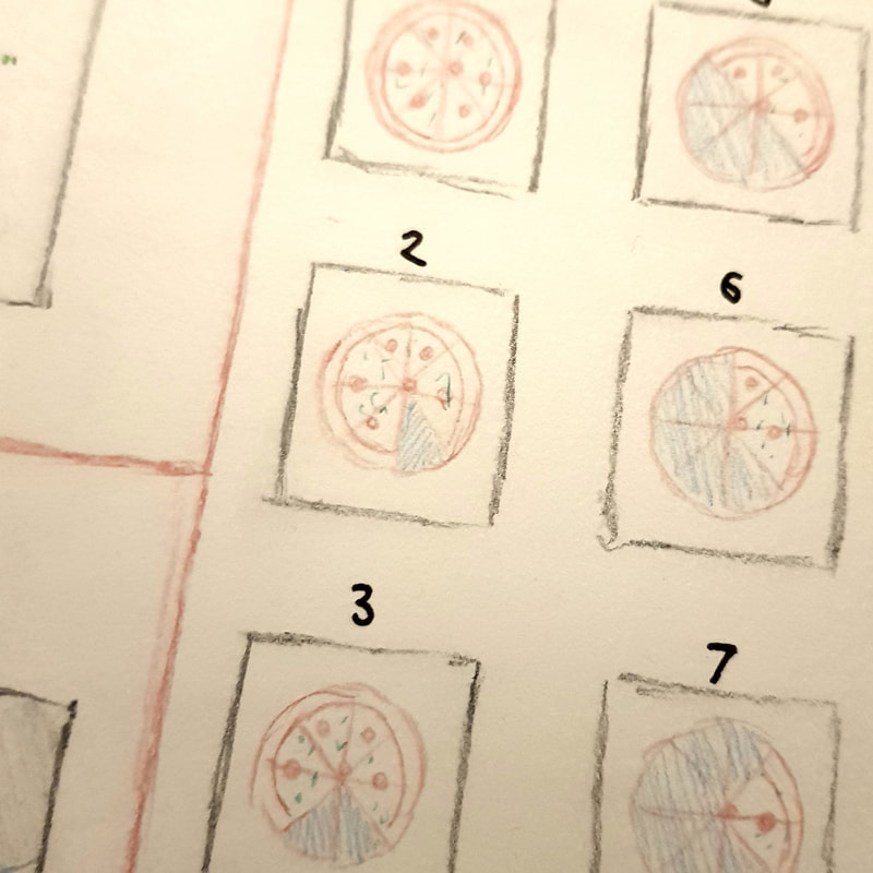
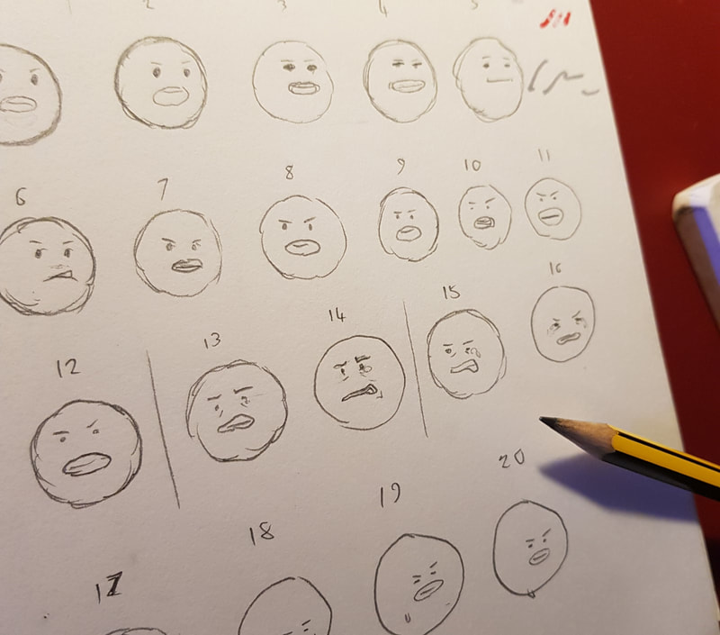
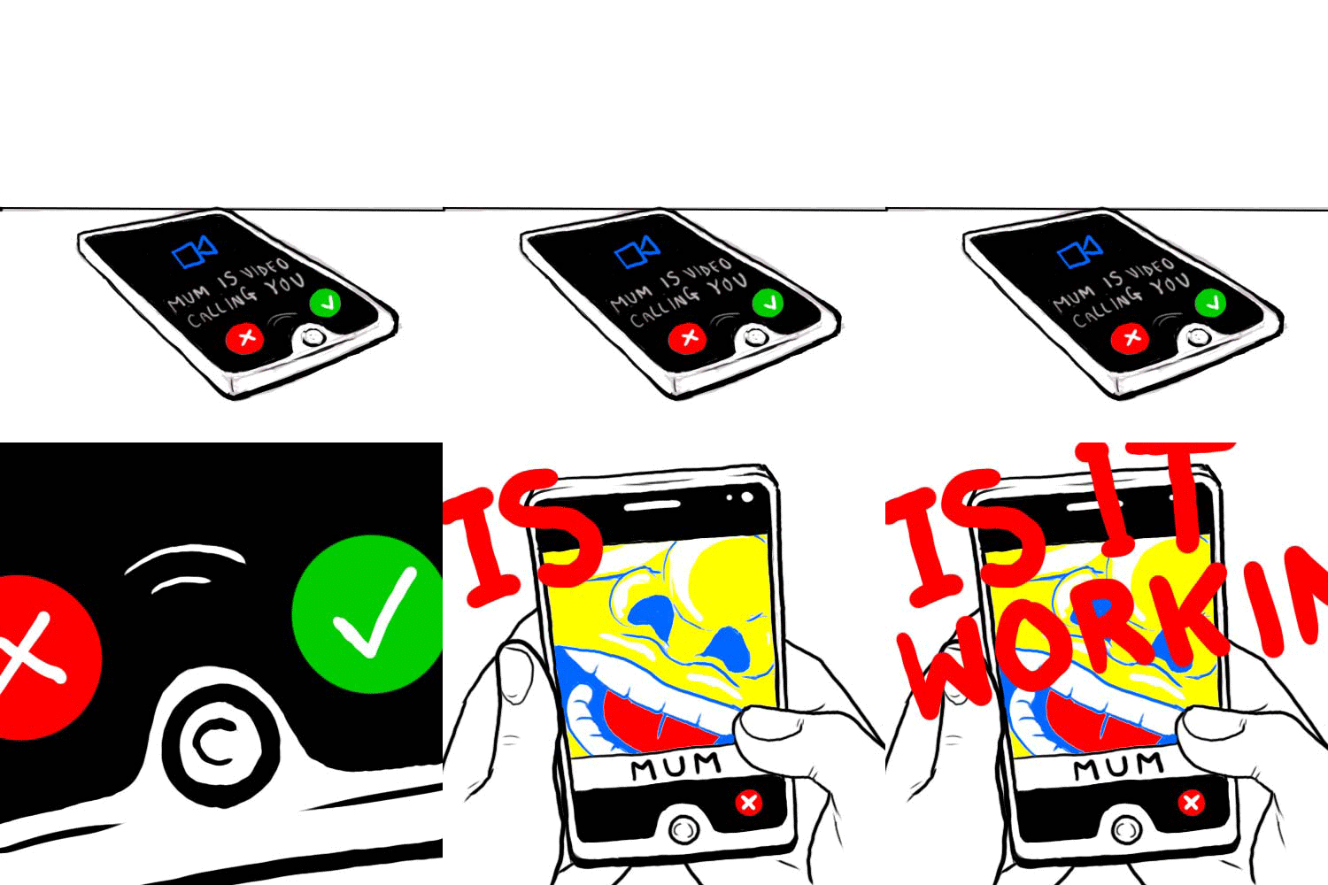
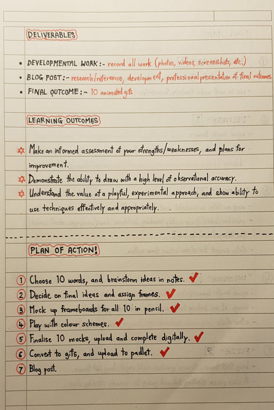
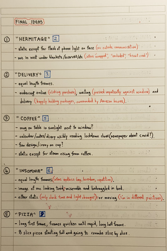
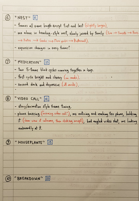
Getting StartedI am a huge fan of animation and animated movies - be it traditional, digital, stopmotion, whatever. Animation is one of my biggest influences, alongside the storyboarding and concept art development behind completed films, so naturally I am keen to learn the workings of it. However, despite my excitement, I was really nervous to move into 4D territory. Admittedly, prior to this module, I had practically not touched the digital medium. Photoshop, animation and digital art in general are all completely new to me, and are areas I am neither confident nor competent in. I knew from the start that my attempt at this project would be pretty damn rubbish, but I consoled myself with the fact that I'm here to learn how to improve on that. Analogue DevelopmentIronically, despite being so terrible at digital art and animation, I can visualise and "direct" moving scenes in my head pretty clearly. I think being such a fan of films, books and graphic novels, I have a decent sense of how a scene should flow; I just lack the actual skill to execute it. Regardless, all that time spent staring out bus windows and visualising music videos and fight scenes paid off in the sense that I was not short of ideas. I narrowed down my theme ideas to the ten I felt best suited gif format. I then laid them all these provisional "scene" concepts out on paper and assigned gif lengths to each; this process can be seen in my lecture notes at the foot of this post. Once the ideas were finalised, I moved on to create "storyboards" for each gif consisting of frame thumbnails. analogue thumbnails and frame planning This was where I had to move out of my comfort zone and use photoshop. I found it really difficult at first; even with the basics training in previous IT lectures, I found it difficult to navigate the tools and brushes. It took me quite a while to get a basic grip on it, but eventually I began to feel a little more confident. I even started to enjoy the feel of digital drawing and the multitude of tools available on photoshop - I am looking forward to learning more and improving my skills digitally for future projects. Putting the completed frames into motion was quite fun, and I think with a lot of practice I will be able to build on what I've learned here. One thing I will say I actively disliked about this project was the colour limitation. I am really not a fan of bold, bright schemes like this and found it difficult to force myself to stick to it - but that in itself was good practice. After all, in a professional setting, you can't turn around and tell a client "I don't like these requirements so I'm going to do something different". I have to be comfortable with pushing my own boundaries. Below are my completed gifs. lecture notes
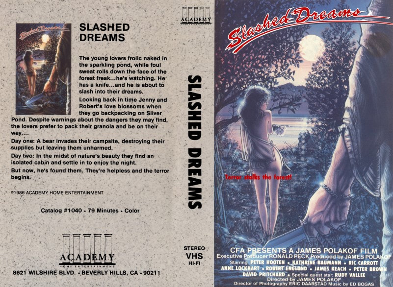
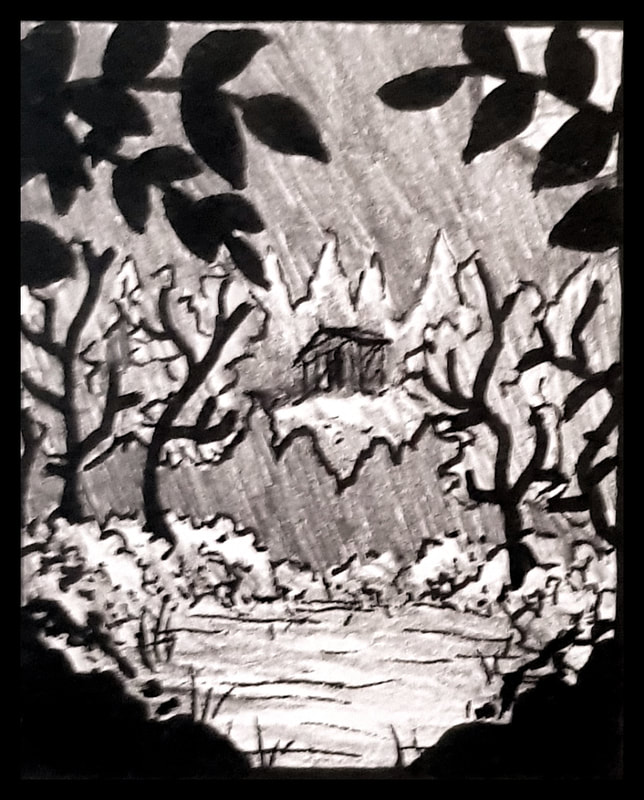
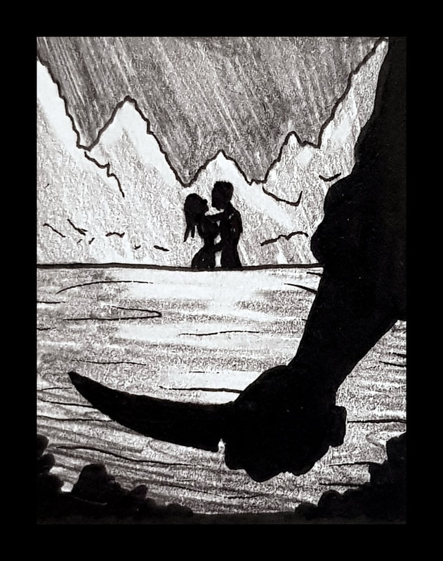
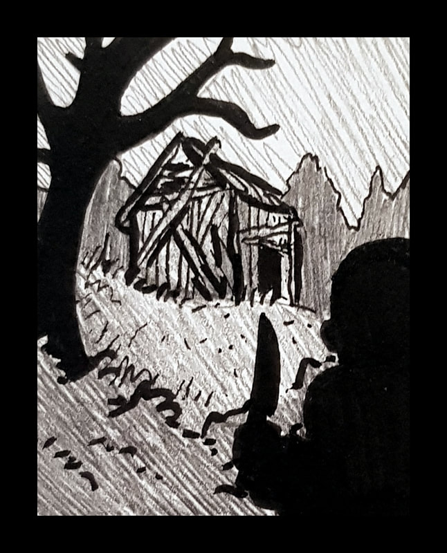
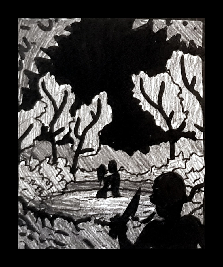
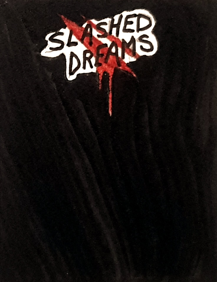
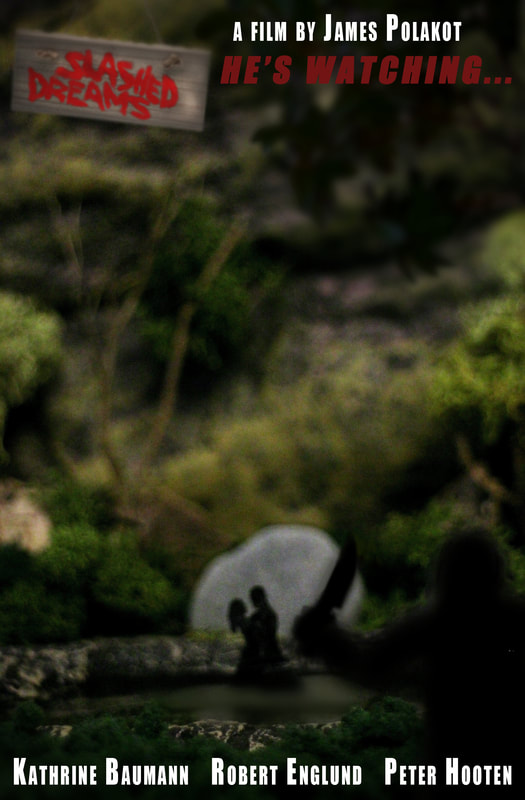
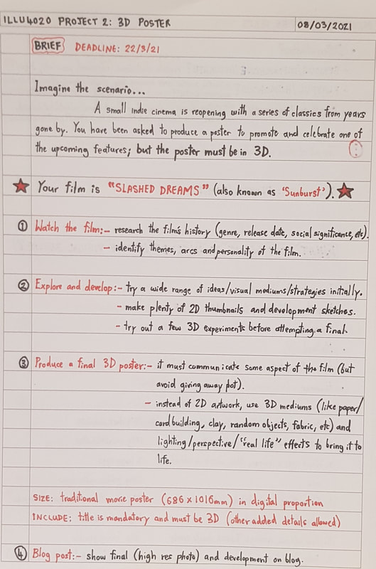
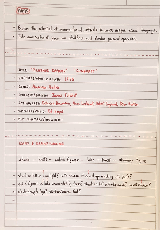
For this project, we were each assigned a film to watch and create a 3D poster for. My given film was 'Slashed Dreams', as linked to below: 'Slashed Dreams', also known as 'Sunburst', is a 1975 American thriller produced and directed by James Polakot. The plot follows a young couple, Jenny and Robert, whose love blooms on a camping trip over Silver Pond. The wilderness seems idyllic at first - hiking through the woods, swimming in a crystal lake, bedding down in an old log cabin - until they are warned of a mysterious danger lurking in the forest. Choosing to ignore the advice, Jenny and Robert venture further only to find themselves stalked and attacked by murderous rapists. "The young lovers frolic naked in the sparkling pond, while foul sweat rolls down the face of the forest freak... he's watching." In all honesty, even just from reading the synopsis, I could tell this was not going to be my cup of tea. Watching the actual film only proved me right - somebody had commented, I quote, "waste of 78 minutes". But, however bad, the film offered plenty of inspiration for poster ideas. I drew particular influence from the existing poster art for the film; I liked the idea of incorporating trees into my own poster, perhaps by layering card or playing with shadows. The forest freak's knife also seemed worth including for both symbolic purpose and ease of representation in 3D. Figures would be more difficult if I wanted to include those; card silhouetting or clay seemed like the best choices for that approach. With these thoughts in mind, I moved on to create some 2D thumbnails. 2D Development
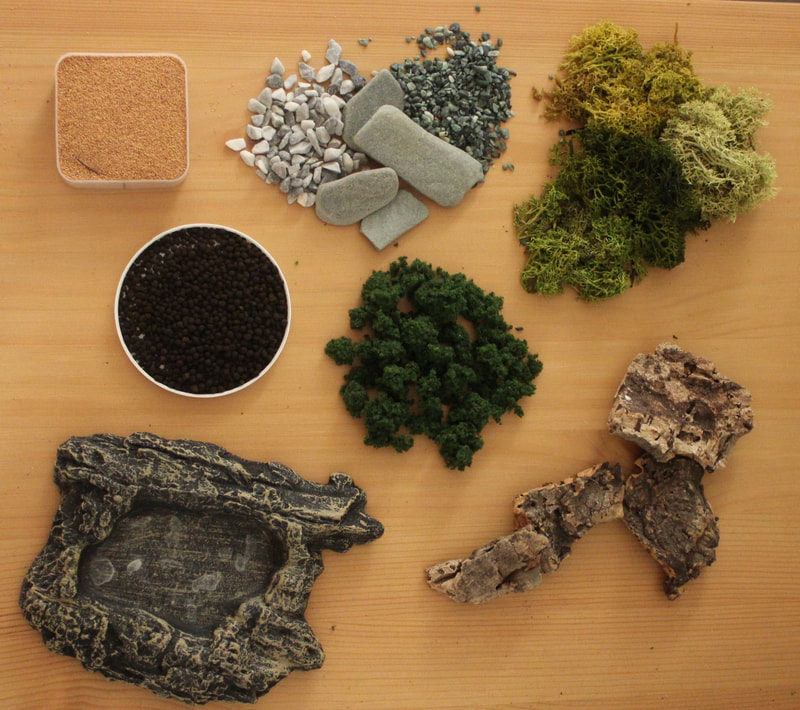
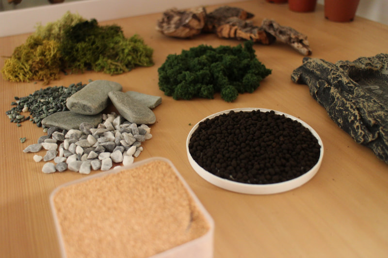
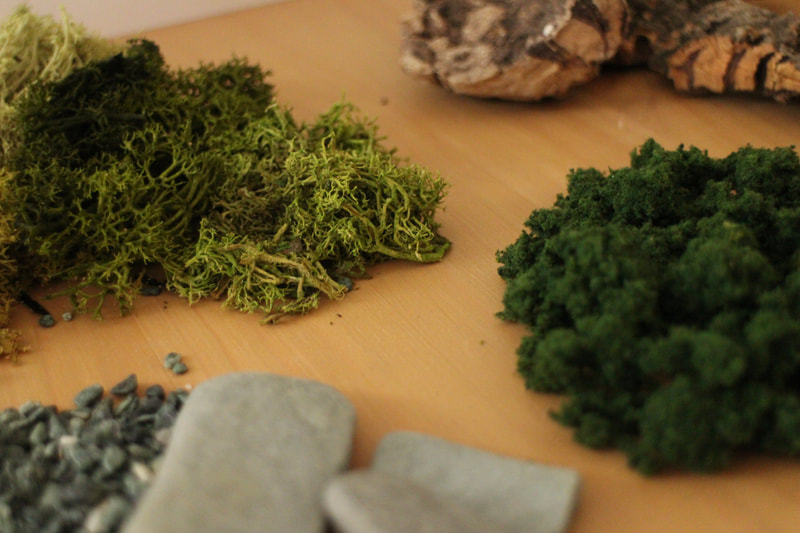
3D Development and ProcessI have a lot of pets, a lot of houseplants, I enjoy collecting little bits and pieces from mother nature and I love crafting miniature landscapes and scenes. What does all this have in common? It means I have a seemingly infinite supply of natural materials! With so much of this at hand, and a forest scene to construct for the poster, I got quite excited about recreating the scene in miniature. Some materials I started off with included:
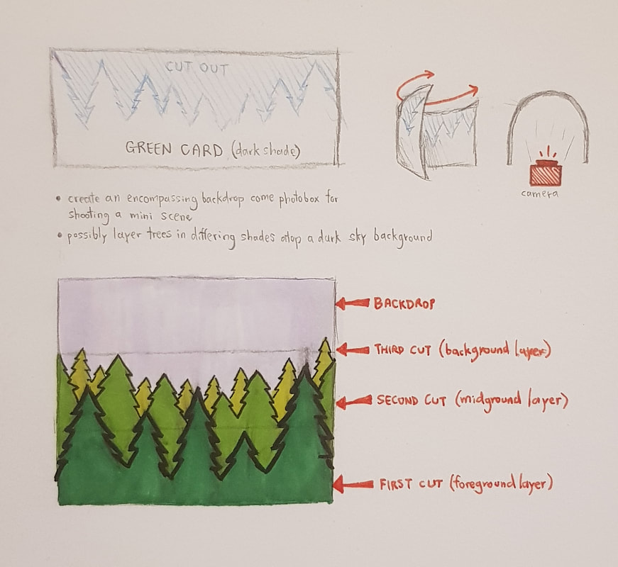
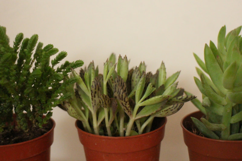
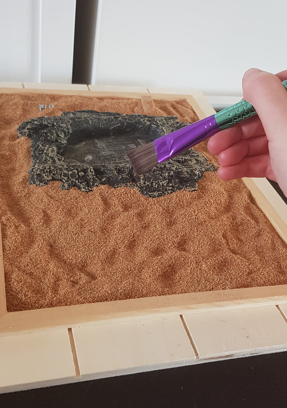
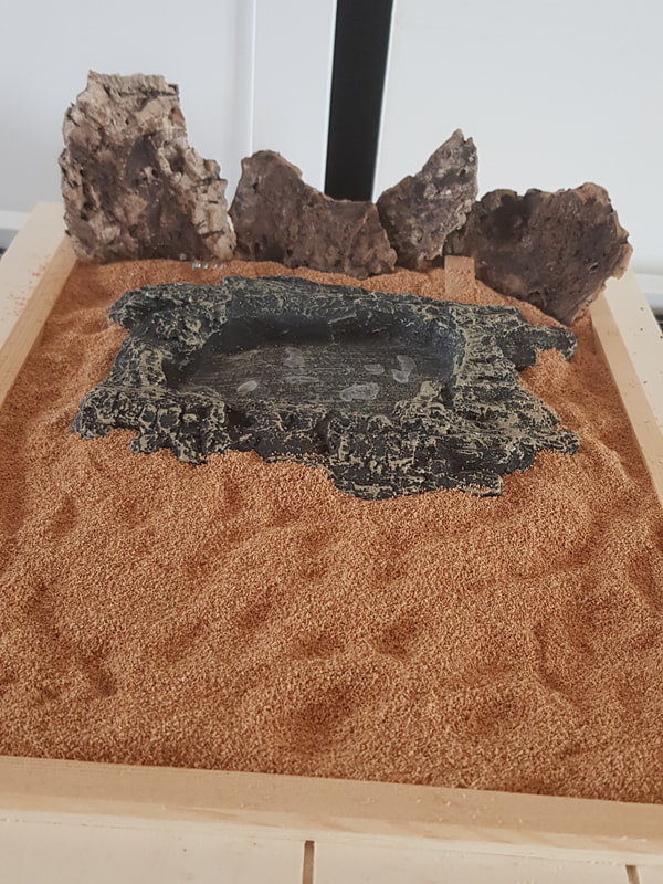
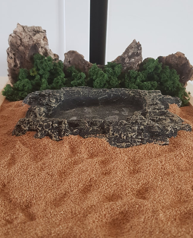
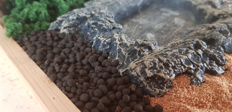
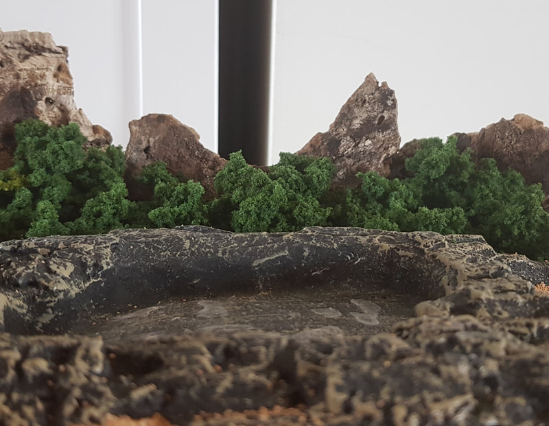
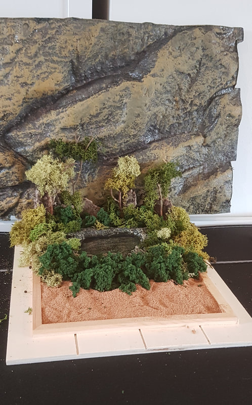
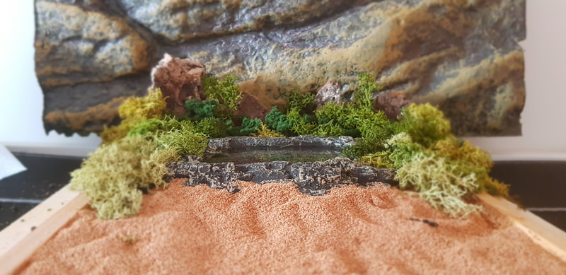
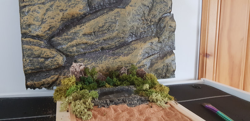
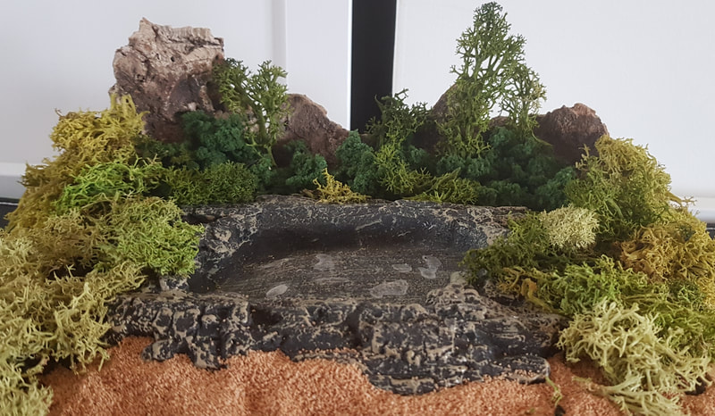
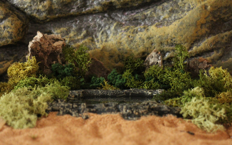
I did consider incorporating my army of succulents, especially the sedums and rattails that better resembled foliage, but decided against it due to their fragility. I ran with the idea of recreating the lake scene - where Robert and Jenny go skinny-dipping in Silver Pond. This seemed like a pivotal moment in the movie, and is also where we first meet the attackers - for dramatic effect, I wanted to include one of them watching the couple from the shadows, waiting with his knife. First of all, however, I had to build the miniature landscape. Enclosed in an upturned box frame, I laid a base layer of sand and placed the "lake" (the feeding dish), adding the bogwood and turf as background foliage. Having decided the sand was too pale in the eye of the camera, I layered the bio-soil over it to darken the scene. Silver Pond was not only the lake in the film, but the name of the hiking area the couple were backpacking in. It was mountainous and hilly, so I dug out the foam backing of my exo-terra to use as a backdrop. The grey-brown tones of the foam helped a lot to steady the colour balance during photos. I surrounded the feeding dish entirely with moss and turf to give the scene more depth, and provide a foreground of "bushes" for the attacker's silhouette to hide behind later.
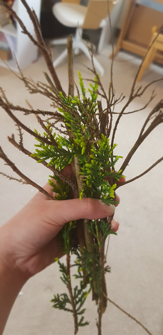
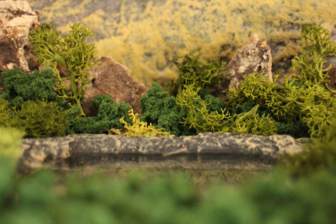
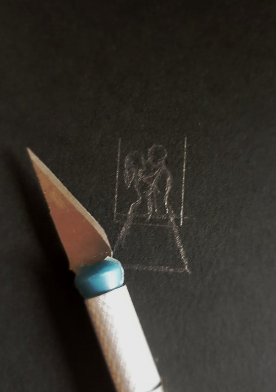
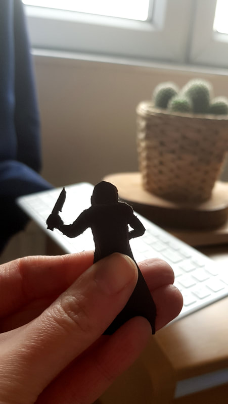
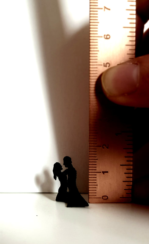
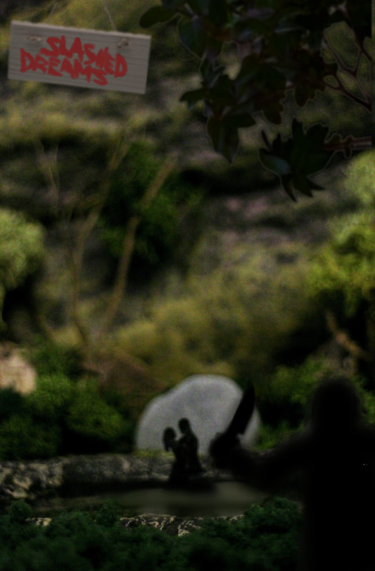
Speaking of foreground, I felt the scene was still missing something. Eventually my idiot brain figured out what my forest scene was missing; the bloody trees. We happen to have an old and dying hedge in the back garden which is coming down after nesting season anyway, so I borrowed some of its arms and fingers to make trees with. I separated them into different sizes for different depths of the scene to keep a believable perspective; with a little moss "foliage", they were good to go. With the landscape complete, I had a small photoshoot before constructing the figures just to experiment with perspective, focus and lighting. I tried different light sources, including daylight and both warm and white LEDs, and swapped lenses and distances until I felt I had the right shot. One I had that, it was time to make the tiniest card silhouettes I've ever made. They were a bit rough around the edges, but I didn't stress too much since the desired atmosphere needed a semi-blurred photograph anyway. The Finished PosterIt took quite a while, a second pair of hands, two lamps and a ridiculous half-crouch position to get the right shot; from just behind the attacker, peering over the foreground bushes at the focused midground where the couple bathe. I was fairly happy with how it turned out, and I enjoyed the hands-on crafting element of this project. project notes
|
ArchivesCategories |
Site powered by Weebly. Managed by 34SP.com

