Font Selfie For our first workshop task, we had to choose a typeface we felt suited us - using our favourite character from that typeface, we then had to decorate it to represent our personality.I chose Forte as my typeface; with its bold thickness yet neat calligraphy-like strokes, I feel it is as self-contradictory as I am. I can be loud and outgoing, and often adjust the way I project myself to fit in with others - but really, I'm kind of a hermit nerd who just wants to write stories at my little white bureau and talk about Latin etymology. Which tends to kill a conversation.
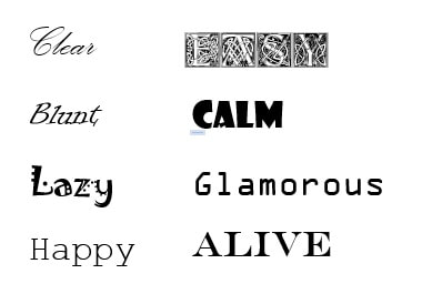
here. I kept the colour scheme pale and cold - muted greens, blues and lavenders - because the highlands always seem to have that misty hazy that gives everything a cooler tone. The sky phasing from light to dark represents the idea of beauty in both sides of the coin - clouds by day and stars by night - and the shadow with the Celtic knot was a nod to my pagan roots. Type Quiz1. Match the typeface to the description. - Fraftur was born in 16th Century Germany and is a heavy metal favourite. - Mistral looks like handwriting. - Bembo is named after a Venetian poet, literary theorist and cleric. - Colonel was inspired by stencil printing on army supplies. - Didot is often found in fashion magazines for its sophisticated looks. - Courier is inspired by letters produced by a typewriter. - Helvetica is popular for signage but can seem boring and clinical. 2. Classification/Style Examples 3. What is the difference between a typeface and a font? The typeface is the broad "umbrella term" for a complete matching set of characters with the same design. Fonts are subfamilies found within a typeface - a version of it that perhaps has a different style, weight or size. 4. Typefaces from oldest to newest Baskerville, Franklin Gothic, Futura, Gill Sans, Times New Roman, Rockwell, Verdana, Gotham 5. Find the "antonym typeface" for each of these words. 6. Summarise this article. As a typographer, you have a lot of control over your work; how well it projects, how it comes across, and what it implies. You must not only think about the typeface you are using, but also how you format it. Kerning, line spacing and alignment can make or break the legibility of your work/article, as can your choice of font/mixes of fonts. AmpersandsHere are eight ampersands that attracted my eye. From left to right:
For the second part of the ampersands exercise, I chose these combinations of typefaces and themes for my quickfire sketches:
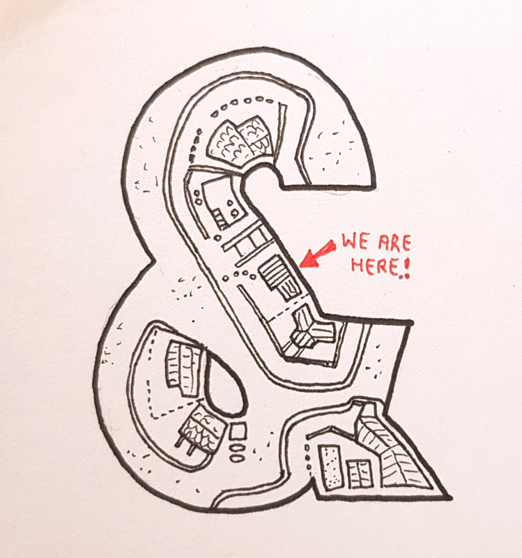
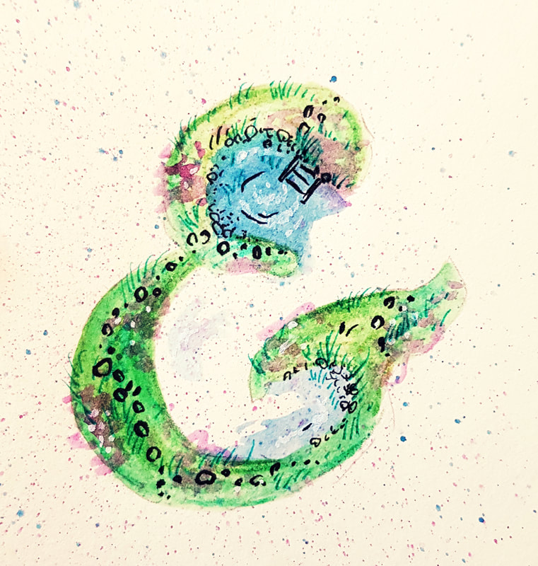
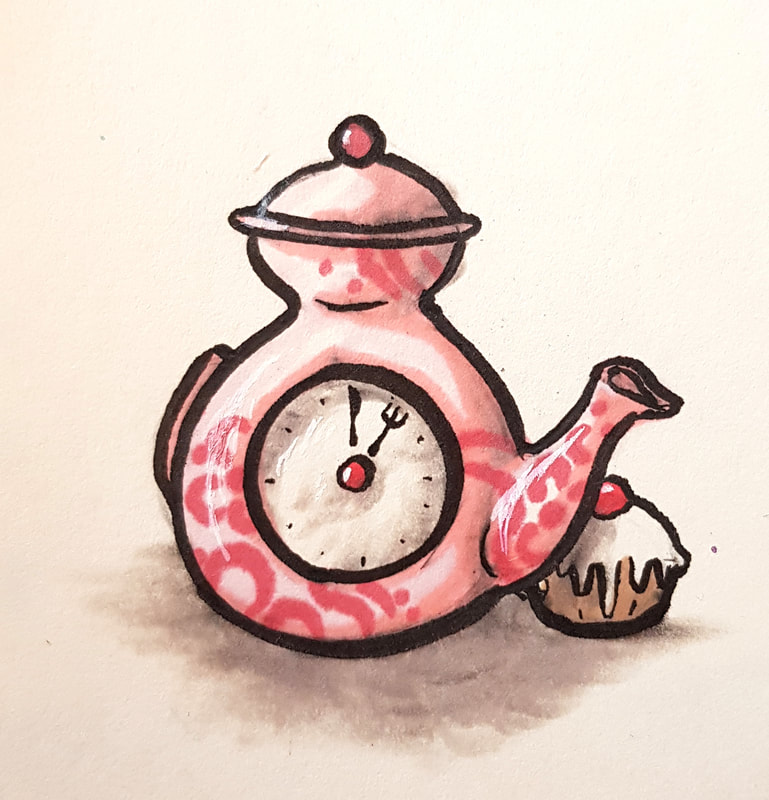
Bauhaus : My Street The Bauhaus ampersand is very thick and chunky, with a lot of space for illustrating the inside. It so happens that I live in a weird, curly little street that could resemble an ampersand if you squinted at it from above. This gave me the idea to draw a rough, quirky little map, with my house highlighted in the typical tourist board "you are here!" Garamond Bold Italic : The Park/Garden This ampersand is quite elegant, with delicate calligraphy-like strokes sloped to the side fancifully. It reminded me of a town park - circular little ponds enclosed by the upper bowl of the character. I used watercolour pencils and added some finer detail in pen, but all in all, it was somewhat of a wild experiment that didn't turn out right at all. Futura : Afternoon Tea Futura has a very simple, clear and curvy appearance - the strokes are very narrow, so I admittedly took a few liberties here regarding shape and style. However, when creating the image of the teapot, I did try to stick to the original appearance of the Futura ampersand.
0 Comments
Leave a Reply. |
ArchivesCategories |
Site powered by Weebly. Managed by 34SP.com


